Review: The Unphotographable

Article main image

If you want to be completely literal about photography, a medium whose technical nature invites just doing that, then you can only take a photograph of something that is tangible. In fact, you could go a step further and start wondering at what stage a photograph ceases to be a photograph, or whether a photograph made without a camera is still a photograph, or whatever else you can come up with. Whether or not you find such exercises particularly illuminating depends on your own disposition.

I personally couldn’t care less about, let’s say, whether a photogram is a photograph. Sure, let’s call it a photograph! Let’s call anything that looks like a photograph or that behaves like a photograph a photograph (photography’s duck test)! And then let’s talk about whether it’s any interesting. As far as I can tell is that this inclusiveness vastly broadens what you’re looking at, and it gets in the way of the kind of navel-gazing that makes so much of the more art/museum-focused kind of photography look so tedious and/or boring and/or just… well, silly (“OMG, there’s a colour filter in front of the lens!”).

As it turns out, you can approach photography from both sides and still talk about the same pictures. I had to think of that when looking at The Unphotographable, a book that contains photographs of things or concepts or ideas you seemingly cannot depict. The reality, of course, is that given there are photographs in the book, apparently the book seeks out to undermine its own premise. It does, and it doesn’t. In five separate chapters, The Unphotographable presents images of things that can’t be photographed for all kinds of reasons, whether it’s given they don’t actually exist (like ghosts), they’re completely abstract, they subvert the medium itself, etc.

What you get from the collection essentially is a glimpse into how the human imagination works. This is where the real fun begins. This is where you can bring together photograms and photographs by famous artists and chance vernacular imagery to have all of these images talk about the same thing: not what’s literally in the pictures, but what we see in them.

It’s hard to see how robotic photography will ever reach the stratum of photography by humans, given robots or machines have no sense of imagination. Maybe some day, they will (it will be a Philip K. Dickean world!). But so far, regardless of what curious image a machine has produced, it always requires a human being to take it – out of all the others – and to then elevate it to something other than a datum.

And this really is the true essence of photography: not any of the technical stuff you might have to do to get your picture, but your sheer insistence – often coupled with utter irrationality – that this here, this picture, deserves to be looked at because you say so. That’s it! And if you say that it’s a photograph of an angel that somehow materializes in a cloud, then we all have to deal with it. To paraphrase Michael Faraday, nothing is unphotographable as long as it tickles someone’s imagination.

The Unphotographable; various photographers; 120 pages; Fraenkel Gallery; 2013

Corinna Sauer: Home Story

Article main image
Corinna Sauer

Photography’s visceral qualities are inevitably tied to the visuals themselves: the use or absence of colour, the amount of contrast, the role technical shortcomings play (even when they’re artificial). But our understanding and perception of photography is also based on its history, and on the medium’s use in the various contexts we find it in. It’s mostly a theoretical exercise to imagine how we would perceive black-and-white photography if we did not know that this is how the medium started out. If we didn’t have the early history of black-and-white photojournalism what would we make of contemporary photojournalistic images that don’t have any colour?

There clearly is something to what a picture looks like that has us react in specific ways. On the surface, none of the various filters the popular app Instagram offers makes any sense – why produce a clearly artificial looking photograph when you can have something that’s much closer to what the camera’s lens saw? And many of the app’s users grew up never actually experiencing the use of, say, Polaroid Sx-70 film, never having asked a photo lab to cross process film, in fact never even have set foot into an actual photo lab.

But the filters that mimic those effects are popular (let’s call them effects for the sake of simplicity; my use of the term is not intended to be a value statement), and that has got to tell us something. I think most people writing about Instagram photography are making a big mistake when not taking this type of photography at face value (the same goes for “selfies,” the latest art craze).

But clearly applying some effect to a picture doesn’t necessarily guarantee a good picture. It just guarantees a picture that has that effect slapped on it. Again, this is not a value statement: you could instead use a view camera and still make incredibly bad pictures. You could spend all day, every day, in the darkroom and still make incredibly bad photographs. Quality photographs are not made with effects or gizmos; quality photographs are made by people who have a clear artistic vision. That’s the way this worked in the past, and it will always work that way (even though, I’ll admit, the idea of merit has always been under assault by artists who were much better at networking or hustling than at making good work; I’m sure you can easily think of examples).

I had to think of all of that when looking at Corinna Sauer‘s Home Story. I have a soft spot for these kinds of black-and-white pictures. They’re easy to like. They’re visceral, at least in terms of the way the tonalities are rendered. So I usually go from my initial reaction immediately to trying to look more carefully, to see whether there is something there beyond the visuals. And if yes, what is it I’m drawn to?

Photography is an act of paying attention to very specific details of the world, and Home Story can serve as a very obvious example of how this can work. Parts of the world are being extracted from it, are being given full attention, and the rest is made to fall away. Crucially, while there are many pictures that work well on their own, as a whole, they add up to something even more.

Particular attention is given to gestures, the same gestures that might subconsciously register, but that often are overlooked. Gestures, the way people use their hands and facial expressions, are very hard to deal with photographically. One of the complications appears to be that the moment we are made to look at a gesture, frozen in a photograph, we have to pay attention to something we usually do not think about. And then it gets weird very quickly.

It’s very hard to describe what it is that makes some gestures believable in photographs, but it’s certainly one of the most overlooked skills a photographer can have (the same seems true in many other forms of art: just look at how hands are rendered in painting or sculptures).

It is especially those gestures, the way they are treated photographically by Sauer, that makes Home Story succeed. This is no simple achievement, given that the overall look-and-feel of the visuals themselves focuses the viewer’s attention so much on them. And then, while seemingly often complex, the images all are much simpler than they would seem at first. Unlike in the case of most photojournalistic images that tend to overload the frame with details, here the viewer’s mind finds itself at rest after all, after the initial jolt of the harsh black and white.

Review: Pepa Hristova – Sworn Virgins

Article main image
Pepa Hristova

The concept, design, and production of a photobook each should add something to the photographs themselves. That, in a nutshell, is how I approach photobooks, both as a viewer and as someone often engaged in the process of making photobooks (in whatever capacity, usually as a teacher). Otherwise, you’d have an album. And you could make an album – provided that that concept makes sense for the photographs. In other words, the end goal is never to have something that’s so outrageous that it screams “photobook.” Instead, it is to produce something that while containing a bunch of pictures, is much more than just a bunch of pictures.

Consequently, there is no formula for how to make a photobook. Every book should be approached on the terms of the photographs it is based on. What story do the photographs tell? (note I’m being incredibly generous with the meaning of the word “story” here) And how can the format photobook be used to tell this story? What this means is that there potentially are a lot of things you can do with a photobook that add something to the pictures. In particular, this means that every photographer (yes, every photographer) would be well advised to talk to other people – designers, editors, etc. – when making a photobook, and to listen carefully to what they have to say.

A wonderful case-in-point is provided by Pepa Hristova‘s Sworn Virgins. The story of Albanian women who, following some tradition, decide to live as men is quite interesting (you want to read the project description on the photographer’s website to learn more about it). But it’s not too hard to imagine a book made from it that you’d pick up, look at once, maybe mutter “that’s interesting,” and then never look again. Part of the reason is that what Sworn Virgins really talks about is not directly in the pictures, and it can never be. Photography cannot depict abstract concepts. Photography cannot depict mental states. Photography can only depict whatever consequences such concepts or mental states have in the world, alluding back to what might have caused what is shown.

An obvious solution is to put some text next to a photograph. If you can’t see it, literally point it out, using words. Large parts of photojournalism operate that way: Get some dramatic picture, add a possibly even more dramatic caption, and you can make sure that your viewers get what you want to tell them. Or maybe not. But either way, such an approach to photography works fairly well, especially in the context of the news. But it’s also rather limiting. What if your viewers don’t see what you want them to see? What if your viewers are tired of being hit over the head with simple messages all day long?

In a photobook context, you have a lot more options, because you have more space. You can try to have people get each and every picture right away, just the way you want. But you can also use the photographs’ cumulative effect and work with that. Or you can mix things. There is a large variety of approaches to “packaging” photography in a book to tell a story, even when that story centers on abstract concepts and/or mental states.

For the book version of the project, also entitled Sworn Virgins, Hristova approached designer Sybren Kuiper (short: -syb-) for help. Kuiper is one of the set of well-known Dutch photobook designers that have been instrumental in greatly expanding our thinking about photobooks. The idea behind most of Dutch design is not to make cool looking photobooks. It’s true, many of those books look cool. But the main point is to get the story across, by whatever means necessary. The format, design, and production of such books usually are not design exercises; instead, they serve a very specific purpose.

How this works, can be seen in Sworn Virgins. Just to make this clear, not every photobook produced by a Dutch designer is good per se. I’ve seen books where the design appears to have overwhelmed the photography (which essentially is the flip side of the Dutch approach – I wrote about this elsewhere on this site). But in the case of this body of work, the photography is greatly enhanced by the very smart design and the beautiful production of the book. The viewer is drawn into a seemingly strange world, and Hristova’s subjects are being brought closer, through a smart mix of the photography (there are archival photographs included) and some beautifully written text (kept separate from the pictures).

Recommended.

Sworn Virgins; photographs by Pepa Hristova; text by Danail Yankov, Sophia Greiff; 228 pages; Kehrer; 2013

Rating: Photography 3, Book Concept 4.5, Edit 3, Production 5 – Overall 3.9

Sandy Volz’s Me and the Others (down the rabbit hole)

Article main image
Sandy Volz

Photography almost always centers on what you decide to show and what you decide to conceal. It’s like a game, where you hand out some clues, and you’ll have people figure out what it all might mean. As I wrote elsewhere, a photographer is like the person standing next to you who’ll whisper something into your ear to make you react. Mind you, your reaction might not be what the photographer had in mind (the idea of the photographer’s intent driving the meaning is very flawed); but at the very least there is a tacit agreement about the ground rules. Without these rules, the game of course wouldn’t work; and the fact that we know the rules while often being seemingly unaware of them only adds to the enjoyment that can be had with photographs.

If you know the rules, you can even play your games with the rules. You can pretend to follow some rules, while in reality working with very different ones. You can start playing your own games with people’s expectations. Doing this well is tricky, because it relies on your audience being visually literate enough to get what’s going on. One of the risks is always to produce something that’s little more than an insider’s game, little more than an exercise for a group that might be too much in love with its own cleverness (this is my problem with New Formalism photography that, sadly, is so en vogue these days). So things can’t become too self-referential. There have to be enough hints at other possibilities. There has to be an openness to something that’s beyond the photographer’s control.

There are a lot of things that are being hinted at in Sandy Volz‘s Me and the Others. As is always the case with photographs that don’t give much information, things can get very confusing. In the photograph above, there is a person’s head, but we only get to see its back, in particular the long hair that is flowing over what initially looks like a couch. But is it really a couch? If it’s not a couch then what is it? (And does this matter? If yes, why?) The rest of the frame is pitch black. This is not how we tend to see things in real life. Very few people spend their time in rooms so large that a flash will clearly illuminate something, yet leave the background completely in the dark.

So what does this mean then?

Well, what do you want it to mean?

We aren’t shown the faces of the people depicted in Me and the Others. Yet we are close enough to see them clearly, and they’re engaged in all kinds of activities. The process of photography always involves the transformation of a viewer into a participant. In fact, this is the very reason why there has been so much hand wringing about the medium and its supposed cruelty: I don’t think we’d worry so much about the medium if we didn’t feel we’d be made, let’s face it, complicit.

Now isn’t that the greatest medium you could imagine, a medium so powerful that it makes its viewers feel they are almost responsible for what they see, when in reality they’re not? It gets even better: Photography shows us things that we wouldn’t have seen, yet we still feel complicit.

Somehow, we feel as if we had something to do with the people in Me and the Others, as if what they’re engaged in had something to say about us, our status, our relationship to these strangers. We want these images to mean something, possibly something very specific, but they don’t seem to conform. They make us feel something entirely different (the point here cannot be to try to narrow down what we are led to feel).

That is how a lot of photography operates, much to our chagrin. That is where many (most?) of those controversies about photography originate: We want one thing, yet we are given another. So it’s the photographer’s fault that the world doesn’t conform to our (internal) world of make believe! It’s the medium’s fault! It’s cruel! It exploits its subjects!

Mind you, there is something to be taken from what photographs make us feel and think, there is something to be taken from our comfort or discomfort. Photographs are taken from the world, but they are not the world. Instead, they’re snippets from the world, whispered into our ears with the knowledge that they’ll push our buttons.

Oh, and do they push those buttons alright!


Review: Johan van der Keuken’s Paris Mortel retouché

Article main image

There is considerable interest in the photobook right now, at least amongst photographers. For those interested in learning more about them there exists a fairly extensive library of books about photobooks, for example the Parr/Badger ones. A third one appears to be coming, but it’s not quite clear to me what exactly that will add to the series (other than creating a collecting frenzy in some areas that have not been touched by that, yet). There are various other books covering the photobook, many of them region specific.

Most of these books about photobooks are very useful as research tools, at least up to a point. If you’re interested in finding out about, say, the history of Dutch photobooks, there’s something for you; if you’re interested in seeing the evolution of the modernist photobook, you can look that up. However, if you’re interested in getting a lot of details about particular photobooks, these survey books – by construction – are of more limited utility. Filling that gap, Errata Editions have been re-publishing mostly out-of-print photobooks as facsimiles (more accurately: photographs of the individual spreads). With in-depth essays for each book added, these books provide quite  a bit more insight into individual photobooks.

All of these books are great teaching tools: If you’re a photographer who wants to make a photobook (and who doesn’t these days?) the best way to approach doing that is by getting educated about the medium, to see what people have done before and how. In all likelihood, you will discover a wide variety of approaches plus, possibly, things you haven’t even thought of before. Of course, you want to make your own photobook; but I’ve found that most photographers tend to look at a very narrow range of books themselves, and they end up being genuinely surprised and thrilled when other books are pointed out to them.

The possibly best way to learn about photobook making is trying to reverse engineer a book that has already been made: How does it work? How does it operate? How exactly does it convey its message? What does it do well, and what isn’t working? This is often a very tough task if all you’ve got is the book itself, and if you don’t know much about photobook making (yet). Approached from that angle none of the books above really gets you into the guts of the individual books, as much as they will provide you with very useful pointers.

This then is where books like Looking For Love On The Left Bank enter. This books dissects Ed van der Elsken’s highly influential Love on the Left Bank. It’s quite unlikely you’ll be interesting in Looking for Love unless you want to get a much better idea of the original book itself. It’s a book for specialists, not the broader public. But any photographer who wants to make a photobook is such a specialist (or at least should be; if you just plop images into a template and call it a day, you’re obviously not). Another example is now being provided by Paris Mortel retouché, a book looking at Johan van der Keuken’s Paris Mortel, created and published by Willem van Zoetendaal (the fact that both Van der Elsken and Van der Keuken were Dutch tells us something, and you can look up what it does either in the Parr/Badger books or in The Dutch Photobook: A Thematic Selection from 1945 Onwards).

In a nutshell, Paris Mortel retouché combines the Errata approach with what Looking for Love has to offer. You get to see the book itself (photographed just like in the Errata model). On top of that, there also is a reproduction of Van der Elsken’s third dummy. Plus there are many unpublished photographs. This is about as good as it can get for a photobook, if (and let’s remember this: only if) you want to really dive into a particular book and see how it works. To compare the dummy and the published book is highly instructive, for example. The differences in edit and layout are telling.

For what it’s worth, I personally think the dummy version is much better than the final book, despite the fact that it would gain from a more rigourous edit. Your assessment might differ, of course. Paris Mortel retouché gives you the chance to look at this aspect of photobook making – exactly the kinds of problems so many photographers struggle with when making books (how do you edit this thing?).

Thus, while Paris Mortel retouché is unlikely to appeal to people who simply want to look at and enjoy photobooks, anyone interested in making a photobook, in learning how photobooks work and how they are made, might want to have a look at this book. It’s about as good as it gets; and it’s produced with restraint. You’re not being flooded with too much material. You don’t have to pick your way through a lot of contact sheets etc.

Highly recommended.

Paris Mortel retouché; photographs, dummy, and book by Johan van der Keuken; essay by Willem van Zoetendaal; 188 pages; Van Zoetendaal Publishers

A conversation with Dorothee Deiss

Article main image
Dorothee Deiss

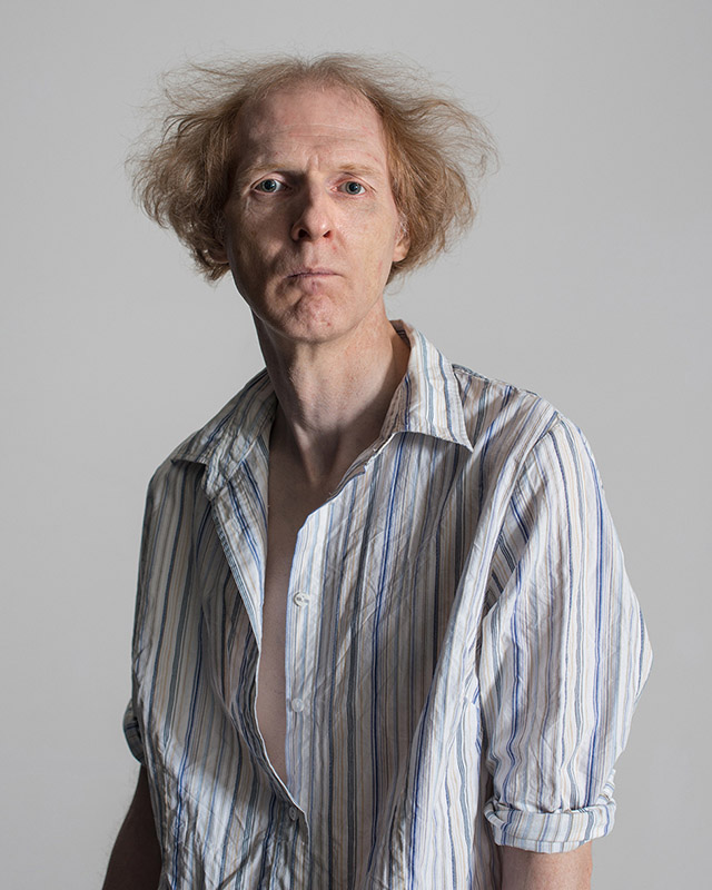
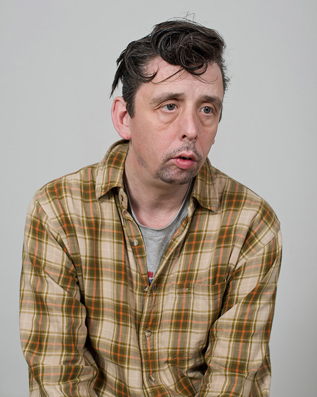
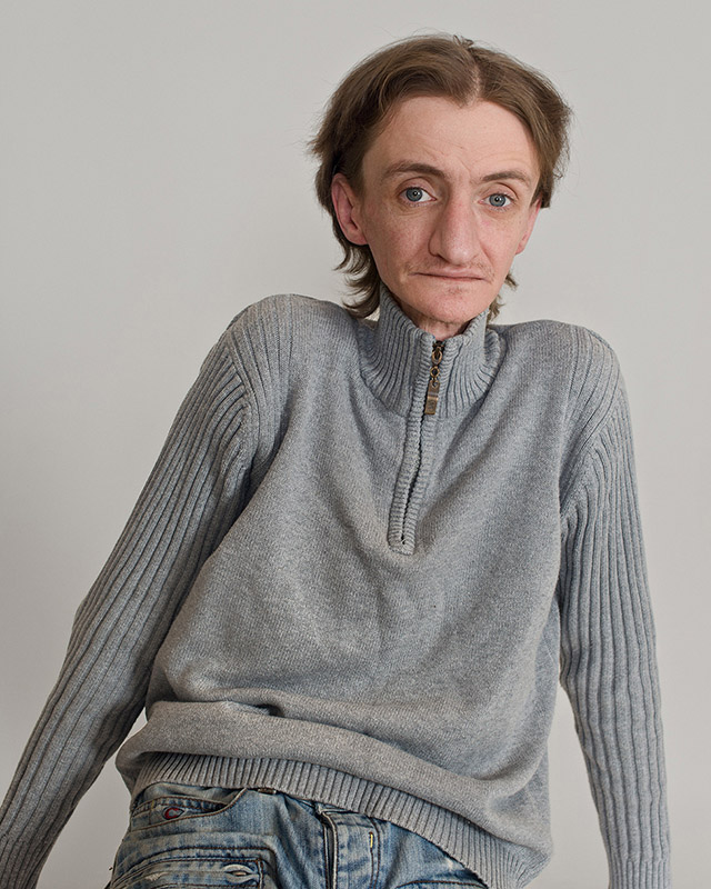
Dorothee Deiss is one of the winners of the Conscientious Portfolio Competition 2013. In her statement about the work, juror Alice Rose George Rose wrote:

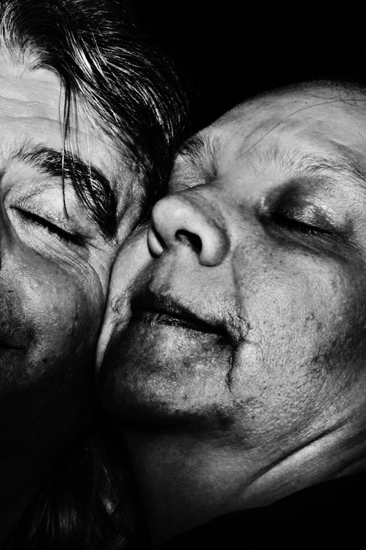
“I find myself going back again and again to these portraits by Dorothee Deiss. Yes, they are inherently fascinating because they show people with what seems to be some physical or mental handicap, but they don’t let you go after the initial surprise. At first they may disturb because they aren’t ‘normal’, but the sensation moves surely and quietly to acceptance and a growing curiosity. Who are these people? What do they feel? How am I to face them? They seem so brave and trusting and vulnerable. They look directly back at the photographer. It’s almost as if they would reverse the roles. The light is bright, more like an examining light than one in a formal portrait; it reveals the mistakes of the flesh but is not mean. And the background is not black, which would be harsh and drama-making, but is a light grey or neutral shade that frames the subjects comfortably — not too tight as to be imposing or distorting, not too wide as to be distancing. The quality of the image making, the surprise of discovering these individuals, and the intelligent and unflinching eye of the photographer make these photographs my choice for the Conscientious Portfolio Prize.”

I spoke with Dorothee about her ideas of portraiture and her work.

Jörg Colberg: Let’s start with a simple question first. What makes a good portrait? What is it a good portrait has that a bad one doesn’t have?

Dorothee Deiss: That’s not a simple question at all. For a long time I have been looking for the ingredients of a good portrait. In my mind a good portrait strives for honesty, truth, intensity, empathy and respect. It dignifies and makes some kind of beauty visible. It is an emotionally striking picture of somebody, where one could catch a glimpse behind the „surface“. A good portrait doesn’t denude, it keeps a secret which the viewer is able to reveal in many different ways.

Portraiture is mostly about nonverbal communication and the relationship between the subject and the photographer, as well as between the picture and the viewer. For me, it is loaded with a lot of human, social, and ethical expectations. A portrait should capture the richness, complexity, and dimensions of human experience.

These days, there are so many discussions if portraiture can still exist as an art form. In a digital world where we look at millions of facial surfaces, which have nearly nothing to do with the personalities behind them, one can argue that a portrait is always merely a mask.

However, I strongly believe in portraiture. In my daily life I depend on reading somebody’s face to understand him to some extent. Faces are vivid maps of human experience, just as good portraits can be.

Nevertheless, a portrait is not only produced by the photographer’s interpretation of someone. In addition, it is transformed by the viewer’s active interpretation, which you can think of as a kind of reinterpretation. With each reinterpretation, it is if the portrait is being recreated.

You can tell a lot about a person from their face, but the way we perceive that face and body also tells a lot about ourselves. Our own prejudices have to be questioned the moment we look at somebody’s face. I have been frequently accused for exposing someone as a freak. But to what extent do we project ourselves when we consider a portrait as a caricature because we cannot deal with our own awkwardness?

In the communal and safe setting of an art gallery or in photobooks viewers can engage with pictures to articulate the most basic of human fears roiling inside them. Therefore, there could be the opportunity that by seeing portraits our ability to think and to see more in general is changed, to see the strange in the familiar.

Portraiture is not a cold and voyeuristic method to get excited about the aberrant, about deformity and marginality. In fact, it provides a safe mechanism to explore, contemplate and experience our own terrifying feelings concerning health or illness, disfigurement and death from afar. Thus, from a distance the viewer can better deal with threads or blemishes the subject in a portrait have to deal with. But at the same time these threads or blemishes are archetypical of our own human experience, of life. Portraits allow the viewer to imagine the unimaginable. This might not serve only for the viewer’s self-acceptance, but also for producing empathy.

With my pictures, I hope to get the viewer into an emotional engagement, to induce compassion, human and social interest for people who do not necessarily fit into a perfect world.

It is important to use the formal aspects in a portrait to express these complex interrelations. I often struggle with creating enough simplicity and formal similarities between different portraits, to sort out the essential features that will make the meanings of the photographs visible, meanings that might otherwise be lost in the process of unpacking less well-structured presentations.

JC: You mentioned two things you essentially need to work against, namely some viewers accusing you of exposing people as freaks. The freaks accusation is an old one, and you’re in good company even though I’m not sure it’s a company you enjoy being in. So I want to ask you about this: What do you make of Diane Arbus’ portraits? How do you see them in relation to yours?

DD: Although I do not feel strongly influenced by Diane Arbus’ work, I cannot ignore the conflicting discourses of her legacy, mainly concerning the subjects of her photographs and her relationship to them. This has a lot to do with my own questions and considerations concerning “misfit models.” Arbus was called the “photographer of freaks,” and her work has been evaluated based on moral and psychological terms concerning her as a person, but less because of the work itself.

It is said in Arbus’ defense that deformity did not interest her, when of course it did. And this is the same for me. What is essential to understanding her pictures as well as mine is that deformity interests us not as a blunt, obscene fact, but for how it has shaped the psyche of the person who has endured it. Diane Arbus once stated
“Most people go though life dreading they’ll have a traumatic experience. Freaks were born with their trauma. They’ve already passed their test in life. They’re aristocrats.”

I do not like to call somebody as a freak. But I agree with Diane Arbus that people who have to struggle with a traumatic experience gain and mature with this experience, provided they are willing to look into it. And, like Arbus, I want to show people who are not afraid of existing the way they are, regardless of any generalizations or stereotypes about them.

Like Arbus’ portraits, pictures of people at the fringes of our society often seem to be provocative, because they raise disturbing questions about the relationship between photographer, subject, and audience. They implicate all three parties and the ethics of vision itself. Our license to have the experience of viewing another person might be changed and challenged, supported and enriched.

JC: You also mentioned that there are all those photographs on Facebook, many of them portraits, that, you say, “ have nearly nothing to do with the personality behind” them. I am very familiar with art photographers dismissing photography shown on Facebook, which, I think, is a very big mistake. After all, why would someone post a picture if it had “nothing” to do with them? Aren’t all those people doing exactly what you are doing yourself, namely taking a photograph that expresses an idea, their idea, of a person?

DD: I mentioned the digital world of pictures in general. However, Facebook is a good example of how people try to define themselves by posting endless pictures of their expressions, food, emotions etc. You are totally correct, those people express their ideas about themselves and others. There’s nothing wrong with that at all. But I cannot keep up with the speed of their digital publishing, it leaves me breathless. As if nobody took the time any more to think about themselves or somebody else before already posting the next picture! It’s like to be on stage and to randomly throw millions of pieces of their personal puzzle into the audience, like an unreflected striptease. I cannot imagine that anybody would seriously think that this could generate a complex portrait. What is more, there is not much room for conversation. You can “like” it or briefly “comment” on it. That is often not enough to build up a relationship between the model and the viewer.

Nevertheless, I agree that the internet has to be (and fortunately is already) a big part of making art accessible to a larger public. That is democracy.

The internet per se is not the culprit of portraits that “have nearly nothing to do with the personality behind” them. The real reason is that in our present world the outer surface is so much more important than the content.

“With my pictures, I hope to get the viewer into an emotional engagement, to induce compassion, human and social interest for people who do not necessarily fit into a perfect world.” – Dorothee Deiss

JC: How do you try to bring your ideas of what a good portrait is and does to your own work, when you photograph someone?

DD: First of all, I have to be honestly interested in the other and be open myself as well. A portrait can only reflect human expression when there is a gracious relationship with the model, a mutual give-and-take.

Before the shoot I always start a conversation with the model, so we can become more familiar with each other. I try to get a rough picture of somebody’s circumstances of life, of important issues and problems he has to deal with, watching his facial expressions and gestures. Portraits are constructed and shaped through the development of productive and benign relationships, where trust is built and intimacy negotiated.

For VisibleInvisible, I worked in the studio for the first time. This gave the opportunity to take more time for a shoot, to create a certain safety zone for the model and me. You might compare it with what happens a psychotherapist’s office. You can let go of your facade, you can scream, cry, grieve, confess your weaknesses. And when you leave, everything stays there, in a safe place. In photography, there is the photograph left as a witness of what happened in this “artificial“ space between the model and the photographer. However, after the shoot, the model can decide to step back, to distance himself from the picture and leave it as „something and somewhere else“ .

During the process to get the „perfect portrait“ I strive for as much honesty and openness as possible between me and the model, with the idea of getting an intense and touching picture. Now I think the picture is a compromise between the search for an „inner truth“ and what I make the sitter to be. In other words, the portrait does not have to capture the model how he sees himself. Of course, it should capture some kind of essence. This could be qualities of his character and history, some of which he is unaware of, some of which he resists, some of which feel deeply familiar.

I think doing portraits is also crucial for my own self-reflection and self-understanding, which is growing out of the relationship between the other person and me. It is in our genuine encounters with what is other and alien that we further our understanding of our self.

In the situation where I take a portrait, the relationship between my model and me works towards self-understanding in two different ways. I can learn from the people I am allowed to photograph. I can learn how they manage their lives with all the challenges, to find gratitude of and confidence in my own incompleteness. On the other hand, the model can learn from the mirror that is held up, from the telling of one’s story through another person’s voice. My hope is that if a portrait is authentic, there is something to recognize in the portrayal that is at the heart of the model’s experience.

Sarah Lawrence-Lightfoot perfectly described the different roles of a portraitist and meanings of portraiture:

“I am a mirror that reflects back their pain, their fears, and their victories. I am also the inquirer who asks sometimes difficult questions, who searches for evidence and patterns. I am the companion on the journey, bringing my own story to the encounter, making possible an interpretative collaboration. I am the audience who listens, laughs, weeps, and applauds. I am spider women spinning their tales. Occasionally, I am a therapist who offers catharsis, support, and challenge, and who keeps track of emotional mine fields. Most absorbing to me is the role of human archeologist who uncovers the layers of mask and inhibition in search of a more authentic representation of life experience. Throughout, I must also play stage manager, coordinating the intersection of three plays, the storyteller’s, the narrator’s, and the perceiver’s, inviting you to add your voice to the drama“.

JC: How do you decide about models/subjects? How do you find them?

DD: I cannot exactly define the characters I am looking for. It’s a question of sympathy, something in their faces, in their charisma, that catches my interest. I am frequently asked why I choose these kinds of people, and I am being criticized for exposing them as freaks. In my mind, I search for an intimacy with these people because there is an affinity with them, a feeling of awkwardness and insecurity.

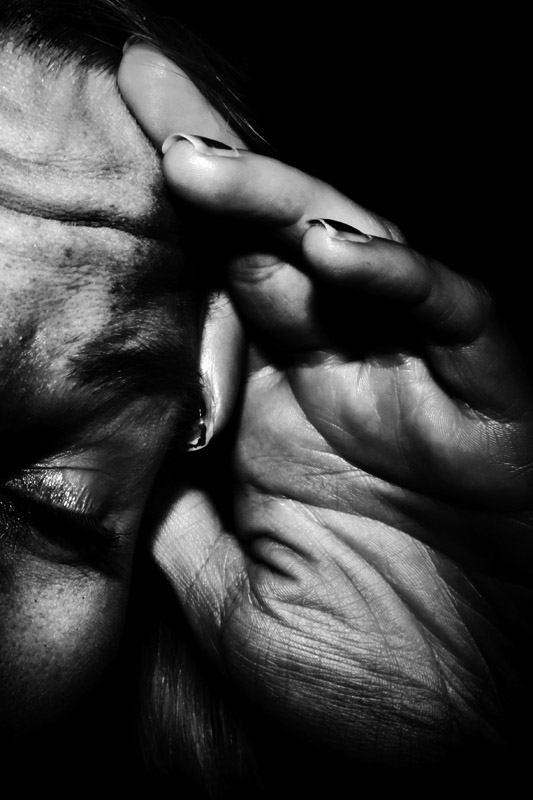
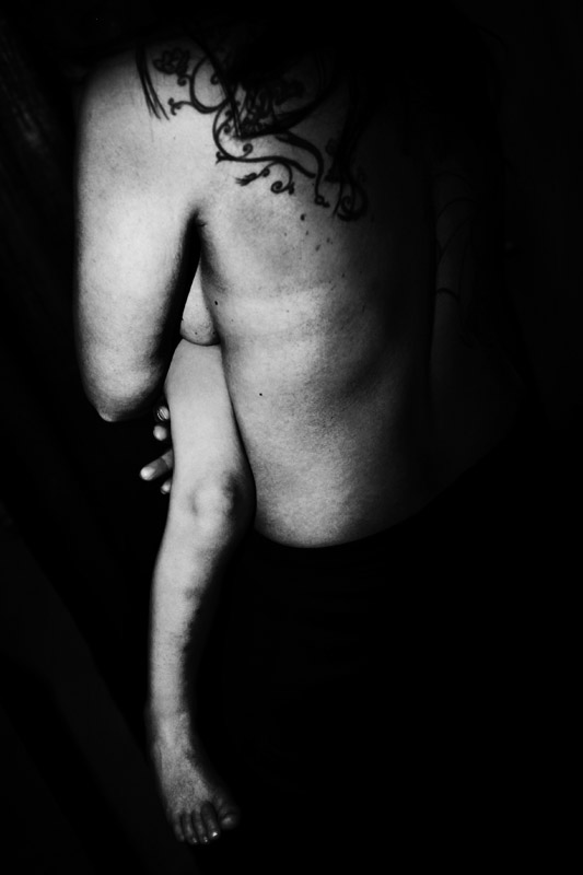
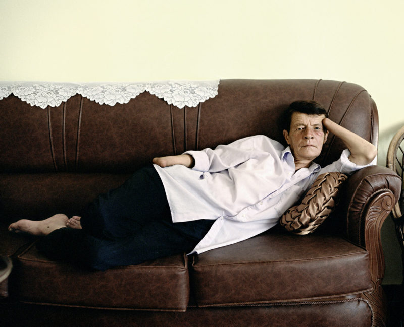
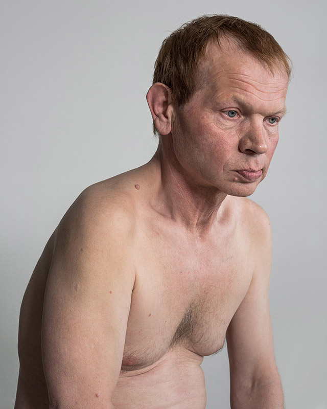
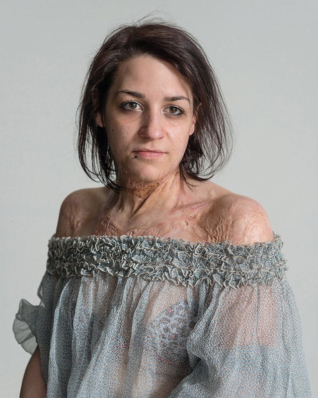
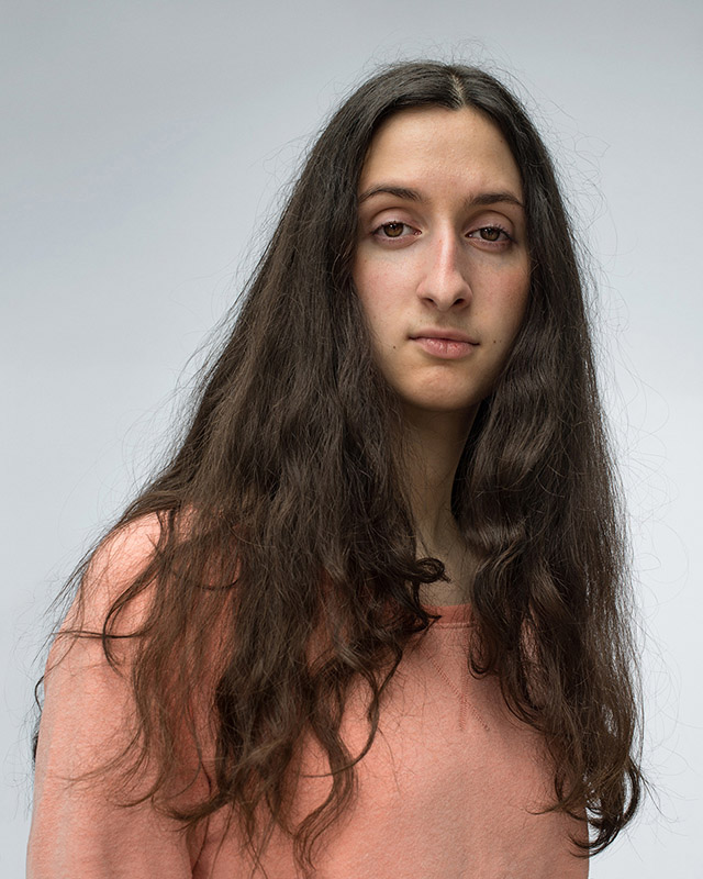
I met Marie, the girl with the burned skin, at a casting for misfit models, where she applied. I was impressed with her confidence and the natural way of living with her burden, her ease when getting photographed. What makes all these people special is that they are all confident in showing themselves despite the fact that they don’t fit into our society. But they are not freaks, they are individuals like all of us.

I believe in the unseizable complexity of everybody’s personality. To picture that in a photograph is impossible. However, I want to mediate at least an idea of this complexity in my portraits.

JC: And then how do your models react when they see the photographs you took of them? Do you show them? Is it important for you to learn about their reactions?

DD: It is always a difficult moment when I show them the pictures. The situation reveals so openly what people in general expect when they look at a photograph. They want to see a professionally made, flattering, pleasant portrait where the real is beautifully painted over. Of course, given my models experienced the shoot, knowing my intentions and what I wanted to get out of them, they try to understand the resulting photograph. Some of them are ready to see the strange in the familiar, to discover something new in themselves. But often they are a bit alienated, sometimes disappointed. Although I understand that, it hurts me. However, it is important to confront myself with their reaction. It can mean different things. It can either mean that they are not willing or able to accept the truth in what they see, or that the portrait is only a distortion of my own imagination and has nothing to do with the person I intended to understand.

Therefore, I always try to make “nice” pictures at the end of the shoot, where I encourage the models to behave and pose how they want to see themselves in a photograph. It is understandable that they want to get pictures which they can proudly show their family and friends, photographs in which they don’t have to reveal any weakness, back in their strong armor.

Joan Fontcuberta: The Photography of Nature & The Nature of Photography

Article main image
Joan Fontcuberta

Joan Fontcuberta is one of the most highly acclaimed international wildlife photographer” it says somewhere in The Photography of Nature & The Nature of Photography, so it’s got to be true. Just like the story about the fossils of mermaids at the end of which this sentence leads off the author’s bio. You might now be tempted to inject that mermaids don’t exist and never did. But Fontcuberta has pictures, and the article, convincingly written, makes a strong case in point. There are quite a few other things you didn’t know about in the book. There’s a early-evolution centaur, where you have a monkey instead of a human torso attached to a horse (any biologists reading this will please forgive my somewhat sloppy description). Or there’s Soviet cosmonaut Ivan Istochnikov, lost in space (along with his companion, a dog named Kloka).

Of course, pictures lie (or can be made to tell a tall tale). We all know that. If all Fontcuberta had ever done was to produce cleverly Photoshopped images of the aforementioned centaur, say, that would not be very interesting. That said, those people trying to sell us something with pictures (remember this or that?) might want to look at Fontcuberta’s work. What has struck me about all those cases that have recently made the news is how amateurish the fakery has been. In much the same way, I’m actually amazed that a photojournalist producing work like this isn’t laughed out of the room by his peers and/or news organizations. This picture isn’t really a fake. But when a news photograph looks like a still from a Hollywood movie, I’m tempted to think there’s a problem.

The reason why all those people should look at Fontcuberta’s work is because he’s testing the boundaries of photographic believability. It starts with the pictures, but it doesn’t end there. For a start, the images are all very well done, they’re very convincing. They follow the conventions of whatever context Fontcuberta wants to play with very closely. While we all now believe that pictures lie (I wrote it earlier) they actually don’t. The idea that photography lies is based on a complete misunderstanding of what photography actually is or does.  Photographs, by themselves, don’t do anything. They’re just photographs. But they can be made to tell a story or tall tale or outright lie when they are being placed in context, when they’re used to tell a story that might or might not be true.

And even if you believe that photographs do something, the idea that they lie is completely detached from how we look at them. The issue of the veracity of photographs depends very strongly on the context they’re used in – different contexts come with very different expectations. To pretend that the same rules apply for each and every context just doesn’t make any sense.

In his work, Fontcuberta has been exploring the mechanisms operating in different contexts in many different ways. The story about the mermaids is more than a set of pictures, for example. The pictures are made to look like the kinds of pictures you would see in an article in a very specific kind of magazine. In other words, Fontcuberta is very aware of context, of its rules, and, in particular, of the viewer’s expectations that come with that particular context. To come back to the heavily Photoshopped example of photojournalism I mentioned earlier: The main problem with this picture is not that it’s Photoshopped. The main problem is that its makers are unaware of (or not interested in) context – they don’t see a problem with a news photograph looking like a movie still.

In 2013, Fontcuberta was awarded the Hasselblad Award for his work. At the occasion of the award, The Photography of Nature & The Nature of Photography was produced, a selection of some of his work. It’s one of those book anyone interested in photography should have a look at. Writing about photography, photographic storytelling, context etc. can only do so much. In contrast, seeing all of that thinking applied is illuminating – and highly entertaining at the same time. Of course, it’s easy to say that one doesn’t believe in mermaids. But it’s quite another thing not starting to wonder whether there might not be something to the story after all… Used smartly, photography can be quite convincing.

Those who’ve just had it with books can get an electronic version.  I tried it on my iPad mini, and that didn’t seem to be the right device for it. I bought the iPad mini in part because I don’t like the clunkiness of the regular iPad. Its main drawback is that as far as I can tell everything is developed for the larger tablet, and things then simply scale down. I did enjoy the way the ebook was put together – comparing it with the actual book showed that a lot of thinking had gone into its making. But once I had the printed copy I never went back to it. Needless to say, that reflects my own preferences to a fairly large extent. On the other hand, the book itself is hard to compete with – it’s a very nice production, a single page of which is quite a bit larger than my iPad.

Whichever version you want might prefer, The Photography of Nature & The Nature of Photography is a book you definitely want to look at. Highly recommended.

The Photography of Nature & The Nature of Photography; photographs and text by Joan Fontcuberta; additional essays by Geoffrey Batchen and Jorge Wagensberg; 224 pages; MACK; 2013

Rating: Photography 4, Book Concept 3.5, Edit 3.5, Production 5 – Overall 4.1

Tobias Zielony’s Jenny Jenny

Article main image
Tobias Zielony

On my pile of photobooks to review, there was a group of books I hadn’t got to, mostly because something bothered me about each of them. There was, for example, Todd Hido‘s Excerpts from Silver Meadows, which I bought thinking I ought to have at least one of the photographer’s books. Or there was Jane Hilton‘s Precious – I was going to review it alongside Antonia Zennaro‘s Reeperbahn; but I never got to it, in part because, to be honest, I was a bit hesitant. They both seemed problematic. Or maybe I was giving myself too hard a time over who knows what. The photography in these books is fine, it’s good work. But it’s also problematic work, mostly for  non-photographic reasons.

It would seem strange to include Excerpts in this group of books – Precious portrays prostitutes in Nevada, and Reeperbahn focuses on Hamburg’s red-light district. But then the women in Excerpt are so clearly depicted in quite a particular way, and that makes for a continuum – at least for me. In Excerpt, for the most part women are apparently up to no good. If your jump-off point is rooted in pulp-fiction from the 1950s or so, then it’s very hard to pull something off using photographs that is an homage, yet at the same time aware of all the problems. Photography is cruel that way. It’s hard to play games with it. It’s so literal. It looks like, well, what it looks like. And that ties in Excerpts with Precious and Reeperbahn – they each end up being that tad too celebratory of a role for women that a lot of people have tremendous problems with (and it’s not because they’re all prudes).

If Jenny Jenny by Tobias Zielony did not exist, I’d be now left to walk down that grim path outlined above. Zielony’s work throws this writer a life line. But it does more than that. It also shows that this general subject matter – however we want to define it – can be approached in ways that, while being aware of the pitfalls, the inevitable pitfalls, still offer an opportunity to make pictures that are neither just decorative, nor too celebratory, nor too stereotypical. The book portrays women who exist at the edges of society, some of them prostitutes, others not. Zielony met a prostitute by chance when he asked a couple in the Berlin subway whether they would allow him to photograph them. Turns out the woman was on her way to work. With time, he gained access to various other women – friends and acquaintances; and he photographed the women and the environments they were acting in.

In an interview that unfortunately is only available in German, Zielony speaks of why and how this whole project is problematic. It is, of course, the classical role of the male photographer and the female model, a relationship that even without the added factor of prostitution is very loaded (as a brief aside, a fierce debate has recently erupted in Germany about prostitution). There is the issue of privilege – the privilege of the artist, and the privilege of the viewers (c.f. this review of a body of work by Malerie Marder that would fit right into this discussion; I didn’t buy the book, so I’m not going to talk about this work here). Zielony’s solution was to acknowledge this situation and to make work that would try to break away from societal restrictions, work that both he and his models would be comfortable with. In other words, the problem isn’t resolved per se. Instead, it is acknowledged, and it is allowed to provide some of the friction that is very obvious in the portraits.

The main reason why Hido’s photographs of women are relevant in this context is the following. Apart from the fact that the main setting, that power relation, is very similar, so are some of the photographs themselves. Looking through Jenny Jenny, at times I was stopped in my tracks, wondering where I had some of the pictures before. I hadn’t, of course. I just found strong visual echos of Hido’s portraits of women. But whereas Hido’s portraits always end up looking as stylized as they are, with the artist seemingly unaware of why such portrayals can in fact be quite problematic, Zielony manages to avoid this problem. Zielony’s portraits never look stylized or staged (even though in reality they are both, at least to a certain extent). For a lack of a better word, they look real. Or maybe believable might be the right word (isn’t that what people are talking about when they say something “looks real”?).

Of course, Zielony’s subjects find themselves in the very circumstances they are depicted in, whereas Hido’s are models. But that’s not what creates the visual difference at all. Photographs are made behind the camera. I think when you compare Hido’s and Zielony’s photographs the different approaches to the photography might be responsible for the differences. Hido’s portraits are not necessarily made to look like what they end up looking like. They’re like those pinup illustrations from the past that now have become collectible (again), because apparently objectifying women’s bodies is not problematic any longer. Or maybe it’s because we’re supposedly now so aware of what’s going on that we can all share a wink: it’s all just a game (mostly for boys, though).

In Zielony’s work, the viewer is made to realize that there’s no game going on. There’s something at stake for everybody here, certainly for the women, to a lesser extent for the photographer, but also for the viewers. I have written about how for photographs to truly work there needs to be something at stake (see this piece), and Zielony’s work makes for an excellent case.

I might as well add that Hido’s landscapes succeed where his portraits fail. Decorative as they often are, they also offer quite a bit more, at least the best of them. There’s something going on that is mesmerizing and uncanny. Putting all those photographs together (landscapes, women, found photographs etc.), however, doesn’t work for me at all, especially not if it’s done in as formulaic a fashion as in Excerpts. As a consequence, I even started disliking the landscapes when I came across them in the book. It took seeing just the landscapes in an exhibition to remind me that, yes, this artist was onto something with those.

You could easily argue that by comparing Hido’s and Zielony’s photographs, I’m comparing apples and oranges. One, Hido, deals with fiction, the other one, Zielony, with facts. In a very old-school sense, this is correct. But the reality is that this clear distinction between fact and fiction does not exist in photography. Photography always is fact and fiction at the same time. Zielony’s work is fiction. It’s very clearly created in a way that resulted from the interaction between an artist and his models in this tug-of-war that is photography.

Crucially, Zielony is comfortable enough to yield some power to the women he is photographing. There is an exchange going on, an exchange that has strong echos of, say, the best of Nan Goldin’s work (the artist  acknowledges Goldin as one of his photographic references). Most of that exchange is absent from Hilton’s photographs in Precious, to bring another one of the books into the fold now. There, things turn completely static, and the results are oddly anemic. The portraits are neither here nor there; they don’t really speak of much else other than the photographic process of making a portrait with a view camera. Mind you, they’re not bad pictures. They’re competent. But they aren’t memorable. They don’t tell us something we don’t already know. And often enough, they end up being merely decorative.

Something being decorative is not necessarily bad. Contemporary art’s audience has a big problem with something being decorative (even though, in reality, whether something looks good over someone’s couch or in some corporate office does play a big role in whether a sale is made or not). This is too bad. If your work is deemed to be decorative, it’s easy to take that as the kiss of death for an artist. I actually don’t think it is, even though it depends on the circumstances. Still lifes, for example, can be very decorative and powerful at the same time. A lot of the New Formalism work that is currently so hot (hopefully for not much longer) also is very decorative. But in the context of the work discussed here, something being decorative feels problematic. There’s just too much at stake for the (mostly) women in these books.

At the end of the day, it’s very hard to say what exactly it is that makes Zielony’s work stand out so much in this group. It’s not the aesthetic, even though that plays a role. Zennaro employs a similar aesthetic, and those pictures end up not working so well for me. Zennaro’s work I’ve seen in before, done by other photographers. It’s the same old yarn of a red-light district’s rough life (with some redemption thrown in for good measure).

I want to believe – and I have no way of backing this up – that Zielony was the only artist who went to look for something he didn’t quite know what it would be, instead of going out to make pre-visualized or pre-conceptualized pictures. I could be completely wrong. But still… At the end of the day, all we have are the pictures, and those pictures speak to us in ways that are often very hard to describe. Jenny Jenny is a gem of a book.

Jenny Jenny; photographs by Tobias Zielony; essays by Ulrich Domröse, Maren Lübbke-Tidow, Vanessa Joan Müller; 128 pages; Spector Books; 2013

Rating: Photography 4, Book Concept 4, Edit 4, Production 5 – Overall 4.3

also discussed above:

Reeperbahn; photographs by Antonia Zennaro; essays by Kurt Tucholsky, Konrad Lorenz, Joska Pintschovius, Rocko Schamoni, Anna Hunger; 140 pages; Prestel; 2013

Rating: Photography 3, Book Concept 3, Edit 2, Production 3 – Overall 2.9

Precious; photographs by Jane Hilton; 128 pages; Schilt; 2013

Rating: Photography 3, Book Concept 3, Edit 3, Production 2 – Overall 2.8

Excerpts from Silver Meadow; photographs by Todd Hido; essay by Katya Tylevich; 108 pages; Nazraeli Press; 2013

Rating: Photography 3, Book Concept 2, Edit 3, Production 2 – Overall 2.5