“The single biggest mistake that a photographer can make is to believe in the profession, to believe in magazines and newspapers. When that happens, you have already failed. One must work first and foremost to satisfy oneself. And in my case [Vietnam Inc.] I always knew my goal was a book on the war.” – Philip Jones Griffiths (quoted from an interview with the photographer done by Geert van Kesteren, Brigitte Lardinois, and Julian Stallabrass; in: Julian Stallabrass (ed.), Memory of Fire: Images of War and The War of Images, Photoworks, 2013, p. 68)
Much has been said and will continue to be said about photojournalism and its ability or inability to tell stories, and to reach people to tell those stories. If there is a perfect way to tell a perfect story, perfectly reaching all those concerned and those not-yet concerned, then I’m not aware of its existence. And it would seem everybody else is in the dark as well.
The real question, however, is whether any of this really matters. The concerns Philip Jones Griffiths had to deal and struggle with probably were different from the concerns photojournalists are facing today. Even the stories might be different – peel away enough from the surface, and there might appear more and more similarities.
And the need to tell the stories has been unchanged. Someone needs to go out and make work and then bring that work to everybody else who does not have access, for whatever reason. This drive, as messianic as it occasionally might appear, sits at the very heart of many photographers’ work, regardless of whether they are photojournalists or fine-art photographers or whatever else: You believe in something, and then you work on getting it done, “first and foremost to satisfy[ing] oneself.”
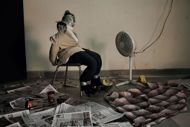
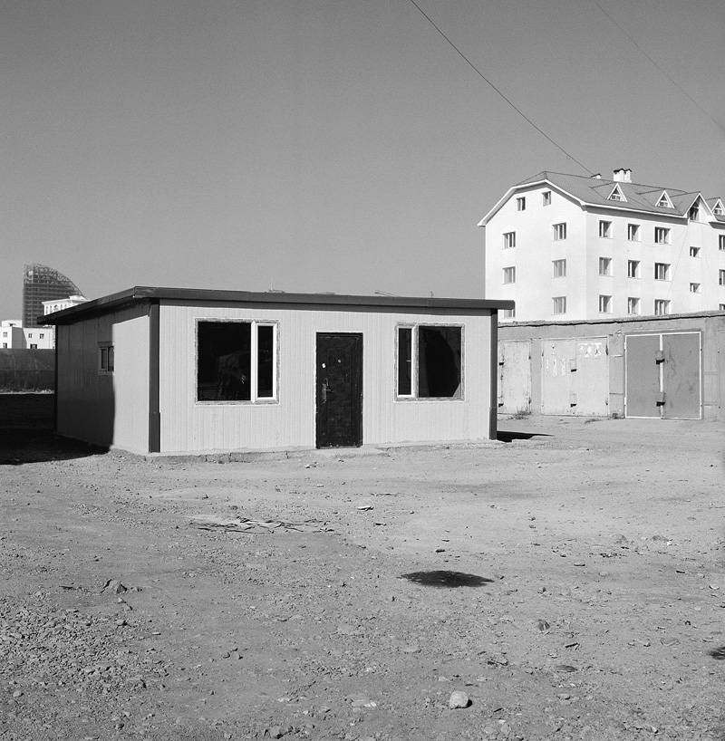
Jérôme Sessini‘s The Wrong Side tells the story of a war, a war that has been going on for years, literally within eye sight of the United States: The war the Mexican government launched on drug cartels, a war that has claimed, so far, between 60,000 and 100,000 lives (there do not appear to be very reliable statistics; btw, this is roughly the same number of casualties as claimed by the civil war in Syria so far). The book is a bleak affair, with overabundant images of drugs, violence, and prostitution.
“I sensed nothing there but despair, resignation and fear.” writes Sessini in the afterword. “As though the poor things knew themselves to be condemned in perpetuity. Their life resembled a long expiatory cavalry, for having committed the sin of being born in the wrong place at the wrong time.”
The Wrong Side relies on photographs first and on text later, diaristic text that has the photographer talk about some of his experiences. It’s never quite clear what the story is (I don’t mean this in any kind of flippant or negative way). Maybe this is part of the problem at the heart of photojournalism: Peel away the material at the surface, and the question really is about what the story is (or should be), and less about the people caught up in that story.
For me, the book deftly avoids this story pitfall. It allows the viewer to come up with their own story, with their way of relating what is to be seen to their own reality. There is a lot of misery, there is a lot of blood; I suspect only those devoid of any form of empathy will manage to remain unmoved.
Thus, maybe The Wrong Side hints at another kind of storytelling, a storytelling that does not define the story a priori, but that allows the viewer to build one. Photojournalism is said to have come to a dead end because of its insistence that individual photographs tell compelling stories. What is to be gained from letting go of that idea, from letting a group of photographs create their own, powerful entity, is demonstrated by this book.
Highly recommended.
The Wrong Side; photographs and text by Jérôme Sessini; 176 pages; Contrasto; 2013
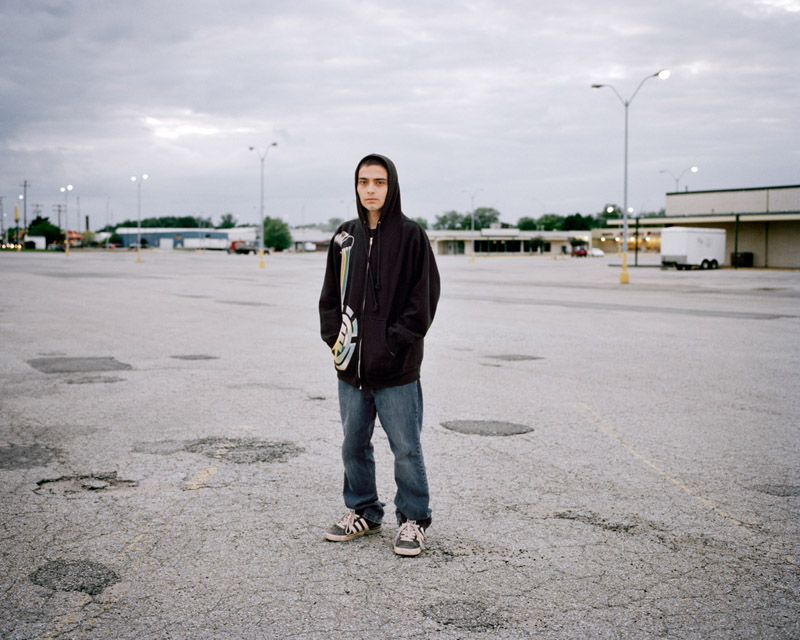
It was a family connection that brought Kevin Mertens to Iowa. He wanted to photograph his father’s town of birth, and he had lived there for a while as a child. Mertens didn’t find what he was looking for: “I asked myself how it could be that in past visits I hadn’t noticed all the worn-down houses, the empty stores, the exhausted looking people.”
I’ve long been undecided about who is better suited to portray a place, any place. Is it someone born and living there, intimately familiar with things? That intimacy might come at a high cost, with, possibly, too many attachments creating too many filters. How can one truly see something one is familiar with? The outsider does not come with that baggage. S/he can explore, but the task of getting under the surface is much harder, and that surface might be too tempting with its many distractions.
I don’t think there is a real solution to this conundrum. I don’t think the insider’s view is preferable over the outsider’s, or the other way around. No place carries with it a true, real story. There are stories we attach to places, some better than others. But to believe that somehow we can unearth or produce the real story, the truth about any place is a folly. There is no such truth. Photography, with its seeming ability to depict the facts, the truth, still has to come to terms with this.
The worn-down houses, empty stores, and exhausted looking people Mertens encountered in Iowa then led Mertens to a man named Jerod first, and to many other people later. The result, Hurtland, is the story of young people trying to make do with what is around, with the world they’re going to inherit soon enough, a world where there aren’t the opportunities any longer enjoyed by their parents or grandparents.
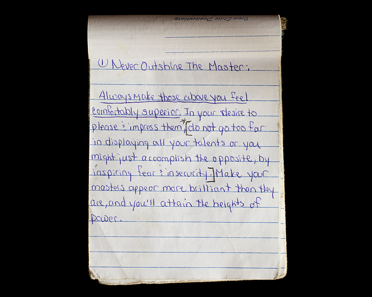
How do you deal with the world you find yourself in? There is no recipe, even though having some ideas, possibly some rules, might help. You’ve just got to be able to grasp something so you can attain some certainty. There has got to be a compass of sorts. In Hurtland some of the rules are provided in the form of The Laws of Power. Passed down from someone’s father (who had written them down while being in jail), they are actually copied from a business bestseller.
Kevin Mertens, Law of Power #1, from Hurtland
There lies rich (and sad) irony in the provenance of these “laws.” The Machiavellian world of business has made large parts of American wealth, and it has also been responsible for the decay many towns are now suffering from. It is questionable whether the young people in Hurtland would embrace these laws had they not been copying down in prison, thus giving them a sort of totemistic power, or maybe more accurately changing their original totemistic power (if you go to the so-called Business section of your bookstore, there is no shortage of books creating whole worlds of often completely absurd make-believe) into a different one.
I sense a pervasive sadness in Hurtland, a sadness not unlike the one picked up so brilliantly by Vanessa Winship in She Dances on Jackson. What will the future hold? We’d all like to know. Somehow, across the land there appears to be the growing realization that whatever the future might hold, it is not going to be what was and still is being promised by those people on TV.
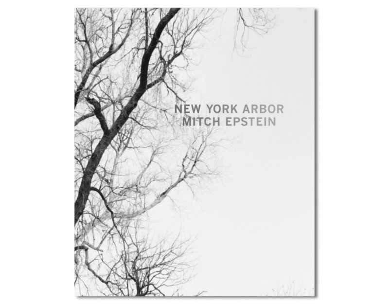
“Mitch Epstein’s new work is a series of photographs of the idiosyncratic trees that inhabit New York City.” This is the first sentence on the publisher’s website that introduces New York Arbor. If you have ever been to an arboretum you might find that description peculiar (one of the things you do not want to miss if you ever find yourself in Boston is the Arnold Arboretum). There is nothing particularly idiosyncratic about the trees of New York City or any other city for that matter. All it takes to realize that is to have an actual look at a tree. Any tree will do. They’re easy to mistaken for somewhat unremarkable, big, usually green, lollipop-shaped plants. But when you step a little closer, there is a myriad of details to be encountered and enjoyed. Their overall shapes and structures vary greatly, as do the shapes and colours of their leaves. The same is true for their bark, their smells, …
To me, photographing the trees found in New York City thus seemed like a simple, yet wonderful idea. In a day and age where so many people’s eyes are glued to their smart phones while they walk around the city, in a day and age where so much photography seems more concerned with appearing clever than with being filled with meaning, photographing the trees of New York City brings back a beautiful simplicity that so much of contemporary photography has lost: This is, after all, what is to be gained from just looking, from keeping an open mind and from looking at what is around you.
Photographed with an 8×10 camera and black-and-white film over the course of many months, New York Arbor presents those various trees in a seasonal order, starting out with barren trees in the winter, then with trees growing leaves, trees filled with leaves, trees shedding their leaves, and finally back to more wintery trees. The book will not replace your visit to the arboretum. But putting them center stage, it highlights their natural beauty, a beauty that, in part, is caused by their lives, meaning the various alterations – man-made or otherwise – that might have occurred during their life times.
In the afterword, the photographer acknowledges his debt to those who came before him as, I suppose, is the right thing to do. What I think matters greatly, however, is to realize that while knowing your references is an inevitable task for any photographer, knowing about what drove the artists who came before you is a large part of that. And Epstein knows. New York Arbor is thus maybe not so much a book about trees that fits into a somewhat specific part of photography’s history, it is instead an artist’s expression of a deep appreciation for something – an appreciation shared with some of those who came before us, some who are still amongst us, and, it is to be hoped, with many of those who will come after us.
New York Arbor; photographs and essay by Mitch Epstein; 96 pages; Steidl; 2013
Via the Free Dictionary, The American Heritage Dictionary of the English Language defines the term “postindustrial” as “of or relating to a period in the development of an economy or nation in which the relative importance of manufacturing lessens and that of services, information, and research grows.” To call cities “postindustrial,” argues Emily Badger, is not a good idea, since “industry still exists in many of these places, and the very notion of defining them by their relationship to the past can hamstring us from planning more thoughtfully for their future.”
I can’t escape the feeling that such definitions or worries might strike the inhabitants of places like Braddock, PA as possibly not so relevant. The past is the past, after all, and the future feels like something that is completely out of reach in such places. And even if it somehow were in reach, it’s not going to pay the bills. When I lived in Pittsburgh, PA, I went to Braddock a few times. I also went to some of the other small cities there, and they offer a grim picture.
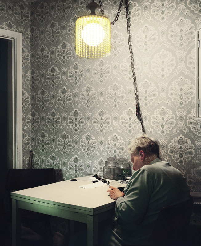
Hanna Fuhrmann, from The 800 Block
For her series The 800 Block, Hanna Fuhrmann photographed five neighbours on a single block in Braddock. There’s Louise, who has been living in the same house for forty years and who is blind. She rents out part of the house to Al, who is long out of work because of illness. Next door lives Denise, who provides daycare every day from 5am to 9pm for six children. On weekends, she also does the night shift at a gas station. Her neighbour, Candy, used to have five children until her eldest one was murdered. What is more, her husband has been in jail for six months. And there’s Mr. Watts, a funeral director, who can’t complain about business. Death knows no postindustrialism.
The 800 Block does with pictures what George Packer‘s The Unwinding: An Inner History of the New America does with words. They’re sucker punches. They are the best photography and writing can do to make you look at the people behind the term “postindustrial,” the people whose future someone wants us to believe is still so wonderful. It might be, or it might be not.
Hanna Fuhrmann, Louise at her kitchen table, from The 800 Block
While the past is the past, and the future hasn’t happened, yet, people have to live with the world they have inherited, or the world that has morphed into what it is now, with factories and good jobs gone. Whatever the future might possibly hold, there’s still the present, in which people have to make ends meet. And having to make ends meet can make for a long, long present, with the future seemingly aeons away.
In the end, it’s not about jobs or food stamps or whatever else. It’s about people who need those jobs to support themselves. It’s about people who might have to rely on food stamps since there are no jobs. It’s easy to forget people when looking at statistics, or at federal budgets, or at grandiose plans of/for the future. Both Packer’s The Unwinding and Fuhrmann’s The 800 Block bring things back to people, and they both remind us that writing and photography can still matter very much, if we’re willing to read and look.
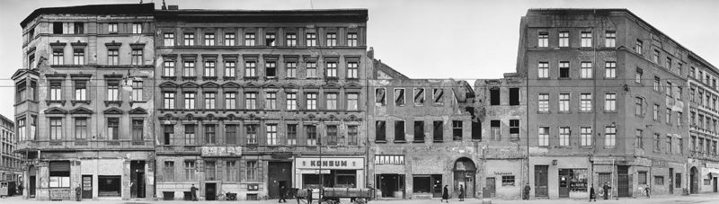
Review: Berlin, Fruchtstraße am 27. März 1952/on March 27, 1952
On March 27, 1952, commissioned by municipal authorities, Fritz Tiedemann set out to photograph Berlin’s Fruchtstraße, between Ostbahnhof and Stalinallee (now Karl-Marx-Allee). Employing two assistants holding long measuring rods, Tiedemann set up his large-format camera at 32 spots along the street’s length, to produce a record of what the buildings looked like. Decades later, Arwed Messmer digitally combined the individual photographs to produce, essentially, Every Building on Fruchtstraße or, to use the matter-of-fact official German title, Berlin, Fruchtstraße am 27. März 1952/on March 27, 1952.
In the day and age of Google Street View or Bing Streetside, such a body of work hardly appears to be relevant. But then, a good look at the book will easily convince all but the most jaded photo enthusiasts that there is quite a bit on view here. For a start, given its original purpose, Fruchtstraße lacks the comparatively speaking sloppy approach of Ruscha’s Every Building on the Sunset Strip. Where Ruscha’s book concerns itself more with a conceptual approach to photography and art (and photography as art), the photographs that make up Fruchtstraße were made to be studied.
Google Street View essentially offers the same degree of sloppiness, only in digital form. Making something like Fruchtstraße hardly seems worth the effort, given it can be done so easily on anyone’s computer. There is one of the conundrums of today’s world: So many things can be done so easily that hardly anything seems worth the effort any longer. And where someone goes about exploring what can be done with, let’s say, Google Street View, the results, where they are actually noteworthy, are presented with a huge layer of conceptualization and/or theorizing added, which, however, for the most part is not actually contained in the work.
Maybe this is what makes Fruchtstraße so interesting: The original photographs required a rigour in approach that has become a bit rare these days. To that Arwed Messmer and writer Annett Gröschner added just the right amount of extra work and effort – the book presents part of the raw materials, panoramas (in the form of gatefolds), and details, all of which can be studied or merely enjoyed in different ways. Here then is just one street in Berlin, seven years after World War 2, the buildings re-purposed and/or still destroyed, a unique time capsule that points at the larger picture and that shows what photography can do when it is at its documentary best. Added bonus: publisher Hatje Cantz brought the best of what photobook publishing can do to the work.
Highly recommended.
Berlin, Fruchtstraße am 27. März 1952/on March 27, 1952; photographs by Fritz Tiedemann, digitally processed and combined by Arwed Messmer; (German/English) writing by Annett Gröschner, Florian Ebner, Uwe Tiedemann; 142 pages; 8 gatefolds; Hatje Cantz; 2012
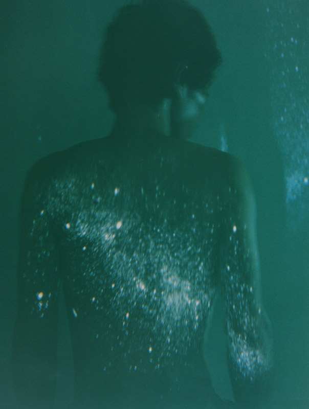
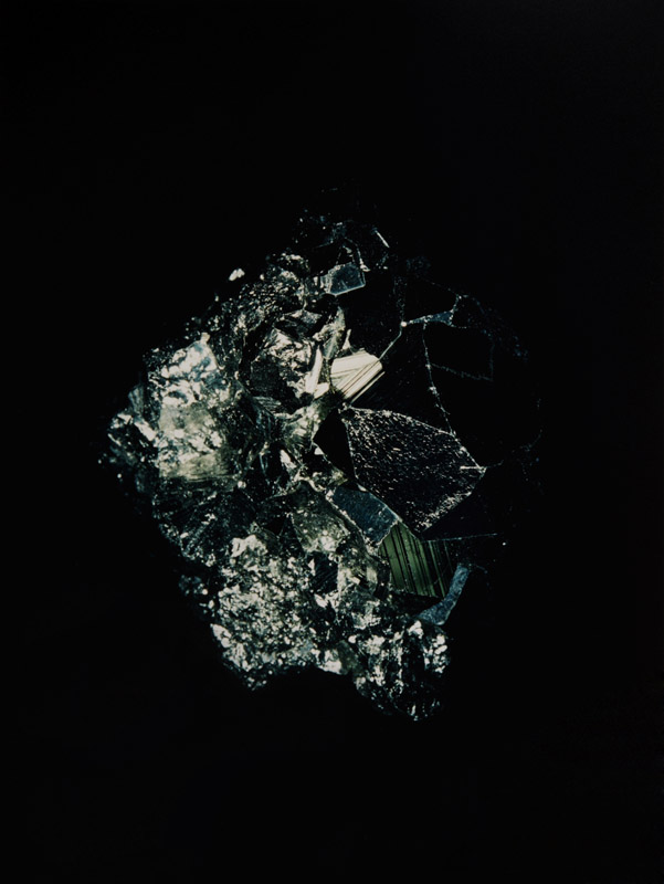
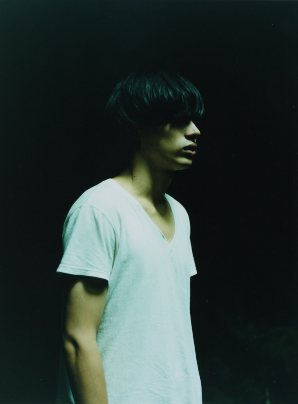
It took me a while to warm up to Mayumi Hosokura‘s Kazan, because, I suppose, I had been too worried that someone was trying to sell me something. Images of youth, images of young, beautiful people aren’t hard to come by; our Western culture has embraced them (the images, not the people themselves) as something to be treasured. It’s easy to sell a pair of jeans when there’s a young, beautiful, seemingly carefree face and/or body next to them. And where no jeans are to be sold, where there’s “just” art photography, it’s the same promise that’s being sold, the promise of youth, of being able to (re-)connect with all that youth had to offer.
So I had to get that out of the way. I had to re-wire my brain a little bit. As it turns out, Hosokura provides a helping hand, since there are also other photographs in Kazan, showing minerals, say, or landscapes. If there are human figures in those landscapes, they don’t frolic in them. The subjects of Hosokura’s photographs are beautiful – in the sense that youth makes it easy to be beautiful, as are the minerals and the landscapes. They’re almost too beautiful.
The moment you realize something is too beautiful, a crack in the beauty emerges. You’ve just become a tad too conscious of what’s going on to continue admiring the beauty. Something is amiss. There’s a second thought, and a very similar thought (realization) emerges when dealing with youth as well: One day you’re young and beautiful, but the next day you’re not young any longer, and what happened to your beauty?
All the various dramas and problems we all encountered when we were young notwithstanding, we all fondly look back to when we were young. We’re nostalgic for our own past, an entirely imagined past. But still. We just never learned to let go, and to be more accepting of what we are and what we have – instead of what we possibly had or quite possibly (so we want to believe) might have. The grass does appear to be greener everywhere, in the past, in the future that we somehow have to work for, everywhere. How infuriating!
Photography manages to stop time, so the people and minerals and landscapes in Hosokura’s photographs will forever be beautiful, youthfully beautiful. But they could also serve as reminders that it is only the artifact photography that does this. Minerals, of course, might remain beautiful forever, but they have no soul. People, in contrast, age and lose their youthful beauty, but they have a soul. I suppose most of us can’t have both, beauty and a soul.
By stopping time, photography reminds us of what is gained from letting go. This is the hardest lesson to be learned when dealing with photographs: Looking at what was is never more than looking at what was. It often says precious little about what is, or what might be.
Ever since seeing Pontiac, I started collecting Gerry Johansson‘s photobooks. They’re unique experiences, quite unlike most of what is going on in the world of contemporary photography. Everything about them feels extremely carefully considered, yet there is a lightness to them that is quite rare. Earlier this year, I met the photographer in person, to hear him talk about his work. This then had me ask him whether he’d be available for a conversation about his work.
Jörg Colberg: To start off, I found a quote by you that intrigues me: “I photograph what I find beautiful. That can include both a run-down 1970s urban scene and a romantic rural landscape. My pictures can be seen as a counterweight to the dystopic portrayal of our world in mass media.” (source) Many artists these days shy away from beauty for reasons that I have never fully understood. What is more, many of your photographs (which I think are very beautiful) show places that I have a feeling wouldn’t look as beautiful if one were there. I grew up in Germany, and I was quite surprised to see your Germany, especially how you found beauty in places that I would have never expected to have any. Can you talk about your approach to a place and to looking for beauty a little bit?
Gerry Johansson: The question What is beauty? is one that I think has an infinite number of answers. I read Robert Adams’ Beauty in photography. An essay in defense of traditional values when it was published in the early eighties. (Who can resist a title like that?) That changed my mind from being a nihilist critic to optimistic recorder of life.
We all find beauty in different things. And most of us try to find beauty in our lives. It might not alway be to your or mine liking, but people try to express themselves through beauty. You seldom hear anybody saying ” I tried to make my garden as horrible as possible” or “this is the ugliest tattoo I cold come up with.” (perhaps not a perfect example)
I think my definition of beauty would be “something I like and can look at for a long time.”
Generally I would say that I only photograph things and places I like for various reasons, history, design, memory, cultural comment… Things I recognize myself in. When I work I just park my car and start walking in the direction that seems most promising and then my curiosity leads me through the day. Photography I think is very much the art of the subconscious. You have the possibility to react to your feelings instantly and it is very difficult to pinpoint what draws you to certain objects or places.
What I try do when I photograph is to present things and places as clearly as possible by means of framing, composition, light and so on. I work with very simple equipment. A Rolleiflex or Hasselblad with an 80 millimeter lens. This simpleness makes it easy to the viewer to orientate themselves in the image. It gives you an impression that you are a part of the picture you self. Well, that’s at least what I hope. Most things are interesting when you are able to see them clearly. I also think that most things are made with the best intentions, even though it doesn’t always work out the way we had hoped.
Gerry Johansson – Dortmund Externberg, 2006
JC: I like that you talk about “things I recognize myself in” when talking about a place. Isn’t that really the fallacy of so much photography – to think you’re pointing the camera at the world, without realizing this so very technical form of art still speaks mostly about the person operating the camera?
GJ: That photography is a technical art form has long been seen as a disadvantage when it is rather the great basic idea with photography. The camera is a wonderful machine to preserve feelings, memories and discoveries, and to communicate those to others sometimes.
I think most photographers start out “with things they recognize themselves in”. That’s what you do when you start making pictures for your own pleasure. Unfortunately, a lot of those personal or private expressions get sorted out because of the rules and conventions of what a photograph shall look like. It’s not by any means easy for a photographer to persist in his ideas of a private, straightforward and communicative imagery. The world is full of editors, art directors, or, in worst case, curators that know best.
You often see amateur photographs made from personal experiences that doesn’t communicate to us very well, because they do not follow the formal rules of what a photograph should look like. But I can feel a lot sympathy for those pictures and I enjoy them.
Sometimes when I look through old prints or negatives I think “why on earth did I make that picture? Shouldn’t I have known better. What did I think of?” Probably I didn’t think at all, I just made it. You should allow yourself to do that. That’s part of the richness of photography.
JC: The work in some of your books was photographed over a fairly long period of time. Deutschland, for example, contains photographs from 1993 and 2005-2012 (which I don’t think is visible in the photographs – I don’t think there is an idea of time in them). How do you go about finishing something like this? How do you know that something is done? And do you have a series of projects that you add to with time?
GJ: From the beginning there was no such thing as a “project”. I simply photographed things I found interesting and collected the pictures in boxes. There were no exhibitions and no books, so there was really no need to end any project. There were “themes” of course but they were kept open, there was no need to finish them. I sometimes miss that feeling. Nowadays I feel a bit forced, mostly by myself, into this project thinking, which is a magazine or art world influence I guess, and I don’t like it. People keep asking “what are you working on now” and “what is your next project”. I hate those questions! Project is dangerously close to assignment.
The first pictures in Amerika (1998) were made in 1993. At that time I had no plans for a book, it just evolved as work went on. After Amerika was published I started on Sverige, which is mostly done 2001-02, but it also contains some pictures from the mid eighties. I tried to find a place to exhibit them, but it wasn’t until 2005 I could show them at Fotografins Hus (House of Photography) in Stockholm. Remember, this is Stömholm/Petersen Country.
The question of time is interesting. I recently had an exhibition at GunGallery in Stockholm with pictures from my six last books. 228 pictures, from 1985 to 2012, in a small gallery, and they all looked as if they were made on the same day.
Even my early, teen age, pictures made in 1962/63 in New York look like they were made in the thirties. I think it has to do with the fact that I avoid having time markers like people and cars in my pictures. I guess it also has to do with my absence of style, that my prints are very neutral, b/w, a bit old-fashioned and small. I rarely photograph new things, they have to gain a bit of patina. Looking at new stuff gives me an uneasy feeling, like having a fresh haircut.
JC: Boxes filled with pictures… I just have to ask: How do you go about editing when you compile a book? You photograph seeing things clearly – what is the next step coming from there when putting a book together?
GJ: I would rather say boxes with small printouts, 9 x 9,2 cm, the same size as in the books. I scan the films and make small printouts on A5 paper of the images I like. I make a generous selection, usually 4 or 5 from each film. I think it is important to see them in the size they will be printed. Pictures can be very different depending on their size and the viewing distance.
Instead of reading a good book when I go to bed, I bring a box of pictures just to familiarize myself with what I have done, to find patterns, surprises or repetitions. This is repeated over a long time, and I have to say, if you excuse me, that I seldom get bored. The final selection is usually quite quick and more based on the concept of the book, alphabetical, geographical or chronological. Sometimes I do it myself and sometimes together with Greger Ulf Nilsson.
JC: Looking at your books, they use a very stark design, with fairly small photographs on the pages. All the books I know (I own four) follow the same layout, and two of them – Amerika and Deutschland – contain photographs simply in the alphabetical order of the location names. How did you arrive at making books like this?
GJ: I have a background in graphic design and publishing. In the seventies, the company I was co-partner of published more than 20 photography books in Sweden. I designed some of them. What always annoyed me was that the photographers wanted to change things. So when Amerika was going to be published (I had left the company by then) I asked my friend Henrik Nygren to design the book. We agreed on the format of the book, mostly based on cost reasons, and it was his idea to have the images so small. My first thought was that they were actually a bit too small and my second thought, thankfully, was that I shouldn’t be like other photographers. My idea with the book was to have a flow of pictures, just one per spread to avoid communication between images. Every picture is a new story, and to emphasize that there was no edited story line they were presented in alphabetical order. The title is also very important to the image. That’s why the type is quite large. Ideally, the book should be read out loud even though it can feel a bit silly. I do this sometimes at exhibitions and it is highly appreciated.
I was really pleased with how Amerika turned out and we have stayed with the concept for Sverige and Deutschland. Kvidinge, Ulan Bator and Pontiac have different editing strategies.
When Sverige was going to be published we changed the binding. Amerika was soft cover and I didn’t like that it didn’t open up properly. Henrik choose the cloth and decided it should have two tipped in images. It was also supposed to have the title and my name on the cover. I decided against that. To me it was enough to have it on the spine and we agreed on that. (after all I’m a photographer). The next decision was taken when Kvidinge was going to be published. At that time Henrik’s friend Greger Ulf Nilsson was added to the “committee”. Should we have a new color of the cloth? We all agreed not to change it. At that point I was quite clear that it would be a series of six books, and we all thought they would look nice together in this wonderful brown cloth.
I’m very happy with the choice of the small images in the books. It has influenced me in a good way. I have been forced to simplify my images and I have no problem with the fact that there sometimes are things you can’t see.
Gerry Johansson – Meeteetse
JC: When you look at your photographs on the wall and in the books – which presentation is the one you’d prefer and why? Assuming you prefer one over the other?
A:I can’t really say that I prefer one over the other. I like the flow of pictures in the books and that the amount of images is a bit forgiving. They don’t all have to be masterpieces. The ups and downs are part of the joy of books. I also like the fact that the pictures become available to a lot of people over a long period of time.
My exhibitions are also quite generous with prints. Usually 50 -150 prints in simple frames. I like the exhibitions because I get to show the real image and the craft of photography. Is there anything in the world that is as beautiful as a black and white sliver gelatin print? I like the idea that you work with a material when you work in the darkroom. It sets certain limits to what you can do. Digital today looks fine, but everything is possible and the result usually comes out boring.