The simplest way to make a book is to take a piece of paper, to fold it in half, and voilà, there’s your book! It might not be the most exciting book with its four pages, of which two are the book’s front and back. But still, it’s a very basic book. If you want your book to have more pages, you can add them by folding more pieces of paper and inserting them. If you don’t want the book to so easily fall apart, run two or three staples through the “spine,” and you’re all set. Of course, you know this publication format, since it is commonly used for magazines. But you could easily employ it for your photobook, because it’s very simple, and it can be very cheap to produce. As an added bonus, it will produce a book that lies perfectly flat when opened.
In Understanding Photobooks I discuss Donald Weber‘s Interrogations as an example of such a book (pamphlet). In that particular case, the format was driven by the idea of arriving at something that would be similar to a basic police report. The very same idea was also used for Valerio Spada‘s Gomorrah Girl, at least the earlier self-published version. The later trade release then had the publisher put a hard case around the book, which completely ruined the original idea.
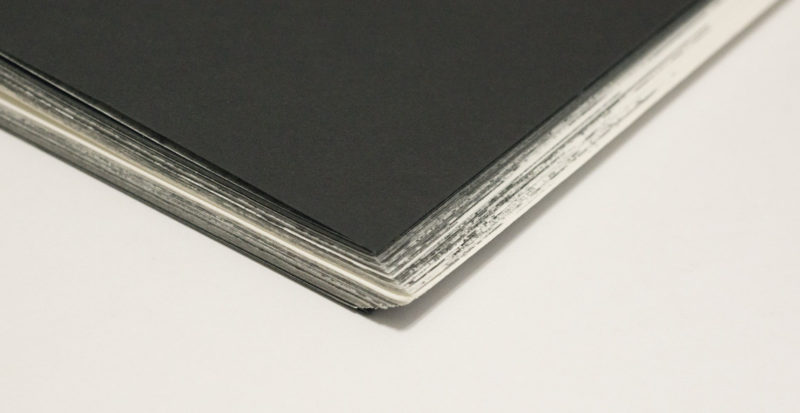
Police-report ideas aside, what else can you do with the pamphlet? If you’ve seen Interrogations you’ll probably remember vividly how it was pretty think, but somehow they “forgot” to trim the fore-edge (that’s where you open the pamphlet — this document might come in handy if you aren’t familiar with book-binding terms). Well, they did not forget, they just decided not to trim the excess, resulting in the pages jutting out. When you buy a magazine, you won’t see this. But pamphlet-style magazines usually are thinner (they use a lighter paper stock), and they don’t have as many pages. They are trimmed at the fore-edge, though.

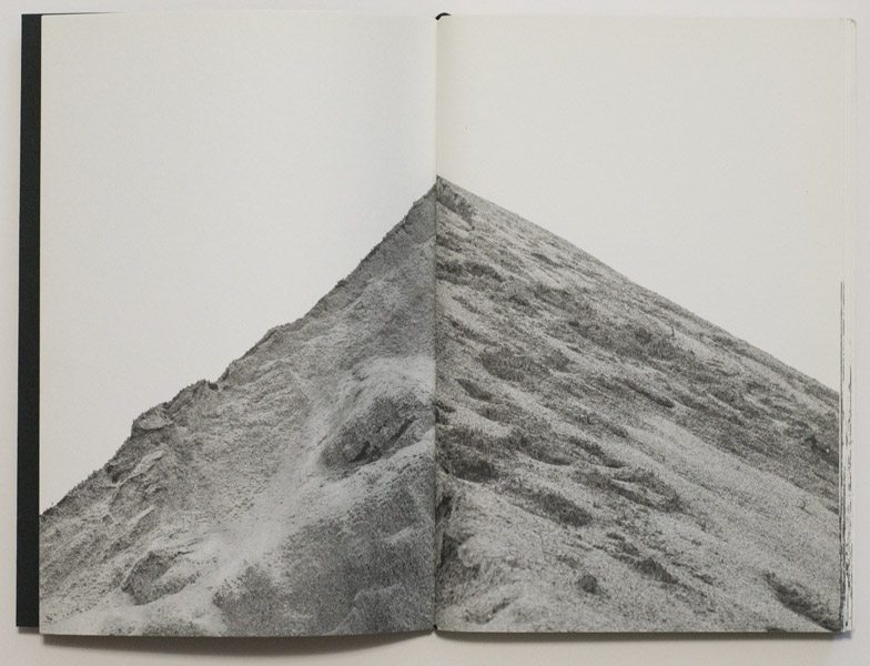
An untrimmed fore-edge in a relatively thick pamphlet gives the resulting object a somewhat sculptural feel. A very good example of how this can be used perfectly is provided by Nicoló Degiorgis‘ Peak. Each photograph shows a mountain in the Dolomites, with the picture centered on its peak (this might not surprise you, given the book’s title). If you look at the book there is a peak of paper jutting out its side (see top image). The book is loosely bound with a rubber band, so you could easily take it apart, and two halves of different mountains would then form new, artificial peaks. Lastly, the photographs are sequences in such a way that they go from very dark (night) to very bright (full day light) to very dark again. These decisions make the book the most perfect realization of the source material I could think of. All the choices are simple, they’re relatively cheap to produce, and the object itself just feels right. That’s what you want for your book.
One of the nice properties of the pamphlet book is that in theory, you can stack as many different types or styles or weights of paper as you want. This type of mixing is a lot harder with other types of binding. Now, the downside of this fact is that you’ll have to pay careful attention to how you’re doing this. Let’s say you think early on in your book you need two pages of a very different paper. So you’ll add it. What this means, though, is that given it’s a pamphlet book, there will also be two of those pages very late in the book. That’s the thing with pamphlet books, every added sheet of paper means four additional pages. Consequently, while mixing different papers is great, you’ll have to plan the content of your book in such a way that everything works out. Unlike in the case of a perfect-bound book, say, you can’t just add two pages somewhere. You’ll always add four, and the two pairs come at the same relative position in the book (two pages in means another pair two pages before the end etc.).
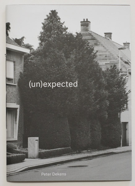

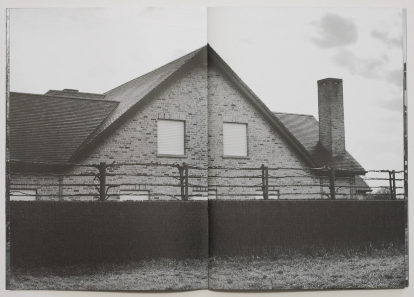
A very good example of the mixing I just discussed is provided by Peter Dekens‘ (un)expected. A book about a region in Europe with a very high suicide rate, the book comprises two types of photographic materials. There are fairly bleak black-and-white cityscapes devoid of human presence. And there are colour photographs, which are done in a documentary style and which center on people left behind (there also are reproductions of archival materials). In the book, these two types of material are made to interweave, with the cityscapes printed big. The other photographs (plus some text) are added as separate smaller sections, which are also printed on smaller pages. It’s a very simple and basic way to separate out the material, while giving the book an, again, simple and basic structure: the “smaller” more personal stories are literally embedded in a “larger” somewhat grim and depressing cityscape. This book really is a prime example of how to employ the idea of mixing paper types and styles very successfully.
Just as an aside, note that with the exception of Degiorgis’ book, all the examples here were produced by Dutch designers. Make of that what you will.
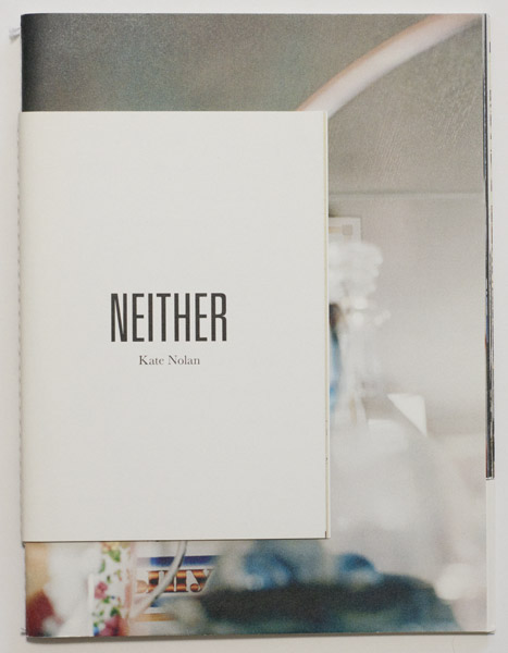
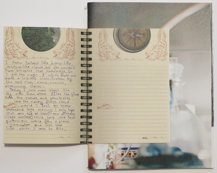

You have to be careful, though, not to possibly go overboard with what you’re doing. For me, Kate Nolan‘s Neither goes that one step too far. What I really like about the book is how the cover is actually smaller than the content pages. After all, there is no law that decrees otherwise, is there? In the front, these first pages are facsimile reproduction of journal entries written by young women living in Kaliningrad (the Russian enclave just north of Poland, which before WW2 was part of East Prussia). In the back, there are quotes from Russian women who were resettled there (after the German population had been driven out). Open the book, and you’ll find full-bleed (square) photographs, underneath of which there are short segments of a larger quote. These segments have been cut from the rest of the page. You can leaf through these two sections independently, combining different pictures with different quotes. I get that idea in principle, but I don’t know what it adds to the whole book. Plus, the way the pages are cut makes turning the smaller sections a bit iffy. So I wish that aspect of the book had been done differently. To me, this feel gimmicky. The rest works very well.
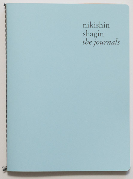
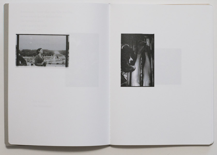
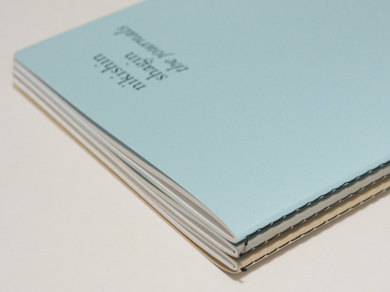
Most pamphlet-style books I know mostly stay within the very basic parameters, usually avoiding any gimmicks or any of the possibilities discussed above. In particular, smaller self-published books often employ this kind of format, either stapled or machine-sewn. When done well, even a very basic production can look very nice and accomplished. The last example I want to discuss is a book that combines the very basic format while stepping beyond it at the same time: Alexey Nikishin‘s the journals. One of the very obvious reference for pamphlet-style note books are plain notebooks you can buy (for example, Moleskine’s Cahier Journals, which come in different sizes). As is obvious from the title, the journals is modeled after such cahier-style notebooks. In this particular case, though, three books are affixed to each other (the back of the first one is glued to the front of the second one etc.), resulting in a single object. Alternatively, one could have housed the set in a slip case, which would have inflated costs, though. As an added bonus of this particular construction, the whole set is pretty solid: while it looks like three notebooks, the overall object isn’t as flexible as a single one would have been.
So the pamphlet-style photobook offers quite a few perks, especially if as a photographer you’re interested in self-publishing. Done well, it results in a very clean book that will lie flat — unlike perfect-bound books, which also use very cheap binding. I think I’ve made it clear that the binding should work with the content as well if possible. Some bodies of work might just ask for a pamphlet-style production, simply because it works so well conceptually, or it might be the easiest and cheapest way to have the book do what it’s supposed to be doing.
However, one always needs to keep one aspect in mind. A pamphlet-style book is unlikely to have a “previous book” cachet — this might be why Twin Palms decided to house Gomorrah Girl in a hard case: now it looks like a “real” book. Unfortunately, this completely destroys the idea behind the original book. What collection of police files comes in a previous case? It doesn’t make sense. In contrast, the slipcase for Interrogations literally is the cheapest possible (and fully functional) case you could think of, hitting both targets easily: it maintains the illusion of someone just holding this police file together, while not telegraphing “I’m precious.” That’s how you do this. As always: form has to follow function. And function better not include “impress collectors looking for precious books,” because once you’re doing that, you’re screwing it up.
This article is the third in a series of five. You can find the other parts here: part 1, part 2, part 3, part 4, part 5