
There’s something interesting about Risograph printing. It has some of the qualities that — if you’re old enough — you might remember from material that had been xeroxed and re-xeroxed too often: there is a definitive lack of contrast, with dark areas losing a lot of definition. On the other hand, the process’ visual rawness itself makes things look very different than, say, a poorly printed photograph on matte paper. The latter merely looks bad. But even a poorly printed Risograph image possesses grit. It feels alive, even if the life on display might not be the one typically seen in the world of photography.
In competent hands, most but crucially not all of the shortcomings of the Risograph process disappear. Because of the screen, there will always be some grit. Because the individual colours in multi-colour print runs never line up perfectly, there always will be a slightly haphazard feel to the images. Because the base colours fall outside of the standard, dominant colours might be ones that aren’t often encountered in CMYK printing. And you can do unconventional things. To get my own images close to what they look like in my book, Travis Shaffer (who produced them) printed a layer of white ink over black.
I’ve maintained for a while that colour photography has lost some of its character in the digital age. With very few exceptions, the colour inkjet prints I encountered in ten years of teaching looked interchangeable. It’s not that they didn’t have character. It’s just that they all had the same character. It wouldn’t be impossible to achieve the same effect with a Risograph machine, but you would have to work really hard on that. The machine basically forces you to consider what you want things to look like, with — and this is where it gets interesting — the high-resolution, “life-like” look that presses so much colour inkjet printing into the same uniform not being available.
I recently bought a couple of Risograph books, and I think they both work really well. Sébastien Girard produced Samuel Fosso’s African Spirits. This is a rather large publication. It’s maybe a tad too large for my taste (where and how to store it properly?). But it’s very nice. I also ordered a copy of Theo Elias’ Fåglarna, produced by Édition Bessard. I’m usually not that much into this type of photography — diaristic snapshots around traveling, but the production really makes this work shine here. You end up with an interesting mix of a photobook and a zine, with the best aspects of both coming together.
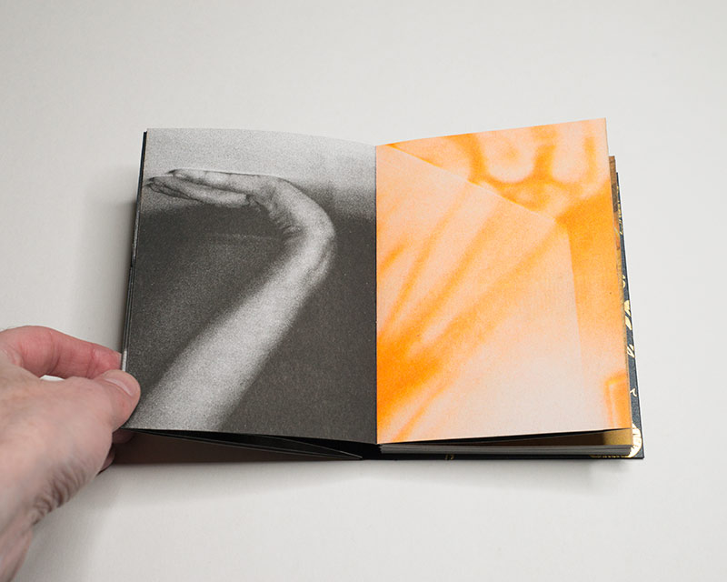
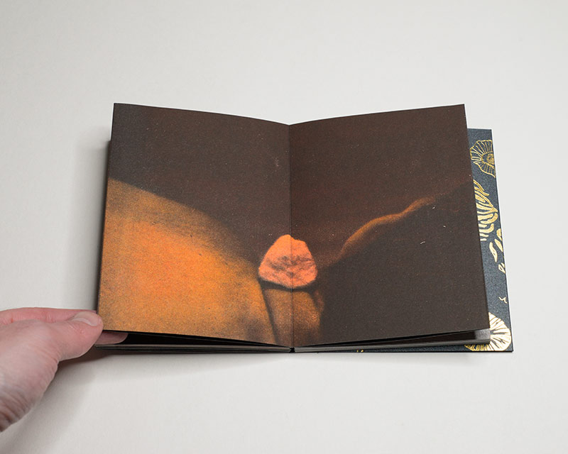
Even as the following amounts to comparing apples and oranges, my favourite recent Risograph book is Ana Lía Orézzoli‘s Un cuerpo escupe sol. Of these three books, it’s the one that embraces the format “book” the most. It’s a handmade accordion (or leporello) book that features both black-and-white printing and colour. The colours mostly fall into the same spectrum of orange, brown, yellow, and pink.
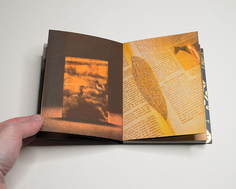
If you want to treat the individual segments of the accordion as pages (why not?), individual images might occupy any number of pages between one and four. Thus if you look at the book the way you’d look at one with separate pages, you might only see part of a photograph. Obviously, you can always unfold a larger section to take in more. Furthermore, on its verso (remember, an accordion book has two distinct sides) the book has a short piece of text unfold (in Spanish; Ana kindly sent along an English translation).
If what can make dreaming so strange it’s the fact that the logic under which it operates differs so much from what we are familiar with from being awake, then it is that type of logic that dominates the sequence of images in Un cuerpo escupe sol. Were there no logic to a dream, it would not have the potential of being unsettling. To call the book that, unsettling, isn’t quite right, though. If the word would not be so sadly overused in the world of art, I’d adopt it here: uncanny.
In the world of the photobook, there is an equivalent to the lack of character that I spoke of when I mentioned most colour inkjet prints. It’s the container-approach to book making that I mentioned here several times. This particular book provides a good example of the exact opposite. This is a book that you will remember in part for its unique character. As an artist, that’s what you want.
I should also note the fact that Ana is based in Peru. One of the beauties of the photobook is that it’s an affordable piece of art that you can make available to people all over the world. As an object, Un cuerpo escupe sol is relatively small and light, which helps keeping shipping rates down and which should help finding interested buyers far away.
Hopefully, there is no need to reiterate that the world of photography — still very much dominated by Western players — can only benefit from having more voices contribute to the conversation and share what they have made. The photobook can play an important part in that process.
All of this combines to Un cuerpo escupe sol being a book that anyone serious about the photobook might want to consider as an addition for their collection. I’m sure that Ana will be happy to send out more copies to people all over the world.
Highly recommended.
Un cuerpo escupe sol; photographs and text by Ana Lía Orézzoli; unpaginated (accordion format); self-published; 2023
If you enjoyed this article, please consider subscribing to my Patreon. There, you will find exclusive articles, videos, and audio guides about the world of the photobook and more. For those curious, there now is the possibility of a trial membership for seven days.
Much like journalism, photography criticism involves a huge investment of time and resources. When you become a subscriber, you not only get access to more of my work. You will also help me produce it (including the free content on this site).
Thank you for your support!