Before writing this review, I thought that the “hive mind” in the form of Wikipedia might help me with the question why I shouldn’t judge a book by its cover. ‘The English idiom “don’t judge a book by its cover”,’ I read, ‘is a metaphorical phrase that means one shouldn’t prejudge the worth or value of something by its outward appearance alone.’ I suppose there are more than enough cases where this might in fact be useful. But the world of the photobook is one where adhering to this idea often can be ditched.
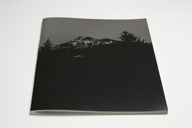
Take Awoiska van der Molen‘s The Living Mountain. It’s easily one of the best photobook covers in a long time, and if you were to judge the book by its cover you would do it absolute justice.
The photograph on the cover (which is not repeated inside, so we might as well treat it as a photograph from the book) shows a landscape somewhere in the mountains where that landscape is defined almost entirely through it being impossible to see. Against a darkish sky, there is a mountain that is flanked by two large trees, and everything beneath the mountain is hidden in a sea of black.
Throughout the book, almost every page uses a card stock that is treated on only one side. The printer had been tasked to saturate each page with ink, resulting in very well defined tones, with an intensely dark black at the extreme end. This makes it very difficult to photograph the book — whatever you see online is merely an insufficient approximation of what you’re going to encounter when you’re in the book’s presence.

To speak more about the book’s production choices is not going to take away anything from its sheer beauty — on the contrary. To print photographs on both sides of this particular paper means that they appear differently, depending on which side they find themselves on. The pictures on the treated side have a luster feel to them, and the viewer is tempted to see the ink sitting on top of the paper. In contrast, the untreated side has the ink sinking into the paper, and the overall texture of the paper stock adds to the way the pictures look. It takes a confident contemporary artist to accept this choice by the designer/publisher, Hans Gremmen, one of the most sophisticated photobook makers in the world.
I find the overall effect very luscious. Despite the fact that it’s a softcover book, it feels very precious, doing the work full justice. In fact, I don’t think producing the kind of expensive art book that the more conservative crowd might imagine would yield quite the same effect. You’d essentially end up with some catalogy hardcover book (catalogy — I know that’s not a word, but now it is), and frankly would be so boring.
What is more, the production choices resulted in a book that looks and feels precious despite only costing 30 Euros. Of late, I have become attracted to books that are not only less ostentatious, but that also are affordable for a larger audience.
Moving through the book, one encounters an experience that is not that dissimilar from Van der Molen’s previous works. There are variations here and there, and there are some added new avenues. This works very well for me: I feel as if I were in the presence of someone who is confident to know what she is doing while being aware of her own ability to expand her horizon, to find new things. What is new does not feel new for the sake of being new, and what is in line with earlier work convinces the viewer through its sheer astonishing beauty.

The work is a collaboration with composer Thomas Larcher, the performance of which was delayed because of the pandemic. In the book, the composer’s score is included in the center of the book (using a different type of paper), which makes for a neat addition to the book. I can’t read music (well, I can, but it’s much too slow to be useful), so to me the score mostly looks like an element of design, and the clusters of notes and their evolution resembles some of what can be seen in the pictures.
With The Living Mountain, Van der Molen demonstrates a few things that are worthwhile pointing out. To begin with, the Dutch artist has established her presence in the world of contemporary photography, showing how the old-fashioned landscape still has so much to offer. What is more, the work clearly arrives at its beauty through its maker being very receptive to what was in front of her: this is not a recording of what was in front of the camera — this is a being with the natural world and the taking of some of that, to craft photographs that speak of both an internal and the external world.
At the risk of inviting a lot of emails (or social-media “debates”), photographers aren’t necessarily known for being good listeners. All-too-often, they present themselves as these god-like creatures that impose their vision onto the world (this is in part related to what I discussed in my article about photography’s macho cult). This morning, I read a (completely unrelated) post by Yurie Nagashima on Instagram that ended with “In Japan, old people often tell children why we have one mouth and two ears. It’s because that [sic!] we should listen to people twice as much as we talk.”

To listen to others, to listen or be receptive of the world — there’s so much we can do to learn something or to expose ourselves to something we’re not aware of. Especially during these troubled times, maybe we should really listen a lot more, be more receptive. As Van der Molen demonstrates, being able to listen allows for the making of some very beautiful photography. And there is tremendous consolation to be had from sheer beauty.
Highly recommended.
The Living Mountain; photographs by Awoiska van der Molen; musical score by Thomas Larcher; 48 pages; FW:Books; 2020
Rating: Photography 4.5, Book Concept 5.0, Edit 3.0, Production 5.0 – Overall 4.5
Ratings explained here.