
One of the bigger (yet inconsequential) mysteries of photography might be why analogue and digital artifacts have resulted in such different receptions. I think the world of photography’s inherent traditionalism is only partly to blame for that. In a purely aesthetic sense, analogue artifacts do tend to register beautiful, a fact that first played out on a larger scale during the era of Pictorialism.
Pictorialism was driven as much as by a desire to make photographs look like art as from the perceived coldness and unforgivingness of the latest photographic technologies at the time. The former says more about ideas concerning art. But the latter connects us with what we see today. Even as there is Hito Steyerl’s In Defense of the Poor Image, in actuality most photographers go out of their ways to stay away from exactly that: a poor digital image.
In contrast, those working with analogue materials have been embracing poor images for a long time. That embrace has happened in such a wholehearted fashion that even to speak of a poor image in this context seems wrong. Unlike digital grain — a mostly ugly conglomerate of jarring colours, film grain is widely seen as beautiful. Following the tradition established by the ideas behind Pictorialism, there have been different photographic movements that were built on equating what in principle are technical deficiencies with aesthetic value — possibly most prominently are-bure-boke from Japan.

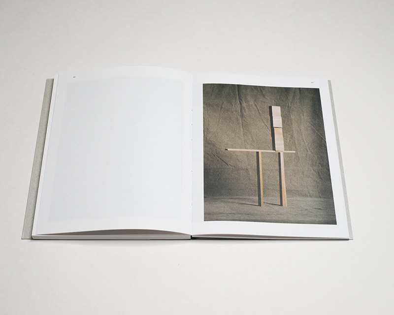
The photographs in Mark van den Brink‘s Stills & Stones were mostly taken with a Minox camera. They’re studio still lives, and ordinarily you wouldn’t use this type of camera for such a purpose. After all, given that you have to control the light and focus, your tool should be convenient to use. Furthermore, at 8x11mm the camera’s negative is impossibly small. Assuming I did the math properly, you would need about 146 of such Minox negatives to cover the area of a 4×5″ negative.
But art making is not centered on efficiency. It is centered on someone’s vision. Consequently, that someone will have to work around the limitations of their tool, and this, of course, is where the fun and frustrations of art making lie. Van den Brink preferred the are — graininess — of his camera over what a view camera would have delivered for him. Produced by using available window light, the photographs evoke a much earlier era of photography even as they were made in the 2000s.
Most of the still lifes are set up in a simple fashion. A stone might be placed on something to support it, with a plain backdrop behind it. Often, scale is difficult to ascertain: how large the stone might be is not clear. At times, it isn’t clear what is actually depicted. Occasionally, the logic of what is on view is unclear: why are these bricks (are they bricks?) piled up the way they are?
All of the decisions behind the photographs force the viewer to engage with their aesthetic experience: the grain, the occasional wonky depth of field, the strange colours in the pictures that are not black and white.
There’s something about the work that has me think about a viewer’s relationship with the pictures. Even as photography is mass produced and thus accessible to any number of people (those who buy the book, say), looking at these pictures gives me the feeling that only I am looking at them. While this might in fact be correct, at least some of the time (who else is looking at them in this exact moment?), the literal aspect is not what I am interested in.
What I’m after might be hard to put into words. Unlike in most other cases of photography, somehow these pictures make me feel as if they were made for me — and for me only. I don’t mean the “for me” as “this writer”. This is not about me. Another person might have the exact same experience. I suppose a different way to express the idea would be to say that here, the very personal joy of making the photographs — in that Dutch studio — translates into a very personal enjoyment of looking at them.
In part, this might be because of the object I’m holding in my hands, a book made by Willem van Zoetendaal. I should probably note that Willem sends me his books, but he does not pay me to write these kinds of compliments. Still, everything about Stills & Stones is perfect: the size, the paper, the design, the printing (well, almost everything: I don’t care much for the square pictures). And you need to arrive at the perfect choices for these photographs, because the wrong package would undercut their appeal — and would probably not deliver the experience I have had with them.
Looking at photography should be enjoyable — maybe not all the time but certainly some of it. We could probably argue forever about what this means — enjoyable. Here, I mean that as a viewer, I want to feel a photographer’s enjoyment while making their work, and I also want to feel the publisher’s enjoyment while making the book. And that’s happening here.
Recommended.
Still & Stones; photographs by Mark van den Brink; text by Willem van Zoetendaal; 120 pages; Van Zoetendaal; 2023
If you enjoyed this article, please consider subscribing to my Patreon. There, you will find exclusive articles, videos, and audio guides about the world of the photobook and more. For those curious, there now is the possibility of a trial membership for seven days.
Much like journalism, photography criticism involves a huge investment of time and resources. When you become a subscriber, you not only get access to more of my work. You will also help me produce it (including the free content on this site).
Thank you for your support!