There are a few inevitable elements usually included in a review of Nobuyoshi Araki’s work, such as the sheer number of photobooks this particular artist has produced so far, or especially the fact that a considerable part of Araki’s portfolio consists of photographs of tied-up women. Reviewers usually get around the latter by someone obliquely pointing to an apparently established tradition of bondage in Japan, as if we, in the West, had in fact never even heard of any such thing. But now that the bestselling book Fifty Shades of Grey has resulted in the eponymous movie we can probably safely dispense with the idea of a non-Western culture being just a tad weird. And serious articles about BDSM are even making their way into Western mainstream outlets (find one here).
Much like any artist, actually given the sheer volume of his output maybe more like most artists, Araki deserves to be treated based on the merit of his work, and not on how comfortable we are with what some of that work depicts. Comfort usually makes for bad art. Of course, that doesn’t automatically result in discomfort producing good art. But the chances are a bit higher, I’d think, at least given that our discomfort might make us look a lot harder at what we take for granted.
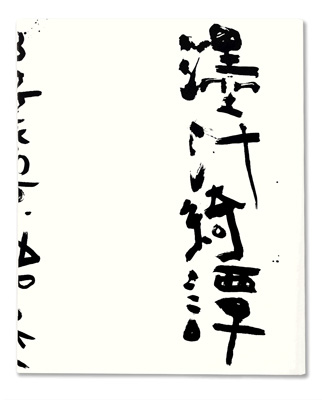
Technically speaking, Araki‘s Marvelous Tales of Black Ink in part is a compilation of older work. In this particular case, photographs of bound Japanese women, often wearing traditional clothes and equally often being in a state of partial undress that leaves little, if anything, to the imagination, are being alternated with photographs of flowers, both in black and white. On top of the prints, the artist has drawn text in the form of Japanese Kanji characters, which, the essay in the book asserts, reference the visuals “in the most extraordinarily imaginative and intellectually sophisticated ways.”
Now that might be the case, provided you are able to actually read the text. This reviewer unfortunately is unable to do so, which deprives him of part of what the book has to offer. Then again, being able to read the text might cut both ways: you might truly enjoy the sheer wit, or you might throw your arms up in terror. Who knows? Regardless, for anyone not being able to read the text, it adds an element of design to the photographs, which itself greatly enhances them.
A marvelously lush production, Marvelous Tales of Black Ink offers an artist at the peak of his game (which, honestly, isn’t the case for a lot of the other hundreds of books produced by/around him). And you have to accept the work on the artist’s terms, because anything else would be, well, simply not art. Even if you end up rejecting the work in the end, and as much as I enjoy it I can also see a vast number of reasons for doing so, the engagement needs to at least temporarily accept where this photographer is coming from. For me, this particular book doesn’t reach the sheer visual wit of Erotos, but it nevertheless is a highlight of Araki’s most recent output. Its consistent, and it really is quite beautiful in a surprisingly large variety of ways.
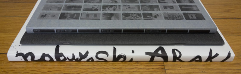
Marvelous Tales of Black Ink; photographs and text by Nobuyoshi Araki; essay by Simon Baker; 108 pages; Mörel; 2014
Rating: Photography 4, Book Concept 3, Edit 3, Production 5 – Overall 3.9

We’re well into the 21st Century, with photography’s 200th birthday approaching in 24 years. To think of the medium as a monolithic entity would be entirely misleading. What is going to be celebrated is the general principle of photography, of capturing and fixing an image with some sort of device (that might involve a lot of chemistry or really just electricity), in some form (that might be tangible or not). The only thing that unifies all the different ideas of what constitutes photography is the steadily growing number of images already taken.
Using pre-existing images from an archive has been an accepted form of photography for a while now. Already some time ago, German artist Joachim Schmid asked people to stop photographing, given there were already enough images in the world, and we haven’t even looked at them properly. It was not to be. In fact, ever since our collective amassing of imagery has accelerated, with countless photographs made every second.
And now there is a secondary industry of artists, whose practice mostly involves doing exactly the kind of recycling Schmid proposed (there is an industry for everything in photography now, isn’t there?). Things can get interesting, but mostly they’re not (they might be entertaining). To get things interesting, the collecting has to involve careful looking, and it has to involve a vision, an attempt to shape something that while being a collection of older photographs ultimately is more than that – much like any photographic body of work that is bound to last ultimately is more than the sum of its parts.
Bryan Schutmaat knows a thing or two about photography. After producing the acclaimed Grays the Mountain Sends, a collection of his own photographs taken in the mostly desolate American West, he teamed up with Ashlyn Davis to peruse public photographic archives, looking for photographs produced by those before him, whether well- or unknown. The result of this endeavour is now available in the form of Islands of the Blest.
The book is interesting for a variety of reasons. For a start, it’s a genuinely good photobook, a proper companion to Grays. Beyond that, though, it offers a lesson to be learned about photography. My experience is that while many photographers are very aware of what is going on right now, who is hot right now and/or who has a hot book out, knowledge of the medium’s history is at best shallow (if that). Now, why would anyone look at old pictures when there is so much good work going on right now and when so many ideas used in photography in the past appear to be so outdated?
The answer is simple: the history of photography offers a treasure trove of imagery, a lot of which feels much fresher than what one would imagine. Strip away our gadgets and what we think of as those original ideas we have in our heads, and you get to the core of things, from which people have been making photographs for a long while now. There simply is a lot of great photography in the archives, photography that looks and feels as fresh as anything made today.
Islands of the Blest hits home this fact fact forcefully. Through the editing by Davis and Schutmaat, there is a clear contemporary sensibility in this book. At the same time, that contemporary sensibility is tied to the past, making one look at the past as the present, or maybe at the present as both a clear consequence and a variation of the past. It’s not quite the eternal recurrence of the same, but it has echoes of that.
Seen that way, Islands and Grays then aren’t so much companions as two sides of the same coin.
Islands of the Blest; photographs by various photographers, edited by Bryan Schutmaat and Ashlyn Davis; poem by Michael McGriff; 68 pages; Silas Finch; 2014
Rating: Photography 3, Book Concept 4, Edit 4, Production 3 – Overall 3.4
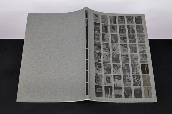
As has become obvious from the preceding two books, reissuing older photographs is quite common. As we have also seen, its forms can vary considerably. Mise au jour, featuring photographs by Johan van der Keuken, lies somewhere in between Marvelous Tales of Black Ink and Islands of the Blest. Edited, designed, and published by Willem van Zoetendaal, the book is a compilation of previously unknown work, made between 1956 and 1982.
I’m always a bit torn about such compilations, about people digging through some photographer’s archives, looking for new material to uncover and publish. It’s just so hard to do it well. Often enough, there are reasons why previously unpublished work was in fact previously unpublished. And even where work clearly deserves to be seen more widely, it’s one thing to have the pictures, but it’s quite another to create a compelling photobook out of them.
Thankfully, Willem van Zoetendaal knows what he is doing, creating a book that does the work the best possible justice, while at the same time showcasing the artist (and not the book’s maker’s ideas), and doing all that in a package that is simple, elegant, and fitting at the same time. The presentation never gets in the way of the photographs, and the production greatly enhances the work.
If you look at the front cover of the book above, it simply presents all the photographs as thumbnail-style negatives, sorted by the locations where they were taken. Inside, chapters are then formed by those locations, with each such chapter being introduced by only its negatives. Photographs change orientation in the book, given they are printed full bleed. The viewer thus has to rotate the book, a device that used to be quite common in the past. I’m sure there will be enough people who complain about this, but it’s clearly the very best way to allow each photograph to get as much space as possible.
On top of that, the printing of the book had me touch the pages multiple times, expecting that almost velvety feel you get from older photobooks, when printing technologies produced heavy layers of ink on paper, making looking at a photobook a very tactile experience as well. You don’t get the same feel here from your finger tips, but you will certainly get it from your eyes, with the black and white being full of life, being rich in a way that makes one re-appreciate what good black-and-white printing can really.
So Mise au jour really is a visual feast, a masterful example of what the medium photobook has to offer for older, reissued work.
Mise au jour; photographs by Johan van der Keuken; 112 pages; Van Zoetendaal; 2015
Rating: Photography 4, Book Concept 3, Edit 3, Production 5 – Overall 3.9
Ratings explained here.