Photobooks come in all shapes and sizes. This hardly qualifies as a meaningful insight for those who buy, view, and/or collect them. But it’s true for any photobook, regardless of whether it’s being produced by a commercial publisher or by the artist her/himself. I’d have to do a little research in my collection, but even without having done that I’m confident to state that self-published books are much more likely to deviate from a format similar to a coffee-table book than commercially published ones. In other words, self-publishers are more willing to take a risk than most publishers.
I don’t mean this as a broad criticism of commercial publishing. While I do think that some publishers could really let loose a little (and try to produce books that are a bit more daring), photobook publishing is an iffy business to be in. The moment you deviate from something safe you’re sticking your head far out of the window, possibly creating something that will never leave your warehouse.
Self-publishers usually don’t have that problem. Well, they do, but many of them decide to ignore it, whether it’s out of not knowing better or out of simply wanting to do something more daring (or a combination of both). This is what makes self-publishing so exciting for me: Just like in commercial publishing you have to sift through a lot of books that aren’t so great, but the good ones usually raise the bar quite a bit. Plus, while self-publishing does of course involve making xeroxed, oddly stapled zines, many self-published books are as professionally produced as commercially published ones.
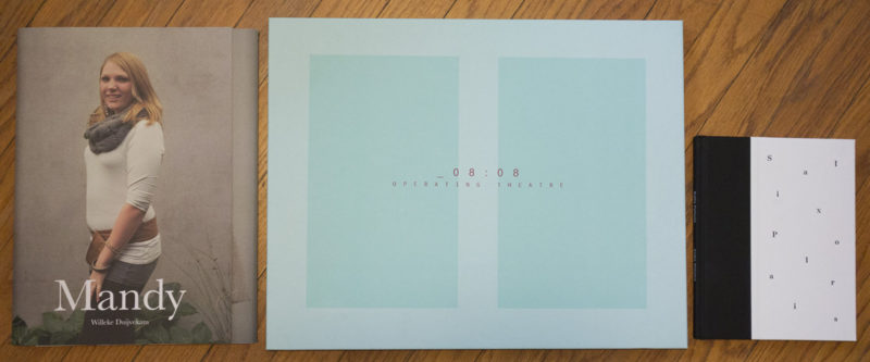
The three photobooks I want to focus on this week all provide examples of where things can go. Just from the photograph at the top of this article alone, you’ll easily get the “in all shapes and sizes” bit, at least in part. Just to give you idea of size, the book that says “Mandy” on the cover is a little bit larger than a letter-size piece of paper (for the nitpickers out there: I know that US and European letter sizes are different, but for each the book is slightly larger, either mostly in the horizontal or vertical direction).
The book I just referred to as “Mandy” is actually called Mandy and Eva, and it was published by Willeke Duijvekam. If you open the cover page, there is another page that says “Eva” on it, another cover page. Unlike the first one, that cover page opens to the right. As it turns out, the book, about two young women named Mandy and Eva who each were born as boys, literally interleaves their stories by combining two books into one, one that opens to the left, one that opens to the right. As you can imagine, this means that part of the other story will always be visible when viewing a spread. Designer Sybren Kuiper made sure that whatever you see always makes sense. In addition, the stories unfold backwards, going back over a considerable period of time. If you’re wondering why you’re looking at the lives of these two young women, you’re going to find out as you get deeper and deeper into the book.
As a photobook, Mandy and Eva is an incredibly successful example of how two stories can be told, two stories which really are part of one larger story. If my description is hard to get, or if you’re wondering if this isn’t just too gimmicky, you probably want to watch the video on the artist’s website; ideally, you’ll just buy a copy of the book (before it shows up in The Dutch Photobook Vol. 2).
I see a lot of photobooks on a fairly regular basis, but this one really stopped me in my tracks (I’ve also used it in classes, and my students reacted very positively to it). It’s rare to find something that’s so ambitious, yet so elegant and simple at the same time. Beyond the way the book is constructed, there is nothing to discover other than the pictures, and the experience of viewing the pictures turning a page left, then right, then left again etc. almost becomes a little meditative.
Next up is Pino Musi’s Operating Theatre, which, as you can see, is quite a large book. It contains, as you might guess from the title and choice of cover colours, photographs taken in rooms in which surgery has just taken place. Everybody is gone, but nobody has come to clean up, yet. The photographs are in b/w, which is a bit of a shame, since I personally would have loved to see the colours, the – I’m guessing – mix of the look and feel of a clinical room that has just undergone a possibly gory, bloody amount of action. But OK, the pictures are quite good in b/w as well.
And while I quite like the way the book is produced, the hard cover with a side-stitched block of pages attached, what’s in between the pictures really doesn’t work for me. In between each pair of pictures, there is a page (slightly smaller, using a different paper) that contains texts by mostly Antonin Artaud. I suppose that could have worked in some way, but for me it’s really ruined by the design, which makes me not even want to engage with the text.
Thing is I might not be a designer, but I still have some ideas what looks good and what doesn’t. Crucially, part of the effort that needs to go into the layout of text is to make it attractive to the eye, so the reader doesn’t have to struggle figuring out how to read it (especially given the sheer size of the book). For what it’s worth, a graphic designer with two decades of experience I spoke with told me the same thing, after I made her look at the book, not providing any input, merely asking for her assessment.
So being ambitious is good, but if you’re ambitious you will have to make it work, and I don’t think Operating Theatre is as successful as it could have been. Which is a tremendous shame, given that the book itself and the way it’s produced is quite nice. But the text and the way it’s treated really doesn’t work.
If you found Anka Sielska‘s Salix Polaris next to Mandy and Eva and Operating Theatre on a table somewhere, you’d easily overlook it, given it looks small in comparison. But it’s not small. The size might be modest, but it’s entirely appropriate. The book combines photographs Sielska took while staying at a polar research station with short poetry (written by Grzegorz Olszanski) and various scientific texts. Unlike in the case of the two books I discussed above it’s not immediately clear what the book might be about. It’s a book that makes you work a little, even though the word “work” isn’t quite right, either.
What is it that has some people go to an environment incredibly hostile to human life? It clearly can’t just be the science, because you could just become a researcher that studies tropical plants and then enjoy, I’m tempted to assume, a much nicer life going to the tropics for work (knowing enough people in academia, I’m sure there are plenty of such researchers who dread those trips, but I don’t even want to get into that). What is it with the arctic? What does it do to or with people? I’m sure it’s not exactly a Solaris type experience, but it might be closest to being one on this planet (btw, the book the movie is based on is fantastic in its own right).
And this is how Salix Polaris succeeds: it is using photography that isn’t designed to be spectacular, it is produced modestly, and it relies on something unfolding in its viewers slowly.
Mandy and Eva; photographs by Willeke Duivenkam; text by Marijn van der Jagt; 2×44 pages; 2013 (order here)
Rating: Photography 3, Book Concept 5, Edit 4, Production 5 – Overall 4.2
Operating Theatre; photographs by Pino Musi; texts by various authors; 15 pages; 2013 (order here)
Rating: Photography 3.5, Book Concept 1, Edit 3, Production 5 – Overall 3.2
Salix Polaris; photographs by Anka Sielska; texts by various authors; 60 pages; 2014 (order here)
Rating: Photography 3, Book Concept 4, Edit 3, Production 4 – Overall 3.5