One of the most underdiscussed aspects of photography is the role played by the way they look. Possibly, this is because photography was invented the wrong way around. In a perfect world, the first photographs would have been in colour, and they would have portrayed the world faithfully. With time, a select few photographers would have then introduced different approaches.
The first photographer to have produced black-and-white images no doubt would have faced a lot of backlash, but she would have insisted on the value of seeing the world in this fashion. Black and white would have slowly caught on, as more photographers would have started to understand what you can do when you remove colour from a picture.
Unfortunately, photography started out with the strangest of monochrome images — oddly disembodied specters floating on the surfaces of mirrors. Relatively shortly after, these got replaced with photographs on paper. But the presence of these life-like images — so different from anything produced before — had people mostly forget about their monochrome nature.
As more photographic materials became available (better lenses as much as different chemistries and types of paper), more options arose for the production of photographs. And there were some early discussions around what photographs ought to look like. Sadly, those neglected the medium at hand and, instead, circled around how or whether to place photography into the larger context of art.
Even as the photographs produced by, say, the pictorialists and the f64 group couldn’t look any more different, their underlying pre-occupation was identical: photography have to look a certain way. And this insistence concerning what photographs would have to look like would continue to this day, without a deeper understanding of what all of this might mean.
Once digital image-making tools came with filters — custom-made settings that allows for the instant creation of a specific look — the window closed fully: amateurs might have to rely on those cheap tools to make their photographs look a certain way. But we, the denizens of the exalted world of photography are doing so much better.
Well, are we?
What a photograph looks like mostly gets discussed in usually the crudest terms when it becomes extreme, such as when William Klein or Daido Moriyama embrace a form of black and white that pushes away all the midtones and, instead, settled for extremes.
Or when photographs look different enough in a fashion that they allow us to attach relatively shallow misconceptions to them, such as when Westerners try to connect Rinko Kawauchi’s photographs to their maker’s Japaneseness (“the Japanese see the world differently” — the form of Orientalism that still is so common).
The reality is that what a photograph looks like forms an integral part of how it reads. It’s important to understand the relationship between form (to use that term) and resulting interpretation. Especially when what a photograph looks like commands a lot of attention we should force ourselves to dive deeper — instead of staying on the easy surface (this is especially important given that we live under an attention economy that is being exploited by fascists for their nefarious ends).
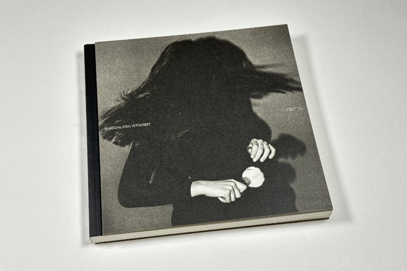
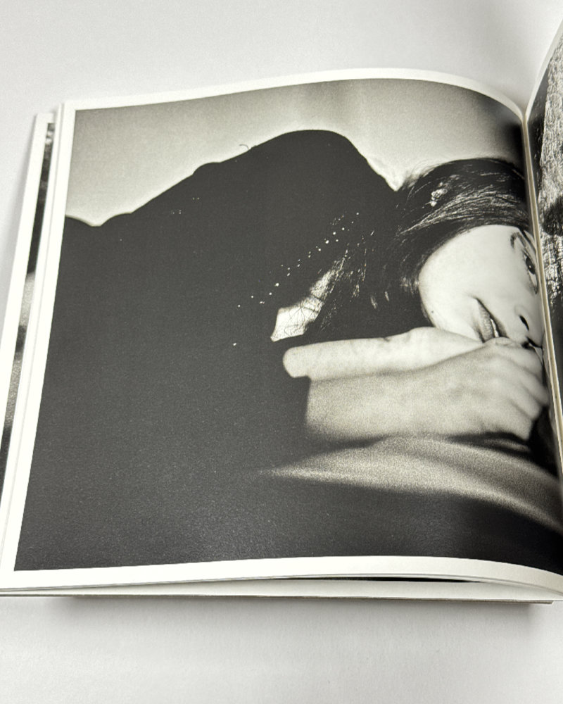
I’ve spent so much time on the above simply because without a heightened awareness of this particular aspect of photography you’re likely to remain on that surface when looking at Magdalena Wywrot‘s Pestka.
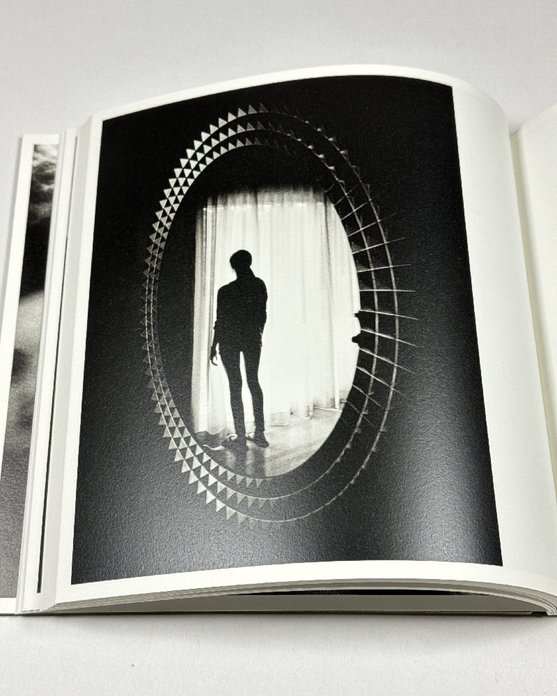
Given our attention economy, it’s likely that you have seen some of the photographs already: it’s the kind of photography that, much like Moriyama’s, is great for online presentations: it’s bold, it’s (pardon the pun) flashy, it’s high contrast.
But you do the work a huge disservice if you remain at that level, because a relationship between a mother and a daughter (actually between any two people who are close) deserves to be seen with an eye for the many nuances entailed in a life shared that inevitably will enter the photographs.
Any person who becomes a parent experiences the parent-child relationship for the second time in their life. During the first time, they’re the child, and as they grow they start to fill out and form the their own personality that in part will be set up in opposition to their parents’. The second time around, the table has turned: now, there is another small person who goes through the same process.
It’s difficult to disentangle the former from the latter.
We don’t actually know to what extent what we see in the photographs in Pestka reflects the daughter’s personality. After all, she’s not the one who has her hand on the camera’s shutter button. We could try to make assumptions about the possible relationship between mother and daughter. But in all likelihood those assumptions would only reflect what we want to see — instead of what is actually there.
Alternatively, we could ask the people involved. I’m not interested in that, either, because whatever they might say closes off the work in very specific ways. The beauty of photography is not that it faithfully represents what its makers want it to do (if that’s all there were to it, it would be really boring). The beauty of photography is that it has the potential to make us feel something in unforeseeable ways.
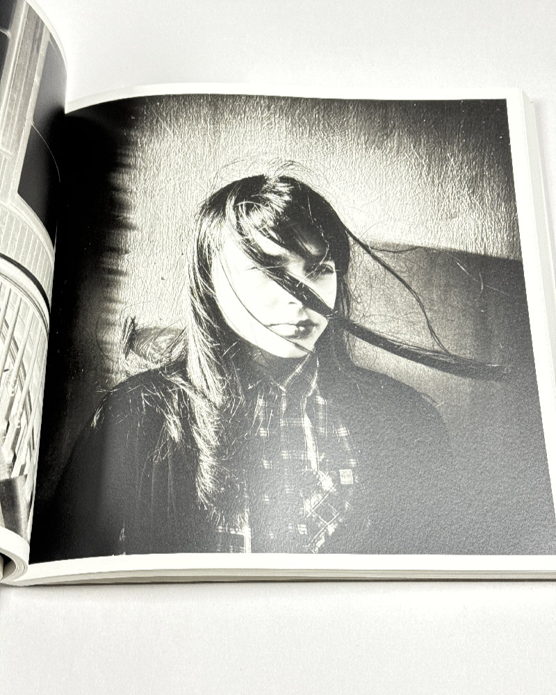
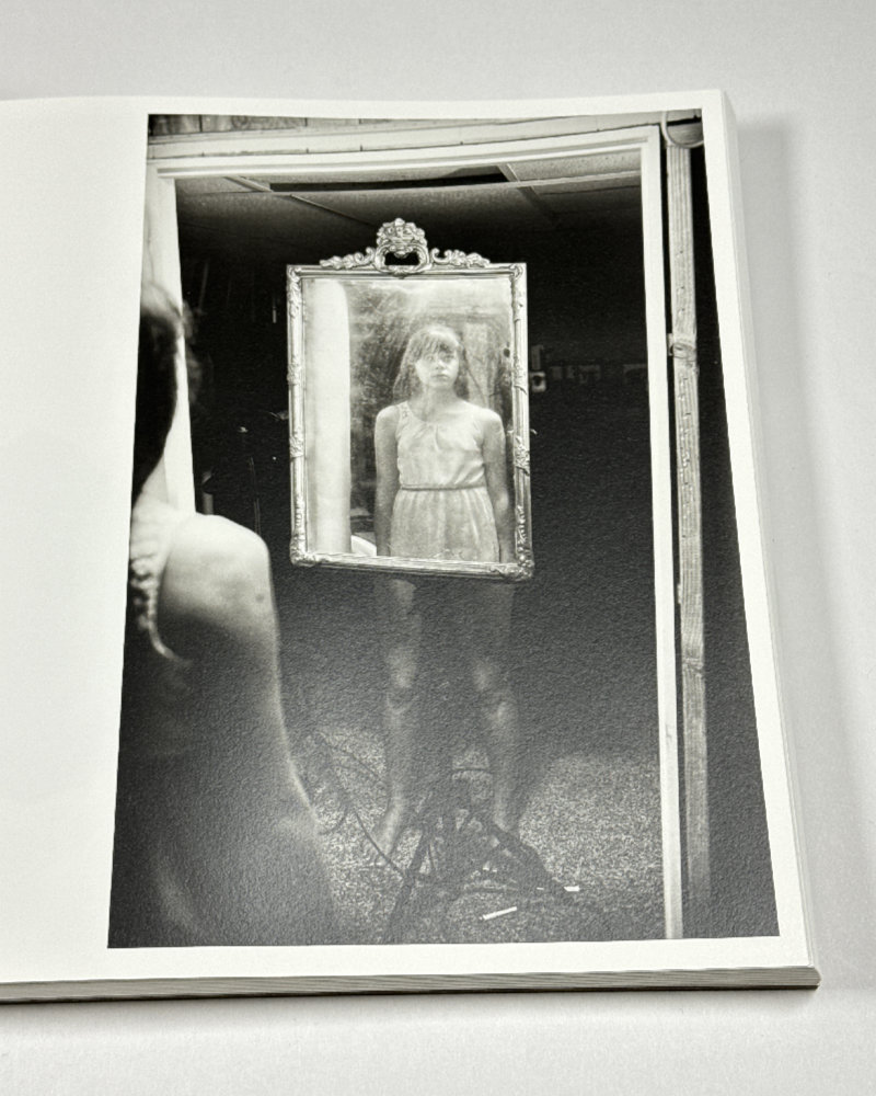
I found myself drawn to mostly the least visually dramatic photographs in this book, because it was there that I felt I was getting glimpses of that independent mind in front of her mother’s camera. This is not to imply that Wywrot was doing anything wrong; it’s just that for me, portraiture lives from what a photographer cannot control.
In those photographs, I noticed a lot of seeing, a lot of different ways in which this young woman dealt with seeing and being seen. The innocence of looking (by which I mean a child’s not knowing that in social contexts, you can never just innocently look at something or someone) is slowly replaced by an awareness of the power of looking.
Looking means exercising a form of power, whereas being looked at does not.
The camera does that, too, of course, but it does it differently.
And it is exactly this growing awareness of looking, of seeing and being seen, that for me provides the intriguing red thread through this book that, alas, is a little bit too eager to sacrifice some of the work’s nuances for sheer spectacle. I just wish that there were more space in the book, that the edit would not try so hard to hit you over the head every time you turn the page.
“A sequence of photographs in a book is an invitation to imagine,” David Campany, the writer and curator (now Creative Director at ICP, that bastion of traditionalism in US photography), writes in the afterword of the book he edited. I wish he had followed his own advice.
After all, when photographs visually evoke the nervous energy of, say, William Klein’s pictures from New York, the temptation is to re-create that nervous energy. You can do that with Moriyama’s pictures, but I don’t think that you want to do it with Wywrot’s. Because sometimes, you have to resist such a temptation: for some photographs, such as the ones here, it only ends up closing off too many possible ways to approach them.
Thus, a viewer will have to do a little bit of extra work with the book to discover the many nuances in the work, some of whom are hidden away underneath a lot of spectacle. It’s work, but there are plenty of rewards.
Pestka; photographs and text by Magdalena Wywrot; text by David Campany; 149 pages; Deadbeat Club; 2024
If you enjoyed this article, please consider subscribing to my Patreon. There, you will find exclusive articles, videos, and audio guides about the world of the photobook and more. For those curious, there now is the possibility of a trial membership for seven days.
Much like journalism, photography criticism involves a huge investment of time and resources. When you become a subscriber, you not only get access to more of my work. You will also help me produce it (including the free content on this site).
Thank you for your support!