It’s probably fair to say that many photographers have a very limited understanding of what photobook publishers actually do. They think that they give them their book (in some dummy form), and the publisher then merely prints and distributes it. While they actually do take care of printing and distribution, even for those publishers that with very good material consistently produce the most boring and unattractive books (think Aperture) such thinking vastly underestimates the actual task at hand.
But then a lot of publishers don’t seem to understand their task at hand, either. Or rather, many of them treat book publishing as pouring books into a container where if there are any considerations about what the end result might look like, it’s thinking about the paper stock and/or making sure it’s printed with rare-earth minerals at some high-end printing house.
The end result of the container-approach contains two aspects. First, the resulting books are not really in conversation with contemporary book making. Second, almost inevitably the books end up being rather expensive, essentially making them collectors items for rich people.

The socio-economic aspect is bad enough. I’d be happy to argue that to a fairly large extent it accounts for the misery photobook makers in general are finding themselves in. If you make photobooks for other photographers or that very small number of rich collectors it’s very difficult to sustain your business, given that you’re essentially aiming at a very limited market with close to zero growth. You can go to photobook fairs all you want: you won’t be growing your audience, given that people outside of the bubble you’re in tend not to show up there.
But the other aspect if more interesting for me both as someone who looks at photobooks and as someone who critically writes about them. As that person with those two roles, I expect photobooks to be in conversation with contemporary photobook making.
What I mean by this is that a photobook produced in 2023, the year I’m writing this, should not look like a book that came out of, say, 1970 or 1980 — especially not given that photobook typically aspire to be art objects. Instead, a photobook produced in 2023 should look like a book produced in, well, 2023. It’s really that simple.

Even if inevitably there are fads in the world of photobook making, photobook publishers should feel the need to embrace what contemporary photobook making has to offer. Even if you think of your photobook merely as a container for someone’s pictures, there are many ways for the resulting book to look at least somewhat contemporary.
After all, regardless of whether you understand this fact or not, the object book itself does quite a bit of the lifting. A well-made book — and by this I mean a lot more than heavy paper stock plus thick printing — communicates its own relevance. It calls attention to itself as the object you can put onto your book shelf or hold in your lap. I often think that this aspect of the book is completely underappreciated: it has to be beautiful itself.
A lot of photographers worry about this aspect, fearing that if the book itself gets any attention, then what about their pictures? Shouldn’t it be all about the pictures? But if you’re so insecure about your pictures, why even make a book at all? And you’re also completely missing this one very important aspect of a well-made book: it elevates the material inside, the pictures. And that’s what you want, even if you don’t think that your photographs need that.

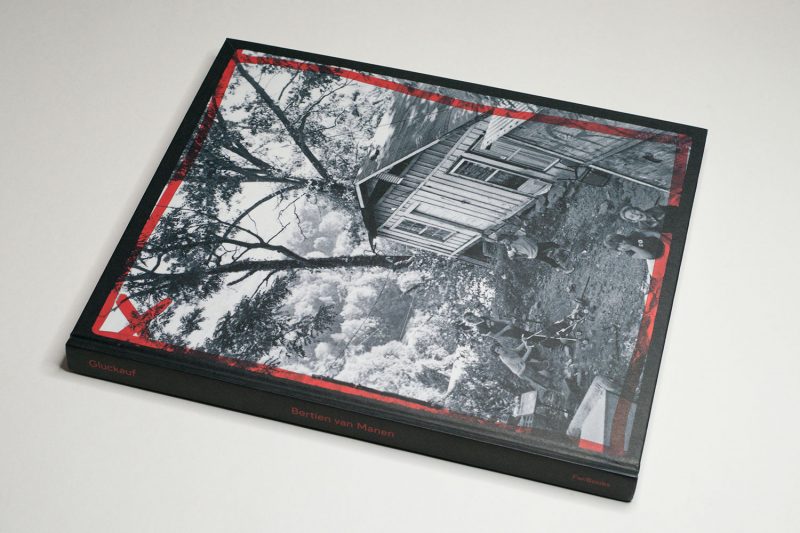
Yet again, Hans Gremmen has produced an example of what an incredibly well-made book can look like, a book that manages to look and feel contemporary (even though the photographs themselves were taken decades ago), a book that simply is elegant and beautiful as an object, a book that helps to vastly elevate the material — here: not just the pictures themselves but also materials produced by the photographer in the form of contact sheets, work prints, etc. The book is called Gluckauf, it contains photographs by Bertien van Manen, and it’s available through Hans’ publishing house FW:Books.
As you might be able to infer from the title, the book contains photographs taken in a number of mining locations all over the world. The photographer herself grew up in a mining area in the Netherlands. For the photographs, she traveled to the UK, to what was then Czechoslovakia and now is the Czech Republic, the United States, and to Russia. The material itself is somewhat heterogeneous with its mix of colour and black-and-white pictures and the inclusion of video stills.

For the presentation, the simplest possible solution was chosen: the material is presented as separate groupings. There are short sections of different material that are placed in between most of the groupings. The visual materials (contact sheets and pictures of work prints) are printed on black paper, using silver ink. (I don’t really want to spell it out, but I might as well: coal is black… You get the idea.) There are are extensive notes by the photographer from her trip to the Appalachian Mountains; these are reproduced on white paper.
For the work from the Czech Republic, images of completely destroyed landscapes that resemble an actual war zone, the photographs wrap around the pages. Fragments of the same image typically find themselves in different spreads. Again, this is a very nifty choice: the already fractured landscape is broken up even further visually, and the often stark juxtapositions of the fragments in each spread drive home the sheer destructiveness of the industry itself. This is photobook making at its finest.

The landscapes aside, the bulk of the pictures centers on people, often photographed in the comfort of their own homes. There is an intense sense of kinship emanating from these pictures. Even as Van Manen was a stranger for her subjects, time and again the daughter of an engineer in the Dutch state mines managed to establish a deep rapport with the people she decided to portray.
As a viewer, you can tell how deeply the photographer cared for the people who ended up in her pictures. I’m almost tempted to think that the pictures themselves weren’t so much the point of the meetings, even if in retrospect and as outside viewers they are the only things we now have access to.
But it’s incredibly refreshing to see work where you can see how a photographer cared deeply for the people in front of her camera. Instead of treating them as raw material for her work, they became an integral part of the photographer’s life. In fact, somewhere in the later parts of the book, Van Manen herself can be found in one of the photographs, blending in seamlessly: she’s sharing coffee and sweets with a group of people, and a woman named Galina is looking at her with a relaxed smile.

All of this makes Gluckauf an absolutely essential photobook. Especially the container-book crowd might want to look at what the photobook has to offer when a publisher is willing and able to embrace the many possibilities of contemporary photobook making.
Highly recommended.
Gluckauf; photographs and text by Bertien van Manen; texts by Fabian de Kloe/Patricia van den Ende and Marcia Luyten; 168 pages; FW:Books; 2023
If you enjoyed this article, please consider subscribing to my Patreon. There, you will find exclusive articles, videos, and audio guides about the world of the photobook and more. For those curious, there now is the possibility of a trial membership for seven days.
Much like journalism, photography criticism involves a huge investment of time and resources. When you become a subscriber, you not only get access to more of my work. You will also help me produce it (including the free content on this site).
Thank you for your support!