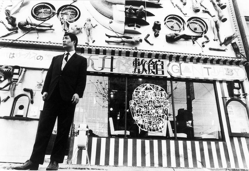
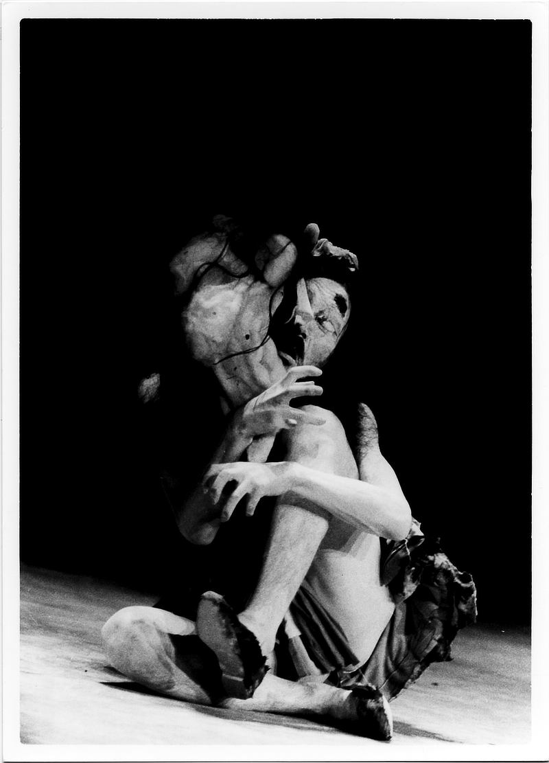
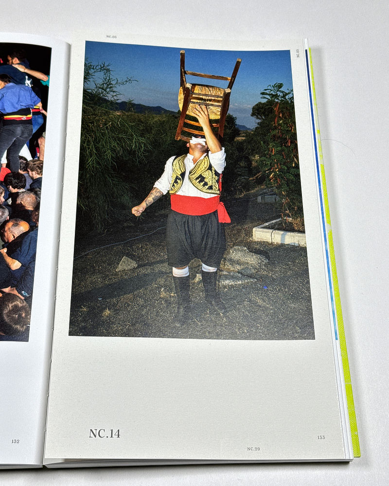
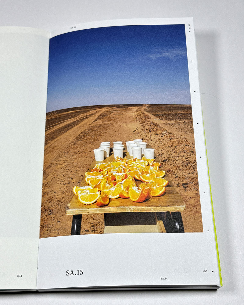
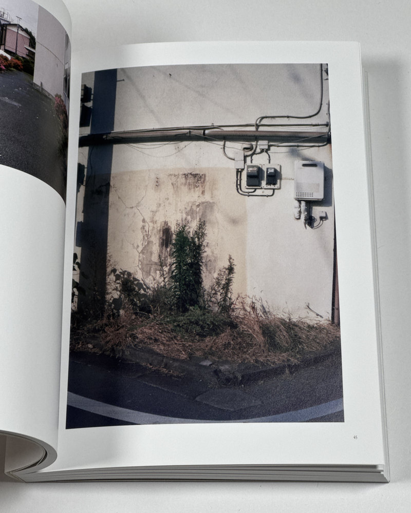
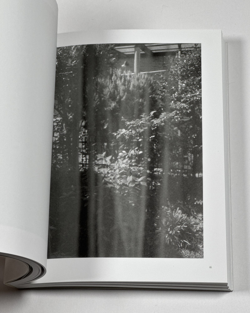
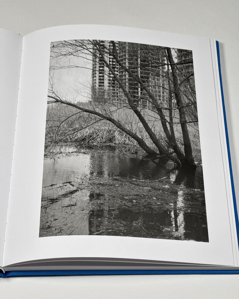
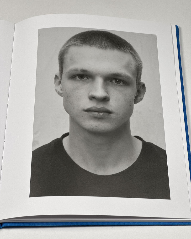
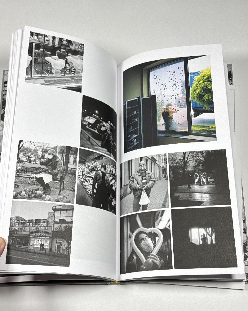
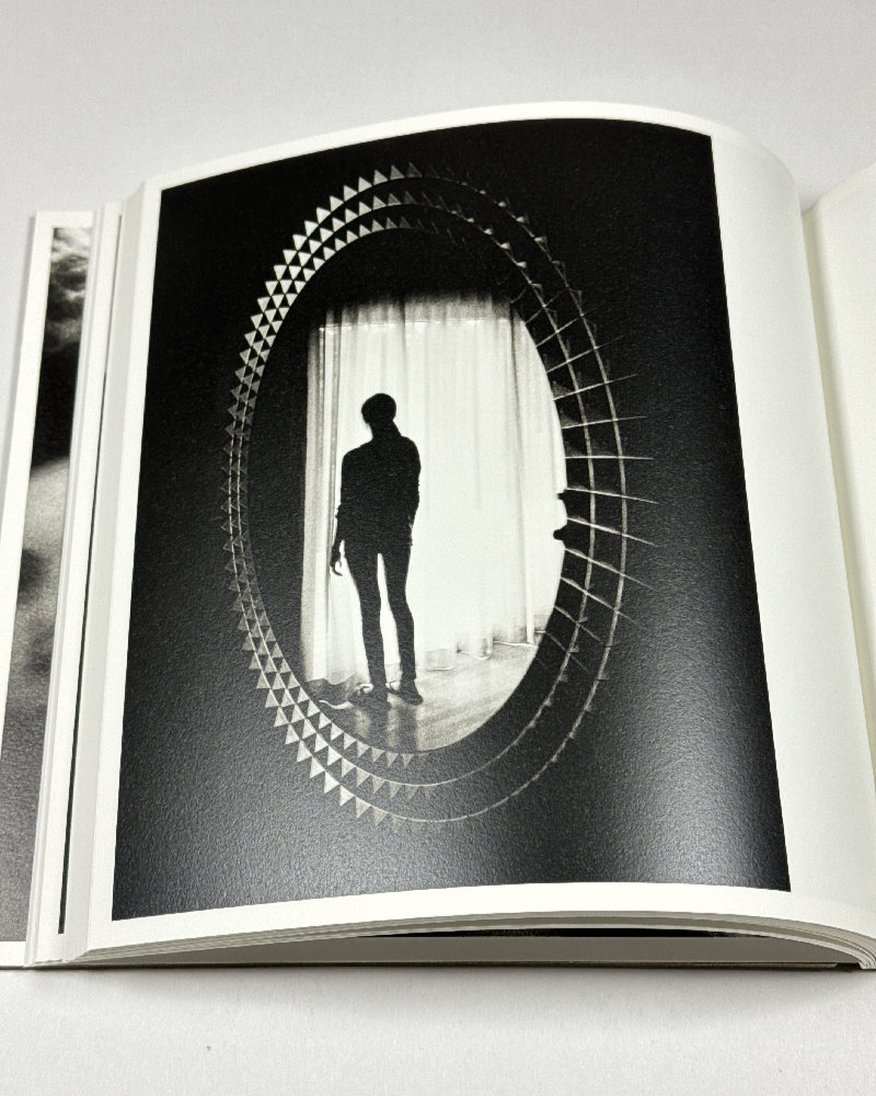
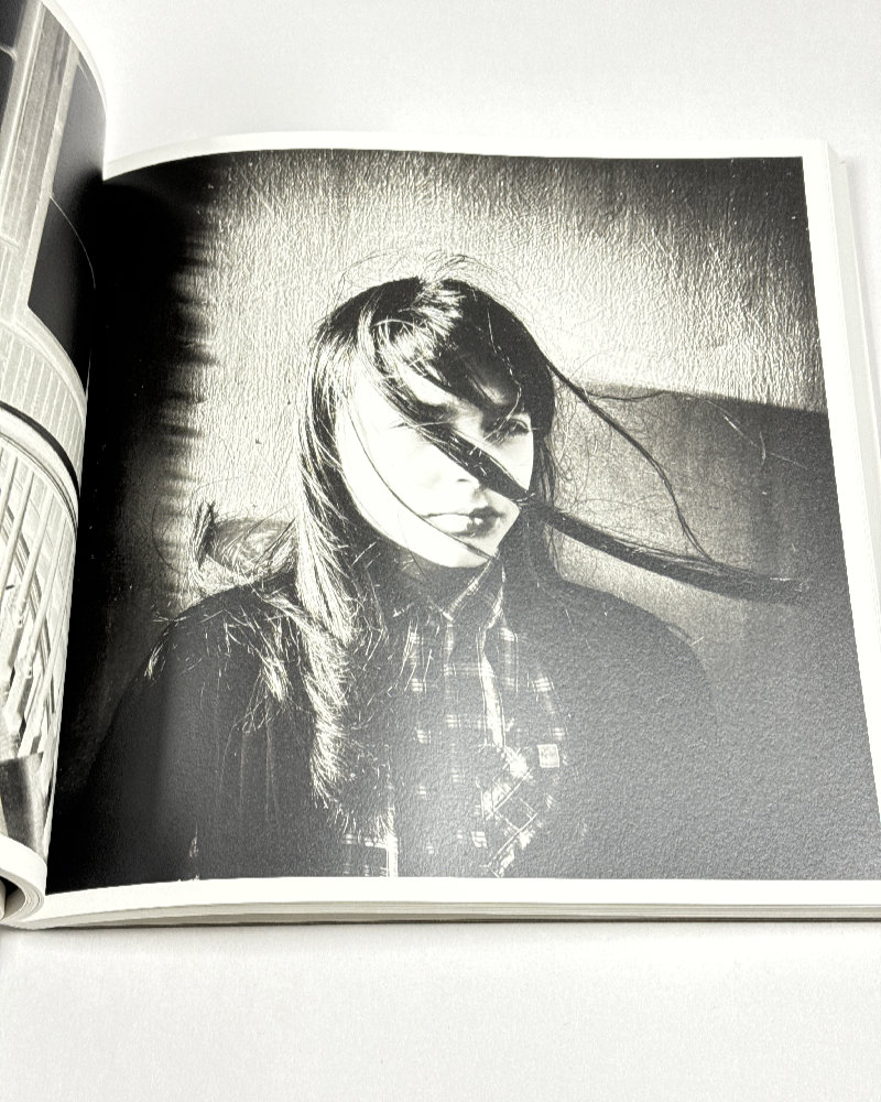
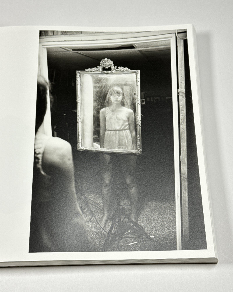
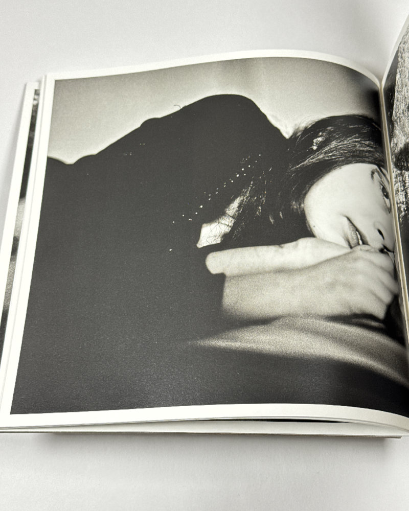
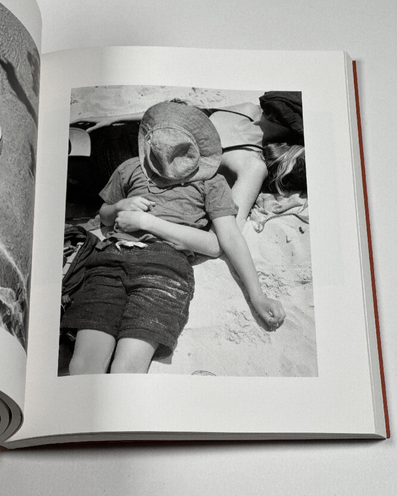
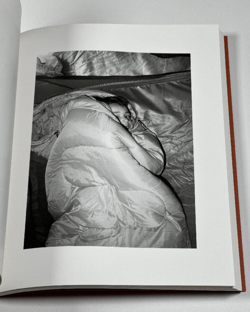
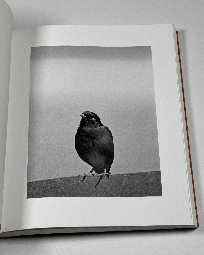
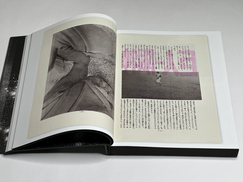
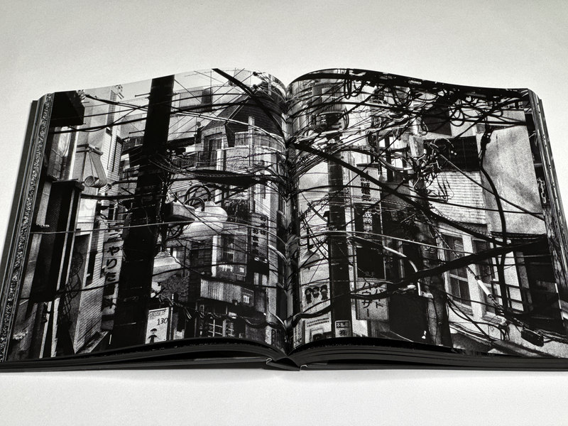
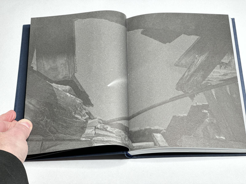
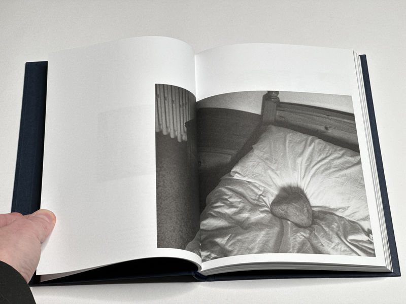
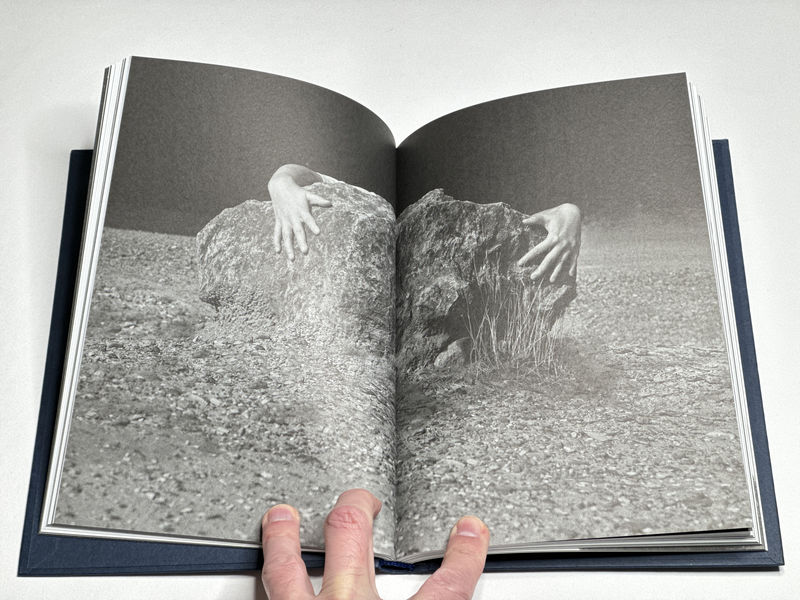
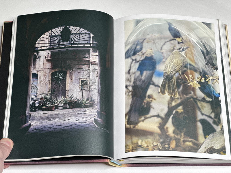
It’s fair to note that Daidō Moriyama’s photography have found their true expression through print publications. The same can be said for many other Japanese photographers, given that in Japan the gallery system did not play the role it did in the West. For a while Moriyama even maintained his own private gallery, entitled Camp.
Camp existed during the years when Moriyama’s own photography appeared to be on the back burner. After his initial flurry of publications, some of them directly connected with the short-lived and influential Provoke group, starting in the mid 1970s until the late 1980s, there is a curious gap in many biographies of this photographer, which, unfortunately, has resulted in Camp not being as well known as it ought to be.
As a brief aside, given the crass neoliberal turn the commercial world of art photography has taken in the West, the idea of Camp has much to offer for photographers today who can’t find their place at the table where the crumbs dropped by the wealthy are being distributed.
In 1972, Moriyama published the first issue of a magazine he called Kiroku (or Record in English, which I will use from now on). “I would like to create a certain tension or antagonism between myself as portrayed in other media and myself as portrayed here in Record,” he wrote in that issue. There were four more issues, and then Record stopped — until it was revived in 2006, following a suggestion by Akio Nagasawa, an acquaintance of Moriyama’s.
“I was addressing myself rather than other people,” Moriyama wrote in issue number 6 about the past, “I wanted a simple, basic title. Sadly, Kiroku ended with the fifth issue. Production costs had doubled in the wake of the seventies oil crisis. I can’t deny that I was also a bit tired of the project.”
A selection of work from the first 30 issues of Record was published in 2017 (Moriyama’s quotes are taken from the book). A second selection, from issues 31 up to 50, has now been published as Record 2.
Both books were edited by Mark Holborn. In a nutshell, while Record contains occasional reproductions of spreads from the magazines (an approach well known from the various books about photobooks), in both books you get parts of the magazines reproduced (all in full bleed), alongside translations of the short introductory texts written by Moriyama.
If you wanted to think about the various issues of Record as a zine, I suppose you could. As far as I understand it, the term zine contains an element of setting things apart: whether it’s their makers proclaiming that they’re not part of the crowd or the crowd proclaiming that, well, those are zines (pronounced in a fashion that evokes the mental image of one’s fingers touching something unsavory).
It might seem a little bit strange to consider one of the most well known Japanese photographers as a zine maker. But if you look at Moriyama’s career, there certainly are many occasions of him brushing against the grain, whether as part of Provoke, as driving Camp, or his various approaches to making his own books. Someone who published a book entitled Bye-Bye Photography for sure wasn’t trying to play it safe.
Alternatively, you could view Record as coming closest to a form of diaristic photography. After all, the 20 issues contained in Record 2 cover the six-year time period from April 2016 until March 2022, meaning that there were roughly three issues every year.
These contain a mix of material, with some issues focusing on the by now familiar photo walks (“I crisscross the central Tokyo area, taking pictures almost daily.” — Record 34) or others produced during trips abroad to attend to an exhibition or prize ceremony (“Last November, while Paris Photo was on, I went to Paris for the first time in two years for business connected with the fair.” — Record 40).
But there also are occasions for Moriyama to look back and to reminisce, and it is these in which the emotions manage to break through what clearly has become the routine of essentially taking the same kinds of pictures over and over and over: “In early November I had some business to do in the town of Zushi,” Moriyama writes for Record 36, “I have a house there and usually visit two or three times a year. The more I drive along the coast and through the streets of the town, the more the images of a young Takuma Nakahira flash through my mind. It’s natural considering that fifty years ago we were close friends eagerly discussing photographic dreams while we walked together through the summer mornings, noon and evenings.”
It is too bad that there is the long gap between 1974 and 2006. To imagine the kinds of issues Moriyama might have produced, chronicling his life and events around him… While especially the years around Camp deserve to be unearthed, an endeavour made difficult by the photographer’s personal problems at the time, the issues of Record we have available cover his earliest, artistically most fruitful time period and the time today, with his name forever etched into the pantheon of contemporary photography.
To approach Moriyama’s Records with the idea of looking for great pictures would miss their point. Even as there is something to be said for careful editing of one’s work, not doing that at all has its advantages as well. If one decides to live one’s life with and in photography, one might as well delineate both — the life and the photographs — with a steady stream of publications that give witness to it all.
After all, the chase for the good pictures that can survive a ruthless edit can be crippling — I’ve encountered as much in students when teaching. What if the idea of the photograph as that precious gem can simply be discarded?
In retrospect, in a world where so many people now do what Daidō Moriyama has been doing for decades, namely relentlessly photographing and sharing their daily lives (much to the chagrin of curators and photography critics wedded to outdated, lazy thinking around photography), this Japanese photographer could be seen as being the true avant-garde yet again, first as a member of a new generation of photographers challenging their elders, and then as the prototype photographer for all those who now make good daily use of the cameras in their smartphones.
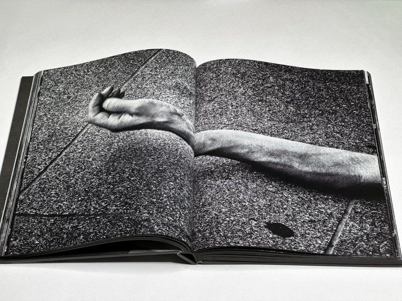
Even as it seems clear from Record 2 that the sun is slowly setting over a life in photography, Moriyama’s true legacy is going to remain with us for many years to come. But you will have to look past the harsh contrast of the black and white in the photographs to discover the multi-faceted human being behind them.
Record; photographs by Daidō Moriyama; edited from Records 1 through 30 by Mark Holborn; 424 pages; Thames & Hudson; 2017
Record 2; photographs by Daidō Moriyama; edited from Records 31 through 50 by Mark Holborn; 352 pages; Thames & Hudson; 2024
If you enjoyed this article, please consider subscribing to my Patreon. There, you will find exclusive articles, videos, and audio guides about the world of the photobook and more. For those curious, there now is the possibility of a trial membership for seven days.
Much like journalism, photography criticism involves a huge investment of time and resources. When you become a subscriber, you not only get access to more of my work. You will also help me produce it (including the free content on this site).
Thank you for your support!
]]>If a rock falls from the sky that must mean something. Because if it didn’t why would it happen? At last that’s we humans approach it. There is something magical about a falling star, even if it isn’t a real star and even if it’s not as rare an event as one might imagine. After all, that rock appears to be coming from another world, a world beyond ours, a world we have no access to other than with our own eyes.
I remember seeing a piece of rock astronauts had brought back from the moon. In the museum setting, the rock had been encased in plexiglass, but there had been a small opening left. If you wanted to you were able to touch the rock with a finger or two. I remember that people must have done exactly that, because the rock looked noticeably different where it had been touched. Thousands and thousands of finger tips had rubbed off part of its surface.
Truth be told, a rock falling from the sky isn’t any more magical than the much larger one we live on. Or rather, a rock falling from the sky is just as magical as the one we live on. But what’s easily available does not come with magic (unless one has managed to keep one’s former childhood sense of wonder and curiosity alive).
For as long as human beings have lived on this planet, they have looked at the sky in wonder, and it’s not hard to understand why. What at first looks like the spherical dome sitting on top of our visible world — much like in medieval illustrations — reveals itself to be a space that has depth once you move away from light pollution. The spherical dome is in fact not a dome: it’s a vast space whose end is not in sight (and which in fact might not have one).
This space reveals itself with time, as you allow your eyes to become sensitive to light that initially you simply would not be able to see. In other words, you see something that you were not able to see before (or you thought that you were unable to do so), and it’s a world that is not merely black and white. Every little sparkle in the sky has its own colour. Some of the sparkles are indeed white, but many are yellow or red or blue.
And out of that vast space — it is vast once you see it the way people saw it before our own lights made it almost disappear — come little rocks our way, crossing the sky in fiery paths, and then crashing into the ground. Again: how is this not magical?
All of this is the premise of Emilia Martin‘s I saw a tree bearing stones in the place of apples and pears. Using the by now familiar contemporary recipe of assembling the artist’s own photographs (some post-processed) and archival ones and including a similar mix of texts, the book dives into our fascination with meteorites.
For someone with a background in astrophysics these kinds of books have a harder job than others. After all, I am very familiar with the science, and I know some of the history as well. Thankfully, the artist did not attempt to play a scientist (in my book one of the gravest mistake an artist can do). Instead, the book mostly centers on the magic of the experience and on the many ways human beings have tried to make sense of these rocks.
As can be expected, the text and images work in different ways. In effect, they complement each other to build up the overall story (“story” is not necessarily the best word to describe it, but for the sake of simplicity I will stick with it). The book itself contributes through its smart and elegant production choices (may I add that at 32 Euros, it will not break the bank — a most welcome price point in a world where now $75 or $85 books have become the norm).
There is, of course, Regine Petersen‘s Find a Fallen Star, a three-volume book that also covers meteorites. Contrary to what many teachers and art critics want us to believe, there is much to be said for the same idea or topic being covered by more than one artist. After all, art is no competition — even if it’s often treated as such.
If I had to pick one book… Which I don’t, because as I said, art is no competition… But still, if I had to pick one it would be Martin’s book, mostly because it is more magical. The older I get, the more magic I want. Plus, magic allows for uncertainty, and uncertainty allows for the space that art, and only art, can fill.
That said, at times even I saw a tree bearing stones in the place of apples and pears is a little bit too cerebral. It would seem that contemporary photographers and their book makers just can’t help themselves. Do I really need to see a grid of similar looking photographs on a spread, supplanting actual magic with whatever this photography game is supposed to be? I think not. I probably also didn’t need any of the explanatory texts.
Maybe there should have been even more magic, even more playing around with possibilities and uncertainty — but then it might just be a different book, and what point is there is discussing an imaginary book over the one at hand?
My minor misgivings aside, I saw a tree bearing stones in the place of apples and pears demonstrates the strength of contemporary photobook making and storytelling. It’s a charming and engaging book that invites the viewer to come back simply by offering surprise revelations here and there. If you miss something the first time around, there always is that second time.
But the book also is a reminder of the simple fact that magic can be had in the simplest of ways: by looking at the stars. Maybe one of them will even fall in front of your feet. You never know.
I saw a tree bearing stones in the place of apples and pears; photographs and texts by Emilia Martin and various authors; unpaginated; Yogurt Editions; 2024
If you enjoyed this article, please consider subscribing to my Patreon. There, you will find exclusive articles, videos, and audio guides about the world of the photobook and more. For those curious, there now is the possibility of a trial membership for seven days.
Much like journalism, photography criticism involves a huge investment of time and resources. When you become a subscriber, you not only get access to more of my work. You will also help me produce it (including the free content on this site).
Thank you for your support!
]]>It is rare to encounter a photobook that is able to open up radically new ways of thinking around how the printed picture can operate. There is only so much you can do with the general form. You will have to arrange the pages in some fashion, and you will have to assemble everything in such a way that it fulfills the basic functions of a book.
A gifted artist, however, might decide to leave some conventions by the wayside for the sake of his own work. With Osamu Kanemura‘s Gate Hack Eden, a truly groundbreaking publication has been published that pushes the boundaries of the photobook in any number of ways, all of them good.
The book was published by ori.studio, which sells the book through their online store. I bought it through ShaShaSha (link here), mostly because adding in more books (by different Japanese artists) made shipping costs more palatable. The book is not particularly large, but it requires careful handling and shipping. If you live outside of Japan, you will have to pay for that.
The Japanese Yen is rather weak at the time of this writing, meaning that the book itself costs about $80. That is a lot of money for a book; and yet I need to point out that a lot of recent photobook releases by Western publishers have now reached price points of $75 or $85. From what I can tell, general costs in the world of the photobook (paper, printing, etc.) have gone up quite a bit recently.
If this is of any help, when you buy a copy of Gate Hack Eden, you’re not buying a book. You’re buying a piece of art. In a general fashion, all photobooks are art. But I’m not talking about that low bar. This particular publication is a piece of art in ways that most other books simply are not.
To begin with, it looks and feels like a piece of art. The closest object I can think of that has some similarities to what the object looks like is an external hard drive. The book presents itself as a black block that sits on top of a smaller white block.
If you put it in front of you on a table — to look at the book, you will absolutely need a table — Gate Hack Eden commands its presence. That presence is a lot larger than the size (163 × 117 × 81 mm) would have you imagine.
How do you look at it? In a very basic sense, the object operates just like any other book, or rather it has the same elements as most other books. The black exterior operates like a slipcase. You can slide it off by pulling it upwards. Once that has been achieved, the cover will open: two cardboard pages that fall away from the interior of the book. Now, you can see the individual pages.
You will also see that the book has five sections, each of them sandwiched by two thin, transparent plexiglass sheets (the one at the top is visible before you open the book). To make the book, its makers had to use some material to give everything just enough stability for it not to fall apart.
Four of the sections contain images, the fifth contains essays (in Japanese and English). When assembled, the former are hidden underneath the black slip case, while the latter is visible at the base of the book. One of the plexiglass sheets juts out a little and creates the base for the slipcase to rest on.
Fully assembled, Gate Hack Eden is very stable. Once the slipcase has been pulled off, the objects becomes a lot more fragile.
Again, how do you look at this? In a nutshell, the five sections are stacked on top of each other. The pages are bound using a single screw post, meaning that in order to look at the images you need to swivel them open. If you want to imagine that you’re playing a game of cards, the pages very much behave like playing cards you’re holding in your hands.
The description of the book states that it has 1648 pages. Initially, I found that hard to believe. I don’t know whether it’s true (I’m not going to count the pages). But given how thin the pages are, I have no doubt that it’s true (the essays are printed on thicker paper). The essay section has 48 pages, which gives you four sections with 400 pages each.
What are all of these images? Apparently, each book was assembled from the same set of pages (or rather subsections of pages), albeit in its own order, creating a sense of randomness for each viewer.
In one section, a large number of black and white photographs unfolds. The paper is so thin that one doesn’t really know whether one possibly missed a page. Two pages might have stuck together. But that wouldn’t matter.
The photographs aren’t photographs, they’re fragments of a larger photograph, and that larger photograph appears to show some greenery in front of one of the many soulless buildings that clutter the Tokyo cityscape. It might be a train station or maybe a parking garage or maybe an indoor mall. It doesn’t matter (the complete disregard for the larger cityscape with which Japanese real-estate developers approach erecting buildings is truly astonishing).
There is picture after picture of the same thing, presented as tiny shards of a larger whole. It is these shards that are more interesting than the larger whole, even if that larger whole never becomes visible. Or maybe it does, elsewhere.
When the next shard finally changes to something noticeably different, there is a brief sense of relief for the viewer. But the next subsection turns out to be just as visually jarring as the one before it. It’s Tokyo, after all, the amazing city that manages to hide its beautiful soul behind mind-numbingly boring facades — and consumption, endless consumption. “I don’t like Tokyo,” Kanemura noted in the first interview included in Beta Exercise.
(Between Spider’s Strategy, Gate Hack Eden, or Beta Exercise, you probably noticed some idiosyncratic word choices; compare: “Mass of the Fermenting Dregs […] The distinctive name […] is simply a collection of words that the original members of the line-up liked.”)
“I started taking pictures of developments promoted by big capital,” the artist said in the same interview, “whose values neglect whether or not they are actually liveable for humans, although I felt uncomfortable about it.” And: “Living under the urban capitalist system strips subjectivity from human beings, transforming them into a mere part of its system.”
It’s not all black and white photographs. There also are shards taken from any number of printed materials, from what look like video stills (Kanemura has a background in video and is using that medium as well), and from drawings, busy doodles that channel the photographs’ nervous energy. In between, there also are larger scenes (that possibly appear broken up elsewhere), the types of photographs the artist is known for in the West (think Spider’s Strategy).
All of this combines into an incredibly immersive experience for a viewer. The little black tower disintegrates before her or his eyes (by their own choice), to reveal a visual chaos that means everything and nothing. You will have to shed your expectations of “narrative” or “sequence” when you approach this book, much like you will have to ignore what it means to edit photographs.
Gate Hack Eden exists outside of the widely accepted narrow ideas of how photographs ought to be treated and used. The book uniquely focuses on Tokyo in a way impossible for, say, New York City, Berlin, London, or Warsaw. Whatever you might be able to say about those Western cities, none of them has the nervous energy Tokyo has, and none of them comes even close in terms of creating its own specific world.
“I have no interest in photos that imply something,” Kanemura said in the same interview I quoted from above, “I’m interested in the possibility of the photograph that doesn’t imply anything, cut off from any implication or meaning.” I might as well note that even if that interest is absent, I don’t think it’s possible to escape the clutches of implication quite that easily.
I think it is only through the form of this book — as opposed to Spider’s Strategy — that the artist achieves that goal. The conventional form of the well-known book only brings back too many implications. Here, though, through the inclusion of all of these other materials and through the cutting up of photographs into smaller parts, the aspect of photography as this thing being done with these specific cameras falls away.
Here, photography finally is a form of art that transcends what the vast majority of photographers have been trying to do before. Here, photography becomes art because it acts like it — and not because it follows artificial conventions.
Thus, Gate Hack Eden is a absolutely essential masterpiece, a publication that explodes the boundaries of the photobook. Unlike artists such as Paul Graham, who have remained stuck in making work that ultimately only attempts to showcase the cerebral approach with which it was made, Osamu Kanemura has figured out how to re-define photography.
I’m in awe.
Gate Hack Eden; photographs and images by Osamu Kanemura; essays by Osamu Kanemura and Pauline Vermare; 1648 pages; ori.studio; 2024
]]>“The foreign obsession with Japan’s material culture began soon after the opening of the nation’s ports in 1853,” Matt Alt writes, detailing how the West fell in love with what became known as Japonisme in French. “Often overlooked, however,” he continues, “is the fact that, at the same time, the western world possessed an equal or even greater fascination with the absence of Japanese stuff.”
In fact, there is a straight line from an observation by the UK’s first ambassador to Japan (quoted by Alt: “There is something to admire in this Spartan simplicity of habits, which seems to extend through all their life, and they pride themselves upon it.”) to contemporary self-help gurus such as Marie Kondo and her Netflix show.
As Alt outlines, none of this actually makes sense: “If Japan truly were a minimalist paradise, why would it need Kondos and Sasakis in the first place?” (Fumio Sasaki is another self-help guru.)
But labels stick not because they’re truthful but because they’re underpinned by ideology. That a lack of material possessions in early modern Japanese history might simply have reflected the general poverty of larger segments of the population escaped most outside observers.
You only have to go to Japan today and look around to find a country that is considerably more complex than the serene paradise of Zen temples and Muji stores inhabited by people who prefer to live with less.
In fact, that idea is belied by some of the most well known attractions of the country, such as the famous Shibuya crossing. How is that zen? Or step into any of the hyper commercialized public spaces to encounter New York’s Times Square on steroids. Again, there’s absolutely nothing zen about those spaces, with their onslaught of audiovisual cues.
Artists such as, for example, Osamu Kanemura have long focused on the visual clutter (let’s stick with Alt’s word choice). In the West, Kanemura is mostly known through his Spider’s Strategy, a depiction of the clutter of electricity and utility wires in Tokyo’s built environment.
Apart from being a writer, this artist has long moved into making videos and ambitious installations of his work, and Spider’s Strategy does not even remotely capture the breadth of Kanemura’s output around his main theme of work.
Interestingly, it was through Kanemura’s Instagram feed that I came across Kohei Maekawa‘s You Can Fix a House With Enough Duct Tape.
Much like eBay, Instagram has lost almost all of its utility as a site where photography can be discovered. But you can win the lottery, and there are those rare moments when you can find genuinely interesting work you haven’t seen before or snatch up something great on eBay. Having just managed to do both, I’m thinking that there’s a long dry spell ahead of me.
Regardless, Maekawa’s book is self-published, and I bought it directly from the artist who very kindly shipped the book before I had even had had a chance to pay for it (if he has his own website, I have not been able to locate it; I messaged him through his Instagram account).
The book comes in the form of a folded piece of cardboard with a photograph attached to the front and the title and artist’s name on the back (in Japanese and English). Inside, there’s a statement about the work (the English version was produced using a combination of DeepL and ChatGPT), a small (inkjet) print, and a set of unbound sheets of prints. Everything is held together with a single binding clip, the type that you might use in an office setting.
Whether or not this is a book or a portfolio of prints is too boring a conversation for me to engage in (the accountants of the photo world can argue about this). Conceptually, though, the rickety construction of this publication is in full service of what the photographs show. Having worked as a delivery driver in suburban Tokyo for years, Maekawa photographed the kind of folk art that he encountered while doing his job: involuntary sculptures if you will or maybe bricolage.
Maekawa mostly photographed at night with a flash, which serves to enhance the sculptural properties of the various objects he came across, a dazzling array of useless beauty. Maybe it is because my late father-in-law had produced similar objects in his workshop and backyard that I am particularly interested in the work. You might be able to find these kinds of art works that nobody would consider as such in many other places of the world.
Whatever it might be, I’m finding myself deeply fascinated by Maekawa’s photographs, especially given that the visual delight they offer does not appear to fade away. And much like the photographer, I can’t help but wonder about the people who are responsible for this kind of visual culture. “The open-ended egos and ideas embedded in their creations are uncharted territory,” he writes, “and to me, at least, remain beyond reach.”
And therein lies the beauty of it all: doesn’t art often start exactly where understanding ceases?
The artistic geniuses behind the various installations encountered by Kohei Maekawa while delivering pizza are likely to remain anonymous. They do not have a place within the grim sphere known as the art world. But their ambitions and ideas nevertheless have resulted in the creation of often surprisingly complex pieces of art.
Neoliberal thinking has brought us the idea of art for everybody (meaning: everybody can consume art by placing some money on the table). You Can Fix a House With Enough Duct Tape, with its Arte Povera elements, shows us the counter model: art can be made by everybody. And it can be enjoyed if you keep an eye out for it.
Recommended.
You Can Fix a House With Enough Duct Tape, photographs and text by Kohei Maekawa; unbound set of prints; self-published; 2024
If you enjoyed this article, please consider subscribing to my Patreon. There, you will find exclusive articles, videos, and audio guides about the world of the photobook and more. For those curious, there now is the possibility of a trial membership for seven days.
Much like journalism, photography criticism involves a huge investment of time and resources. When you become a subscriber, you not only get access to more of my work. You will also help me produce it (including the free content on this site).
Thank you for your support!
]]>There a numerous reasons why Peter Hujar is not as widely known as anyone who is familiar with his work would assume. Such familiarity has so far been difficult to obtain. Hujar published one book during his life time, the 1976 Portraits in Life and Death. The book had been out of print until this month. Now, there is a much overdue reissue.
Hujar has so far been shoehorned into being a very specific photographer: a photographer not just of any time and place, but one who lived in New York City before and during the AIDS crisis. His own untimely death at age 53 would include him in the countless victims of that disease — at the time, they were stigmatized in the most revolting fashion.
Of course, Peter Hujar was very much a member of New York’s artistic community, and the death toll created by AIDS is very much real. When I wrote that he was being shoehorned, I do not intend to take anything away — on the contrary. What I mean to argue instead is that beyond that specificity in time and place, there is a universality in his work that deserves to be seen more widely.
It’s a trite statement to say that portrait photography uniquely centers on the human condition. The moment you place yourself with a camera in front of someone who has agreed to be photographed, the resulting picture (or pictures) will say something about the human condition.
What makes photographic portraiture so interesting is that if you take a picture of someone famous, most people will obtain a picture of someone famous. In his very good pictures, though, Hujar was able to create photographs of human beings, people as brilliant and flawed and vulnerable and lonely as he was, and the fact that they were famous plays no role in any of that. You can see people with an inner life, possibly a very rich one.
Being able to take these kinds of photographs is a gift that even someone like Hujar was not able to conjure at will. In Peter Hujar’s Day, a conversation with Linda Rosenkrantz about a single day in the artist’s life, Hujar somewhat casually re-narrates how on 18 December 1974, he set out to photograph Allan Ginsberg as a commission piece for the New York Times.
Long story short, he treks over to what at the time was one of the seediest areas in Manhattan, 10th Street between Avenues C and D. “The neighborhood intimidates me,” he tells Rosenkrantz, “it’s frightening, so run down and dreary. I don’t have any real fear but it’s very uncomfortable to go down there.” Thinking that Hujar somehow is much more connected to the Times than he was, Ginsberg at first acts like a real jerk, only to warm up a little later (in the way that an incredibly chilly morning might do in mid-winter).
The photography session unfolds as a real disaster. Ginsberg breaks out into chanting at various times (“He sat down in the lotus position, looking very Buddha, right in the doorway, and started to chant. And I really thought well, I can’t interrupt God.” — Hujar), but there are pictures for the photographer. And he knows that these pictures are of the first kind I mentioned above: they’re of someone famous. But they’re not more than that.
After all, even for someone as gifted as Peter Hujar, there is only so much that can be done when the stars do not align in the right fashion as someone’s portrait is being taken. You can see one of the Ginsberg photographs here.
What it is (or rather was) that enabled Hujar to align the stars in just the right fashion I don’t know. Of course, there are all the statements made about Hujar by those who knew him (many of them found themselves in front of his camera; many of them the kinds of irritating motormouths New York tends to produce in such abundance).
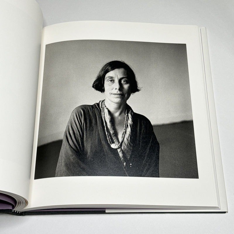
Susan Sontag, a close friend, wrote the introduction to Portraits in Life and Death, which is included in the reissue. The portrait of her by can be found in the book. I suppose it’s maybe the one photograph by this artist that is more widely known. Alas, it’s also just a picture of someone famous. It’s very good. But it doesn’t go where many of Hujar’s real treasures went.
I’m thinking that Peter Hujar knew of the power a camera can have because he placed himself in front of his own many times. There are two such picture in the book. The first shows him mid leap in his own apartment, giving a military style salute to the camera. This is brilliant. It’s not necessarily a masterpiece photograph; but I don’t think I can imagine another photographer, living or dead, who would pull this off (other than, maybe, Nadar whose photographic materials were way too slow to allow him to do this).
The second photograph can also be found on the cover of Peter Hujar’s Day. It shows Hujar lying in bed. His arms are raised above his head and rest on the pillow. The photographer has turned his head just enough for him to be facing the camera.
I have no way of knowing whether this photograph was made on the same day that he took my favourite photograph of his (which, alas, is not included in the book). In that photograph, Hujar, fully nude, is slouched on a chair. To say that there is a quiet desperation on view would be to take words to describe a situation that exists outside of language itself. The photograph is entitled Seated Self-Portrait Depressed, 1980.
It’s one thing to expose others to the camera’s cruel gaze. It’s quite another to be as relentless in exposing yourself to it as Peter Hujar did. He knew what it meant to suffer. So he knew what he was asking of others when they presented themselves to his camera. That, and only that, is what it takes to be a really great photographer.
When you look at Portraits in Life and Death, you want to ignore everything you know about those portrayed (there’s an index in the back). Instead, try to see the human beings that Peter Hujar saw.
Highly recommended.
Portraits in Life and Death; photographs by Peter Hujar; essays by Susan Sontag and Benjamin Moser; 100 pages; Liveright; 2024
If you enjoyed this article, please consider subscribing to my Patreon. There, you will find exclusive articles, videos, and audio guides about the world of the photobook and more. For those curious, there now is the possibility of a trial membership for seven days.
Much like journalism, photography criticism involves a huge investment of time and resources. When you become a subscriber, you not only get access to more of my work. You will also help me produce it (including the free content on this site).
Thank you for your support!
]]>We don’t really know much about Tomas, other than what we can infer from the photographs and words he left behind. Oh, and there are the snippets of memories by his grandson Terje (Terje Abusdal, the photographer), who was too young to ask more questions around the time Tomas took his pictures.
Tomas moved in with Terje’s family after his wife had died. He was already in his seventies. Even as his upcoming exploits — in the form of travels — would hint at a man aware of a newly found freedom, it would appear that he also was fundamentally lazy. Without a wife serving him life might have been too difficult, too tedious certainly.
There’s a short story in Costa Bravo Holiday Paradise about how Tomas, the widower, went to see his childhood sweetheart who had remained unmarried. Alas, he was told that now it would be too late to get married.
Which is interesting, because on the one hand, there is the possibility of romantic love and the reality of life near its end. On the other hand, the childhood sweetheart might not have needed a possibly rather helpless and lazy old man to take care of, given she had avoided just that all her life.
We will never know. We can only imagine.
By the way, if you spotted a typo in the title: congratulations! It’s Tomas’, and Terje carried it forward. So please don’t email Terje or me. We know.
But it’s a very interesting typo, isn’t it? Having taken up traveling late in life, Tomas went to a number of places to enjoy the good life. This included the Costa Brava. I’m imagining that he maybe misread the name of the locale as a confirmation that finally!, he had taken up living the good life. Bravo! (Again, we will never know.)
The good life thus consisted of traveling and seeing places and people. People inevitably included women, and as far as one can tell the seeing remained that, seeing. “There are many out of focus pictures of younger women,” Terje writes, “and over seventy self-portraits. He gave the camera to strangers and posed.”
For many of his photographs, Tomas wrote short captions. The photographs are interesting because they’re so utilitarian and artless, and the same is true for the captions. A somewhat blurry photograph of some red and white flowering bushes, possibly located in the setting of a shopping mall, comes with the caption “Many flowers” (the captions were all written in Norwegian, there are English translations underneath).
It’s hard to tell whether there was any depth to Tomas’ life. There might not have been. Depth does not necessarily make for an interesting or good life. (The lack thereof doesn’t either, though.)
At some stage, Tomas was so old that he was unable to travel on his own any longer. Given the above, you can probably guess what happened. Yes, that’s right, family members had to travel along to make sure that Tomas was not missing out.
And who can blame him? From what Terje infers, Tomas had never liked the work he had had to do his whole life. And he might not have liked his deceased wife, either: “There are no pictures of his wife in the albums. There is only an image of the headstone on her grave.”
Ultimately, though, all we can do as viewers is to infer what we might be able to come up with, given the photographs and the few details that Terje is able to remember or was told earlier.
The more often I look at the book, the bleaker it gets. Obviously, that’s me seeing Tomas, and it’s me seeing the world. Your own impressions might be very different.
There have been many books made with photographs left behind by often nameless strangers. Working with such imagery has spawned its own industry, with some artists doing only that. The problem with those books for me usually is that the material is enticing or maybe even really interesting. But once the novelty has worn off, you’re left with… Well, not much.
In the case of Costa Bravo Holiday Paradise it’s the other way around. The photographs aren’t particularly spectacular. But there is enough in them that forms an image of the person who took them (or had others take them for — and of — him). There are, in other words, many small hooks that attach to a viewer’s own flesh, making her or him think about life choices and about what it means to be a person in this world.
Whether or not the life choices one infers for Tomas have anything to do with reality is completely besides the point. The man has been dead for a long time, so there is no way of finding out. It seems clear, though, that he managed to set up a relatively happy ending for an otherwise unhappy or maybe discontented life.
And that’s what we all have to do with our own lives: deal with their realities and see what we can make out of them. Ideally, we’ll be starting to think about this a lot earlier than Tomas might have done.
Costa Bravo Holiday Paradise; photographs by Tomas Mølland, edited by Terje Abusdal; 144 pages; journal; 2024
If you enjoyed this article, please consider subscribing to my Patreon. There, you will find exclusive articles, videos, and audio guides about the world of the photobook and more. For those curious, there now is the possibility of a trial membership for seven days.
Much like journalism, photography criticism involves a huge investment of time and resources. When you become a subscriber, you not only get access to more of my work. You will also help me produce it (including the free content on this site).
Thank you for your support!
]]>How do you re-narrate the totality of someone’s life, whether your own or someone else’s? It would seem that providing as much detail as possible will help an audience understand the person in question. But as Édouard Levé demonstrated in his book Autoportrait, the accumulation of the most precise and minute statements only produces an incredibly compelling and magical piece of art, without bringing a reader any closer to the lived reality of the author’s life.
Photographs add a complication to the already fraught task of narration, given how mute they are. It’s not the trite fact that they only show surfaces; instead, it’s their completely fragmented nature that makes them such cumbersome entities to work with when biography is the intended end result.
Photographs are puzzle pieces that typically do not connect with each other. The best you can hope for when working with them is the creation of a mosaic.
There is much to be said for such mosaics, though, especially in light of the ultimate futility of attempting to re-narrate someone’s life: if, as is obvious, a life cannot be re-narrated truthfully, whether on an atomic Levé level or a much larger one, the deliberate exclusion of a life’s aspects (“facts”) can serve to create the larger whole. And words — written text — can fill the role that plaster plays in a physical mosaic.
Francesca Todde‘s Iuzza relies on photographs and text to re-narrate aspects of the Italian actress and writer Goliarda Sapienza‘s life. There are seven chapters, each with its own particular focus. The bulk of the text comes at the end of the book, even as it refers to some of the visual elements presented earlier.
A disclaimer: I was not familiar with Sapienza. While I know a few things about Italy, I ended up feeling that I probably do not know enough about either the actress/writer or the country to be able to fully understand the book. I do think that the book probably relies on an audience that has more knowledge about its topic than I am able to bring to the table. You will want to keep in mind.
This is not to say that I did not enjoy spending time with the book. I did. As is the case for all of the books made by Départ Pour l’Image, a relatively new publisher based in Italy, the book has been produced with a lot of attention to detail, and it features wonderful photography.
Given my relative ignorance of the main topic, I probably picked up a few notes more than others. In particular, there is a pervasive feeling of sadness throughout the book, a feeling of melancholia. At any given moment, I thought, it could tip into something much more severe.
I have been to Italy numerous times. As much as I enjoy the country — how could one not when surrounded by so much culture and a real appreciation for good food and drink? — the inevitable presence of the country’s past always had me on edge. You might imagine the country being a gigantic theme park, and there certainly are areas that feel like that. But historical sites and buildings are so common that outside of the very touristy areas, they still cast their shadows.
Maybe there is something to be said for the stereotype that if you are born in Germany, some of the ideas of Romanticism will inevitably become ingrained in your psyche: the idea that decay and beauty combine in a fashion that might reveal a dark side any time soon. Maybe that is what I connected with on my trips to Italy and when looking at this book.
Some of the text in the back of the book informs me that Sapienza did indeed have periods where her mental health deteriorated, with severe depression playing a role. This is not sadness, and it is not melancholia. It’s something else entirely.
Thus with this book, I am bringing certain aspects to the table — a history of depression and that German Romanticism I mentioned above. What I’m connecting with is something that the work attempts to communicate. I can see it in the pictures, and the words are clear as well.
I suppose all of the above also must acknowledge the crucial fact that the final part of a biography — anyone’s, whether Levé’s or Sapienza’s — is always formed in a reader’s/viewer’s head: you respond to what you can and want to respond to. That’s the beauty of it all.
As I said, only a person who is more immersed in the world presented in the book can probably more fully appreciate and enjoy it. But that’s OK. In the end, with all pieces of art we’re limited in what we have available when facing them. The purpose of art cannot be to serve those fully in the know. Instead, art needs to reach out to those who are not.
That is what Iuzza does.
IUZZA. Goliarda Sapienza; photographs by Francesca Todde; texts by Luca Reffo; 280 pages; Départ Pour l’Image; 2024
If you enjoyed this article, please consider subscribing to my Patreon. There, you will find exclusive articles, videos, and audio guides about the world of the photobook and more. For those curious, there now is the possibility of a trial membership for seven days.
Much like journalism, photography criticism involves a huge investment of time and resources. When you become a subscriber, you not only get access to more of my work. You will also help me produce it (including the free content on this site).
Thank you for your support!
]]>Sandwiched between two perpetually murderous nations (Germany and russia), Poland has had its fair share of tragedy over the course of its history. It is situated at the western edge of the region termed Bloodlands by historian Timothy Snyder who described the reign of destruction inflicted by Nazi Germany and the Soviet Union. At various points in time, Poland ceased to exist as a state, having been parceled up and incorporated into neighboring empires. No surprise then that national identity and history — mind you, the writing of it — play an enormous role in Poland.
This became especially clear during the recent reign of the neofascist PiS party that sought to re-define history (as all neofascist parties do) to further the country’s glory, elevating any number of odious characters (ditto) and demonizing its neighbours, which, granted, had brought much destruction to Polish lands. Of course, given how bad it had been that destruction did not need any PiS efforts to talk it up. And PiS’ embrace of some of the more odious aspects of Polish history also did not reflect well on the country.
But neofascism isn’t interested in historical facts or truth: it’s interested in a glorified past that aligns with its ideology, and it’s interested in constantly whipping up voters’ resentment. Resentment drives the neofascist project, in particular the ideas that a) people voting for neofascist parties somehow are overlooked, ignored, and/or forgotten while others reap the benefits (cue the inevitable racism and antisemitism) and b) the country needs to go back to a glorious past that has been betrayed by “elites” in power.
Even without the neofascist project history is constantly being re-written and adjusted. This is not just because there might be the occasional new discovery, whether archeological or otherwise. But people’s thinking also evolves. A few hours ago, I visited a village just to the north of where I am writing these words. In one of the historical houses, one of the volunteers bombarded me with details about the various rooms none of which I retained, simply because I was so struck by her use of “we” and “the English” — as if somehow this was still the 18th Century.
In a different building, a museum, you could easily discover updates to the various displays. A number of stone plaques, created to memorialize people (colonial settlers) who had lived there, had been covered up with cloth ones: the language had been changed in order to reflect today’s sensibilities. A corner now contained word of the role of slavery in the village, and various items had been removed from vitrines and replaced with signs that they were now being looked at to determine whether it was culturally sensitive to still display them.
History, in effect, does not exist. History is always an exercise in ideology, however benign one might imagine that ideology might be. It is the telling of history that reflects what a country believes about itself, and for me, that is one of the most interesting aspects of history (because, let’s face it, the re-telling of most historical facts — usually endless names of rulers — is mostly very tedious).
By construction, there is a certain cartoonishness to historical reenactments. Everybody knows that it’s costumes, and everybody knows that those wearing them typically live much more comfortable lives than the ones they pretend to exhibit during the shows. Furthermore, the selectiveness of their historical narration is amplified through the spectacle itself, which, of course, has to be entertaining for spectators.
With all of the above in mind, historical reenactments really are not about the past. They’re about the present: they reflect what people want to believe in. And that’s why they can be so interesting. Over the years, I have seen a number of photography projects about such reenactments. The problem with such projects is that it’s so easy to get the pictures, but it’s so hard to make them about more than the costumes. It’s the costumes, after all, and possibly the fake blood that will get all of the attention.
Michał Sita‘s History of Poland Vol. 2 differs from such project for two reasons: first, there is added text, words spoken by some of the reenactors. Second, and crucially, Sita himself was one of them, wearing a camera around his neck during the proceedings (the camera took a photograph every second, and while it was not visible for spectators, the other reenactors were aware of it). There also are a few other photographs that look as if they were taken with a different camera.
The show in question is called The Eagle and the Cross, and it’s happening in Murowana Goślina, a small town in western Poland, just north of Poznań (which, if you don’t know, sits about in the middle between Berlin and Warsaw). The show feature six separate chapters, starting somewhere in the Middle Ages and ending with a Nazi soldier sending prisoners to Auschwitz (the book explains some of the events and characters).
I was particularly struck by one of the text sections in which a volunteer actor imagined how one of the thousands of Polish officers murdered by Soviet soldiers in Katyn might have faced his death. It is clear that the actor does not have the unnamed officer in mind. There might not have been a specific officer anyway, a person with a family. No, it’s an unknown officer, one whose death will later play a role when both Nazi Germany and the Soviet Union will accuse each other of the massacre.
And of course, the death also plays a role in the play: yet another, very different role. “Pride,” the actor imagines, “is not a smile, but rather a grimace showing that he is no longer afraid and is ready for what is about to happen.” “Dulce et decorum est pro patria mori,” the Roman poet Horace had already written two millennia earlier: “It is sweet and proper to die for one’s country.” But it’s not just sweet and proper, you also have to go about it with pride so that your death might serve those who survive or live later.
There is something unsettling about a book that lays out so clearly how the past is made to serve contemporary purposes. But it’s an important book, especially given the fact how the past has become weaponized by the neofascists — in Poland as much as in the US, Germany, Hungary, Italy, russia (the movement’s center), and elsewhere. Even as it’s important for us to understand the past, it’s equally or possibly even more important for us to understand to what end we want to understand it.
History of Poland Vol. 2; photographs and text by Michał Sita; 96 pages; Sun Archive Books; 2024
If you enjoyed this article, please consider subscribing to my Patreon. There, you will find exclusive articles, videos, and audio guides about the world of the photobook and more. For those curious, there now is the possibility of a trial membership for seven days.
Much like journalism, photography criticism involves a huge investment of time and resources. When you become a subscriber, you not only get access to more of my work. You will also help me produce it (including the free content on this site).
Thank you for your support!
]]>It’s probably fair to say that the one place that has most severely been photographically misrepresented is the continent of Africa. There are many contributing factors, most notably, of course, colonialism. The European colonial project relied on the camera for its purposes, defining to a large extent how Africa was to be seen. But it doesn’t stop there.
Western photojournalism played and still plays a major role in the continued misrepresentation of Africa. It doesn’t matter at all whether photojournalists went or go to Africa with the best of intentions (as they typically do); what matters is that many of them appear to be oblivious of the issue at hand.
One of the key approaches to rectifying the situation entails looking at the work of local photographers. How have photographers born and working in Africa portrayed the people in the various countries they were and/or are living in?
In photoland, this approach is typically broadly described as centering on a person’s gaze. It’s likely that you will be familiar with the term “the male gaze”. But you need to be careful with that term, because the male gaze is not identical with a man being the photographer. What it means instead is that the world is portrayed in such a fashion that the visual representation conforms to how an assertive heterosexual man views it. As is very obvious from the world of fashion photography, women photographers can easily re-produce the male gaze.
In much the same fashion, to discover the African gaze you need to go deeper as well. Photographers from Africa can easily produce what you might want to think of as a neocolonial view of Africa (the most obvious example is provided by some of Pieter Hugo’s work).
The following might be tad naive, but it still might serve as a good initial approach to how to distinguish the neocolonial view from a real African gaze. The former is produced for outsiders (in Hugo’s case, a Western art market interested in pictures that look good over wealthy collectors’ couches). The latter is produced for a local audience (even if it could eventually reach an audience outside of Africa).
Amy Sall‘s new book The African Gaze provides a most welcome overview of some of the richness produced by photographers and filmmakers from Africa.
I should note that in the following, I will focus on the first half of the book, photography. This is because I know next to nothing about film making in general. I don’t mean to imply that film making is not interesting. It might well be. I simply don’t watch many movies. As a consequence, there’s nothing of any value that I could say about them. I am in no position to assess the second half of the book in any kind of critical capacity.
In a nutshell, The African Gaze contains introductions to 25 photographers and 25 filmmakers. In the photography case, the artists hail from Algeria, Benin, Burkina Faso, Cameroon, Congo, Côte d’Ivoire, Ghana, Mali, Nigeria, Niger, Senegal, South Africa, Sudan, and Uganda (several countries are represented by more than one photographer).
Individual biographies might be more complex. For example, Augustt Azaglo Cornélius Yawo was born in Togo. He spent his childhood and formative years there and in Ghana. He then became a prominent photographer in Côte d’Ivoire after he settled in that country at age 31.
For sure, some of the names will be more familiar to a Western audience than others. Malick Sidibé’s work is relatively well known in the West (not necessarily compared with Western artists but certainly when compared with photographers from Africa), as is Ernest Cole’s, Samuel Fosso’s, or James Barnor’s.
One of the most interesting aspects of looking through the book — besides the discover of any number of incredible artists — is understanding the many shared sensibilities between the photographers, since it connects the known names with the lesser known ones and their background.
The business of the photography studio provides the most prominent backdrop of vast parts of the work showcased in The African Gaze. The photographs in question were commissioned by people coming to the studios who wanted to have a visual keepsake — much like how in other parts of the world photo studios played the same role.
The role of photography studios is possibly underappreciated in photoland for any number of reasons. Where photo studio artists have become known, it’s mostly because of the perceived exoticism of their work — and this is not necessarily only the West looking at the rest of the world. Reading about the work of, for example, Mike Disfarmer, I usually can’t help but think that it’s the perceived exoticism of those in the photographs that provides most of its appeal.
Of course, there also is the fact that given its very traditional and conservative leanings, photoland demands that photographers be artists, and an artist is supposed to be independent of the whims of the people paying for their work (however laughable an idea this is once you look at how the art market works). A true photolandian portraitist must insist on their own artistic genius over what their sitters want. Throw in some classism, and thus the whole rich genre of the photo studio is mostly relegated to the dustbin.
If as a viewer, you’re able to free yourself from how photoland views photography studio work, The African Gaze has much to offer. Time and again, the photographers were able to produce the most amazing work, even as they often eschewed what elsewhere were considered photo-studio conventions.
In maybe the most exciting such example, Oumar Ly’s assistant spread his arms while standing behind a young woman holding her young child, creating a backdrop with the fabric of his garment. In Ly’s framing, the assistant’s head and left hand remain visible, as does part of the background. The resulting photograph is a portrait of a woman and her child. But it also is a portrait of a life situation — the complete opposite of the family propaganda that was so commonly produced in the West.
This is the main point of The African Gaze: how you look at someone (and with what ideas in mind) determines what you will see. A whole continent narrowly defined using racist ideas can only emerge on its own terms if it is allowed to do that, if, in other words, it is encountered on its own terms.
The photographers in the book — in combination with those who commissioned their work — set those terms, terms that not only enrich our understanding of Africa but also challenge some of the ideas we have adopted for the depictions of ourselves.
Recommended.
The African Gaze; images by various artists; essays/texts by Amy Sall, Mamadou Diouf, Yasmina Price, Zoé Samudzi; 288 pages; Thames & Hudson; 2024
If you enjoyed this article, please consider subscribing to my Patreon. There, you will find exclusive articles, videos, and audio guides about the world of the photobook and more. For those curious, there now is the possibility of a trial membership for seven days.
Much like journalism, photography criticism involves a huge investment of time and resources. When you become a subscriber, you not only get access to more of my work. You will also help me produce it (including the free content on this site).
Thank you for your support!
]]>In a conversation I had with a photographer a little while ago, she mentioned how terrible most of her teachers had been at the art school she had gone to. However, there had been one exception, a teacher whose generosity and dedication towards his students had known no bounds: Allan Sekula.
Anyone who went to an art school might share similar experiences. I personally never went to an art school. But for a while, I had the privilege to teach at some. In that capacity, I taught alongside a relatively large grouping of other teachers.
Seeing other teachers at work isn’t comparable to interacting with them as a student. But it was straightforward to notice which teachers were generous and genuinely invested in their students’ best interests — and which ones were not. In fact, the best teachers — or what I imagine the people possibly perceived as the best teachers by the students — were those who inspired me and who had me jealous of what they had to offer.
Being able to teach alongside Barbara Bosworth or John Priola or Lisa Kereszi or Steve Smith or Doug DuBois or Mary Frey — to mention just a few names (I’m sure to for forget some, but completeness really can’t be the point here) — was an experience that I will carry with me forever. I’m still making my way through the many lessons they imparted on their students, a much delayed process that is not always easy.
What I realized watching these brilliant teachers teach is that in their own ways, they were giving a part of themselves that they then would not have for themselves. Teaching can be cruel that way — if you approach it with the greedy, selfish mind of an artist.
A brief aside: for someone to make art, they will have to be greedy and selfish while they do it (but hopefully not when engaging with other people). Through that greed and selfishness you get thrown back to your own innermost core. And it is only from there, when you’re as true to yourself as you possibly can be, that you can — and will — make art that has the potential to touch other people.
Teaching is only cruel if as an artist you don’t understand that it actually is a two-way street. If you go about teaching as a job that entails imparting your wisdom on young people who paid you for that, you’ll not only be a bad teacher. You also will not learn anything yourself. And what’s the point of teaching if you don’t use the opportunity to grow yourself?
I’m not at all surprised to see that Alec Soth has now made a book about teaching art. Even as our approaches to teaching were very different — for example, Soth has a sense of humour, whereas I don’t; Soth doesn’t take everything always seriously, whereas I take everything much too seriously all the time; Soth thrives in group settings, whereas I’m often wracked by social anxiety, etc. — it was abundantly obvious how much generosity and curiosity he brought (and I must assume still brings) to teaching.
And so there now is Advice for Young Artists, a book photographed at a number of undergraduate art departments in the United States. I don’t think the book was made for people like me. I see it as aimed at these young people who for some reason or another decided that they wanted to go to an art school (this group includes one of my nieces).
I don’t know whether there ever was a good time to go to an art school. As far as I understand it, studying art has always been seen as a futile endeavour, as something that would put you on a difficult track as far as later career opportunities were concerned.
Of late, US academia has become ever more corporatized. Tuition rates have exploded, saddling young people with a shameful and absolutely disgusting amount of debt. Meanwhile, teaching opportunities have become rarer and rarer.
Now it’s not even your parents who might tell you that going to an art school might be a bad career choice. It’s also the larger public sphere that continues to devalue the humanities, because the jobs are where bombs are being made or algorithms are being coded or new financial products are being packaged.
All of that makes going to an art school a bold act. It’s the pursuit of something seen as useless by the larger public sphere. For that fact alone I love the idea of doing it, and I have endless respect and admiration for those who do it. Pursue the useless! Or rather: pursue what other people might see as useless, and then really show them! But I’m getting carried away. After all, it’s not my advice anyone is interested in. For all the right reasons, it’s Soth’s.
If people might be suspecting a lot of heavy text, they might come away disappointed from the book. That disappointment is solely on them — and not on the photographer. Because one of the biggest lessons the work has to offer lies written in the faces of the young students who found themselves on the other side of the camera. Their earnest and so obviously heartfelt pursuit of art making — where else in this world do we get to see so much genuine earnestness and heartfelt pursuit?
What do we see when we look at the larger public sphere? A sphere filled with fascist shysters, no-nothing venture capitalists, and soulless politicians who have to focus group their lunch order lest they eat the wrong thing. What are we seeing in their faces?
I shouldn’t be comparing Soth’s portraits with my own for reasons that are too obvious to mention them here. Still, I will note that the students in front of Soth’s camera exude that sense of genuine earnestness and heartfelt pursuit I spoke of above (whereas the ones in front of my camera typically look stressed or worried — which, granted, works well for the themes in my work).
In the end, of course, what we see in the portraits is the person behind the camera. In other words, the photographs in Advice betray their maker’s dedication to teaching and the full-on earnestness and dedication to a greater good. And that’s a really good thing.
Advice for Young Artists; photographs by Alec Soth; 72 pages; MACK; 2024
]]>If you want to destroy a democracy, you need to do two things. First, you need to destroy the idea of a greater good. Over the course of the past roughly 45 years, neoliberal capitalism has done that job. Margaret Thatcher famously said the following: “who is society? There is no such thing!” If there is no society, no greater good, if, in other words, only the individual matters, then you can pursue policies that disassemble what holds societies together (public infrastructure, the social safety net etc.).
Depriving people of their means of survival then is not an attack on every single person (in other words, on society itself). Instead, it’s merely an attack on some people who, and this is usually implied but occasionally said, for some reason had it coming (the poor, foreigners, asylum seekers, women, etc.).
Second, you need to establish doubt as one of the drivers of public discourse. Arguing for truth (one of those larger goods) is tedious, and it takes too much time. Instead, you only need to instill in people that their own personal doubt, whatever it might be based on, is valid and that everything, however much it might be based on facts or reality, should be subjected to doubt.
In a nutshell, this idea pours gasoline onto the small fires in the reptilian parts of people’s brains: if it is acceptable that everything can be doubted, there will be strife. And strife serves the purposes of those who want to destroy democracy and replace it with something else (whether they’re a former TV personality with a severe psychiatric disorder or a street thug whose education was provided by the KGB).
Doubt, of course, has long played a role in the lives of human beings. There isn’t necessarily anything wrong with doubt per se — quite on the contrary: the most dangerous people usually are those who are incapable of doubting themselves.
We all experience doubt throughout our life times. On a larger scale, we might question our life choices (“maybe I should have pursued a different career?”). On a daily basis, the sheer infinity of choices we face each come with a bit of doubt (“should I have bought eggs from a different company?”).
In other words, doubt is part of the essence of being human being. Doubt comes with — or creates — uncertainty.
It’s so interesting that even as doubt is essential to being human, if there’s anything we hate it’s uncertainty. For example, when physicists developed quantum theory, one of its most bewildering aspects was what became known as the uncertainty principle. The cat in the unopened box, to use the image widely known outside of the world of physics, should be thought of as simultaneously alive and dead. How can this be when in our daily lives we only know cats that are alive or dead — but not both?
Anna Püschel‘s Encyclopedia of the Uncertain attempts to provide an answer, even though it will largely depend on the reader her or himself to determine whether that’s the case. Some readers might embrace the uncertainty; others might discover the solution for their personal conundrum.
The book compiles a large number of text fragments with images and illustrations (the list of references runs all the way up to 517). Interspersed in between are excerpts from the artist’s own writing.
This is an unusual book for a publisher that has so far focused on a very specific style of photobook, one in which text typically plays a large role. There is a consistent didacticism to their back catalogue that is entirely at odds with what this Encyclopedia provides.
Even though the book purports to follow the conventions of encyclopedic books, it’s probably closer in spirit to a pre-scientific Wunderkammer approach. And how could it not be that? How could there be certainty in a book focusing on uncertainty?
Encyclopedia of the Uncertain is not the type of book that you would read like a novel. Or at least I am unable to do it (there are people, I was told, who do read encyclopedias). Instead, you’re much better off nibbling here and there, whether in the order in which the material is presented or not (I don’t think this matters).
Opening the book in a random spot might deliver something genuinely interesting, or it might not, much like reading it from the beginning (something I initially attempted to do) delivers the same experience.
What I especially appreciate about the book is that it rejects the idea of making ultimate sense, the idea of coming to a specific conclusion. Too often when artists attempt to engage in what they think is scientific work, the end results are simultaneously scientifically clumsy (if even that) and artistically needlessly didactic.
Of course, didacticism has its place — but not in the arts, the domain of the useless, the poorly defined and uncertain, the domain of love and doubt.
“As individuals in uncertain times,” the text accompanying the book says, “we not only have the right but also the duty to look for truth, and not blindly follow the loudest voices that (un)knowingly propagate falsities.” You get to hear or read that a lot these days: it’s the idea that you can fact check away fascism. But you can’t — unless you understand the idea of truth better.
In an episode of Seinfeld, George tells Jerry: “Jerry, just remember. It’s a not lie if you believe it.” To treat utterances by, say, Donald Trump as lies is pointless, given that there is no shared understanding of the idea of truth. I’m convinced that Trump actually believes all the things he’s saying, even if he changes his mind all the time. He’s not a liar: ordinary liars understand and accept the idea of an agreed-upon truth.
That’s why Trump’s world and Vladimir Putin’s converge. Putin emerged from the Soviet Union’s KGB. Under the Communist system, truth was defined by facts or reality. Truth was defined by the party and its ideologues. And that truth could radically change from one day to the next (as it occasionally did). People were sent to the gulag or shot in KGB prisons because what had been true the day before now was not any longer.
I think the only way to re-center the truth is to first re-center something else: the greater, universal good. You will need a greater good, because if there is no greater good there will be nothing that provides the solid ground truth can stand on. And that greater good will have to be unconditional and apply to everyone.
The one thing that most people still don’t understand is that the sciences work with doubt all the time. They acknowledge uncertainty, and they incorporate it into their work. Given that we live in a quantum world, it would be scientifically unsound not to do so.
While absolute scientific certainty can never be had, it’s doubt and uncertainty that actually drive scientific progress: what if there were a better way? What if we attempted to be a little bit more precise? What if in that tiny little imprecision lies a way to improve our understanding of what’s going on?
As individuals in uncertain times, we thus have to understand that uncertainty is not the — or a — problem. Doubt and the resulting uncertainty are what make us human. Doubt creates the most beautiful art.
Our main problem is our lack of a will to work towards the greater, universal good. After all, there is such a thing as a society, and it is rather beautiful, however imperiled it might be right now.
Encyclopedia of Doubt; text fragments, images, and illustrations compiled by Anna Püschel; 768 pages; The Eriskay Connection; 2024
If you enjoyed this article, please consider subscribing to my Patreon. There, you will find exclusive articles, videos, and audio guides about the world of the photobook and more. For those curious, there now is the possibility of a trial membership for seven days.
Much like journalism, photography criticism involves a huge investment of time and resources. When you become a subscriber, you not only get access to more of my work. You will also help me produce it (including the free content on this site).
Thank you for your support!
]]>After 300 years of self-imposed isolation, in 1868 Japan opened to the world again. The regime, essentially a feudal military dictatorship, was toppled, and a new order was installed. With European colonial powers ravaging neighbouring country — the previously powerful and hugely influential China had been reduced to a hollow shell of its former self, Japanese leaders quickly realised that in order for the country to avoid that fate, they had to adapt. The Meiji Restoration included importing a huge amount of Western technology and know-how. The military was restructured and brought to Western standards, the education system was overhauled, doctors started learning Western medicine… It was a huge endeavour.
Not that Japan had previously not adopted outside knowledge or customs — on the contrary. Japanese is written using a complicated system derived from Chinese characters (in fact, Chinese had played the same role for the pre-medieval elite that Greek had played for the Roman elite: an advanced language that was able to express a lot more nuance than the local language). Buddhism, one of the two main religions, originated in India, with some of its sects being Chinese creations. Guns had been imported using European traders.
But even before the country closed itself of from the outside world, there had been fights over the importance and role of foreign imports. There had been many discussions around how to deal with foreign influences. At various times Buddhism had been attacked as being foreign. Closing the country solved that problem: if nothing new was able to get in, the risk of what we would call a culture war today was eliminated.
Spread from Suda Issei — Fushikaden
Even before the threat of European colonialism (once the United States engaged in their own colonial endeavours, it added another aspect to this), Japan’s leaders had been enormously fearful of foreign invasions. None of the ones experienced in the past had been successes. Famously, presumed divine winds (kamikaze in Japanese, in actuality a storm) had destroyed invasion fleets sent by Mongol leader Kublai Khan. Thus, invasions, whether actual or cultural ones, loomed large in the Japanese mindset.
In the 1930s, the pendulum swinging between inviting the world in to contribute to Japan and rejecting the outside world to assert Japan’s true values produced the most drastic outcome in Japanese history so far. While the country had engaged in brutal warfare on the Asian continent before (Korea had been invaded), the invasions of parts of China and larger parts of East Asia were mixed with a distinctly modern colonial zeal. After the country’s attack on the US, the pendulum swung back just as wildly and brutally, resulting not only in hundreds of thousands of Japanese citizens being burned alive by incendiary and nuclear bombs but also, later, in the American occupation after the war had ended.
In some ways, after 1945 the Meiji Restoration was repeated, albeit by American occupiers following American rules. The Japanese had very little say in what they were given and in what they had to do. And how could they expect more? They had just lost a barbaric war in which they had committed brutal atrocities in large parts of East Asia. The country was given a modern structure, even as due to the (perceived) Communist threat in East Asia, the US eventually ended up re-installing some of the very war criminals they had claimed they would get rid off. Most notably, the Emperor stayed in place and was not charged at the Tokyo War Crimes Tribunal.
Spread from Moriyama Daidō – Japanese Theater
And so the pendulum began swinging again, albeit in far less drastic terms — at least as far as questions of war and peace were concerned. The question, though, what Japan meant or what it meant to be Japanese re-erupted, with American imports — ideas as much as physical objects — becoming a focal point. The 1960s saw both a rapid expansion of the Japanese economy and fights over whether or not the security arrangement with the US put in place after World War 2 should be kept in place. For the elites, the arrangement was a good deal: the US essentially provided security, meaning Japan would not have to spend much money on its own military.
A lot of Japanese citizens saw it differently. Massive student revolts erupted, and a new generation of Japanese artists started to look at their art and what it meant to be Japanese. It’s important to realize that focusing on Japaneseness not necessarily involved rejecting outside influences, though. After all, young art rebels also rebelled against their own teachers who, in turn, might have had their own, very traditional idea of what it meant to be Japanese or what the essence of Japan might be.
That struggle is reflected in a number of books produced by photographers. In the following, I want to focus on two of the most daring examples of its time, the 1968 Japanese Theater (にっぽん劇場写真帖) by Moriyama Daidō (森山大道; born in 1938) and the 1978 Fushikaden (風姿花伝) by Suda Issei (須田 一政; 1940-2019). Both books originated from work that had been serialized in photography magazines before. Those interested in the important role magazines played for Japanese photographers will find all the information in Japanese Photography Magazines: 1880s to 1980s by Kaneko Ryūichi, Toda Masako, and Ivan Vartanian. Following Vartanian and Kaneko’s use in their earlier Japanese Photobooks of the 1960s and ‘70s, throughout this text I will refer to Moriyama’s debut book as Japanese Theater instead of the commonly used Japan — A Photo Theater.
Spread from Moriyama Daidō – Japanese Theater
After all, contrary to what is widely seen as the focus of this photographer’s work, the book does in fact center on Japan itself. In fact, Japanese Theater is a truly essential book. It is possible to read it as a lot more than a photographic exercise. With such a read, Moriyama’s early work is being brought back to some of the contexts it was made in. Furthermore, the read allows for its at times feisty takes on Japan to come to the fore.
Both books have been reissued a number of times. I do not own copies of the original editions. Instead, I have two versions of Japanese Theater, a 1995 version and a 2011 one. Both maintain the original edit and sequence. But both deviate from the original in the chosen layout. The 1995 version adds blank space above and below the photographs (this version is shown in the photographs). The 2011 version returns to the original full bleed but contains some at times drastic layout changes. Pairs of pictures from an original spread might be broken up into singles. And there are at least two occasions where a single photograph was reproduced over two separate spreads.
I also own two versions of Fushikaden, one from 2020 and the other from 2024. As far as I can tell, the 2020 version does not contain the full set of photographs from the original. In contrast, the 2024 version contains an additional 38 photographs that had not been included in the original (an afterword written in 2012 by the photographer makes it clear that he approved of this change).
Spread from Suda Issei — Fushikaden
Unlike the photographs published in Moriyama’s later books, the material in Japanese Theater is incredibly heterogeneous. Provoke style photographs flow into street photography, which in turn flows into the documentation of avant-garde theater groups the photographer spent time with and worked for. With the later books in mind, Japanese Theater does in fact feel fragmented and jarring. However, it would be a mistake to dismiss it as early work by an artist who had not reached his artistic maturity, yet. It is true that Moriyama was experimenting, often drastically, such as when he re-photographed images from posters or other media. At the same time, despite the differences in the photographic approaches, a very genuine curiosity for the country he was (and still is) living in shines through the book.
Placed into the context provided by the book, everything becomes a theater: a performance enacted for effect, albeit not always for an audience. It is actually the photographs of the avant-garde theater groups that appear tamest next to the other material. Their nature of producing documents has the viewer focus past the photographs on what’s on display instead. The very first photograph in the book — presented smaller than the rest — shows Isamu Shimizu, an actor, perched on a chair — as if wanting to invite the viewer to the show that is due to unfold over the rest of the book. Shimizu comes across almost as an equivalent of Pee Wee Marquette, the Birdland MC who would introduce a number of Art Blakey albums on Blue Note between 1954 and 1960 (here’s an example).
And then the show unfolds with its rapid-fire sequence of photographs, some helter-skelter, others less so. There’s an abundance of symbols to give away the times and the place: there are Japanese flags (the post-World War 2 one and the older one), and of course, there are frequent depictions of members of US military forces. Crucially, the Japanese people themselves are shown in any number of ways, whether wearing traditional attire, Western dress, or they’re dressed up to perform their avant-garde theater.
Spread from Moriyama Daidō – Japanese Theater
If it is not clear what exactly the Japanese are standing for or who they are, that is precisely the idea of the book. Moriyama doesn’t appear to be taking sides, either, instead following along and recording with the detached approach he became known for. The viewer is constantly being thrown around the different faces of Japan, with the effect that at some stage, the normal looks crazy, and the crazy looks normal. It’s a very free-flowing approach to making a book, one in which there is no real narrative. You end up with what in German is called a Stimmungsbild: a visual depiction of a mood. But unlike in Moriyama’s later books, it’s not the photographer’s mood. The “hunter” persona he would adopt later (in fact there even is an eponymous book) had yet to emerge. And it precisely that fact that makes Japanese Theater more effective than any of the later books (and most certainly the most recent ones, in which Moriyama in effect has become his own cover band).
On a photographic level, Suda Issei’s Fushikaden is much simpler. Even as the photographer did experiment considerably with the cameras he used, for his different projects he mostly used one tool, in this case the square format with the occasional use of a flash (there are a few non-square pictures in the 2024 edition of the book, which I’m pretty certain were part of the later add-on). As the list of photographs in the back of the book makes clear, Suda photographed all over Japan.
A few of the photographs appear to have been taken at any of the country’s frequent and still common summer festivals where visitors wear yukata (a light and less complex kimono) to watch performances of music and processions. Some of the most jarring photographs feature tightly cropped closeups of performers or observers. What in real life would merely be a person performing in the context of a larger festival, through the framing and often through the use of flash is transformed into an actor on their own — or rather Suda’s stage. Much like in Japanese Theater, these performance photographs pull the other ones into the same realm: suddenly, everyone is performing a role, and the whole country becomes its own slightly strange play.
Photograph from Suda Issei — Fushikaden
As in Japanese Theater, the traditional mixes with the modern and slightly premodern. Despite the relative photographic uniformity, with Fushikaden Suda ends up creating the same atmosphere Moriyama did in his debut book. We encounter a country that manages to be at peace with itself while being engaged in a struggle over its own identity, a country that desperately wants to embrace all that is new while clinging on to its ancient traditions, a country that simultaneously is insecure and overly confident. This certainly is not a uniquely Japanese predicament: watch Germany struggle over what it wants to be or any of the other nations currently stuck at some stage of the theater of fascism (with Japan’s politics essentially frozen in the place after World War 2, the country has so far managed to avoid going down that road).
Suda took the title of his book from Zeami Motokiyo (1363-1443), who played an essential role in the creation of Noh theater and who wrote material about it, notably “The Transmission of the Flower of Acting Style” (Fushikaden). In fact, in the late 1960s Suda had photographed avant-garde theater himself, working with the same Terayama Shūji (寺山 修司; 1935-1983) who had also pulled Moriyama into his world (he wrote the text that is contained in Japanese Theater). There even was a joint book produced in 1968, which, alas!, is hard to come by.
Thus, in light of both photographers’ involvement in the world of Terayama, the emergence of the two books does not come as a surprise. That they would both pick up on the cultural and societal convulsions of the newly emerging consumerist Japan also is not quite as surprising as one might imagine: great artists are able to pick up on the movements of their society’s shifting tectonic plates (see Robert Frank’s The Americans or Michael Schmidt’s Ein-Heit).
What is remarkable, though, is how these seemingly so different photographers both produced variations on the same theme. It is almost as if they had had an arrangement to make the same book, one in which the seeming certainties and denied uncertainties of late 1960s/early 1970s Japan were going to put on full view and in which the country itself was being transformed into one gigantic playhouse where every street and every alley was transformed into a stage. Interestingly, despite the vast differences in these two photographers’ personalities the two end results are very similar in spirit, and they both refuse to provide answers.
What is Japan? What does it mean to be Japanese? Where will the country go?
Who knows.
And who cares?
The pendulum will keep swinging.
]]>A sense of quiet runs through Caroline Kist‘s book It’s that you’re here. A softcover that despite its relatively large size feels delicate, in page after page after page the viewer comes across scenes of stillness, a stillness that is not only caused by photography’s inherent nature of capturing a small fixed moment in time forever.
Photography is a way of paying attention to something or someone, and it is exactly that aspect that makes it interesting. You can do so for any number of reasons. The one reason I personally enjoy the most is when it is done out of a sense of uncalculated generosity, when, in other words, a photographer pours their love for their subject matter into the work.
Here, the subject (ugly word, I know) is a man named Reinoud (the book is dedicated to him). Reinoud has Down Syndrome, “a genetic condition where a person is born with an extra chromosome” (source). Initially, viewers get to see only small parts of his body — his hands, the back of his neck. But more and more details are filled in. At the same time, there are details from around the house and, one must assume, the direct neighbourhood.
The book paints a portrait of Reinoud and, indirectly, of the photographer herself. Even as we will never know how the photographs were made, their stillness and special care hints at the relationship between the people in front of and behind the camera. In effect, the viewer is invited to enter that very personal, close space between these two people and experience some of the emotions between them. There is enormous tenderness, and there is enormous care.
That care is reflected in the production of the book. Book production becomes especially relevant when the themes in the work center on intimacy, tenderness, care. It is especially important to realize that the value in “production value” does not necessarily mean an extremely expensive production. An expensive production translates into an expensive book, which by its own nature negates ideas of intimacy or tenderness (there’s nothing tender about money).
Instead, a book about a loving relationship between two siblings should communicate that it was conceived and made with care. For example, the fragility inherent in most familial relationships, especially in one where one person has Down Syndrome, should be something a viewer experiences when handling the book.
A hardcover book, which by construction is rigid, does not communicate fragility quite as well as a softcover. In much the same fashion, if the book had simply been stapled — instead of being sewn together with a couple of threads — it would also send a different signal to the viewer.
An added detail in the book is the inclusion of four sheets of vellum paper, which create added engagement for a viewer: parts of photographer superimpose upon another and create visual echoes. The use of vellum paper is always a risky choice: if you don’t do it well, it quickly becomes a gimmick. But here it works very well.
If I had to talk about one problem with the book, it’s one that is more common than it should be: the book’s title and the photographer’s name are nowhere to be found on the cover. A viewer should not have to open a book to find out such basic details.
If you imagine the book on a table alongside a number of other books, It’s that you’re here simply have a hard time competing for a possible viewer’s attention: are they going to pick the grey cover with the rather non-descript small picture on the cover? What might this be about? Who made it?
Book makers have to be extremely mindful of such details. As objects, books communicate on such basic levels, and it’s a big mistake to try to fight this (or simply ignore it). This doesn’t mean that you book cover should be splashy (even though at photobook fairs, that absolutely helps selling books). But it should make a viewer want to pick it up — whether out of curiosity, attraction, or whatever else.
One of the defining features of It’s that you’re here is that it truly unfolds only after a few repeated viewings. Each time a viewer revisits the book, there are new details to be discovered, and the overall impression the book leaves fills out more.
There’s much to be said for such photobooks, in particular given that this is something typically associated with some types of music — as opposed to movies or literature, which are the most commonly referenced arts forms when it comes to photobooks.
With all that said, Caroline Kist‘s book is a really good example of what only a photobook can do. It communicates care and tenderness. In perhaps the most indirect fashion, it creates a small community of viewers all of whom have been invited to witness the deep love between a brother with Down Syndrome and his sister.
Recommended.
It’s that you’re here; photographs by Caroline Kist; 36 pages; self-published; 2024
If you enjoyed this article, please consider subscribing to my Patreon. There, you will find exclusive articles, videos, and audio guides about the world of the photobook and more. For those curious, there now is the possibility of a trial membership for seven days.
Much like journalism, photography criticism involves a huge investment of time and resources. When you become a subscriber, you not only get access to more of my work. You will also help me produce it (including the free content on this site).
Thank you for your support!
]]>Up until now, Chinese artist Cai Dongdong has been known for working with found photographs. The work he has done with his massive archive of photography taken in China over many decades divides into two separate parts.
First, there is what for a lack of a better word is the sculptural work. It involves using specific photographs and creating three-dimensional installations around them. Modifying the source photographs in question might be included. Parts of photographs might be repeated or mirrored or changed in any way necessary to create a segue to the installation around it. Even as there are books that feature this work, it’s best enjoyed in a physical setting. Often, it is subversively funny.
The second strand revolves around creating new narratives out of previously completely disconnected photographs (here’s an example). In contrast to the sculptural work (which in the world of photography is almost sui generis), this narrative-based work follows a relatively well-trodden path. What sets it apart, though, is its incessant focus on China itself, in particular its history (here is another example).
And now there is a new, a third strand, in the form of Passing by Beijing (looking online, I found one bookshop that carries it; if you’re interested, you possibly could also email the artist’s studio to get a copy). “The pictures in the book,” Cai writes in the afterword, “are a selection of color photos I took between 2002 and 2022. They bear witness to my move from northwest China to Beijing […] I have been living in Beijing for for than 20 years, but it has always been a strange city to me.”
That I would have never guessed the environment the photographs were taken in is a meaningless observation: I don’t know much about Beijing. There are a few very obvious references to that city in the book, but they feel more as if a visitor had taken them. Obviously, there might be other references that I simply can’t notice given my unfamiliarity with the city.
Unfortunately, after a brief and feverish run on Chinese photography at the beginning of this century, interest in it appears to have completely disappeared in the West (albeit, from what I can tell, not in Japan). How the photographs would be seen in the context they were taken in or how they would compare with other work made there I have no way of knowing.
What I do know, though, is how smitten I have been with these photographs: immediately and deeply smitten. To begin with, the pictures very strongly betray their maker’s love for the medium itself. They do not appear to have been made with anything other than a dedication to the camera itself — and all the various things that can derive from that, in particular the very momentary deep engagement with something or someone in front of the camera’s lens.
Consequently, the photographs in Passing by Beijing are very heterogeneous. They include landscapes and cityscapes, candid and posed portraits, spontaneously observed still lives, and much more. Ordinarily, it’s a challenge to pull together a coherent and meaningful edit from such a heterogeneous set of photographs (just look at the hot messes in the various re-editions of William Eggleston’s earlier work).
But here, everything falls into its own place. Given Cai’s observant and witty work with other people’s pictures, maybe it should not surprise us to encounter the skill with which he worked with his own photographs. Still, if you have ever attempted to do both — editing other people’s pictures and your own — you know how difficult it is to be a good editor of your own work.
I don’t know to what extent the artist would agree with the following sentiment. There is a pervasive feeling of melancholia throughout the book, a feeling that the moment a picture was taken someone might come and irrevocably alter what has just been captured on the film in the camera. The many people portrayed in the book feel a little bit lost — if not in the world then at least in their own thoughts.
On top of all of that sits the often absurd spectacle that unfolds when many people gather in the same spot, to live their lives beside one another, knowing that any moment is sure to end, and that they all might disperse again. The coming and going is reflected in the built and un-built environment, the latter in the form of wastelands of previous structures the rubble of which is waiting to be removed to make space for what soon enough will be the rubble of tomorrow.
The photographer remains the listless wanderer who at times can’t quite believe the scene he stumbled upon (what’s with the young woman lying draped across a tree’s roots as if she were dead?). And when there is nothing to be photographed, there always is his own shadow.
Given how deeply affecting the photography in Passing by Beijing is, its presence demonstrates that Cai Dongdong is an artist who deserves much wider exposure. Besides the wittiness of his sculptural work and the cleverness and visual literacy of his work centered on history, the artist also is an incredibly talented photographer in his own right.
To be able to do such diverse work on such a high level is an achievement. Let’s hope that Passing by Beijing will find its way into the homes and hearts of people who are passionate about photography and who are done with seeing tiresome reissues of the same old Western or Japanese suspects.
The superficial Western fad around Chinese photography might have become a thing of the past; now it’s time to get serious about truly discovering what artists in China have to offer.
Highly recommended.
Passing by Beijing; photographs and text by Cai Dongdong; 172 pages; self-published; 2024
If you enjoyed this article, please consider subscribing to my Patreon. There, you will find exclusive articles, videos, and audio guides about the world of the photobook and more. For those curious, there now is the possibility of a trial membership for seven days.
Much like journalism, photography criticism involves a huge investment of time and resources. When you become a subscriber, you not only get access to more of my work. You will also help me produce it (including the free content on this site).
Thank you for your support!
]]>A few days ago, I wrote an article for a German newspaper about THAT Trump picture. Given the typical length of such opinion pieces, there were a few strands that I was only able to allude to. They would benefit from a longer discussion. That’s what I want to be doing here.
By now, you’ve seen THAT picture. And you’re likely to see it again and again, given that it was a propaganda boon for Trump. For those reasons, I’m not going to show it here.
By now, you probably have also come across articles that describe THAT picture as “iconic”. You might also have seen the almost inevitable comparisons to paintings. These comparisons are mostly intellectually embarrassing. And the problem with such discussions is that they treat the picture as an end point, from which various authors mostly derived conclusions based on what they believed was true.
Instead, we should be talking about how we got to THAT picture in the first place. There are some larger problems. THAT picture exists in a photographic tradition that stopped making sense decades ago. Before I will get to that part, I want to briefly outline why THAT picture is so bad.
Trump knew that the same visual journalists he often refers to in his speeches as “enemies” would produce the pictures that would serve him. That’s what they had been doing ever since he first ran for president. And obligingly, oops!, they did it again.
The photographers fell into Trump’s trap, just as the neofascist had anticipated — and so did the viewers who took the raised fist not as a spontaneously used opportunity to create fascist imagery but, instead, as a sign of Trump’s triumph of his will.
After so many years of dealing with that person and his uncanny ability of manipulating the media into amplifying his message people still don’t get it. It’s mind blowing.
After I posted some thoughts about this on Instagram, as could have been predicted some people asked me what I would have said about such a picture if a Democratic party had been attacked. It’s a ludicrous question that probably only makes sense in US newsrooms (the “both sides” force is strong in those ones).
To get to an answer, we simply have to remember one very basic fact: it was Trump who did not accept the outcome of the 2020 election, and it was his supporters, goaded on by him, who stormed the Capitol on January 6, 2021. Attempting to maintain a neutral, both-sides approach strikes me as ludicrous, given those basic facts.
Also, if you’re a visual journalist, your job should not entail making propaganda photos for anyone, regardless of who it is in front of the camera. Tellingly, after I said as much in my conversations with members of the news crowd, they asked me whether I think there should have been no pictures from the event. That question is a huge tell. We’ll see below why.
The day after the event in question, an article appeared in The Guardian that was filled with the sadly inevitable self-aggrandizing by the people behind the picture: the photographer and editors. The photograph was described purely in formal terms (composition), whereas any mention of its content (what it actually showed) was missing. It was clear that the people behind the picture had not considered it — or that they thought the content would not be their concern.
They also had not considered what THAT picture might actually do, or whether in the general situation we’re find ourselves in right now THAT picture does the necessary job: allowing introspection and thinking about how to pull back from the political abyss we’re facing.
I would have expected a group of photography professionals to at least consider these aspects. The simple fact that THAT picture would serve as a propaganda photograph for the Trump campaign was either not considered or simply ignored (I don’t know which is worse).
Instead, THAT picture was described as a photographic “jackpot”. I’m assuming part of the thinking behind such an assessment is the possible prize it might win, whether a Pulitzer or whatever else.
But there also is the direct connection to one of the most well known concept in photography, the so-called decisive moment. In a discussion of Henri Cartier-Bresson’s writing, Michael Rubin wrote, “it is true […] that when all those compositional elements align, the thing that you’re photographing can reveal something magical and iconic. But this is a result of the composition.” (emphasis in the original)
Rubin’s is a very important insight: iconic images are iconic to a large extent because of photographic choices. All photographs take very short moments from the unending continuum of time and compress a part of the world into a two-dimensional frame.
But iconic photographs are also iconic because they reveal our desire to have one picture stand for a large, complex event. We need that simple token that, ideally, confirms our beliefs.
Especially iconic photographs heavily aestheticize the moment and, by extension, the event. That aestheticization serves to numbs a viewer’s critical facilities. In that one Walter Benjamin article that most photographers say they read, the writer notes that “the logical result of Fascism is the introduction of aesthetics into political life.”
Besides the threat of neofascism, we live in a world in which there exist so any crises at the same time that it is very difficult to keep track and even more difficult to understand the stakes. Furthermore, a lot of the crises are complex and interrelated. Climate change, for example, leads to migration. You could try to understand migration — in itself a complex topic — without thinking about climate change, but that would already be a simplification.
The search for iconic photographs is connected to the complexity of the time we live in. If we only had that one photograph that could stand for a complex crisis or event or war! Then…
Well, then what exactly?
To begin with, no photograph could possibly adequately describe a complex event or crisis. Every single one of them focuses instead on some aspect. However large that aspect might, the picture be still excludes many other aspects.
With their aestheticization and the resulting short-circuiting of viewer’s critical facilities, iconic photographs actually become a lot more damaging than regular photographs. Their deception is one of simplicity. Often enough, they merely serve to cushion their viewers’ ideas — instead of challenging them or at least making them think.
We need to understand that the model of the decisive moment, which still underpins visual journalism, originated at a time when the world was radically different. The model probably worked well at a time where the world was the part of your city or village that you were able to traverse and where the larger world arrived at your doorstep in the form of a physical newspaper. It was a world where you mostly had to actively look out for pictures (by buying newspapers, books, etc.).
But that’s not the world we live in any longer. Instead of having to look for pictures, pictures are now looking for us. Our world has become visual — Guy Debord described this in The Society of the Spectacle (Walter Benjamin and his friend Siegfried Kracauer would have immediately understood).
“The spectacle,” Debord wrote, “is not a collection of images; rather, it is a social relationship between people that is mediated by images.” (my emphasis) Thus, our task now is to select images: what do we or can we or should we pay attention to?
How in such a much changed world decisive-moment style pictures are supposed to play a useful role is a really important question. You often hear photographers complain that their pictures now have to compete with all these other pictures out there.
I would argue that if your idea of photography resolves around decisive moments, then you’re going to have a very hard time. All you can do in that competition is to attempt to out-aestheticize all the other photographers. When you have such a picture, you have your “jackpot”. But again, what exactly do you gain from this?
The world of visual journalism would do a lot better if it finally ditched that approach to picture making — or at the very least realized that there are other ways to communicate something with pictures.
The single-picture approach never worked that well in the first place. Chasing after single, defining pictures simply can only lead to failure in a world of polycrisis. This is not to say that some events might not be served by a single picture. But the majority of important events, wars, and crises are not.
Instead of chasing after iconic pictures, visual journalists have to start considering to what end(s) their pictures need to be made. Merely saying “to report events” is not enough any longer. Merely saying “that’s my job” is not enough any longer.
Visual journalists have to start understanding the roles their photographs play in this world. This includes editors and potentially even writers: what are we trying to do here?
Changing visual journalism away from the decisive-moment approach would be a big challenge for all those involved. But isn’t it actually the job of people who produce and work with photographs in visual journalism to figure this out — for us?
Honestly, though, I’m under no illusion that I will see a sea change in visual journalism in my life time. Too many people are too attached to the model that serves them well.
There have been photographers here and there that have challenged, say, photojournalism. Unfortunately, they have mostly fallen by the wayside, as new generations of photojournalists continue to trod their older heroes’ path.
When I first learned that Robert Capa was killed by a landmine because he had the idea that in order to get good photographs he had to be close to where things happened, I was saddened by the sheer futile waste of this talented man’s life. And it pains me to know that so many young photographers still believe in that old yarn — or in Cartier-Bresson’s decisive-moment caper.
This might be a bold thing to claim in 2024, but I truly believe that photography’s full potential still is unexplored. But we desperately need to step away from those simplistic ideas around the media that so many people are attached to.
Instead, we need to challenge our most basic beliefs around what photographs are and how they can be made to communicate stories, events. In a world inundated with images, trying to create visual gems only produces blips for a day or two at best.
And visual journalists also finally ought to realize that their beloved idea of the disinterested, neutral observer has stopped making sense. Climate change affects all of us. Threats to democracy affect all of us.
In the face of grave danger, acting as if a neutral position were most important isn’t professional. Instead it’s foolish, and it negates our collective shared responsibilities for this world — and for each other.
Contrary to the old caper, democracy does not die in darkness. Instead, it dies in broad daylight, with everything on full view.
Photography, a way of looking, must become a means towards a deeper understanding — and not remain a tool for cheap visuals thrills, based on some outdated ideas by photographers that have long been dead.
]]>Last week, I wrote that I don’t look at photobooks to see photographs. I look at photobooks to encounter life. Of course, that’s not the entire story, because I also look at photobooks for the simple reason that I love books in general.
If I had to summarize what exactly I’m looking for, I would probably say that I’m am looking for photobooks with character. In the past, I used Tupperware containers as a metaphor for photobooks without character.
It would be a grave mistake to confuse a photobook’s character with its production value. There are a lot of publishers who produce high-production value photobooks that have no character whatsoever. Every book looks and feels like every other of their books, using the same drab design, the same production etc.
It would be a different mistake to equate character with flashiness. If in real life you walk around with a red nose and a bunch of bells and whistles, you’ll be taken for a clown. You could apply similar thinking to photobooks: character arises not from how many bells and whistles you add to your book. It arises from all choices made being solely in service of the book itself (the book, not the photographs: unless it’s a catalogue, a photobook is more than merely a collection of photographs).
The best photobook publishers manage to produce books with a lot of character, and that character is both a reflection of the publisher and the work that is contained in the books. This makes for a tricky balance because a publisher’s contribution should not drown out the work, while the production of the work needs to neatly fit in with the publisher’s catalogue.
Of course, character can mean many different things. But at its core sits the publisher’s dedication to their medium, combined with their willingness to push boundaries where they can and need to be pushed.
If you look at Nicola Nunziata — Ando, you’ll encounter a combination of all of the above. To begin with, the book doesn’t even look like a real book. It would be easy to mistaken it for a file folder (there are five different colours for the cover available).
Once you open the folder, you’ll encounter the “file”: a collection of six folded sheets of paper. There are five that have been folded twice and that are made to look as if they were the sheets you’d get from a printing press: they are stacked, there are crop marks, and at the top you can see CMYK patterns that might be used to ensure proper print quality.
Of course, the sheets could have arisen from larger sheets that were cut down to this smaller size. Whether or not that was the case does not matter. What does matter is that as a viewer, you’re made to feel as if you were encountering printed materials that have not gone through all steps of book production, yet.
If you look carefully, you’ll see page numbers on the sheets. If you open the first sheet, you’ll notice that due to the folding, there are two pages hidden inside. You’ll be going from 1 to 2 to 3 to 4, as you might expect. But the following sheet continues with 9.
As it turns out, the missing page numbers can be found on that first sheet. They continue there, meaning that if you insisted on looking at the book following the order dictated by page numbers — maybe because you’re a good German and you’ve been taught to always follow orders, you’d have to disassemble the stack of folded paper.
Lest you worry too much, there are small notes on the sheets that will help you re-assemble to object back to its original state.
On the various pages, you encounter what you could best describe as a visual inventory of places, objects, and printed materials that center on Ando Gilardi, an Italian photographer and photography researcher.
Nicola Nunziata — Ando follows a tradition established be artists such as, for example, Christian Boltanski. In the 1970s, Boltanski exhibited all possessions of a number of people, and there are books as well — visual catalogues. Boltanski is one of the underappreciated artists in the world of photography, especially given that his insight into what photography can and cannot do still is very relevant today (read The Possible Life of Christian Boltanski to find out more!).
But the book also follows its publisher’s own tradition. In 2009, Hans Gremmen (the mastermind behind FW:Books) and Jaap Scheren got together to produce a book called Fake Flowers In Full Colour. In a very playful and smart fashion, the book centers on how colour photographs are printed today, using colour separations, with CMYK serving as the baseline (you can add all kinds of extra colours if you want).
Bring together any one of Boltanski’s inventories (stripped of its idea of completeness), throw in some of the ideas used in Fake Flowers, and you have Ando. It certainly does not matter whether you know Boltanski’s work or the Gremmen/Scheren book.
That’s key to making a good photobook as well: even if ideas are related to earlier ones, you want to avoid making books for your clever in-crowd (that’s not only tedious, it also severely limits the size of your potential audience).
Thus, the publication will appeal to photobook geeks who will appreciate the production value and sheer cleverness of its concept, and it will appeal to anyone who is looking for an engaging and visually delightful publication.
And everybody gets challenged in an equal fashion, because, after all, what’s the deal with all those unbound pages? How do you even look at this? Is there a right way? Or is that for you to figure out?
All of that can be had for € 18,35 (however much that might be in your local currency, should your country not use Euros). Which only proves that it is possible to produce incredibly engaging and smart photobooks without asking your audience to fork over a lot of money.
Recommended.
Ando; photographs by Nicola Nunziata; essays by Francesco Zanot and Elena and Patrizia Piccini; 44 pages; FW:Books; 2024
If you enjoyed this article, please consider subscribing to my Patreon. There, you will find exclusive articles, videos, and audio guides about the world of the photobook and more. For those curious, there now is the possibility of a trial membership for seven days.
Much like journalism, photography criticism involves a huge investment of time and resources. When you become a subscriber, you not only get access to more of my work. You will also help me produce it (including the free content on this site).
Thank you for your support!
]]>Sometimes, I wonder why I’m supposed to meddle in the lives of strangers. OK, I understand that I’m not really meddling when I’m looking at an art book in which a total stranger exposes their own private life. Still, it does feel like meddling. Or rather, it’s not the looking that feels like meddling, it’s the writing about it.
More often than not I’m thinking that the only people who really care about these photobook reviews are the books’ makers — the photographers, the publishers. I’m not really meddling, then, more like writing an extended set of words from which they can pick a blurb for the websites (if, that is, I’m complimentary enough).
I also know that when photographers ask you “what do you think?” after they’ve shown you their pictures, they’re not really asking for what I am in fact thinking. Instead, they want reassurance more than praise. Praise is cheap and can be had accordingly. Reassurance, though, is hard to come by in this cold, neoliberal world.
Sometimes, I wonder how or why I ended up in this position as a person who is supposed to provide that — reassurance, especially if the work in question is very personal.
I suppose especially with very personal work that’s the biggest challenge: to publish very personal work that will be meaningful in the fullest sense only to yourself.
Then again, we could probably say that about any piece of art made. Who other than the maker will see everything that went into it?
But that’s precisely where art will be art, namely in all of those infinite situations in which a complete stranger sees something in what you’ve made that resonates deeply, even if the people in the pictures are complete strangers.
Obviously, there’s also the sisterhood or brotherhood aspect of art, in which a group of people, whoever they might be, can relate because theirs were the exact same experiences even if their pictures or words would have been completely different.
Which leads to the very valid question of how you would even assess the “success” of a photobook (or any piece of art) other than by insisting that it succeeds on its own terms?
But that can’t be quite it, because it sounds so detached, especially in cases where a book centers on the possibly the most personal experiences a person can have — a mother dying, two young daughters coming into this world.
If the emotions come across that’s everything you can ask for. Everything else is a bonus. What does it matter what a total stranger, sitting far away in his own home, has to say about it?
I suppose if I had been involved in the making of Lydia Goldblatt‘s Fugue… Which already is a ridiculous way to talk about the book, given that I have not been involved. Still, if I had been involved I would have pushed for the book to be simpler, because its underlying emotions are simple.
It’s the simplest emotions, though, that are hardest to deal with. Grief is such a simple emotion, and yet it can be so overwhelming. Love is simple as well, at least in its most basic form.
What makes emotions not simple is the fact that we’re not well equipped to allow ourselves to exist in their simplicity. We tend to make things too complicated, or we are being pulled by conflicting emotions into different directions, or those around us are so concerned about us that things will become much too complicated, because everybody is trying too hard to avoid hurting feelings where there are so many raw emotions already.
I don’t have any children, so I have no way of knowing what that feels like. It’s mostly second-hand knowledge — and not actual experience — that’s driving this writing.
In my life, I have experienced being pulled into different directions. But I have not experienced it in the context of a parent dying while there are young children in the house. And it’s not just a parent dying in the book, it’s the photographer’s mother, and it’s not just children in the house, it’s her young daughters.
I’m imagining that under these circumstances, beyond the grief and the love there is another emotion that here and there comes across in some of the writing in the text. Or maybe I’m imagining it. And I don’t even know how to put it into words in a fashion that will get at what I think might have been present (because ultimately, only the photographer will know).
But there is this chain of women that’s continuing through the generations, and every woman in that chain is merely a link, a link that, yes, is incredibly important, but that is also being used by those coming after her.
This connects to what many women have told me about being mothers and trying to be something else (a photographer, an artist, …) at the same time. Usually, you can only fill one of those roles. So there’s a decision to be made: in any given moment, do you want to be a mother or do you want to be a photographer?
Having a moment with one of the daughters, Goldblatt describes this basic conundrum: “Turning to the window, I meet our reflection in the glass […] I like seeing us together, the embrace…” But then comes this: “I think that I should photograph it, but it’s too dark, and I don’t want to exchange child for tripod, the embrace giving me as much as it does her.”
The embrace giving her as much as it does the child — except for a picture: “An unmade image to add to the archive.”
There it is, one of the many complications that sits on top of the simple emotions. I’m imagining the wrestling in the photographer’s head (even though obviously I have no way of knowing): should I do the picture or be in this moment and enjoy what it gives me?
Assuming that there was even that choice. After all, especially with very young children, there is too much work to do, while there is only so much time left, only so much mental energy left. How would you explain this to your photographer colleagues that you’re a photographer but you are unable to take pictures? Maybe ask them to read, say, Rebecca Solnit’s writing about it?
So much pulling from so many directions.
As I already noted, there are photographs in the book alongside Goldblatt’s own writing. It’s the writing that mostly pulls out the mother’s death and its aftermath. And a reader will have to pay attention because the writing will not reveal things too easily.
Once again, I’m thinking that this should have been simpler. But life itself isn’t simple, and dealing with simple emotions isn’t simple. After all, as someone who comes to the book, I’m hoping to connect to my own emotions by way of a stranger’s. In the end, though, it’s not my own mother that has died, it’s this stranger’s.
How could I possibly ask for this to be told more forcefully when I possibly couldn’t do the same — were the roles reversed?
Because that’s the thing, we always ask too much of artists. We always want them to be better and more perfect people than we are. We want them to be making all the right and perfect choices, simply because we are incapable of doing that in our own lives.
There are those pictures in the book where the two conflicting strands I spoke about come together. Maybe the light was right, maybe there was no tripod to be produced — it doesn’t really matter.
For example, early on in the book, there’s a spread that shows two photographs of the daughters nestled against their mother’s body. The tight framing forcefully pushes their girls to the fore.
In the picture on the left, the daughter’s eyes are closed as she lies in her mother’s armpit. In the picture on the right, the other daughter appears to be licking her mother’s collarbone. Through the layout, the two girls are made to face each other, and in the center, in their center, there is their mother, the photographer.
Even as what we see of her merely is some skin and a few locks of her hair, she is the complete opposite of what is on view in those invisible-mother photographs that routinely make the rounds in photoland. She’s very much the visible mother. She is the center of their world. There is incredible tenderness in this spread, and so much love.
Through the hectic edit and the desire to include too many pictures, some of that tenderness and love gets lost a little bit. And obviously, it’s not just those emotions, because there also is the grief, and there are all those other emotions.
But for me, the book succeeds the most in those moments where a picture, however reduced it might be, reveals the whole world and where a picture (or two) is (are) given the chance to do that.
There is no shortage of photobooks about children made by photographer mothers. In fact, there is no shortage of photobooks about family. For the most part, I have never been particularly interested in them. It has taken me a long time to understand why: in almost all of the cases, the mother (or father) made the decision to be a photographer first and then (maybe) a mother (or father).
I mean that’s fine, who am I to tell people what to do? If you want to be a photographer first and then a feeling human being, I have no problem with that.
But I’m not looking at photobooks to see photographs. I look at photobooks to encounter life.
That’s why all those books filled with sticks and stones, made by (mostly) male photographers who have feelings (or think they do), leave me cold. In the end, it’s not the feelings that shine through, it’s their avoidance of dealing with those feelings by taking pictures that you can frame and hang on a wall: it’s just stick and stones.
What makes Fugue so special is that it appears to have arisen from a situation where the opposite happened. It’s a book filled with photographs that are infused with emotions, with being gentle — even where two of the protagonists often enough were not gentle at all (young children tend to explore the full range of feelings and experiences around them).
In the end, the two people for whom this book was made are the daughters. I don’t know whether the photographer feels that way. I’m just going to make the claim anyway. I have the feeling that once they’re old enough to be able to see and understand, they will treasure the book forever.
For the rest of us… We can only partake in small parts of what they will see — and connect those small parts with the larger emotions in ourselves. It’s very much worth it.
Fugue; photographs and writing by Lydia Goldblatt; 192 pages; GOST; 2024
If you enjoyed this article, please consider subscribing to my Patreon. There, you will find exclusive articles, videos, and audio guides about the world of the photobook and more. For those curious, there now is the possibility of a trial membership for seven days.
Much like journalism, photography criticism involves a huge investment of time and resources. When you become a subscriber, you not only get access to more of my work. You will also help me produce it (including the free content on this site).
Thank you for your support!
]]>Even as there are some fluctuations between the statistics available online, the reality of sexual assault is that it’s very common. “Every 68 seconds another American is sexually assaulted,” the Rape, Abuse & Incest National Network (RAINN) reports. The National Sexual Violence Resource Center (NSVRC) writes that “nationwide, 81% of women and 43% of men reported experiencing some form of sexual harassment and/or assault in their lifetime.”
These numbers are US based, and they might differ in other countries. What seems clear, though, is that given the sheer scale of the problem, it’s incredibly unlikely that the US are a strange outlier. Comparisons with other countries can be difficult, though, given the differences in what exactly is treated as sexual assault and what is not (for example, see Why country-to-country comparisons of rape statistics are so difficult).
Given the sheer scale of the problem, you would imagine that more of an effort would be made to combat what easily could be seen as one of the most pressing issues facing contemporary societies. And yet, what we witness instead is a combination of mostly silence and denial.
The lurch to the right/far-right that we’re witnessing for sure is going to make the problem much worse, given that far-right politics has an explicit focus on misogyny and violence (for example: “A jury found Donald Trump liable Tuesday for sexually abusing advice columnist E. Jean Carroll in 1996”).
Furthermore, victims of sexual assault usually have to fight an uphill battle when they step forward. Often, it is them who have the burden of proof; and just as often, in many countries societies will gather around accused perpetrators to effectively shield them from accusations.
The Germans even have a word for that. Strictly speaking, it’s a word that applies to anyone accused of a crime who has not been convicted by a court of law, yet. But funnily enough, Unschuldsvermutung — the presumption of innocence until proven guilty — pops up mostly in discussions around sexual assault. Even if for sure a democratic society should insist on the courts being the ones determining guilt, in cases that almost inevitably start out with someone’s words against someone else’s words, the word Unschuld (innocence) for sure plays a crucial psychological role that creates a systemic disadvantage for those who want to report sexual assault.
As a consequence, a lot of sexual assault goes unreported. The barriers of having to report something very violent and intimate to a group of strangers is already high. The fact that those same strangers then often at least implicitly side with the perpetrators, making the lives of victims incredibly difficult, is of no help. And unfortunately, public opinion is of no help, either. As far as I can tell, most societies will favour siding with those in power over those who have less (or none); and the power always resides with perpetrators of sexual assault.
Consequently, it requires enormous acts of bravery and confidence for victims of sexual assault to come forward and to speak about what happened to them. And then… how do you speak about the unspeakable? How do you convey what has happened to you? How can you express what you need to express?
The cover of Simone Engelen‘s 27 Drafts shows a jumble of handwritten lines of text superimposed on top of each other. There is more text at the top than at the bottom, as if someone had started to write something, to then abandon the writing at different points in their endeavour. The cover of the book simply consists of an untreated card stock; the text has been printed in deep black on top. Even though you can literally feel the ink sitting on the paper with your fingertips, I can’t help but think that the words have been burned into the cover.
Crucially, as a viewer you are unable to read the text. The same text reappears later. Strictly speaking, I don’t know whether it’s the exact same text or some other text written by the same person. It’s the same handwriting. And common sense would tell you it’s in fact the same text. The writer and avid reader that I am, I tried reading it. Most of it is illegible, some of it appears to be in Dutch, some in English.
But the idea behind the inclusion of the text, of this text (there’s another piece of text literally inserted into the book in the form of a folded sheet of paper), at least that’s what I came away with, is that you cannot read most of it. What you can read does not add up to much. I think that that’s a wonderful device, even as I can imagine some members of photoland balk at the idea. But bookmaking, good bookmaking, relies on trusting most of your desired audience to get the idea.
I like that idea of trust because in some distant fashion it connects with the trust that needs to exist between the survivors of sexual assault and those who want to be there for them in as supportive a fashion as they can: even where the words might fail to provide the clarity that the latter would prefer (especially given the Greek chorus of Unschuldsvermutung around them), there will have to be the trust that something that might be uncommunicable is in fact being relayed.
With that in mind 27 Drafts is a visual book that conveys its story through the photographs. And that story is simple and clear: to understand it you do not have to have studied photobook making for years.
I could tell you the story, or rather I could tell you how I read the story as it is presented in the book. But I feel that that’s not something I want to do.
To begin with, it’s not a critic’s job to do the reader/viewer’s work. But certainly nobody should feel compelled, for whatever reason, to re-tell the story told by a survivor of sexual assault. The task is to listen. Here: to look. That’s my task as much as anyone else’s.
That looking itself if not neutral. This is the second aspect of the book. It centers on sexual assault, but it also centers on what came before and after; and it centers on the conditions under which the assault occurred. It centers on femininity, or rather a type of femininity, and it centers on how that type of femininity can mean very different things for different people — for victims and for perpetrators: rape culture.
When helping photographers to make their books, I always tell them that the most important person they’re making the book for is themselves. Whatever an audience will make of that is outside of their control. If there’s any book where this dictum applies very strongly, it’s 27 Drafts. We have no way of knowing to what extent the making of the book resolved something; and frankly, it’s none of our business.
What is our business as an audience is to find ourselves in the book, meaning: we have to see our position vis-à-viz what is shown here. Again, you don’t want to take this idea too literally (unless you happen to be embedded in some US high-school/college football context in which case: look around, and pick up on all those signs!).
Instead, traces of what can is presented in the book can be found everywhere. It can be found in people’s attitudes towards the way women dress, towards “boys being boys”, towards listening to statements of sexual assault…
It can also be found in the general acceptance of the kind of low-level violence that is par for course in US (and many other countries’) cultures. Just think about how so much entertainment is produced around nerds versus jocks or “popular” versus “unpopular” people.
Seen that way, 27 Drafts is akin to a stone that’s being tossed into a lake: the concentric waves caused by its impact move further and further out — until, however faintly, they have touched every part of the water’s surface.
27 Drafts; photographs by Simone Engelen; short text by Anouk Spruit; 108 pages; FW:Books; 2024
If you enjoyed this article, please consider subscribing to my Patreon. There, you will find exclusive articles, videos, and audio guides about the world of the photobook and more. For those curious, there now is the possibility of a trial membership for seven days.
Much like journalism, photography criticism involves a huge investment of time and resources. When you become a subscriber, you not only get access to more of my work. You will also help me produce it (including the free content on this site).
Thank you for your support!
]]>I’ve lost track of the number of photo festivals and photobook/photobook-dummy awards. Typically, these events come with shortlists. Often, these shortlists stretch the actual meaning of the word “short” quite a bit. For example, the Arles Book Awards 2024 “shortlist” contains 122 books in three categories. I became aware of this after stumbling across Instagram posts by publishers who “humbly” reported how three or four of their books had been listed.
It shouldn’t be necessary to explain how a shortlist of 122 books is ludicrous. Somewhere, I read that it was compiled from 800 books. But even if it had been compiled from 80,000 books, a list of 122 books is meaningless. It’s little more than an exercise to inflate 122 CVs (actually, since there are publishers and photographers and occasionally also writers, the number of inflated CVs is likely much larger).
It’s not even that mind seeing people rewarded for their achievements. That’s not the point at all. My point is that it’s not a reward to be on a list that has no discriminatory power. It is a lose-lose situation for everybody involved: the people who somehow don’t get shortlisted get to feel like real losers, given that so many of their peers were shortlisted. And the shortlisted photographers find themselves in some huge company.
I don’t mean to only single out Arles. That list is bad enough, but it’s hardly the only offender. Dummy Award 2024 recently announced that they had shortlisted 50 books out of 420 submissions.
With often very extensive shortlists and so many different shortlists, it sometimes feels as if every book has been shortlisted somewhere.
You can see exactly that effect with a number of photobook workshops that result in photographers producing dummies. Afterwards, the photographers flood all the various festivals with their dummies, inevitably some of them get shortlisted, and then the workshops advertise how beneficial the process is.
The larger problem is the following: the idea of awards for outstanding work has run its course. After all, while the number of shortlists (and “talent” listicles) has exploded, critical writing about photography has become rare. That can’t be a good development: instead of critical praise, people now mostly get semi-anonymous recognition in the form of being on a shortlist or — the lucky few — some award.
This development does not only apply to photobooks. You could say the same about Western (“World”) Press Photo (WPP), an award that every year reduces the (relative) complexity of photojournalistic work into some categories, each one with a winner. Inevitably, the overall winner then triggers the same conversation as the year before, which only proves that a) the makers behind WPP are either unwilling or unable to learn anything and b) in a world that is saturated with photographs picking one that satisfies a Western audience’s need to feel good about itself is absurd.
It would be straightforward to modify WPP to honour photographers and their work: simply don’t pick individual photographs. Award the photographers, and showcase their work. For example for this year’s winner, Mohammed Salem, the larger selection of his work around the carnage in Gaza would be much more challenging for an audience than that one single picture that sanitizes way too much and that too obviously caters to Western expectations.
After I posted a few very short words about “shortlists” on my own Instagram account (I had created a meme about the Arles shortlist earlier), I received some (private and public) comments. According to a number of people, the real problem is that there simply is too much of everything: too much photography, too many photographers, too many books.
Well, no. I will happily go on record as saying that I find that approach self-defeatist and extremely counter-productive. To begin with, I don’t see how it would be a good idea to go back to the world where there were a handful photobook publishers producing mostly books by wealthy white men (which is still happening, btw, those guys still churn out their stuff).
But the larger issue is that numbers never are a problem. The frequently used claims of “too many photographs” or “flood of photographs” are intellectually lazy and shallow. How would the supposedly large number of books be a problem when a much better approach would be to celebrate the medium for its sheer richness? Keep in mind that we’re now seeing a much broader range of work that previously would have had a hard time even finding an outlet.
Thus, the underlying problem is not that there are too many books (or too many pictures made or too many photographers). The underlying problem is a lack of interest or ability in dealing with the challenge in ways that do not simply and neatly replicate the casino capitalism we’re all embedded in: it’s all about winners and loser, and of course you have to pay money to be a part of it.
A photobook exhibition where you have dozens of books on tables, possibly with some added text, really is the bare minimum of what can — and I would argue should — be done with this particular medium. (In the following, I will stick with books, simply because it’s where most of my passion lies.)
Realistically, someone going to such a festival will browse through however many books their attention span and/or mental energy will them allow them to process. It takes time and energy to look at books. You simply do not advance careful looking at books by turning even the act of looking into a competition.
So what would one do if dumping a “shortlist” on an audience isn’t a good answer? Here are some ideas. You might have other ideas. In the following, I do not intend to argue that mine are the only possible ideas. I don’t even mean to argue that they’re good ideas. I simply want to point out some very basic deviations from a model that’s really, really bad.
The main reason why I’m suggesting something is that while a lot of people tend to agree with me when I point this stuff out, almost inevitably the question follows: “but what can we do instead?”. Well, maybe ask yourself first what you would like to see?
Anyway, to begin with, we collectively need to dump the idea of “the best”. I thought we had all agreed on being artists? Where is the idea of “the best” coming from? Yes, right, that’s just casino capitalism (and the internet — same thing, though). Chasing after “the best” and awards does not advance anything other than casino-capitalist ideas.
Finding the best books also is a bad idea because your idea of what’s good will likely differ from mine. If you think some book is good — and I do not, then what? We could either agree to disagree, but that would be a very sad baseline.
Ideally, we’d come to understand what we appreciate in each other’s choices, and we would both learn a little bit. We might still not see tremendous value in that other book, but we might be able to understand how someone else sees it. And that, in turn, will teach us something about ourselves.
I have some pointers for why some books might be a bit better than others, given how much time I have spent on writing about them, helping people make them, or making them. However, the situation in which you think a book is good and I do not simply is a reflection of our different personalities and expectations. And that’s perfectly fine. We need to move away from the rigid model of that very small select group of experts that get to decide what is good and what is not.
Picking “the best” precludes an approach of looking at books with differences between people in mind. Instead, it separates the 800 photographers into 122 (almost) winners and 678 losers. And it then pits the 122 photographers against each other, with everybody wondering which one (or which three, it’s three categories) will be “the best” (it might be the jury members’ friends’ — who knows?).
Instead, a jury should go through the 800 books and pick a small enough number in such a fashion that they can be put into a conversation with each other. Instead of a “shortlist”, you’d then simply have a selection of, say, 10 or 15 books (not more!). Those ten to 15 books would be presented by highlighting their connections — and differences.
Imagine walking into a room where instead of a competition between 122 books you have 15 books that each address a specific theme in their own ways. This would would trigger conversations around the books and between people — the exact opposite of the casino-capitalism outcome.
We need conversations around books and between people more than ever, given how increasingly fractured our social and political spaces are.
You might imagine that this approach would be similar to those shortlists produced by prizes around some incredibly vague and ideally completely inoffensive theme. But no, to create something of value, you need to do better, something that has some bite.
You want to aim for intelligent conversations that elevate the books and their makers — and not plaster over differences by making everybody feel good about themselves.
Consequently, the jury would really have to do some work. I’m imagining that there are people out there who have the competence, passion, and energy to create something smarter out of 800 books than a “best of”.
The key would be to create something intelligent, something that will get an audience engaged and that helps them understand the books and the art behind making them better.
As a consequence, book presentations have to become a lot more engaging than they currently are. Books on tables do not invite cross-conversations. They merely invite solitary looking. If there are books on tables, efforts have to be made for viewers to engage with each other.
What prevents you from having a small room where someone will present a book to a small enough audience that a real back and forth would be possible? What if there were eight different artists, curators, writers every day who present and discuss one book of their choice during the eight hours of the day? The possibilities are endless.
Photobooks are typically made by incredibly passionate people, and they’re discussed and viewed by equally passionate people. Why wouldn’t you tap into that passion as the organizer of a festival? It boggles the mind!
In the end, though, it can’t be only on the organizers of the festival and the juries. If enough people are unhappy about our casino-capitalist world of photobooks, then we have to make the decision whether we want to do something about it or not. We can either put ourselves at the mercy of what people offer — or create something ourselves.
Remember that, for example, Aperture magazine was founded by Ansel Adams, Melton Ferris, Dorothea Lange, Ernest Louie, Barbara Morgan, Beaumont Newhall, Nancy Newhall, Dody Warren, and Minor White. What is preventing photographers today from launching a new magazine? What is preventing photographers from starting their own festivals?
Please don’t tell me “there’s no money”. I understand that money is a problem. But why couldn’t a photo festival be a collection of connected open-studio situations with, possibly, some other spaces added in?
I’m genuinely puzzled by the general lack of imagination. So many people are so passionate about photography. Creating art relies on creativity and on making do with what you have. What’s preventing people from applying those skills when it comes to creating cross-conversations around their photographs and/or photobooks?
OK, I get it, as a photographer/artist, life is busy enough. Maybe you’re even an academic and have to waste your time with the energy vampires in academia.
Still, things aren’t going to get better if there aren’t efforts made to change something. Because honestly, unless some people get together to create something better, we’ll be stuck with casino-capitalism festivals and “shortlists” for which even a CVS receipt is not long enough.
]]>Every once in a while, some photography comes along — or, as it typically the case, is being discovered long after it was made — that has the potential to radically change our ideas and views of a place at a specific moment of time, offering a sudden form of recognition for its audience — a moment of satori if you will.
The above is clearly the case for the photographs made by Akihiko Okamura in Northern Ireland around the low-level civil war that typically is being described euphemistically as “the troubles”. When I grew up, that war was a frequent part of the news on TV in then West Germany.
As a child, I didn’t know anything about the reality of the world. Colonialism didn’t mean anything to me, and sectarian violence struck me as absurd. I only heard about bombs going off on a regular basis or about some military roughing up protestors yet again. It was much later that I learned what was going on.
There has been a lot of photography made around the war, and I find most of it lacking. Gilles Peress’ many photographs show everything but reveal nothing. Paul Graham’s work speaks of a detached art outsider’s privilege more than anything else: it shows nothing and reveals even less. The rest of the work made in that small patch of land falls near one of those two poles: the (roughly) photojournalistic one or the arty one.
That it would take an outsider to break open the visual representation of Northern Ireland’s war should come as no surprise. As an outsider, you’re typically not anchored to precious beliefs other than your very personal ones. However, given that Okamura was a photojournalist, the fact that he managed to break free from the conventions he had adhered to earlier is in fact surprising.
For reasons that would appear to be at least partly unknown, Okamura moved to Ireland and brought his family along. The work that he ended up making around Northern Ireland, now released as The Memories of Others, looks as if he always arrived a moment too early or to late at any of the locations he photographed. But it is in exactly those moments that a larger truth emerges about what was in front of his camera.
Some of the imagery made by Okamura is almost too bizarre to be true. For example, one photographs shows a soldier carrying a door while walking next to a woman. As a viewer, you want to believe that he is carrying the door for her, even though you obviously have no way of knowing. And why would the door have to be moved? In my whole life, I have never seen anyone carry a door on the streets, let alone an armed soldier.
How does that picture fit into the certainty with which observers typically look at Northern Ireland? It doesn’t. It refers to the violence — the solider is outfitted for war; but it also refers to something completely different, which in part is (or at least looks) absurd in this frozen moment. The photograph catapults us out of what we know (or we think we know) and forces us to consider other possibilities.
In another picture, two women stand in front of a burned out house. The older one of them is holding a number of empty coffee or tea cups. In front of them, there is what might be a kitchen appliance on top of which some plates are stacked. Were these items rescued from the house behind them? Or are people being offered food and drink? It’s impossible to know.
In fact, trying to find explanations might be precisely the wrong approach. Explanations only lead to certainty, and it is the irreconcilable certainties of the two sides at war that caused the horrendous loss of life, a loss of life alluded to in many pictures, such as when a black flag is being shown that is waving over two sets of flowers. Someone had lost a lot of blood and their life in that spot. The blood had not yet been cleaned up.
There is a very touching and rather sad short essay by Kusi Okamura, one of the late photographer’s daughters, at the very end of The Memories of Others. “His Irish photographs,” she writes, “hold an intimacy that his other photographs don’t have. They hold the key to where my father’s heart lay.”
I’m imagining the consolation this insight must bring, however small or large it might be, given that “he was absent for much of my childhood, away working, and died when I was just 9.” I suppose that there always is a price to be paid for photographs to be taken. It makes me feel bad that in this case, it fell on Okamura’s next of kin.
If there is one thing I took away from the book it is deep sadness that so much was sacrificed for so little. You could probably say that about every war, civil or otherwise.
Still, that’s not how we typically discuss or treat war. After all, wars usually have winners and losers, there is a good and bad etc. Sure, there is a good and bad here. And yet I cannot help but feel that in the end, everybody ended up being a loser, being poorer, being deprived of so much happiness — until an agreement in the late 1990s put an end to the violence. Despite the Tories’ recent best efforts to damage the agreement because of their “Brexit” folly it has (so far) remained in place.
The Memories of Others is filled with incredible photographs. As I’ve argued, the book can show a way forward for all those who cover what euphemistically is called “conflict”. You can’t just parachute in. Most importantly, though, you have to be emotionally involved in the place you’re trying to say something about (and not merely in your own personal story).
Furthermore, the essays included in the book provide much needed insight into what is on view and into the person behind them. They’re a delight to read because they’re well written and avoid tedious jargon. And I might as well note that the photographs have been edited and sequenced deftly so that even the many stand-out pictures still exist in the continuum of the work and context.
For all these reasons, The Memories of Others is a landmark publication that deserves to be seen widely. And Akihiko Okamura should be remembered for creating such a deeply meaningful body of work around a country far removed from the one he grew up in.
Highly recommended.
The Memories of Others; photographs by Akihiko Okamura; essays by Trish Lambe, Pauline Vermare, Masako Toda, Sean O’Hagan, Kusi Okamura; 160 pages; Prestel; 2024
If you enjoyed this article, please consider subscribing to my Patreon. There, you will find exclusive articles, videos, and audio guides about the world of the photobook and more. For those curious, there now is the possibility of a trial membership for seven days.
Much like journalism, photography criticism involves a huge investment of time and resources. When you become a subscriber, you not only get access to more of my work. You will also help me produce it (including the free content on this site).
Thank you for your support!
]]>For the past few years, on and off I have been looking at some photographs that intrigued me ever since I first saw them. If you know what to look for, they are easy to find online: The photographs Frances Benjamin Johnston took at the Hampton Normal and Agricultural Institute are contained in the Library of Congress (LOC; here).
Even as there are a number of really interesting details (I will get to them below), up until recently my interest has solely focused on the photographs themselves. There’s something very intriguing about the work — or rather about some of it (more on that below as well). It’s best to simply look at an example.
Let’s first ignore everything we could learn from the LOC and simply look. You have a photograph of six individuals, and it would appear that they’re all African American. They’re engaged in what looks like the construction of a staircase, in particular the building of the protective railing around it. You would imagine that such an endeavour would result in a lot of motion and visual and literal mess. But no, everything looks perfectly still, and everything looks very carefully composed.
If you have a good sense for photographic composition, you will immediately see how well this photographs is done. There are so many small details that someone not paying attention might have screwed up. Here, everything is in just the right place.
The photograph reminds me of modernist socialist imagery: imagery of workers. In fact, you can find the same echoes in many of Lewis Hyne’s photographs of the construction of the Empire State Building or in the famous picture of a power-house mechanic: the staging combined with the apparent physical energy soon to be released by the human form is one of the hallmark signs of this kind of imagery.
And note that such photography was produced in the capitalist and in the socialist worlds, the difference being the ways they were interpreted: under capitalism, the photographs were seen as showing the awesome power of progress and capitalism. In the Soviet Union, the photographs were seen as showing the power or workers.
But that can’t be the case in the Hampton case, because the people in this particular photograph look as if they had existed before photographic modernism came about. Indeed, the records say that this is the reproduction of a platinum print, and the photographs were taken around 1899-1900.
At this stage, I might as well acknowledge that you might not see the connection to modernist socialist art (which would eventually be known as socialist realism). What I’m mostly responding to is the very constructed nature of the imagery. What you see does not feel quite real: it’s almost too idealized. But there also the aspect of labour in the service of a larger good. They’re working towards something else.
Given that I previously wrote about Photography’s Neoliberal Realism, my reaction might not surprise you. In that essay, I argued that sections of contemporary photography have become indistinguishable from propaganda for the neoliberal economical system we live in.
In much the same fashion, I see Frances Benjamin Johnston’s photographs as a form of propaganda. That’s not a very original take, and I will get to that a little bit later.
A little while ago, I decided that I should have a collection of the photographs in my library, assuming that it existed in book form. As it turned out, a few years ago (in 2019) MoMA has published exactly such a book: The Hampton Album.
As it turns out, there appear to be multiple copies of these sets of photographs. MoMA acquired their copy through Lincoln Kirstein who apparently found it in some bookshop in Washington, DC during World War 2. Roughly twenty years later, he donated it to MoMA, which resulted in some research into it and an exhibition in 1966. There’s an essay in the 2019 book by Sarah Hermanson Meister that will tell you all about it.
Now that I have a copy of the book — essentially a reproduction of the object that lies somewhere in MoMA’s vaults, I will deviate from the rest of the world of photography. This is not an album. It’s a fully realised photobook.
Obviously, we could have a long discussion about albums and photobooks, if we had too much time on our hands and didn’t mind the ensuing tedium. There are reasons why I want to consider this book as what it is. First, if Anna Atkins’ very early work constitutes a photobook (and not an album), then there’s no reason why we should treat this book differently.
Second, the fact that the prints were tipped in is irrelevant. The book was produced at a time when the mass production of photographs was not remotely possible in the way it is now. Furthermore, whether photographs are tipped in or whether they’re printed directly onto the paper is not a very good way to distinguish a photobook from an album. If we did that, Rafal Milach‘s The Winners would not be a photobook, which would be an absurd statement to make.
Most importantly, though, as is very clear from The Hampton Album, what we have is a very carefully considered book that follows all the rules of photobook making. Even if we have no direct access to its maker(s) intent, through its very considered nature, it’s absolutely clear that they had a book with a very clear message in mind. And that’s the most important reason to consider it as a photobook — and not as an album.
Johnston’s photographs had been commissioned by the Hampton Normal and Agricultural Institute to showcase the institution’s efforts to provide education for African American and Native American students.
Old habits die hard, though. The book opens with what today reads as some incredibly crude juxtapositions of “before” and “after”: life without Hampton input and life with. For example, one spread shows a Native American woman and her child in what might have been traditional dress (“Without Education”) standing somewhere in the open opposed to a family of four dressed following Western bourgeois standards in a photo studio (“With Education”).
Equally striking are the differences in names used in those spreads. You might have two Native American women. One is Cracking Wing, shown “On arrival at Hampton” opposite of Adele Zinney (I’m having trouble reading the handwritten title, I might have misread the last name and some of the following text), “A girl whose every physical measurement is artistically correct” (which implies that Cracking Wing’s is not).
“The message is clear,” wrote Richard B. Woodward, “Hampton is bringing civilization to people who have not enjoyed it until now, and those people ignore its philanthropy at their peril.”
“The main group of photographs in the album, though,” he continues, “don’t have this scolding tone, even if the intent remains didactic.” This sentiment is mirrored in some of the other writing around the book I’ve seen: well, there is the blatant propaganda in the beginning, but the rest is better.
Well, yes and no. The propaganda isn’t quite so blatant later on, but to insist that it is less scolding in tone… I don’t see it that way. It’s just done differently.
As Meister notes in her essay, Hampton University was not particularly pleased when in 2000, Carrie Mae Weems’ The Hampton Project used the photographs to address some of the issues of the work to speak of the larger complexities and, in particular, on the function the students were given then and now. “Weems,” Meister writes, “employed a strategy that complicated — or indeed, rendered impossible — any singular understanding of Johnston’s work.”
This brings me back to my original interest in the book. After all, the first photographs I saw are from what Woodward calls the main group, a large selection of photographs showing students in class or engaged in other school related activities.
What I had picked up on, after all, was merely one aspect of the photographs, namely the very carefully constructed nature of the classroom photographs (some, I might add, work better than others). It is that artifice that I had picked up on that seemed to be directed at something else, something outside of the frame and outside of the lives of the people in the frames.
It should be clear that we will have to live with the contradictions in the photographs that immediately arose from the institution at that particular point in time. The crass paternalism is very difficult to ignore.
It would be foolish to expect or think that the contradictions in the photographs do not exist: we cannot hope for the past to be better than it was, even if the people behind the project meant well. But there’s something to learn for us, both for our way of looking at and deciphering photographs. And there is a lesson for our own lives and how intent might or might not translate into a lived reality.
As I’ve hoped to make clear in the above, Frances Benjamin Johnston’s photographs from the Hampton Institute should be looked at more widely. The book — The Hampton Album — is a fully realised photobook whose edit and sequence deserves careful attention. Even as it arose from a time where the medium photobook did not play much of a role, the book is so well made that much can be learned from it.
If you enjoyed this article, please consider subscribing to my Patreon. There, you will find exclusive articles, videos, and audio guides about the world of the photobook and more. For those curious, there now is the possibility of a trial membership for seven days.
Much like journalism, photography criticism involves a huge investment of time and resources. When you become a subscriber, you not only get access to more of my work. You will also help me produce it (including the free content on this site).
Thank you for your support!
]]>The world of photography (aka photoland) stubbornly clings to a rather limited set of beliefs, even as the way photographs are viewed and used has changed considerably over the past decades. Photography students still study form and content (and only that) and then learn how to edit their photographs based on the idea that it’s only the single, precious pictures that can and should be used.
Consequently, a lot of the conversations in photoland look, well, old-fashioned at best and out of touch at worst when seen from the outside. For example, street photographers still insist on their rights to make their photographs even as the societies have changed their views of people’s privacy rights considerably. And crucially everybody is using their smartphone to take and share their pictures of what they’re doing — as if you could just do that! (Well, you can, and it’s fun — try it!)
One of the most astounding observations for me is that many people outside of photoland are adept at using photography in a fashion that most photolandians would struggle with. Memes might well be the most interesting example. They rely on images (often photographs), usually with short text added, and they create pithy and very powerful statements (often humour plays a huge role in them).
Looking at what memes do and how they do that can be used to understand more about photographs.
Before I dive into memes, there is a prerequisite that is simply taken for granted outside of photoland. You wouldn’t be able to make memes so relatively easily if photographs came with fixed and very specific meanings (I’m going to focus on photographs here; there is more to memes but you can read up on that elsewhere).
Photographs do not come with meanings any more than other human-made artifacts do. Instead, meanings are being attached to photographs through their use and reception. But it’s not quite as simple as that because obviously, in general you cannot attach just any meaning to a photograph. There is a reason why photographers think that their picture has a specific meaning. That’s because photographs essentially are pointers.
What is a pointer? Unfortunately, the concept of the pointer — at least the one I have in mind — comes from computer science (I used to do a lot of programming when I was an astrophysicist). I’m going to try to explain it briefly and in very general terms so you can get an idea of what I mean.
Imagine that you’re writing a computer program that centers on families. Imagine that for each family, you want to store the names. Imagine that you decide that you will use a table (“a set of facts or figures systematically displayed, especially in columns”). In many programming languages, you define a table by giving it a name and a size. You’d maybe use something to the effect of “Family[2][2]”. That basically gives you four data entries that your computer stores somewhere, and you can fill it with your data.
But there’s a problem, because what if your family has more or less than four members? Then, you’re out of luck. You’re either left with unused memory, or you need to re-define things.
In many more advanced programming languages, you can avoid this problem by using pointers. You would use “*Family” instead. This tells the computer “there is this entity that I will refer to as ‘Family'”, and the computer will find some position in memory to store it. You don’t have to worry about where that is, your computer will do the work. Later, when you know the size of the family in question, you can say “OK, now please allocate three units of memory for me” and store your data (because you might have three family members).
Photographs basically operate like pointers when it comes to their meanings. They provide a general location of where meaning can be found, and the meaning is then generated later through a combination of use (how and where the photograph is used/shown) and reception (the people who look at the photograph).
For some people, this idea might sound too complicated. But it only sounds too complicated because typically, photographs are shown and discussed within the same cultural/societal circles in which many shared ideas are taken for granted and are thus ignored.
Imagine you see a photograph of a person who uses her hand in a very specific fashion: the thumb and index finger form a circle. Clearly, she’s trying to tell you something with that gesture (that’s the pointer aspect of this example). People from different cultures/societies will associate different meanings with the gesture. In Japan, for example, that’s a common hand gesture for money. In the US, the gesture used to mean “OK”, but it has now been coopted by the far right to symbolize something that is absolutely not OK.
This example is instructive because it demonstrates that different culture/societies might associate very different meanings with the same photograph, and the meaning of a photograph in a culture/society might change with time for all kinds of reasons. But the photograph in questions retains the same very basic idea. This person is sending you a signal: she is telling you something.
That’s why I think that treating photographs as pointers is such a good way to understand how photographs and meanings are connected. Photographs nudge the viewer into a direction, which might be very specific, or maybe it’s more general, and the meaning is then constructed in that area.
Another example: imagine a photograph of an old man in a suit who is smiling at the camera. If you don’t know the person, the meaning you would associate with the picture would depend on what that photograph evokes in you. But if you know that that old man is the US president, then the meaning of the photographs becomes a lot more specific. Depending on your particular politics, a very specific meaning will be produced immediately. And note how there is a very different meaning — produced by “the other side”.
Again, on its own the photograph of the president has no specific meaning. As a viewer, you and your politics create the meaning — if you know who that person is. If you don’t know, the game changes considerably.
For photolandian photographers, the idea that the meaning of a photograph is not fixed is a nightmare. Most of them believe that every photograph has exactly one meaning — typically the one they can think of, and the discussion better stop there. And god forbid that someone else would take their pictures and make something with them! I mean, OK, maybe the photo editors of prestigious magazines are allowed to do that. But certainly not strangers who — gasp! — might not even have an MFA.
The reality is, though, that you could learn more about photography by embracing and playing with memes than you might be able to imagine. To begin with, memes require a sense of playfulness, which is almost entirely absent in any photoland setting I have been exposed to.
Playfulness is good: it’s not only fun once you’re allowing yourself to fully engage in it, it also boosts your creativity.
The only problem with memes is that not that there isn’t enough information available for them. It’s the opposite: there’s too much. I personally often use a site called Know Your Meme if I need to find out more about something I encounter.
When it comes to memes, not all photographs work equally well. The best pictures contain malleable specificity. On the one hand, they’re specific enough to have a hook you can latch onto. On the other hand, they’re not so specific that anything you can make out of them becomes this one super specific thing.
If you think about it, that’s actually really interesting. In fact, it’s not that different than what you encounter in photoland, where the most interesting photographs tend to be the ones that leave enough space for a viewer’s imagination while not leaving them hanging or shoehorning them into one interpretation.
I’d love to illustrate this article with memes made from famous photographs. But I know that I will get inundated with angry emails from the photographers. So I will stick with some of the well known photographs (or video/movie stills) that have been widely used to create memes.
If you’re uncertain how to approach memes, start with taking a single image, and then add text to it.
It’s not necessarily bad to start with something simple and obvious, because what you make has to work. By now, memes have become so common that for some of the most widely used ones (see above), there are websites you can use to create them.
With these kinds of memes, the added text can serve different functions. It either serves as a label (as in the above case), or it becomes the speech uttered by who or whatever is shown in the photograph. That’s pretty obvious, but it’s important to keep in mind: much like photographs themselves, text can have different functions. You need to understand that aspect for things to work.
It’s also important to note that you do not need to use text on top of a photograph to create a meme. With the “distracted boyfriend” image used above, I have seen people place different pictures on top of the photograph itself. When you do that, though, you need to preserve the essential idea of the source photograph.
I should also note that when it comes to memes, there usually is nothing particularly subtle about them. And the photographs used for memes often reproduce fairly broad ideas and/or stereotypes. If you’re one of those photolandians who writes essays that accumulate a lot of nouns created by adding -ality and -ness to simpler words, this might strike you as problematic. But the key to memes is that they can be very critical — while being easily understandable.
See what I did there?
Anyway, this particular photograph is a great illustration of the idea that photographs act as pointers. They guide you towards something, and you create meaning around that. In the case of the meme, the meaning is fixed through the addition of text.
But that doesn’t mean that everybody looking at a meme will necessarily get it. I could be wrong, but I do think that this meme only works well if you know Bernie Sanders who has a strong Brooklyn accent and who always sounds at least a bit exasperated (these two might in fact be the same thing).
Otherwise, you’d have an older white man in a parka giving you photo advice (which for generations of photographers would just have been your regular art-school experience).
Things get a lot more interesting once you produce a meme that combines two (or more) photographs plus text. You basically get a contemporary version of an old-school comic strip or, if you’re of a certain age, a very short photonovel (when I was a teenager, this kind of material was pretty common).
Of course, things get more interesting in such memes. A common variant involves different pictures of the same person, in particular the person reacting differently to something. That something in the meme is provided by the text, such as in the example above.
Memes can be thought of as didactic, but they’re never didactic in an obvious fashion. Instead, in these kinds of memes, the text pieces sit in the “wrong” spots. It’s very basic, but it’s effective.
Things get a lot more interesting once you use two unrelated photographs, such as in this pairing. Even without the added text, it’s a very interesting pairing, given how inevitably a viewer will attribute human characteristics to the cat. And we read the pairing as if the cat were reacting to the woman yelling, even though we also know that these pictures originate from very different contexts.
In other words, multi-image memes can teach you about sequencing images. But it’s happening in the context of a meme, meaning that all the weight that typically makes sequencing photographs so difficult for people is absent.
The above really is an impossibly long way of arguing that photolandians make their own jobs much too difficult a) by not looking at the cleverness with which images are being used by people who usually have no art education, b) by insisting on much too narrow meanings for their own photographs and thus shoehorning them into much too narrow possibilities, and c) by avoiding aspects of play when putting their work together.
Play plays a crucial part in the development of a human being. Sadly, as adults we shed a huge fraction of our playfulness for any number of reasons. In my experience, most photographers and artists are much too worried about preciousness of their end results — instead of playing with possibilities, the consequences be damned.
Even if your own photographs don’t show, say, yelling women or cats that are disgusted by salad, you can — and I would argue you should — not shy away from using your own photographs in the most outlandish fashions, simply to learn more about their potential and about the possible meanings they can take on.
Furthermore, handing your photographs to someone else so that they can make something out of them can also be incredibly enlightening. Photographers typically only do that when some curator wants to do something (and even then, there often are endless arguments).
Forcing a meaning on your photographs — whether individually or as a set/group — is not necessarily a bad thing. It gets bad when you insist on that and only that meaning. Photography is much too rich a medium for such a narrow-minded and ultimately self-defeating approach.
Playing with memes to see what you can do with photographs is a good way of allowing yourself to get rid of that anchor that’s keeping you forever tethered to that small harbour that you know you need to get out of.
]]>I have long been baffled by the fact that if you want to learn more about photography, arguably the most important medium of our troubled times, you’re made to face a library of writing that is neither wide nor deep. In fact, that there is indeed useful writing around photography is almost accidental. None of the people who wrote the most widely read texts were photographers (or curators). Roland Barthes was a literary theorist, Susan Sontag was writer, and Walter Benjamin was a cultural critic.
Possibly, this all makes sense, because on its own, photography is entirely without meaning. Of course, you can make photography around photography and then present the results in the context of art museums or commercial galleries. But no insight whatsoever is gained from writing that attempts to make sense around such endeavours — other than navel gazing or (this is not a given) insight into the machinations of the institutions that produce such exhibitions.
Thus, we have to look for insight into what photography is — and this inevitably means what it does and how it is being used — elsewhere, outside of the narrow confines of photoland. And we can only hope to get to a closer understanding of the medium if we look at it in context — whatever that context might be. As is the case with photography itself, something will have to be at stake: there will have to be some tension, some hurt, for true insight to be gained.
If the author (or photographer) does not feel such tension or hurt, it’s very unlikely that a reader (or viewer) will. The reader might have experiences with the same tension or hurt; or she might not. It’s the sign of good art being present that even if a reader is unfamiliar with the world presented in a book, they will still be able to connect to it and, at the very least, understand that beyond their own world there is a larger one, in which things unfold in entirely different ways.
What makes photography so potent is that it has the potential to short circuit critical thinking. Photography triggers our best and our worst impulses, leaving us at the mercy of our own unfinished and imperfect selves. Contrary to what we might be inclined to believe, we have to do the work when we see a photograph. It is convenient to attempt to offload the blame onto the photographer. However, even where such an approach is justified (it might be, but usually is not) that doesn’t absolve us completely from facing the truth we perceive in a photograph.
Christina Sharpe’s Ordinary Notes is not about photography. The book’s focus is Blackness and its position in a world that is structured around racism. But — maybe I should write of course — photography plays a part in it, because the medium has been used for exactly the purposes from which the author now has to extricate herself.
Photography has always been used to define (and thus to reduce), and it is exactly the struggle to break from and against definitions set by white people that most of Sharpe’s 248 Notes center on. But there is a lot more, in particular love and care; in her final Note, the author writes “This is a love letter to my mother.”
Ordinary Notes is one of the rare books where once I had finished reading it, I immediately thought that I needed to read it again. There is a wealth of material inside, some of which I connected to easily (for example the photography parts), some of which was harder, given my own lack of exposure.
Of course, there is the basic fact that even though I have been living in the US for a quarter of a century now, for me as a white German man, larger parts of my adopted home country are still profoundly strange and unknown to me. While I’ve given up on some (I will never understand the appeal of baseball, say), I’m still attempting to understand many others.
But that’s the beauty of books: if you keep them in your house, you can come back to them, so that they can teach you something new. In Ordinary Notes, Toni Morrison’s Beloved is one of the books that is given that role. Notes 207 and 211 show photographs of Sharpe’s copy, which is filled with added sticky notes and writing. Unlike your friends, books will allow them to do this for you.
In the context of Ordinary Notes it’s not the novels that strike the most contemporary note, and certainly it’s not the photographs. It’s the videos that, I suspect, we all have seen or made to see, or maybe we decided not to watch them: the videos made by people present when cops murdered Black people, most famously the video of George Floyd’s death, which led to an eruption of mass protests a few years ago.
Photographs do their thing, novels do their thing, videos do their thing — when you want to find out how different media work, you typically learn the most by looking at a collection of them in a specific context. Sharpe deftly weaves in and out of all of the different media, while approaching them from different angles.
A comparison with Barthes’ Camera Lucida is most instructive, given that for both authors photographs of their mothers are of central importance. Where the French writer never actually gets close to his own feelings, Sharpe centers herself right there. The reader gets to see the pictures in question (compare that with Barthes’ “Winter Garden” picture being absent), and the looking is a careful look and untangling of what, in effect, cannot be untangled.
“With beauty,” Sharpe writes (in Note 138), “something is always at stake.” This observation follows a longer quote by Glenn Ligon who noted that “discussion around beauty is often used as a way to preempt any debates about exclusion or marginality or privilege or any of the topics that had some currency in the art world of the late eighties and early nineties.” With my own students in the past, I was unable to have discussions around beauty: they wouldn’t consider it. It was as if the idea of beauty was somehow tainted.
Or maybe it was simply that they realized that something would be at stake.
If I were still teaching photography, Ordinary Notes would be the first book I would ask my students to read. As I tried to describe above, if there is a way to discuss photography, it ought to be done in context, looking at how photographs are used and how they operate in context. Furthermore, unlike many of those who wrote about photographs, Christina Sharpe does some very careful looking (at some stage in the book, she fillets Barthes over his careless looking and writing).
But of course, the book concerns itself first and foremost with Blackness and with being Black in a structurally racist world. If, as is being made very clear in the book, Black people have to engage in very careful looking in order to be able to live their lives as unharmed as is possible (as the videos of the police murders demonstrate, some things cannot be controlled: “the always-present threat of state violence against Black people” [Note 231]), then that very careful looking also has to happen by those who live with the luxury of not having to do it.
If people are happy to pledge “liberty and justice for all”, then that ought to have consequences. Justice is not justice if it is only justice for some. Liberty is not liberty if it is only liberty for some.
“I want acts and accounts of care as shared and distributed risk,” Sharpe writes (Note 234), “as mass refusals of the unbearable life, as total rejections of the dead future.”
Highly recommended.
If you enjoyed this article, please consider subscribing to my Patreon. There, you will find exclusive articles, videos, and audio guides about the world of the photobook and more. For those curious, there now is the possibility of a trial membership for seven days.
Much like journalism, photography criticism involves a huge investment of time and resources. When you become a subscriber, you not only get access to more of my work. You will also help me produce it (including the free content on this site).
Thank you for your support!
]]>If, like me, you have a hard time remembering people’s names, reading history books becomes a real chore, especially in cases such as Japan. There, for the longest time the ruling class played elaborate games with the idea of power, all of them of course at the expense of those not typically mentioned in history books at all: all those thousands of people listed as numbers in battles and all those millions of people whose job it was to sustain all of it.
Furthermore, the ruling class also created a bizarrely complicated power structure for the country, with emperors resigning the moment their heirs were old enough to take over, only to then continue ruling behind the scenes as “retired” emperors (often “cloistered”). This immediately doubles the number of characters because each emperor of course needed his own court (power structure). You thus get twice the number of names, a game made even more complicated by not uncommon name changes.
But power did not always reside with an emperor at all, whether retired or not. Other figures — it’s easiest to think of them as warlords — jockeyed for influence in a variety of positions, whose actual amount of power would shift as well. At some stages, being a shōgun was mostly meaningless. At other stages, you were the man (and yes, it’s almost all centered around men).
When Tokugawa Ieyasu reunited the fractured country in 1603, creating what became known as the Edo period, his most important achievement for the ruling class was the elimination of all of those power games. For the rest of the country, it meant peace, a peace that had been elusive for so long.
You would imagine that an arguably seminal figure such as Tokugawa Ieyasu would be featured prominently in a book that is centered on the lives of 20 Japanese people throughout the country’s history, but he is absent. As it turns out, Christopher Harding‘s The Japanese — A History in Twenty Lives is not your ordinary history book. Harding is a cultural historian. Consequently, the country’s culture features very prominently in the book.
For those eager to learn about the reunification, there is a chapter on the first of the three warlords who sewed the seeds for what Tokugawa would harvest later. In his earliest years, the fiendishly brutal Oda Nobunaga was simply known as “the fool”. Thankfully, the book only briefly mentions some of the brutality this particular man engaged in.
I have always considered it as a shortcoming that so few history books deal with anything other than power. For example, you can understand parts of Germany’s history through its rulers. But you will still not be able to understand why certain things evolved as they did and why the country even today is so insecure about its own identity. In the very different context of Japan, you could make the same observation.
Located near the much older and usually much more powerful Chinese nation, the Japanese looked to that region for inspiration in any number of ways, whether in terms of religion or culture. In fact, for the longest time the Japanese ruling class would learn and speak Chinese, adopting Chinese script to write their own language (for which previously there simply was no script).
The court was so engaged in cosplaying another country’s culture that what would turn out as one of the defining pieces of Japanese culture was produced by someone who had no real part in any of that: Murasaki Shikibu is one of the early characters in The Japanese. Her real name is unknown. “She was born around 973,”Harding writes, “at a time when it was considered poor form to record — or even use, in public — an aristocratic woman’s personal name.” Unlike the cosplaying aristocrats around her, Murasaki Shikibu left a lasting impression in the form of The Tale of Genji, arguably the world’s first novel.
Harding’s use of writers, monks, travelers, inventors, or financiers is masterly: instead of telling the story of Japan as one of battles and court successions and land reforms, it becomes one of people, around whom things are happening and who have a role, whether small or sometimes large, in it. Some of the stories are almost too fantastical to believe, such as Hasekura Tsunenaga’s travels to Europe via the Americas to meet with the pope some time in the early 1600s.
As a consequence, if there’s one overarching achievement — besides providing the sheer joy of reading an incredibly engaging book — The Japanese does the country a huge service. All too often, Japan is seen in the West as something that is just different; Orientalism — whether of the malign or now mostly benign kind — is never far away. By presenting the lives of twenty people, most of them as ordinary as extraordinary, for the reader any otherness encountered is always only the otherness of the past, an otherness that we all know from our own personal histories.
For this writer and photography critic, the book also hit a different note. Over the past few years, I have become very interested in Japan. But I have also become rather disenchanted with the fact that photography is usually discussed in ways that is not too dissimilar from how history is discussed. That photographers are embedded in their societies and that they often are deeply affected by them too often is simply ignored.
To stay in the context of Japan, I personally couldn’t care less about the Provoke movement’s use of blurry and grainy photographs if there is no mention of how the photographers got there in the first place, what the aesthetic actually says about its time, and what ideas were being played with by some of its practitioners. That way, the movement becomes a lot more interesting, because it speaks of a very particular time in recent Japanese history.
How such a retelling could be achieved is demonstrated by Christopher Harding in The Japanese — A History in Twenty Lives. Even if you’re not at all interested in the country, I suspect that you will still enjoy reading the book. Ultimately, it’s a collection of people’s aspirations, some fulfilled, others not; and not all heroes (if that’s even the right word here) remain untainted by their times.
Highly recommended.
If you enjoyed this article, please consider subscribing to my Patreon. There, you will find exclusive articles, videos, and audio guides about the world of the photobook and more. For those curious, there now is the possibility of a trial membership for seven days.
Much like journalism, photography criticism involves a huge investment of time and resources. When you become a subscriber, you not only get access to more of my work. You will also help me produce it (including the free content on this site).
Thank you for your support!
]]>In early 2021 I reviewed Thana Faroq‘s I Don’t Recognize Me in the Shadows, a book that foregrounded the photographer’s and other people’s experiences as refugees in the Netherlands. The book left a lasting impression on me.
Usually, it’s photographers taking on such topics as outsiders, which might or might not lead to all kinds of problems (particularly in the world of photojournalism, which often prefers flashy images at the expense of deeper, meaningful stories). Here, the photographer was directly affected herself. In other words, the separation between photographer and subject had ceased to exist.
Late last year, Thana’s second book, how shall we greet the sun arrived, with which she yet again challenged her way of working through the inclusion of very personal writing. The combination of these two books had me convinced that I needed to speak with her to find out more about the books and the person behind it. In April, we connected over Zoom. The following conversation has been edited for clarity.
Jörg Colberg
I think it’s fair to say that a lot of people, me included, don’t really know all that much about Yemen. What would you like people to know about the country and your background?
Thana Faroq
I was born and raised in Yemen, absorbing its culture, language, and ideas. I’d like people to understand that Yemen is truly a beautiful country, despite the cliché it might sound like ‘oh my country is beautiful’. Beyond the harsh portrayals often seen in the media, there is beauty and peace. Socially, there’s a strong sense of cohesion, which isn’t usually highlighted. Being from Yemen gives me a deep sense of community. Its history is endlessly fascinating, and every day I discover something new, realizing how much more there is to learn about my culture and everything it entails. That’s what I wish more people knew about Yemen. As for the aspects I prefer not to mention, I’ll leave it to others to discover those on their own.
Jörg
I seem to remember that the country was divided into two right for a long time.
Thana
Yeah, it used to be divided into the south and the north, but that’s no longer the case since unification occurred in 1990. Occasionally, when I apply for things and need to select a country, I still see both options listed, but in reality, it’s been united. However, with the ongoing conflict, there’s a growing desire in the south to separate and become distinct again.
Yemen is actually what got me into photography, even though I started photography in the US during my undergraduate studies. But to be honest, it’s really hard to be a Yemeni woman and not have anything in your hands. You need to say a lot about a lot of things. Not necessarily the good things, the ones I mentioned before, but things you’re angry or frustrated about. Or you want to ask questions for the sake of asking questions. So Yemen got me into photography. We were a really small group of Yemeni women, a minority of photographers there. We weren’t many back then. For me, using the camera back then was an act of empowerment. The subject matter was not my main focus: It doesn’t matter what I photograph, but look at me, people! I’m holding the camera! That got me into photography.
I think that in a way Yemen challenges me. I hate it and love it at the same time. I never figured this relationship out.
Jörg
That is really interesting. I often tell people in the world of photography, that it’s not just the pictures. The act of taking the pictures can be very powerful. And often it’s more important than the pictures themselves. It sounds as if for you as a woman in Yemen, the camera in your hand was more important than the pictures themselves.
Thana
Definitely. I would not necessarily take selfies back then. The culture of selfies did not really exist. The camera gives me a sense of confidence. When I used to walk around the streets with a camera, I would hear: “Where’s her husband?” “Where’s her man?” “Where’s a family?” “She’s going around with a camera. Is she a foreigner?” The camera was really a protector. I am walking with a camera for a reason. It gives me the confidence. I claimed my space. And I loved it.
There were times I returned home empty-handed, without a single photo. Yet, I felt accomplished, as if I had captured something significant (not images), but their perceptions and emotions. Being a woman with a camera was enough to challenge people’s perception.
Jörg
I love that. I think photography is best where it can make people think or challenge people’s ideas. That’s so important.
Is it correct to say that you were forced to leave or that you had to leave Yemen? Maybe because of the war?
Thana
Well, how can I explain this?I left Yemen in 2016 after receiving a scholarship to study photography in London. At the time, I was quite naive, believing that the war back home would end by the time I completed my studies. Unfortunately, that wasn’t the case. I was eager to return, but then the airport was bombed, leaving me stranded. In the UK, without a valid visa or a clear purpose, I felt utterly hopeless. This prompted me to seek asylum, and I chose to go to the Netherlands. Looking back, it was definitely the right decision.
When you hear that refugees don’t have a choice I want people to believe that. No, for sure they don’t have a choice. For real. I would have definitely not left my country if it wasn’t for what happened in the world.
I got the scholarship in London, and I wanted to be equipped with what I’d learn so I could go back and keep documenting everything. But if that space is not available anymore… If the woman with the camera cannot safely walk around anymore… That was not possible any longer.
Jörg
When you had to go through the process did you meet a lot of other people with similar experiences? I think a lot of people don’t understand how difficult that process is. Can you talk a little bit about that?
Thana
It took a few months. I was lucky because it was early. Now, it is getting difficult when it comes to asylum procedures in the Netherlands. At that time, it wasn’t that difficult. We were also few Yemenis here, and the media were reporting on the war. So we had legitimate reasons to apply for asylum.
But every day felt like three years or four years. It’s not easy. It’s the waiting part, which I talked about in the first book. You are waiting. You don’t have papers. Mentally, it was not okay for me to go somewhere, even though it was allowed. But I did not do anything. What if I crossed the street and somehow missed the lights? What would happen if the police ask for my papers and I don’t have any? Mentally, it was difficult. I didn’t feel that I existed at that time. If you ask me whether I was with other people… It’s hard to remember actually. I do not even remember that I was with someone. Of course, I was with people, with lots of people. But it was me — and all the world against me. And all those people were just in the shadows.
I always say this, also in the second book. We aged as women. We aged not in a physical sense, but I felt like I was 50, going through it on a daily basis, waiting… Am I gonna get the asylum papers? Am I in? Am I out? What is the situation? But somehow I used to see the light in the dark.The inspiration for my second book came from the daily gatherings with women over shisha and coffee in the camps. During these sessions, we discussed everything under the sun, love, movies, relationships, husbands, motherhood you name it… Everything, that is, except the war. These conversations have occupied my thoughts and taught me much about myself and women’s lives in post conflict and migration.
I didn’t know what resilience meant. What does it mean to say you have resilience? Is this resilience? Is it about strength? No, I was not strong. I don’t think I was strong. But it was able to endure. And I love the expression to endure in spite of it all. And of course, the camera was with me the whole time. I photographed everything.
Honestly, I didn’t want my work to be interpreted as another refugee project, that wasn’t the intention ; In my work I was concerned of what was happening? Was this even real? How can I visualize trauma? Can photography do that. I’m still trying to process it all, even now. I’d be lying if I said everything was okay. It’s still a work in progress, and it likely always will be.
Jörg
Looking at your books, I think you had an idea of what photography is and what you wanted to photograph. But then the reality of your life forced you to do things differently. You started writing in the second book. I think that’s what makes the work so interesting that there is photography — and then there’s all this uncertainty around it. Am I reading something into the books that’s not there? What do you think?
Thana
You’re absolutely right, I was responding. Whenever I’m asked about my methods, I think that I work intuitively. It was about me responding to the moment. There is no certainty. There is no such thing as it needs to be photographed this way or that way. I was confronting the circumstances I experienced.
I’m no longer sure what constitutes good photography. I’d love to create work that I can confidently call good, and I aim to improve all the time. However, defining what “good” really means in photography confuses me. I find myself reacting to moments as they occur, doing my best to capture them and the feelings they evoke. Sometimes, the images let me down. The frustration of not being able to capture a feeling exactly how I envision it is immense. My work, therefore, stems both from these spontaneous moments and disappointments. These disappointments aren’t a driving force, but they shape the images I create.
The position I’m currently in, I was wondering: is photography saying enough? That’s why I started writing from a lot of frustration and not knowing what good photography is. And I always keep the viewer in mind. Will you get it when you see it? Will it have an effect on you? In the pretentious photography world, they talk about affect theory.
I used to question things a lot. But I stopped questioning a long time ago. Now, I think that, OK, this is who I am as a photographer. Really poor images also count. So I include poor images in the process. And you’ve seen that a lot in the first and second book: the value of poor images and how I also include them and value them.
The writing… For me, text itself can be an image. And really, it excites me to produce images through text. If something else, maybe moving imagery, will be part of the equation, I will include it too. It’s all about the moment.
Jörg
I was really fascinated when you said you included poor images. That is not something that most photographers would admit, even if they do it. And I think most people probably wouldn’t do it.
This maybe is a strange question to ask. But what do you think when you look at your books? Do they do what you hope they do? Or do you think there’s something missing and you have to make the next one?
Thana
I work in chapters. The first book is chapter one. The second book is two. When I look at the two books, they are a mix of imperfection, good photographs, perfect photographs, poor images, and less poor images. It’s exactly what I need to communicate. This process, the emotional interior landscape, the landscape of whatever I’m feeling… How can I revisit trauma? What does it look like? How does it feel?
That’s also why I struggle to exhibit the work. It needs to be seen as a book because a collection of photographs on the wall doesn’t do it. You need to see it as this package with the poor images, the imperfect, the perfect. With that packaging I feel satisfied that I communicated what I needed to communicate. But there will be more. It’s to be continued. It’s happening. It’s still coming for me. I haven’t said everything.
Every story traditionally has a beginning, a middle, and an end. My fascination lies not with the start or the conclusion, but with the middle—the heart of the narrative where everything intensifies. The middle is where the chaos unfolds, where the noise is loudest. As a photographer, my method is to focus on the central part of the story. Perhaps in a few years, when you look at a collection of my works and books, you’ll notice a theme: I capture only the middle. And it’s in these middles where you find the raw, unfiltered messiness of life.
Jörg
How do your students respond? Do you tell them about poor images?
Thana
I teach at the BA level. They are still young students and excited about photography. I don’t talk about poor images. During the sequencing and editing, I don’t even say “your least favorite pictures”. But I use the term “the images you discarded”, “the ones that you left at home before coming here”. I’m really curious to see these. Why did you leave them behind?
Jörg
I have another question. This is also a difficult topic. You have residency in the Netherlands.
Thana
I have a Dutch passport.
Jörg
I didn’t know that.
Thana
I became Dutch last year. That was a really happy moment.
Jörg
Europe as a whole has a big, big problem with the far right. It’s getting worse and worse. And they’re very racist. So you just arrived at a place where a lot of people would campaign against people like you. I think that is completely shameful. How do you deal with that? And is this something that will become part of your work?
Thana
I have to tell you that when I received the Dutch passport and became a Dutch citizen, it was one of my best moments. I had asked myself whether it was it worth it, all this hardship. It was worth it. It was definitely worth it to feel that you fit in. Physically and emotionally you are part of the Netherlands. It felt really good.
When events unfolded, I came to a startling realization: what I thought was real was actually an illusion. The sense of safety and security I felt was only temporary. Now, I find myself in a place where I have to teach myself not to get too comfortable, to stay alert and prepared for change
I feel lucky because I’m surrounded by a Dutch community that is really understanding and open minded, whether at work when I teach or my surroundings in the Dutch art scene here. But the whole world is not all of it like that. So I not I’m not comfortable. That’s the word. Not scared. I’ve experienced war. I’m a war survivor. So nothing scares me anymore. But not comfortable is exactly how I feel.
Because then I’m left questioning where to go next. Last year, I visited my family in Yemen for the first time, and I must admit, I felt like a stranger both to them and to myself. If I feel out of place there, and I feel like a stranger here, where do I belong? What comes next for me? It was a deeply unsettling experience.
Of course, I will do work about that, but I wouldn’t work to… I’m not an activist. It’s not going to be the kind of work where I’m holding everyone accountable: Look at what’s happening! I will stay in my zone. I will speak about it in my own means and ways .
In my second book, ‘ How shall we greet the sun ‘ I explored the themes of integration and fitting in. Now I started a new project about what does it mean to disturb memories? The word disturbing is really really strong for me. I’m talking about the awakening and the shock and the grief that comes from it. I think I will speak about what happens when you disturb things. I plan to also address the themes of grief, shock, and discomfort. These topics will likely be explored in one of the upcoming chapters.
As I mentioned, I feel that the true value of my work will be recognized over time. My approach isn’t tied to a single project. I view my work as a series of chapters, which collectively will serve as an archive in the long run.
]]>