On the design-production spectrum of photobooks, there exist two very distinct poles that are (pardon the pun) worlds apart. At one pole, you have American photobooks, in which typically adornments of any sorts are viewed as little more than heresy. This is possibly because of the still vast influence the work of Walker Evans has for American photography, an influence that prevents many photobooks from going beyond what has been deemed acceptable according to an orthodoxy that in the second decade of the 21st Century reeks of moth balls. Photobooks here are seen as little more than containers of photography, and nothing is allowed to possibly get in the pictures’ way. The idea that the whole could amount to a lot more is restricted to amorphous concepts, with the viewer’s overall experience with the book being mostly discounted. In other words, these books telegraph a strong and, if you think about it, condescending message to its viewers: you people better be in awe of these pictures, and don’t you dare to ask for more.
At the opposite end exist what happens to books when Japanese and Belgian/Dutch book makers get together. At their best, these books make for that truly immersive experience that American photobook makers are unable to deliver. At their worst, though, it’s like the circus is rolling into town, and you don’t know what animals you’re supposed to look at first, given there are so many clowns distracting you with their horns. Here, the overall experience comes first. But this runs the tremendous risks of drowning out the pictures or, as is often the case, of resulting in a flashy book that one would only want to look at because of the bells and whistles, which actually serve to hide the weakness of the photographic material at hand.
It’s probably clear from the preceding and from the many book reviews I have written over the past years that if I had the choice between two books I didn’t know, one from each of these poles, I’d happily pick the Japanese/Belgian/Dutch one. But this doesn’t mean that I think there isn’t merit to the American model: for the appropriate material, it works very well. I have a fair amount of such books in my library, and I appreciate what they do and how they do it. To make matters interesting, in between those poles there exist a variety of other fairly well defined locations that, however, I won’t get into here.
Instead, I want to focus on two recent books from that Japanese/Belgian/Dutch pole that, I think, deserve to be seen widely, because they each showcase what this particular model of photobook making can achieve. In addition, in both cases the work was produced by an emerging female Japanese photographer. With Western audiences (and many curators!) still mostly thinking of the same (literally) old grouchy Japanese guys and — given this is Listmas — with so many “best of” lists dominated by male white photographers, I find this important for reasons that I might not have to explain.
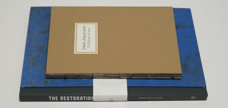
If you are a little bit confused why I grouped together Japanese and Belgian/Dutch photobook making, these two books — and many recent other ones — show that connection. They were both produced in workshops at Tokyo’s Reminders Photography Stronghold, which is co-run by Yumi Goto. The Belgian “visual storyteller” in question is Jan Rosseel. Each book was first hand produced in a small number before it was submitted to different dummy competitions. Each book won a competition that resulted in a mass trade edition being produced. In the case of one of the books, Dear Japanese, I was the juror in Cortona, Italy (at the publisher’s request, I also wrote an essay for the book afterwards). While I don’t think the books’ shared history matters, those thinking about the business of photobook making — or photographers interested in making their own — might want to take note. Just to be perfectly clear, I don’t intend these comments as either an endorsement or a criticism of this particular procedure.
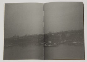
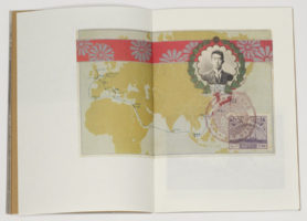
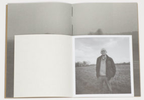

Miyuki Okuyama‘s Dear Japanese: Children of war centers on a complex, yet not very widely known aspect of World War 2. In this case the larger background is the Dutch colonial occupation of Indonesia, which was invaded by Japan in 1942. A large number of Japanese soldiers fathered children with Indonesian women. Both the Japanese and the Dutch occupation eventually ended (in 1945 and 1949, respectively). As a consequence these children, many of which now had Dutch stepfathers, left their homeland along with their families, to move to the Netherlands. While there are a few more details, these basic details might already hint at the complexity of the story and the struggles these children had to go through in their lives. It is that larger story that the book tells using mostly pictures.
There’s a lot of talk about narrative in the world of photobook making these days, to the point of it almost having become a bit of a fad. I view narrative mostly as an added device at a photographer’s disposal. Where appropriate and when used well, it’s a great tool to make a book. In this particular case, one might imagine a more documentary-photography style approach would yield the best results, using ample amounts of text (plus captions). It’s true, such an approach would maybe be able to communicate the facts better. At the same time, it would take away from what Dear Japanese is concerned with, the experiences of these children (who are now grown ups) in their adopted homeland. Some things can be said more clearly by using less (or no) words, not more.
Okuyama tells this story through a combination of her own photographs — landscapes and portraits — and archival materials. What makes the book so strong for me is that the archival materials aren’t made to do the whole lifting. Instead, they serve to add many of the aspects that the photographer can’t access: you can’t go back in time to 1949, say, to take a picture of a ship leaving for the Netherlands. In Okuyama’s melancholic pictures, the full quiet drama of people who look and feel lost in a somewhat unforgiving and altogether not very inviting landscape unfolds. The story thus centers on the here and now of a lived experience against a larger background, which makes this book so successful.
After all, there are so many people today who have to live through the same experiences today (migrants and/or refugees) and so many others who might be directly or indirectly responsible for their suffering, whether it’s heartless government bureaucrats, people who vote for the likes of Trump or Wilders, or the vast masses who are largely indifferent to the suffering in their midst. So while Dear Japanese deals with a very specific aspect of history and its consequences for a relatively small number of people, its background of forced migration makes it a book that deserves to be seen widely.

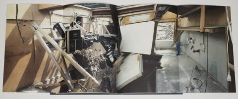
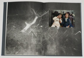
Mayumi Suzuki‘s The Restoration Will comes from a more personal space. Suzuki lost her parents when the 2011 tsunami hit the small town they were living in. Their bodies were never found. The book tells the story of that loss and of what was left behind. In the broadest sense, Suzuki uses the same devices as Okuyama. But the archival materials are very different, given that often, they show the photographer herself as a small child. And many of these photographs clearly betray of having been washed over by the sea.
In addition, there are many somewhat blurry b/w photographs in the book, presented full bleed. These pictures were made with a lens found in the remains of her father’s photography studio. What a casual glance might dismiss as a toy-camera aesthetic thus has a much deeper — and profoundly — touching meaning, a photographer using her father’s lens, one of the few things physically left behind to record a world that now seems filled with sorrow.
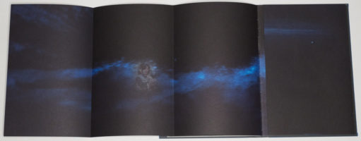
Following an older tradition of Japanese photobooks, there are many gatefolds in the book, used to great effect. Maybe the most poignant one comes right after the center of the book, requiring the viewer to unfold pages twice (to the left and right), revealing two ghostly images against an abstract black-blue image of the sky (or sea perhaps). All of the various choices employed in the book, such as tipped-in photographs, could have been overused, but they weren’t. As a consequence, the book remains touching and moving even after repeated viewings.
Dear Japanese and The Restoration Will demonstrate what can be done with the form of the photobook if design and production are employed to contribute to the overall experience. Both books establish the voices of two emerging female Japanese photographers that, I hope, we will see a lot more of over the course of the coming years.
Both highly recommended.
Dear Japanese: Children of war; photographs by Miyuki Okuyama; essay by Jörg Colberg; (no page count); Cortona on the Move; 2017
Rating: Photography 3.5, Book Concept 5.0, Edit 3.0, Production 4.0 – Overall 3.9
The Restoration Will; photographs by Mayumi Suzuki; 104 pages plus gatefolds plus 16-page insert; Ceiba; 2017
Rating: Photography 4.0, Book Concept 5.0, Edit 4.0, Production 4.0 – Overall 4.3
Update (19 December 2017): At the request of Yumi Goto, I changed Rosseel’s role from designer to “visual storyteller.” As is obvious, this adds even more reasons to discuss this particular way of book making, which I might do in a future article.
Ratings explained here.
