The Casino-Capitalist Photobook Festival

Article main image

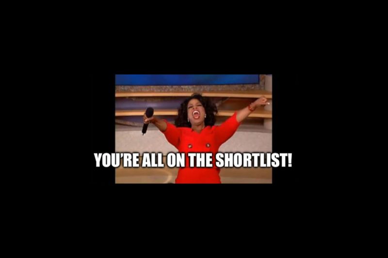
I’ve lost track of the number of photo festivals and photobook/photobook-dummy awards. Typically, these events come with shortlists. Often, these shortlists stretch the actual meaning of the word “short” quite a bit. For example, the Arles Book Awards 2024 “shortlist” contains 122 books in three categories. I became aware of this after stumbling across Instagram posts by publishers who “humbly” reported how three or four of their books had been listed.

It shouldn’t be necessary to explain how a shortlist of 122 books is ludicrous. Somewhere, I read that it was compiled from 800 books. But even if it had been compiled from 80,000 books, a list of 122 books is meaningless. It’s little more than an exercise to inflate 122 CVs (actually, since there are publishers and photographers and occasionally also writers, the number of inflated CVs is likely much larger).

It’s not even that mind seeing people rewarded for their achievements. That’s not the point at all. My point is that it’s not a reward to be on a list that has no discriminatory power. It is a lose-lose situation for everybody involved: the people who somehow don’t get shortlisted get to feel like real losers, given that so many of their peers were shortlisted. And the shortlisted photographers find themselves in some huge company.

I don’t mean to only single out Arles. That list is bad enough, but it’s hardly the only offender. Dummy Award 2024 recently announced that they had shortlisted 50 books out of 420 submissions.

With often very extensive shortlists and so many different shortlists, it sometimes feels as if every book has been shortlisted somewhere.

You can see exactly that effect with a number of photobook workshops that result in photographers producing dummies. Afterwards, the photographers flood all the various festivals with their dummies, inevitably some of them get shortlisted, and then the workshops advertise how beneficial the process is.

The larger problem is the following: the idea of awards for outstanding work has run its course. After all, while the number of shortlists (and “talent” listicles) has exploded, critical writing about photography has become rare. That can’t be a good development: instead of critical praise, people now mostly get semi-anonymous recognition in the form of being on a shortlist or — the lucky few — some award.

This development does not only apply to photobooks. You could say the same about Western (“World”) Press Photo (WPP), an award that every year reduces the (relative) complexity of photojournalistic work into some categories, each one with a winner. Inevitably, the overall winner then triggers the same conversation as the year before, which only proves that a) the makers behind WPP are either unwilling or unable to learn anything and b) in a world that is saturated with photographs picking one that satisfies a Western audience’s need to feel good about itself is absurd.

It would be straightforward to modify WPP to honour photographers and their work: simply don’t pick individual photographs. Award the photographers, and showcase their work. For example for this year’s winner, Mohammed Salem, the larger selection of his work around the carnage in Gaza would be much more challenging for an audience than that one single picture that sanitizes way too much and that too obviously caters to Western expectations.

After I posted a few very short words about “shortlists” on my own Instagram account (I had created a meme about the Arles shortlist earlier), I received some (private and public) comments. According to a number of people, the real problem is that there simply is too much of everything: too much photography, too many photographers, too many books.

Well, no. I will happily go on record as saying that I find that approach self-defeatist and extremely counter-productive. To begin with, I don’t see how it would be a good idea to go back to the world where there were a handful photobook publishers producing mostly books by wealthy white men (which is still happening, btw, those guys still churn out their stuff).

But the larger issue is that numbers never are a problem. The frequently used claims of “too many photographs” or “flood of photographs” are intellectually lazy and shallow. How would the supposedly large number of books be a problem when a much better approach would be to celebrate the medium for its sheer richness? Keep in mind that we’re now seeing a much broader range of work that previously would have had a hard time even finding an outlet.

Thus, the underlying problem is not that there are too many books (or too many pictures made or too many photographers). The underlying problem is a lack of interest or ability in dealing with the challenge in ways that do not simply and neatly replicate the casino capitalism we’re all embedded in: it’s all about winners and loser, and of course you have to pay money to be a part of it.

A photobook exhibition where you have dozens of books on tables, possibly with some added text, really is the bare minimum of what can — and I would argue should — be done with this particular medium. (In the following, I will stick with books, simply because it’s where most of my passion lies.)

Realistically, someone going to such a festival will browse through however many books their attention span and/or mental energy will them allow them to process. It takes time and energy to look at books. You simply do not advance careful looking at books by turning even the act of looking into a competition.

So what would one do if dumping a “shortlist” on an audience isn’t a good answer? Here are some ideas. You might have other ideas. In the following, I do not intend to argue that mine are the only possible ideas. I don’t even mean to argue that they’re good ideas. I simply want to point out some very basic deviations from a model that’s really, really bad.

The main reason why I’m suggesting something is that while a lot of people tend to agree with me when I point this stuff out, almost inevitably the question follows: “but what can we do instead?”. Well, maybe ask yourself first what you would like to see?

Anyway, to begin with, we collectively need to dump the idea of “the best”. I thought we had all agreed on being artists? Where is the idea of “the best” coming from? Yes, right, that’s just casino capitalism (and the internet — same thing, though). Chasing after “the best” and awards does not advance anything other than casino-capitalist ideas.

Finding the best books also is a bad idea because your idea of what’s good will likely differ from mine. If you think some book is good — and I do not, then what? We could either agree to disagree, but that would be a very sad baseline.

Ideally, we’d come to understand what we appreciate in each other’s choices, and we would both learn a little bit. We might still not see tremendous value in that other book, but we might be able to understand how someone else sees it. And that, in turn, will teach us something about ourselves.

I have some pointers for why some books might be a bit better than others, given how much time I have spent on writing about them, helping people make them, or making them. However, the situation in which you think a book is good and I do not simply is a reflection of our different personalities and expectations. And that’s perfectly fine. We need to move away from the rigid model of that very small select group of experts that get to decide what is good and what is not.

Picking “the best” precludes an approach of looking at books with differences between people in mind. Instead, it separates the 800 photographers into 122 (almost) winners and 678 losers. And it then pits the 122 photographers against each other, with everybody wondering which one (or which three, it’s three categories) will be “the best” (it might be the jury members’ friends’ — who knows?).

Instead, a jury should go through the 800 books and pick a small enough number in such a fashion that they can be put into a conversation with each other. Instead of a “shortlist”, you’d then simply have a selection of, say, 10 or 15 books (not more!). Those ten to 15 books would be presented by highlighting their connections — and differences.

Imagine walking into a room where instead of a competition between 122 books you have 15 books that each address a specific theme in their own ways. This would would trigger conversations around the books and between people — the exact opposite of the casino-capitalism outcome.

We need conversations around books and between people more than ever, given how increasingly fractured our social and political spaces are.

You might imagine that this approach would be similar to those shortlists produced by prizes around some incredibly vague and ideally completely inoffensive theme. But no, to create something of value, you need to do better, something that has some bite.

You want to aim for intelligent conversations that elevate the books and their makers — and not plaster over differences by making everybody feel good about themselves.

Consequently, the jury would really have to do some work. I’m imagining that there are people out there who have the competence, passion, and energy to create something smarter out of 800 books than a “best of”.

The key would be to create something intelligent, something that will get an audience engaged and that helps them understand the books and the art behind making them better.

As a consequence, book presentations have to become a lot more engaging than they currently are. Books on tables do not invite cross-conversations. They merely invite solitary looking. If there are books on tables, efforts have to be made for viewers to engage with each other.

What prevents you from having a small room where someone will present a book to a small enough audience that a real back and forth would be possible? What if there were eight different artists, curators, writers every day who present and discuss one book of their choice during the eight hours of the day? The possibilities are endless.

Photobooks are typically made by incredibly passionate people, and they’re discussed and viewed by equally passionate people. Why wouldn’t you tap into that passion as the organizer of a festival? It boggles the mind!

In the end, though, it can’t be only on the organizers of the festival and the juries. If enough people are unhappy about our casino-capitalist world of photobooks, then we have to make the decision whether we want to do something about it or not. We can either put ourselves at the mercy of what people offer — or create something ourselves.

Remember that, for example, Aperture magazine was founded by Ansel Adams, Melton Ferris, Dorothea Lange, Ernest Louie, Barbara Morgan, Beaumont Newhall, Nancy Newhall, Dody Warren, and Minor White.  What is preventing photographers today from launching a new magazine? What is preventing photographers from starting their own festivals?

Please don’t tell me “there’s no money”. I understand that money is a problem. But why couldn’t a photo festival be a collection of connected open-studio situations with, possibly, some other spaces added in?

I’m genuinely puzzled by the general lack of imagination. So many people are so passionate about photography. Creating art relies on creativity and on making do with what you have. What’s preventing people from applying those skills when it comes to creating cross-conversations around their photographs and/or photobooks?

OK, I get it, as a photographer/artist, life is busy enough. Maybe you’re even an academic and have to waste your time with the energy vampires in academia.

Still, things aren’t going to get better if there aren’t efforts made to change something. Because honestly, unless some people get together to create something better, we’ll be stuck with casino-capitalism festivals and “shortlists” for which even a CVS receipt is not long enough.

The Memories of Others

Article main image

Every once in a while, some photography comes along — or, as it typically the case, is being discovered long after it was made — that has the potential to radically change our ideas and views of a place at a specific moment of time, offering a sudden form of recognition for its audience — a moment of satori if you will.

The above is clearly the case for the photographs made by Akihiko Okamura in Northern Ireland around the low-level civil war that typically is being described euphemistically as “the troubles”. When I grew up, that war was a frequent part of the news on TV in then West Germany.

As a child, I didn’t know anything about the reality of the world. Colonialism didn’t mean anything to me, and sectarian violence struck me as absurd. I only heard about bombs going off on a regular basis or about some military roughing up protestors yet again. It was much later that I learned what was going on.

There has been a lot of photography made around the war, and I find most of it lacking. Gilles Peress’ many photographs show everything but reveal nothing. Paul Graham’s work speaks of a detached art outsider’s privilege more than anything else: it shows nothing and reveals even less. The rest of the work made in that small patch of land falls near one of those two poles: the (roughly) photojournalistic one or the arty one.

That it would take an outsider to break open the visual representation of Northern Ireland’s war should come as no surprise. As an outsider, you’re typically not anchored to precious beliefs other than your very personal ones. However, given that Okamura was a photojournalist, the fact that he managed to break free from the conventions he had adhered to earlier is in fact surprising.

For reasons that would appear to be at least partly unknown, Okamura moved to Ireland and brought his family along. The work that he ended up making around Northern Ireland, now released as The Memories of Others, looks as if he always arrived a moment too early or to late at any of the locations he photographed. But it is in exactly those moments that a larger truth emerges about what was in front of his camera.

Some of the imagery made by Okamura is almost too bizarre to be true. For example, one photographs shows a soldier carrying a door while walking next to a woman. As a viewer, you want to believe that he is carrying the door for her, even though you obviously have no way of knowing. And why would the door have to be moved? In my whole life, I have never seen anyone carry a door on the streets, let alone an armed soldier.

How does that picture fit into the certainty with which observers typically look at Northern Ireland? It doesn’t. It refers to the violence — the solider is outfitted for war; but it also refers to something completely different, which in part is (or at least looks) absurd in this frozen moment. The photograph catapults us out of what we know (or we think we know) and forces us to consider other possibilities.

In another picture, two women stand in front of a burned out house. The older one of them is holding a number of empty coffee or tea cups. In front of them, there is what might be a kitchen appliance on top of which some plates are stacked. Were these items rescued from the house behind them? Or are people being offered food and drink? It’s impossible to know.

In fact, trying to find explanations might be precisely the wrong approach. Explanations only lead to certainty, and it is the irreconcilable certainties of the two sides at war that caused the horrendous loss of life, a loss of life alluded to in many pictures, such as when a black flag is being shown that is waving over two sets of flowers. Someone had lost a lot of blood and their life in that spot. The blood had not yet been cleaned up.

There is a very touching and rather sad short essay by Kusi Okamura, one of the late photographer’s daughters, at the very end of The Memories of Others. “His Irish photographs,” she writes, “hold an intimacy that his other photographs don’t have. They hold the key to where my father’s heart lay.”

I’m imagining the consolation this insight must bring, however small or large it might be, given that “he was absent for much of my childhood, away working, and died when I was just 9.” I suppose that there always is a price to be paid for photographs to be taken. It makes me feel bad that in this case, it fell on Okamura’s next of kin.

If there is one thing I took away from the book it is deep sadness that so much was sacrificed for so little. You could probably say that about every war, civil or otherwise.

Still, that’s not how we typically discuss or treat war. After all, wars usually have winners and losers, there is a good and bad etc. Sure, there is a good and bad here. And yet I cannot help but feel that in the end, everybody ended up being a loser, being poorer, being deprived of so much happiness — until an agreement in the late 1990s put an end to the violence. Despite the Tories’ recent best efforts to damage the agreement because of their “Brexit” folly it has (so far) remained in place.

The Memories of Others is filled with incredible photographs. As I’ve argued, the book can show a way forward for all those who cover what euphemistically is called “conflict”. You can’t just parachute in. Most importantly, though, you have to be emotionally involved in the place you’re trying to say something about (and not merely in your own personal story).

Furthermore, the essays included in the book provide much needed insight into what is on view and into the person behind them. They’re a delight to read because they’re well written and avoid tedious jargon. And I might as well note that the photographs have been edited and sequenced deftly so that even the many stand-out pictures still exist in the continuum of the work and context.

For all these reasons, The Memories of Others is a landmark publication that deserves to be seen widely. And Akihiko Okamura should be remembered for creating such a deeply meaningful body of work around a country far removed from the one he grew up in.

Highly recommended.

The Memories of Others; photographs by Akihiko Okamura; essays by Trish Lambe, Pauline Vermare, Masako Toda, Sean O’Hagan, Kusi Okamura; 160 pages; Prestel; 2024

If you enjoyed this article, please consider subscribing to my Patreon. There, you will find exclusive articles, videos, and audio guides about the world of the photobook and more. For those curious, there now is the possibility of a trial membership for seven days.

Much like journalism, photography criticism involves a huge investment of time and resources. When you become a subscriber, you not only get access to more of my work. You will also help me produce it (including the free content on this site).

Thank you for your support!

The Hampton Book

Article main image

For the past few years, on and off I have been looking at some photographs that intrigued me ever since I first saw them. If you know what to look for, they are easy to find online: The photographs Frances Benjamin Johnston took at the Hampton Normal and Agricultural Institute are contained in the Library of Congress (LOC; here).

Even as there are a number of really interesting details (I will get to them below), up until recently my interest has solely focused on the photographs themselves. There’s something very intriguing about the work — or rather about some of it (more on that below as well).  It’s best to simply look at an example.

Let’s first ignore everything we could learn from the LOC and simply look. You have a photograph of six individuals, and it would appear that they’re all African American. They’re engaged in what looks like the construction of a staircase, in particular the building of the protective railing around it. You would imagine that such an endeavour would result in a lot of motion and visual and literal mess. But no, everything looks perfectly still, and everything looks very carefully composed.

If you have a good sense for photographic composition, you will immediately see how well this photographs is done. There are so many small details that someone not paying attention might have screwed up. Here, everything is in just the right place.

The photograph reminds me of modernist socialist imagery: imagery of workers. In fact, you can find the same echoes in many of Lewis Hyne’s photographs of the construction of the Empire State Building or in the famous picture of a power-house mechanic: the staging combined with the apparent physical energy soon to be released by the human form is one of the hallmark signs of this kind of imagery.

And note that such photography was produced in the capitalist and in the socialist worlds, the difference being the ways they were interpreted: under capitalism, the photographs were seen as showing the awesome power of progress and capitalism. In the Soviet Union, the photographs were seen as showing the power or workers.

But that can’t be the case in the Hampton case, because the people in this particular photograph look as if they had existed before photographic modernism came about. Indeed, the records say that this is the reproduction of a platinum print, and the photographs were taken around 1899-1900.

At this stage, I might as well acknowledge that you might not see the connection to modernist socialist art (which would eventually be known as socialist realism). What I’m mostly responding to is the very constructed nature of the imagery. What you see does not feel quite real: it’s almost too idealized. But there also the aspect of labour in the service of a larger good. They’re working towards something else.

Given that I previously wrote about Photography’s Neoliberal Realism, my reaction might not surprise you. In that essay, I argued that sections of contemporary photography have become indistinguishable from propaganda for the neoliberal economical system we live in.

In much the same fashion, I see Frances Benjamin Johnston’s photographs as a form of propaganda. That’s not a very original take, and I will get to that a little bit later.

A little while ago, I decided that I should have a collection of the photographs in my library, assuming that it existed in book form. As it turned out, a few years ago (in 2019) MoMA has published exactly such a book: The Hampton Album.

As it turns out, there appear to be multiple copies of these sets of photographs. MoMA acquired their copy through Lincoln Kirstein who apparently found it in some bookshop in Washington, DC during World War 2. Roughly twenty years later, he donated it to MoMA, which resulted in some research into it and an exhibition in 1966. There’s an essay in the 2019 book by Sarah Hermanson Meister that will tell you all about it.

Now that I have a copy of the book — essentially a reproduction of the object that lies somewhere in MoMA’s vaults, I will deviate from the rest of the world of photography. This is not an album. It’s a fully realised photobook.

Obviously, we could have a long discussion about albums and photobooks, if we had too much time on our hands and didn’t mind the ensuing tedium. There are reasons why I want to consider this book as what it is. First, if Anna Atkins’ very early work constitutes a photobook (and not an album), then there’s no reason why we should treat this book differently.

Second, the fact that the prints were tipped in is irrelevant. The book was produced at a time when the mass production of photographs was not remotely possible in the way it is now. Furthermore, whether photographs are tipped in or whether they’re printed directly onto the paper is not a very good way to distinguish a photobook from an album. If we did that, Rafal Milach‘s The Winners would not be a photobook, which would be an absurd statement to make.

Most importantly, though, as is very clear from The Hampton Album, what we have is a very carefully considered book that follows all the rules of photobook making. Even if we have no direct access to its maker(s) intent, through its very considered nature, it’s absolutely clear that they had a book with a very clear message in mind. And that’s the most important reason to consider it as a photobook — and not as an album.

Johnston’s photographs had been commissioned by the Hampton Normal and Agricultural Institute to showcase the institution’s efforts to provide education for African American and Native American students.

Old habits die hard, though. The book opens with what today reads as some incredibly crude juxtapositions of “before” and “after”: life without Hampton input and life with. For example, one spread shows a Native American woman and her child in what might have been traditional dress (“Without Education”) standing somewhere in the open opposed to a family of four dressed following Western bourgeois standards in a photo studio (“With Education”).

Equally striking are the differences in names used in those spreads. You might have two Native American women. One is Cracking Wing, shown “On arrival at Hampton” opposite of Adele Zinney (I’m having trouble reading the handwritten title, I might have misread the last name and some of the following text), “A girl whose every physical measurement is artistically correct” (which implies that Cracking Wing’s is not).

“The message is clear,” wrote Richard B. Woodward, “Hampton is bringing civilization to people who have not enjoyed it until now, and those people ignore its philanthropy at their peril.”

“The main group of photographs in the album, though,” he continues, “don’t have this scolding tone, even if the intent remains didactic.” This sentiment is mirrored in some of the other writing around the book I’ve seen: well, there is the blatant propaganda in the beginning, but the rest is better.

Well, yes and no. The propaganda isn’t quite so blatant later on, but to insist that it is less scolding in tone… I don’t see it that way. It’s just done differently.

As Meister notes in her essay, Hampton University was not particularly pleased when in 2000, Carrie Mae Weems’ The Hampton Project used the photographs to address some of the issues of the work to speak of the larger complexities and, in particular, on the function the students were given then and now. “Weems,” Meister writes, “employed a strategy that complicated — or indeed, rendered impossible — any singular understanding of Johnston’s work.”

This brings me back to my original interest in the book. After all, the first photographs I saw are from what Woodward calls the main group, a large selection of photographs showing students in class or engaged in other school related activities.

What I had picked up on, after all, was merely one aspect of the photographs, namely the very carefully constructed nature of the classroom photographs (some, I might add, work better than others). It is that artifice that I had picked up on that seemed to be directed at something else, something outside of the frame and outside of the lives of the people in the frames.

It should be clear that we will have to live with the contradictions in the photographs that immediately arose from the institution at that particular point in time. The crass paternalism is very difficult to ignore.

It would be foolish to expect or think that the contradictions in the photographs do not exist: we cannot hope for the past to be better than it was, even if the people behind the project meant well. But there’s something to learn for us, both for our way of looking at and deciphering photographs. And there is a lesson for our own lives and how intent might or might not translate into a lived reality.

As I’ve hoped to make clear in the above, Frances Benjamin Johnston’s photographs from the Hampton Institute should be looked at more widely. The book — The Hampton Album — is a fully realised photobook whose edit and sequence deserves careful attention. Even as it arose from a time where the medium photobook did not play much of a role, the book is so well made that much can be learned from it.

If you enjoyed this article, please consider subscribing to my Patreon. There, you will find exclusive articles, videos, and audio guides about the world of the photobook and more. For those curious, there now is the possibility of a trial membership for seven days.

Much like journalism, photography criticism involves a huge investment of time and resources. When you become a subscriber, you not only get access to more of my work. You will also help me produce it (including the free content on this site).

Thank you for your support!

The Meme Is the Message

Article main image

The world of photography (aka photoland) stubbornly clings to a rather limited set of beliefs, even as the way photographs are viewed and used has changed considerably over the past decades. Photography students still study form and content (and only that) and then learn how to edit their photographs based on the idea that it’s only the single, precious pictures that can and should be used.

Consequently, a lot of the conversations in photoland look, well, old-fashioned at best and out of touch at worst when seen from the outside. For example, street photographers still insist on their rights to make their photographs even as the societies have changed their views of people’s privacy rights considerably. And crucially everybody is using their smartphone to take and share their pictures of what they’re doing — as if you could just do that! (Well, you can, and it’s fun — try it!)

One of the most astounding observations for me is that many people outside of photoland are adept at using photography in a fashion that most photolandians would struggle with. Memes might well be the most interesting example. They rely on images (often photographs), usually with short text added, and they create pithy and very powerful statements (often humour plays a huge role in them).

Looking at what memes do and how they do that can be used to understand more about photographs.

Before I dive into memes, there is a prerequisite that is simply taken for granted outside of photoland. You wouldn’t be able to make memes so relatively easily if photographs came with fixed and very specific meanings (I’m going to focus on photographs here; there is more to memes but you can read up on that elsewhere).

Photographs do not come with meanings any more than other human-made artifacts do. Instead, meanings are being attached to photographs through their use and reception. But it’s not quite as simple as that because obviously, in general you cannot attach just any meaning to a photograph. There is a reason why photographers think that their picture has a specific meaning. That’s because photographs essentially are pointers.

What is a pointer? Unfortunately, the concept of the pointer — at least the one I have in mind — comes from computer science (I used to do a lot of programming when I was an astrophysicist). I’m going to try to explain it briefly and in very general terms so you can get an idea of what I mean.

Imagine that you’re writing a computer program that centers on families. Imagine that for each family, you want to store the names. Imagine that you decide that you will use a table (“a set of facts or figures systematically displayed, especially in columns”). In many programming languages, you define a table by giving it a name and a size. You’d maybe use something to the effect of “Family[2][2]”. That basically gives you four data entries that your computer stores somewhere, and you can fill it with your data.

But there’s a problem, because what if your family has more or less than four members? Then, you’re out of luck. You’re either left with unused memory, or you need to re-define things.

In many more advanced programming languages, you can avoid this problem by using pointers. You would use “*Family” instead. This tells the computer “there is this entity that I will refer to as ‘Family'”, and the computer will find some position in memory to store it. You don’t have to worry about where that is, your computer will do the work. Later, when you know the size of the family in question, you can say “OK, now please allocate three units of memory for me” and store your data (because you might have three family members).

Photographs basically operate like pointers when it comes to their meanings. They provide a general location of where meaning can be found, and the meaning is then generated later through a combination of use (how and where the photograph is used/shown) and reception (the people who look at the photograph).

For some people, this idea might sound too complicated. But it only sounds too complicated because typically, photographs are shown and discussed within the same cultural/societal circles in which many shared ideas are taken for granted and are thus ignored.

Imagine you see a photograph of a person who uses her hand in a very specific fashion: the thumb and index finger form a circle. Clearly, she’s trying to tell you something with that gesture (that’s the pointer aspect of this example). People from different cultures/societies will associate different meanings with the gesture. In Japan, for example, that’s a common hand gesture for money. In the US, the gesture used to mean “OK”, but it has now been coopted by the far right to symbolize something that is absolutely not OK.

This example is instructive because it demonstrates that different culture/societies might associate very different meanings with the same photograph, and the meaning of a photograph in a culture/society might change with time for all kinds of reasons. But the photograph in questions retains the same very basic idea. This person is sending you a signal: she is telling you something.

That’s why I think that treating photographs as pointers is such a good way to understand how photographs and meanings are connected. Photographs nudge the viewer into a direction, which might be very specific, or maybe it’s more general, and the meaning is then constructed in that area.

Another example: imagine a photograph of an old man in a suit who is smiling at the camera. If you don’t know the person, the meaning you would associate with the picture would depend on what that photograph evokes in you. But if you know that that old man is the US president, then the meaning of the photographs becomes a lot more specific. Depending on your particular politics, a very specific meaning will be produced immediately. And note how there is a very different meaning — produced by “the other side”.

Again, on its own the photograph of the president has no specific meaning. As a viewer, you and your politics create the meaning — if you know who that person is. If you don’t know, the game changes considerably.

For photolandian photographers, the idea that the meaning of a photograph is not fixed is a nightmare. Most of them believe that every photograph has exactly one meaning — typically the one they can think of, and the discussion better stop there. And god forbid that someone else would take their pictures and make something with them! I mean, OK, maybe the photo editors of prestigious magazines are allowed to do that. But certainly not strangers who — gasp! — might not even have an MFA.

The reality is, though, that you could learn more about photography by embracing and playing with memes than you might be able to imagine. To begin with, memes require a sense of playfulness, which is almost entirely absent in any photoland setting I have been exposed to.

Playfulness is good: it’s not only fun once you’re allowing yourself to fully engage in it, it also boosts your creativity.

The only problem with memes is that not that there isn’t enough information available for them. It’s the opposite: there’s too much. I personally often use a site called Know Your Meme if I need to find out more about something I encounter.

When it comes to memes, not all photographs work equally well. The best pictures contain malleable specificity. On the one hand, they’re specific enough to have a hook you can latch onto. On the other hand, they’re not so specific that anything you can make out of them becomes this one super specific thing.

If you think about it, that’s actually really interesting. In fact, it’s not that different than what you encounter in photoland, where the most interesting photographs tend to be the ones that leave enough space for a viewer’s imagination while not leaving them hanging or shoehorning them into one interpretation.

I’d love to illustrate this article with memes made from famous photographs. But I know that I will get inundated with angry emails from the photographers. So I will stick with some of the well known photographs (or video/movie stills) that have been widely used to create memes.

If you’re uncertain how to approach memes, start with taking a single image, and then add text to it.

It’s not necessarily bad to start with something simple and obvious, because what you make has to work. By now, memes have become so common that for some of the most widely used ones (see above), there are websites you can use to create them.

With these kinds of memes, the added text can serve different functions. It either serves as a label (as in the above case), or it becomes the speech uttered by who or whatever is shown in the photograph. That’s pretty obvious, but it’s important to keep in mind: much like photographs themselves, text can have different functions. You need to understand that aspect for things to work.

It’s also important to note that you do not need to use text on top of a photograph to create a meme. With the “distracted boyfriend” image used above, I have seen people place different pictures on top of the photograph itself. When you do that, though, you need to preserve the essential idea of the source photograph.

I should also note that when it comes to memes, there usually is nothing particularly subtle about them. And the photographs used for memes often reproduce fairly broad ideas and/or stereotypes. If you’re one of those photolandians who writes essays that accumulate a lot of nouns created by adding -ality and -ness to simpler words, this might strike you as problematic. But the key to memes is that they can be very critical — while being easily understandable.

See what I did there?

Anyway, this particular photograph is a great illustration of the idea that photographs act as pointers. They guide you towards something, and you create meaning around that. In the case of the meme, the meaning is fixed through the addition of text.

But that doesn’t mean that everybody looking at a meme will necessarily get it. I could be wrong, but I do think that this meme only works well if you know Bernie Sanders who has a strong Brooklyn accent and who always sounds at least a bit exasperated (these two might in fact be the same thing).

Otherwise, you’d have an older white man in a parka giving you photo advice (which for generations of photographers would just have been your regular art-school experience).

Things get a lot more interesting once you produce a meme that combines two (or more) photographs plus text. You basically get a contemporary version of an old-school comic strip or, if you’re of a certain age, a very short photonovel (when I was a teenager, this kind of material was pretty common).

Of course, things get more interesting in such memes. A common variant involves different pictures of the same person, in particular the person reacting differently to something. That something in the meme is provided by the text, such as in the example above.

Memes can be thought of as didactic, but they’re never didactic in an obvious fashion. Instead, in these kinds of memes, the text pieces sit in the “wrong” spots. It’s very basic, but it’s effective.

Things get a lot more interesting once you use two unrelated photographs, such as in this pairing. Even without the added text, it’s a very interesting pairing, given how inevitably a viewer will attribute human characteristics to the cat. And we read the pairing as if the cat were reacting to the woman yelling, even though we also know that these pictures originate from very different contexts.

In other words, multi-image memes can teach you about sequencing images. But it’s happening in the context of a meme, meaning that all the weight that typically makes sequencing photographs so difficult for people is absent.

The above really is an impossibly long way of arguing that photolandians make their own jobs much too difficult a) by not looking at the cleverness with which images are being used by people who usually have no art education, b) by insisting on much too narrow meanings for their own photographs and thus shoehorning them into much too narrow possibilities, and c) by avoiding aspects of play when putting their work together.

Play plays a crucial part in the development of a human being. Sadly, as adults we shed a huge fraction of our playfulness for any number of reasons. In my experience, most photographers and artists are much too worried about preciousness of their end results — instead of playing with possibilities, the consequences be damned.

Even if your own photographs don’t show, say, yelling women or cats that are disgusted by salad, you can — and I would argue you should — not shy away from using your own photographs in the most outlandish fashions, simply to learn more about their potential and about the possible meanings they can take on.

Furthermore, handing your photographs to someone else so that they can make something out of them can also be incredibly enlightening. Photographers typically only do that when some curator wants to do something (and even then, there often are endless arguments).

Forcing a meaning on your photographs — whether individually or as a set/group — is not necessarily a bad thing. It gets bad when you insist on that and only that meaning. Photography is much too rich a medium for such a narrow-minded and ultimately self-defeating approach.

Playing with memes to see what you can do with photographs is a good way of allowing yourself to get rid of that anchor that’s keeping you forever tethered to that small harbour that you know you need to get out of.