A Part of Marianne Müller’s Life

Article main image

This article is the first in a new series entitled “In Hindsight”. In a nutshell, I am going to be discussing photobooks. But unlike in the case of the photobook reviews I will here focus on older books. There really is nothing wrong with the reviews, but I frankly have grown a little bit tired of only discussing/reviewing new books. With many books, their true value and merit reveal themselves only with time; and a lot of books that should get some attention (or that maybe should get re-evaluated) simply don’t (or never have), given the flood of new books and circumstances that in retrospect might not even be that clear.

The idea here is not to create some sort of Parr-Badger effect, where a bunch of old books are being turned into collectors items. However, if I manage to lift a book from an obscurity that I feel is completely undeserved then I am not going to be too worried about it (and I will have to live with its possible Parr-Badger effect).

Lastly, I am planning to add some new features (types of articles) to this site (or revive older ones). I also just started a Mailing List, hoping that with time, it will allow me to ditch social-media use completely. You can sign up here, where you can also see some already existing material (which includes my motivation for doing so).

It’s a Mailing List, not a Newsletter (there will hardly be any news). And while the site I’m using allows me to evaluate statistics, I am not going to do that. In other words, I’m not going to look at who clicked on what or how many people read this or that… I find that a bit creepy. If you have any comments or recommendations or requests for the Mailing List, feel free to each out via email!


My basic expectation is that when I look at a book that is 20 years old I will see its age. I will see that its sensibility is one that has become a bit dated, whether as a whole or in part. My expectation might simply be based on having experienced this process many times in my lifetime. Most jarring examples are probably provided by re-encountering something that I appreciated quite a bit when I was younger, or something that I simply didn’t notice all that much in the past but that now strikes me as dated.

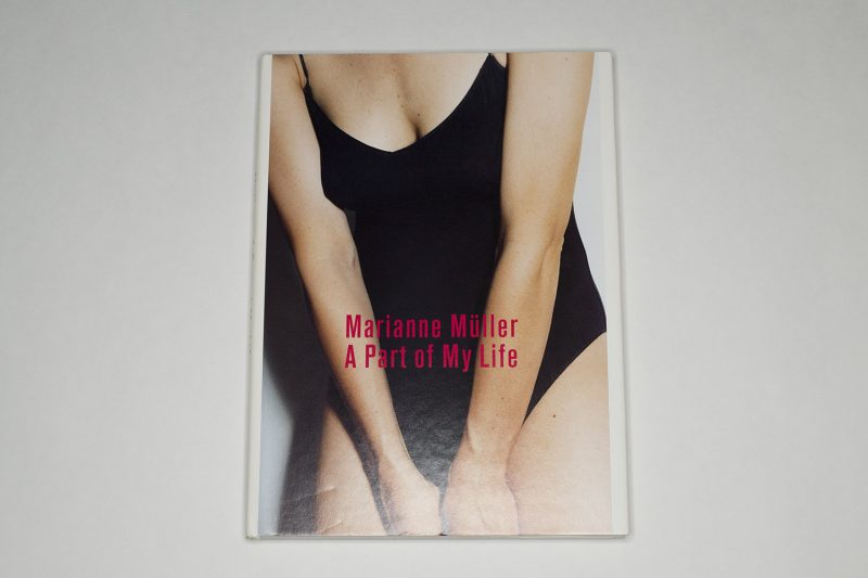
Much to my surprise, when I first received Marianne Müller‘s A Part of My Life in the mail, some time in late summer 2019, the book looked as if it had been published that year — and not in 1998. To begin with, despite its very low price ($4.77 on US Amazon), the book arrived in pristine condition in its original shrink wrapping. Really the only thing that would betray its original publication date was the treatment of the typography. But the photographs themselves appeared to have been taken for the moment we are now experiencing (or, possibly, re-experiencing — it would take an art historian specializing in feminist art to dive more deeply into this).

I had discovered the book in Walter Keller — Beruf: Verleger (reviewed here). Leafing through the pages of spreads of book published by Keller’s Scalo publishing house, there were four pictures from the book that made me look into their origin. I quickly found that the book could be had for less than $5 easily, so I ordered a copy, not really knowing what to expect. But I didn’t order the book based on its price — something about those four pictures intrigued me.

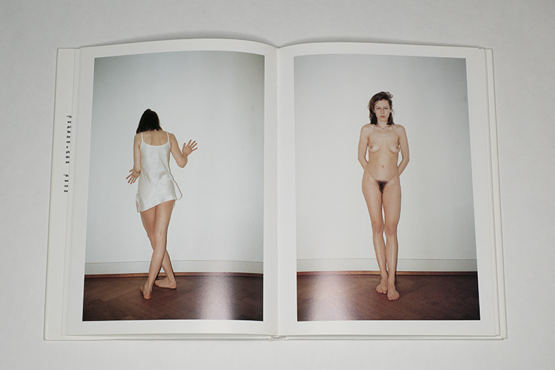
The bulk of the book consists of self portraits, in which the artist scrutinized her own body. There are a number of photographic approaches (and cameras), ranging from pictures made at arm’s length to pictures taken with a tripod, some in black and white, but most in colour.

I’m obviously looking at the book against the background of the selfie craze (which, for the record, unlike many of my colleagues I have absolutely no problem with), so there is a sense of familiarity for me in these photographs. Still, the book is radiant with a sense of exuberant self discovery that I can’t easily recall seeing elsewhere.

Having seen Talia Chetrit’s work a little earlier, there also was that reference; but while I appreciate some of that artist’s photographs quite a bit, in the end I’m left feeling that what I am made to look at is a cerebral exercise first and an artistic project second (for me, quite a bit of contemporary photography falls into this category).

Müller’s photographs, in contrast, never made me feel that way. Another major difference is provided by the fact that the Swiss photographer weaves in what you could call still lifes. There is, for example, a photograph of a maroon dress on a hanger — turn the page and you see the same dress on the artist’s body. Now, this description might hint at this sequencing being cerebral or, even worse, didactic, but in the book it’s neither. It works.

And then there are what we could call the travel photographs, which appear to have been taking with any one of those 35mm film cameras that would produce a time stamp in the frame — a device that at the time was very popular (this is the only aspect that betrays the book’s time of origin, even though it is not as intrusive as one might imagine). These pictures arrive out of the blue, and much like everything else in the book, they blend in seamlessly. I found myself surprised by how well this works as well.

There also is the presence of another person, a man, who remains faceless. There are bits and pieces of his body — a hairy leg here, part of his torso there. The book culminates in a section that is openly sexual in a way that all the others are not. A close-quarter examination of the artist’s body leads up to a spread in which they’re seen fucking.

I’m finding myself at a loss how to properly attach words to what’s on view. They make love, but what they do is more carnal than that. (English is my second language, and I’ve always found that phrase clunky.) They fuck, but there is the harshness implied by that word’s rough consonants, clustered around the short vowel, that somehow seems too harsh, too carnal. In the book, the act’s very harshness, the it being animalistic, does not deny the sheer pleasure and delight and shared agency — and it is exactly this aspect that had me startled.

I can think of an endless number of books, where a male photographer photographs his consort, his — ugh! — muse (oh, how I hate that word!), while being engaged in sex, and almost inevitably, the submission is all-encompassing. The woman submits herself to these acts, being a passive receptacle of male dominance and power (think Araki, think d’Agata, … — it’s so infuriating to witness how many examples there are and how celebrated these brutal photo machos still are).

To see a female artist produce a book that not only openly asserts her own agency, an agency denied to the macho’s “muses”, but that also embraces all that is pleasurable between two equal partners — that shows that another world is indeed possible, a world that even 20 years after the book was first published still only exists at the margins or in very narrow circles of photoland.

A recent survey book of photobooks by female photographers is entitled How We See. I’ve always thought that that’s such an apt title. It’s particularly apt to describe A Part of My Life as well: this is how a young woman sees her body, her life; this is how this seeing has translated into photographs — in John Berger’s phrase a way of seeing; and not it’s up to us to engage with it.

Ironically, large parts of the book will never be seen online since the photographs run counter those Puritan “community guidelines” established and maintained by American social-media companies. Those guidelines censor female bodies much more than male ones, and they largely cement a patriarchal, male-gaze centered engagement with the world — where scantily clad so-called influencers are fine, but other women celebrating their bodies and sexuality are not. So if you’re interested in the work, buy the book.

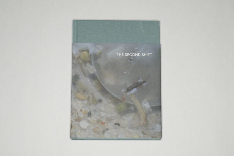
A Part of My Life; photographs by Marianne Müller; 127 pages; Scalo; 1998

The Second Shift

Article main image

“The Second Shift is the term given to the hidden shift of housework and childcare primarily carried out by women on top of their paid employment.” This is the first sentence of a short text right at the beginning of Clare Gallagher‘s The Second Shift. The text continues: “It is physical, mental and emotional labour which demands effort, skill and time but is unpaid, unaccounted for, unequally distributed and largely unrecognised.” Here, there’s a pivot towards photography, with an implication of what an attentive viewer might pick up on: a deep injustice, a feeling of what it might feel like to be at the receiving end of this deep injustice.

More photography in the next paragraph: “Hidden in plain sight and veiled from familiarity and insignificance, the second shift is largely absent from photographs of home and family.” With many of the famous and all-too-often discussed examples of family photography made by men, this might not come as a surprise (my take here is US-centric, given I’ve been teaching entirely in this context so far; realistically, I do not expect the situation elsewhere to be much better, if better at all). And then there’s the sentence: the project “is a call for resistance to the capitalist, patriarchal and aesthetic systems” that ignore this type of work.

This is a timely book.

You cannot photograph an injustice, you can only make photographs and convey the sense of injustice. The same basic fact is true for any other abstract concept such as, say, love — anything really that exists in our minds and is communicated using words for which there are no physical embodiments.

It’s a coincidence that I’m writing these words on Martin Luther King Jr Day, a day that like no other in theory should serve as a reminder of what can be gained from personal and political integrity and a sense of justice, more abstract concepts that these times make a mockery of: in Anglo-Saxon politics, integrity is in very, very short supply, as is justice.

Again: this is a timely book.

Looking through The Second Shift, I was struck by its somber tone. I hadn’t expected to run into it, and I’m sure my reaction was based on having seen a lot of other family photography before. Family, after all, is something joyful even when it is not: it’s supposed to be presented as such, and even the most celebrated examples obey that rule. There might be conflicts, but they are presented within strictly defined and, we might add, previously agreed-upon parameters so that a viewer might feel somewhat uncomfortable — but not too much. Even seemingly harsh work such as Richard Billingham’s Ray’s a Laugh follows conventions: we know how and where to file the pictures (alcoholic father? check! poverty? check!).

It is this get-out-of-jail card for the viewer that’s missing here, this way of allowing her or him to ultimately disassociate from what is on view. I don’t know if as a viewer you’re going to remember individual pictures as much as the overall experience of looking through the book (which is, after all, what a good photobook should do). You might remember piles of things depicted here or there, whether books or laundry, there’s plenty of detritus lying around, waiting to be picked up by someone (now who might that be?). And there are pictures of children, but even when they’re depicted at their most playful, that feeling comes with ther one of dread: oh boy, there will be some more mess that has to be sorted out (now who might do that?).

Interestingly, the photographs all strike me as tender. One could have gone about this idea using a flash, but then we’d be in an entirely different visual universe. Instead, these pictures here are observed (but not necessarily elaborately made, which, yet again, would have resulted in a different visual universe). I’d like to think that I can tell how their maker cares as much about what was in front of her camera’s lens (in particular the children) as she dreaded all the inevitable, mind-numbing work associated with it, with all of it. (Full disclosure: I don’t have any children, so I have no first-hand knowledge of any that.)

Smart design and production choices help transport the book’s overall feeling. Many of the photographs are reproduced full bleed (without any borders around them), making the overall experience very immersive for the viewer. At times, a photograph might be shown with a border; in that case, it’s relatively small on the page, which results in it feeling precious (even when what’s on display is merely a stil life of vegetable shavings). With the exception of the colophon, all text is reproduced on smaller pages (there also are a few pictures on such pages), which makes for neat breaks for the viewer. What’s more, what the text might be talking about always ends up peeking in: a viewer can always see fragments of pictures along with the text.

Now, whether or not the book will indeed do what it set out to do — that’s ultimately up to its viewers. Do we want to treat it like Martin Luther King Jr Day, where, let’s face it, most of us merely pay lip service to the ideas Dr King stood for? Or do we want something better? And if we want something better, what could that better look like? Given that the book focuses on home and on the second shift, a viewer might as well start there. After all, larger change will only arrive if it first occurs at a personal level.

The Second Shift; photographs by Clare Gallagher; poem by Leontia Flynn; 64 pages; self published; 2019

Rating: Photography 3, Book Concept 4, Edit 3, Production 4.5 – Overall 3.6

The Form of the Photobook (Revisited)

Article main image

Of all the books in my library, the one with seemingly the most intriguing title is The Form of the Book Book. A look inside will make it very clear how and why there is absolutely nothing peculiar about the title at all: a number of essays by well-known designers explores the form and function of books working with photographs. Yet somehow, its mint-green cover also has it stand out among the other books around it as well, making me look at the spine regularly. Ah, yes, the form of the book. It’s a useful reminder that it matters, that, in other words, as a photobook maker, you will want to consider the overal form of your book, in other words the design along with the choices of materials.

Given there are so many Tupperware photobooks — books where the photographs were dumped into a generic looking and feeling container, I find well-considered books rewarding. Especially in the US, there is strong resistance to producing anything other than a glorified Tupperware photobook: after all, shouldn’t a photobook be concerned with the pictures?

This attitude is grounded as much in the fact that the world of US photography is overall very conservative (for many practitioners, contemporary photography means the likes of Garry Winogrand), that the role of design and production usually is not very well understood at all, and that many photographers don’t trust in the power of their pictures. After all, if you know you have good pictures, you’re unlikely to be worried that design might somehow overshadow them, right?

So let’s look at a number of recent photobooks using this particular angle.

When I received Stijn van der Linden’s Essay on the Concave City Corner in the mail, I was bewildered. The mailman made me sign for a very long package, and I didn’t remember having ordered anything long. Having received a great many photobooks in the mail, I knew their boxes or envelopes would typically be wide, tall, and more or less flat (as an aside: if you ever publish a photobook, do yourself a favour and never send it in merely an envelope). But no, it was a book that clearly required the unusual dimensions of its packaging (it’s 13 x 36.5 cm). There was, however, no information on the cover or spine — other than cryptic numbers (if you ever publish a photobook, do yourself a favour and print the title and your name somewhere on the cover and spine).

Looking inside, I found photographs of a large number of corners in some city that each come with a little diagram plus some more cryptic numbers underneath, making it the kind of conceptual photobook that does not need to rely on anything other than competent pictures. The former scientist in me found that potentially interesting, and the few science corners in my brain that are still in operation started attempting to figure out the meaning behind all of it. At times, there are gatefolds in the book that are constructed in such a fashion that parts of separate corners will combine to form a new one until the viewer unfolds the paper. Neat.

After the sections containing the photographs, there is a lengthy essay about the project, which I have to admit I never finished reading. I tried a couple of times, but it’s just too tedious (that’s obviously on me, not on the writer). I did, however, read the end (this writer knows some of the tricks), to arrive at “this research on concave city corners might be criticized for failing to answer a meaningful question. This could be extended to a critique of the scientific process as a whole, nowadays above all incentivising scientists and academics to publish or perish” (with a footnote pointing to some article on VOX). Hmmm, OK, this is cute, but this former scientist would be tempted to think that — as you say in German — der Schuß geht nach hinten los (which in English rather prosaically means it backfires).

After all, if anything I’d see the book as one of those many attempts by an artist to mimic the scientific approach (honestly, how many projects are there where some photographer is “exploring” something?); to then take the whole thing, to apply it to the sciences, and to say “hey, look, I’m just going to show you how meaningless so much of science is” — that doesn’t quite cut it for me.

In fact, it’s the criticism approach that bothers me. Had this all been done in a completely deadpan fashion, as, in other words, an attempt to come to conclusions about cities based on their corners, then I would have been happy. There could be, after all, a scientist engaged in what to laypeople might be similarly meaningless research.

Especially in this day and age where, to give the possibly most important example, a tiny minority of freak scientists and pseudoscientists is used by the fossile-fuel industry and right-wing governments all over the world to question climate science — in such a day and age, this questioning of the scientific method and its process contributes to undermining the very sciences we need to take more — and not less — seriously.

That aside, ignoring the fact that the book makes it so hard to find the name of its author and title (there’s no title page, either), the form of the book is about as good as it gets. It employs all the right tools and tricks to present its information, and it literally stands out. It is a book that you will remember (even though you might never find it in your library again, given there’s no information on its spine).

Essay on the Concave City Corner; photographs by Stijn van der Linden; essay by Stijn van der Linden and Katrien Vanherck; 144 pages; photobook week arhus; 2019

Rating: Photography 3, Book Concept 4, Edit 3, Production 5 – Overall 3.8

As far as I can tell, there’s no shortage of photobooks about guys who decide to build and/or live in cabins in the woods. A future critical history of photography should contain a little chapter about this particular topic (which, I’d argue, is tied to many photographer’s focus on depicting the lives of underprivileged bearded strangers living off the grid or roaming the lands). How refreshing then to find the following in the larger text piece of Karianne Bueno‘s Doug’s Cabin: “I shoot a full film on the graveyard and car wreck, despite knowing they’ll be too cliché to use. Regardless: I feel great. Like a conqueror. I, the city dweller, found a hidden piece of history in this faraway fairy-tale forest.”

Much like all books I’ve seen by Breda based The Eriskay Connection, text plays a vital role in this book. Bueno’s first-person account describes what the photographer saw as much as more general aspects of the process, in particular her being out of place in her chosen location. That, I’d argue, is one good approach to solve the conundrum of some “city dweller” photographing this kind of situation.

In addition to being very smart about the inclusion and use of text, The Eriskay Connection also excel at working with design and materials. Bueno’s photographs of landscapes are often presented full bleed, which especially in the very beginning very aptly sets the tone of the book and which makes for an immersive experience for the viewer. Of course, archival materials are being used, and those are printed on a different paper, on newsprint actually, and those sections are untrimmed at the bottom (with trim marks provided for the viewer).

I was writing “of course” because archival materials appear to be a prerequisite these days for photographers attempting to portray strangers living in the woods. The more often I see this, the less I like it. To be honest, to me the use of archival materials has begun to look and feel like an unnecessary trope (obviously, your mileage might vary). Instead, I would have preferred to see some actual people here: some faces (c.f. my earlier piece You Haven’t Seen Their Faces).

Near the end of her text, Bueno writes “I admire Doug for his way of life. Untamed nature, solitude, and confrontation with one’s own insignificance within the planet’s bigger picture, has always deeply haunted me. I admire his fearlessness.” As much as there is a lot to unpack here, I appreciate the photographer’s honesty. Might she not be describing the sentiments of all those venturing out to photograph, say, bearded strangers in the American West?

I don’t think the honesty absolves the photographer of the possible problems that come with such a portrayal. That future critical history of photography might venture into that (somebody commission me already!). But this is a good first step for larger parts of photoland to examine their motivations for putting certain types of people — more often than not quite a bit worse off — in front of their expensive cameras.

Doug’s Cabin; photographs and text by Karianne Bueno; 180 pages; The Eriskay Connection; 2019

Rating: Photography 3, Book Concept 3.5, Edit 3, Production 4 – Overall 3.4

When you first look at Grid Corrections by Gerco de Ruijter, open the book at page 157, and marvel at the following 143 pages. This, essentially, is visual communication in book form at its best. It’s incredibly elegant and actually somewhat understated. But the combination of very smart design and production choices makes for a thrilling experience for the reader/viewer. Perhaps not surprisingly, the book was designed by famed Irma Boom Office (who is Irma Boom? you might wonder — watch this video to find out).

At the core of the book lies the fact that in order to organize land, grids have been the go-to solution in the post-Enlightenment West. You can see such grids in an abundance of example culled from Google Street View before and after the book’s central section. Looking at these screenshots, I am reminded of modernist ideas of grid-based graphic design. The grid is obvious and easy because it tessellates very well — unlike the irregular, rounded shapes used to organize medieval European cities (or farmers’ plots), say. As is well known from the game Tetris, the grid works best if squares or rectangles are used, ideally all of the same size.

So there’s the idea of the book. That’s it. That’s all you need. Simple ideas are often the best, in part because simple is not the same as simplistic. Still, De Ruijter’s idea could have resulted in a dreadfully boring book, had there not been the smart and elegant design and production. Sometimes, that’s all it takes to elevate a book out of the pit of boredom (that all those Tupperware books exist in).

Now, I can imagine the Tupperware crowd to argue that the pictures aren’t that interesting, and they’re right. They’re not. But that’s just missing the overall point here. This is a not a book filled with jewel-like pictures. Instead, it’s a photobook that conveys an idea very well and that makes for an incredibly engaging experience. And there really is no need for any more description or commentary other than if you have the chance at all, you certainly want to look at this book to see what can be done with smart design and production choices.

Grid Corrections; images by Gerco de Ruijter; text by Peter Delpeut; 304 pages; Nai010 Publishers; 2019

(not rated)

After Social Media

Article main image

In regular intervals, a certain type of Twitter post goes viral. Typically, the post will contain a fragment of a sentence, and readers are encouraged to add their own words to it once they “re-tweet” it. Twitter being Twitter, more often than not the overall idea is to say something that might or might not be popular, thus potentially triggering the kinds of exchanges the platform appears to attract: people arguing with each other in an increasingly angry fashion until someone is compared to Hitler.

I’m really only on Twitter out of a sense of obligation. Ever since RSS was made to die, I have felt obliged to somehow telegraph the articles that I write (RSS isn’t really dead, but much like, say, mechanical typewriters it’s a technology that is of very little actual use). I’m not on Facebook, so Twitter is the one social network I use to that effect.

Years ago, I was on Facebook, but I quickly left because I saw too many problems with it, including the company’s atrocious attitude towards its users’ privacy. I have been told many times by a number of people who clearly meant well that being on Facebook would help me to spread the word of what I’m doing, but that’s simply not something I want to or will do, given the company’s overall behaviour.

I’m really only on Instagram out of a sense of obligation as well. It’s a great way to see how people use photography, and I feel that as someone writing about photography I have to experience it. But it comes at a fairly steep price: neither Twitter nor Instagram are good for my own mental well being (research appears to be increasingly showing that social media in general are not good for anyone’s mental well being). Oh, and it’s owned by Facebook, so they’re able to syphon parts of my privacy. Great. On top of that, Instagram’s “community guidelines” are deeply discriminatory for all kinds of reasons (see my piece on censorship on that platform).

The reality is that I would have easily and happily quit both Twitter and Instagram already if I had been able to find suitable replacements. Over the course of the past few weeks, a few events conspired to have me think about this again. For example, Lewis Bush used one of those aforementioned add-your-own-words Twitter posts to suggest: “Lets [sic!] all get off Twitter.” This sounded like a good idea to me.

If you’ve grown up with social media or if your experience of the internet has been mostly shaped by them, you might not be aware of the world of photography online before them. I realize I’m going to sound exactly like one of those old people who are telling the young how everything was so much better in the past. While that’s the last thing I want to do — there’s nothing more annoying than having to listen to some often misguided nostalgia, I’m very happy to argue that the world of blogging as it existed around 2007 or 2008 was a lot more vibrant than whatever we’re witnessing now.

Mind you, I’m not talking about what people were or are writing. In fact, there is as much — if not more — high-quality writing online now as then. However, the sense of community and excitement that existed back in the day is completely gone. In a nutshell, social media have essentially atomized a vibrant community, to turn them into a group of loners that might engage politely with each other but that each just take care of their own domain. And that’s it.

The reason I see for this development is simple: on social media, users operate on the company’s terms, not on their own. In contrast, during the time of blogging, there were no companies dictating the terms. It was a bit of a pain to set up a blog, but with a little work (and possibly a little help by some tech savvy person) you’d be ready to go. It would be you defining the terms of what was going on. And people would read what you produced simply because they could subscribe to your feed (that’s what RSS did). There were no algorithms that would restrict things or suggest things or filter things.

As a consequence, there was a general sense of excitement, of producing something new, something that would bring value to the world of photography. That’s all completely gone.

It will be impossible to squeeze the toothpaste back into the tube. I also know that many readers will react to what I just wrote just how I tend to react to old people telling me about the good old days. The thing is, though, that I’m noticing a growing chorus of people uttering the very same sentiments.

Like I said, social media’s mental toxicity is becoming an increasing concern for a lot of people. One doesn’t have to be overly pessimistic to predict that given the US presidential election, in 2020 Twitter is going to become an even more toxic cesspool than it already is (I think the platform is going to implode once Trump is out of office, whenever that might be).

But maybe there is a way to squeeze some of the toothpaste back after all. For a while now, I have been thinking about re-creating the one-to-one relationship I used to have with readers in the past. I’m old enough to remember that way back in the day, emails formed the basis for what would become blogs later. Message groups were not without any of the problems that, vastly inflated, we now see on social media. But as a reader, you’d simply sign up (or off).

Due to a lack of time, I haven’t had the opportunity to set up a mailing list as a way to distribute my work and to possibly add back many of the things that over the past few years have fallen by the wayside on this site. But it’s something I want to, in fact need to do this year — to ultimately phase out my use of Twitter. Alec Soth just set up one — you can sign up here. A bit earlier, Bryan Formhals set up his (sign up here), as did Noah Kalina (sign up here) or Fette Sans (sign up here).

I’ll announce mine once it’s ready.

I don’t know if such things are going to bring back the sense of online community that has now been reduced to an algorithmic segment on Facebook etc. But I’ve seen enough platforms come and go that I’m hopeful that social media have crested.

Realistically speaking, photoland is too small a niche to be able to influence what else might come. After all, photoland blogging was a tiny part of the overall blogging landscape. But if enough people within photoland attempt to circumvent social media and to re-build more meaningful one-to-one relationships between its members, then something might actually arise that could rival the richness those of us experienced who were around during and/or participated in the world of blogging more than ten years ago.