Heisei, Reiwa, and the Limits of Photography

Article main image

On April 30th, 2019 (which at the time of this writing is tomorrow), Japan’s Emperor Akihito will abdicate, leaving the thrown to his son, Crown Prince Naruhito. It is, so I am told, a momentous event, given that Japanese Emperors don’t tend to do that. Much like British monarchs, they die in office. But the event is maybe more interesting not because of basic facts but because of its symbolism. A new era will begin. Heisei will end, Reiwa will begin.

However, on the last day of Heisei, the country will more of less look exactly the same as on the first day of Reiwa. Political and cultural symbolism tend to be entirely at odds with most people’s lived reality. That reality stubbornly refuses to conform to the expectations placed upon it by the symbolism (if you don’t believe me, just wait for the day when you turn, let’s say, 50): everything changes, we think, and everything just stays the same.

It is this basic fact that has put Japan on a curious trajectory over the past few decades. While the current prime minister seems to want to turn the country into a much more militarily aggressive version of itself, its rapidly aging population is due to increasingly pose considerable problems. This is, of course, a situation not unfamiliar to many other so-called developed nations (including, of course, my native Germany). How to go about this basic conundrum in a day and age where neoliberal politics (that hollow out societies rapidly) are considered the highest good is not clear.

How would one go about dealing with such a situation photographically when all there is to be recorded are surfaces? I think it’s obvious that the only solution is to plow straight ahead and to work towards the symbolism of the recorded surfaces adding up to everything that is inexpressible in photographs. Contemporary photography is filled with work that does just that.
There is a challenge for the viewer, though: these days, I’m sensing the general expectation that photographs, whether as singles or as groups, express more than they actually can. Frustration is expressed concerning a perceived lack of specificity, of photobooks being “too complicated.” As a consequence, many photographers are embracing what I call art-editorial photography: photographs that look like they were made to illustrate an article in some magazine (we just saw the release of a very prominent example). There is nothing wrong with such work even though for me it falls way short of the medium’s true potential.

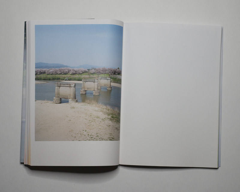
The alternative route is to let photographs do their job, realizing that what they will add up to is ultimately left to the viewer. This approach was pursued by Miki Soejima in The Passenger’s Present. I always tell students that one should make photographs or books for a sufficiently attentive audience, an audience, in other words, that will spend some time with the work without wanting to be presented with immediate satisfaction (for that they’ll always have the art-editorial work). This book could serve as a good example of what can happen when one does indeed spend some time.
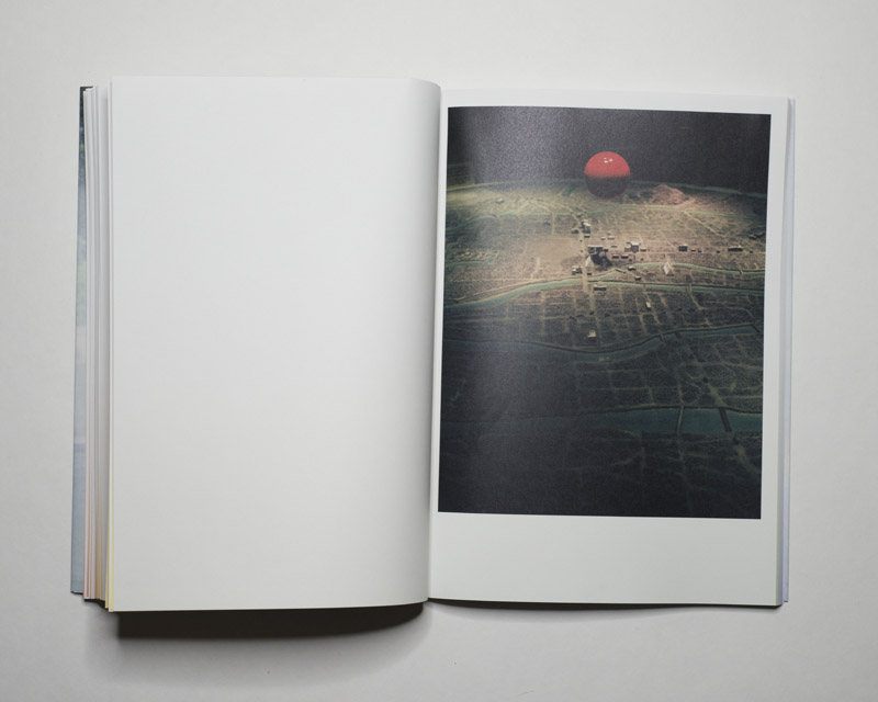
Just to give one example, the second photograph in the book shows two red spheres in a rather minimal still life. Anyone not living under a rock might connect these red spheres with the flag of Japan, in which the red circle represents the sun. There are, of course, no two suns. But a few images later, there is another such red sphere hovering curiously over what looks like a diorama of a destroyed city. There probably is no need to spell out what this means. The very last photograph in the book then shows a cluster of very bright red flowers against an otherwise somewhat dreary background, setting what could be seen as a counterpoint to the other two images.

There is a lot more symbolism being used throughout the book, some of it in straight photographs, some in constructed still lifes. What this all adds up to in the end is not all that clear — but I think that’s exactly the point. After all, if it were a photographer’s task to provide solutions (or, possibly, solace) then she might as well put down the camera and become a politician (or therapist).

So what Soejima does with the book is to express her conflicted feelings about Japan — at least that’s how I see this. And that’s more than enough for me. After all, it’s now up to me as a viewer to imagine myself in that situation, or to maybe think back to my first trip to the country to think about what I possibly sensed, or to think about my own native country to consider my own misgivings about it.

Much like many contemporary photobooks The Passenger’s Present thus presents a riddle, and the viewer’s enjoyment derives from being presented with that riddle — and not its solution.

The Passenger’s Present; photographs by Miki Soejima; 128 (pouch) pages; Fw:Books; 2018

Rating: Photography 3.5, Book Concept 3.0, Edit 3.0, Production 4.0 – Overall 3.4

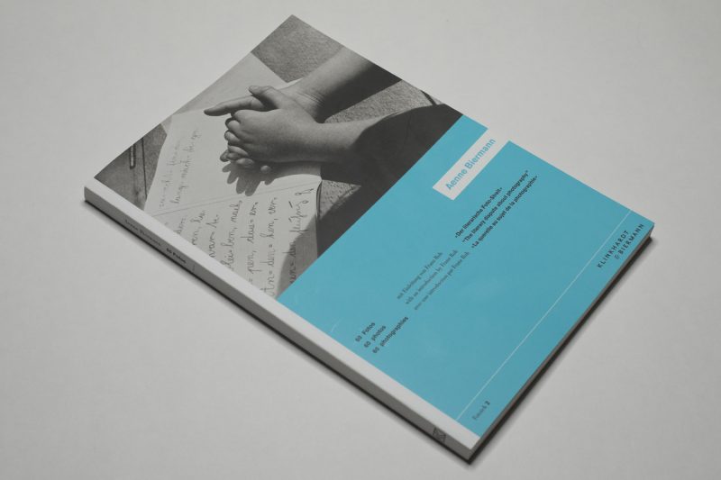
Aenne Biermann’s 60 Fotos

Article main image

The Weimar Republic coincided with one of photography’s few major inflection points. As a consequence, no other location propelled photography forward quite as much as Germany during its ill-fated attempt to establish a democratic society. The Bauhaus whose 100th birthday is being celebrated this year provided a large section of the laboratory in which photographers worked on expanding what pictures might look like and what could be done with them.

But of course, there were other non-Bauhaus affiliated artists such as, famously, August Sander or Karl Blossfeldt both of whose main ideas originated in 19th Century thinking but who allowed themselves to see the potential of their work truly blossom. For a variety of reasons, Aenne Biermann is a lot less well known. To begin with, after a period of less than ten years of intense photographic activity, the photographer died in 1933 at age 34. Large parts of her work — prints and negatives alike — are considered lost: the family was Jewish, and her widower was unable to save anything other than bare necessities when emigrating.

An autodidact, Biermann is considered part of the New Objectivity movement, even though as Hans-Michael Koetzle points out in his afterword to the newly reissued 60 Fotos, this label for sure is somewhat debatable (much like most labels are). While the hallmarks of New Objectivity are present, so are photographic approaches that are a lot less cerebral and a lot more felt, such as in the photographs she took of her two children.

This book was supposed to be a part of a much larger series of books entitled Fototek, devised and partly realized by Franz Roh and Jan Tschichold, the former an art historian and journalist, the latter one of the most important graphic designers of the 20th Century. There is an ad in the book that lists of eight existing and planned books. The first one, also entitled 60 Fotos and produced by László Moholy-Nagy, has become famous. The six other books never appeared, which is a real pity. El Lissitzky‘s 60 Fotos (book number six) would have been marvelous, as would have been book number 3 entitled The Monstrous (dealing with the idea of kitsch in photography).

Biermann’s 60 Fotos follows Moholy-Nagy’s in style and spirit, offering 30 pairs of photographs, many with a pithy caption added (in German, English, and French). Unlike in the Hungarian Bauhaus teacher’s case, the focus is solely on straight photography. There are no photograms or collages. In addition, perhaps not surprisingly Biermann’s book is a lot less didactic than Moholy-Nagy’s, a lot less cerebral.

In the world of contemporary photography, pairings of pictures are often produced in so-called conversations between two separate photographers. There, more often than not the pairings are based on a “this looks like that” or a “this is that” approach. Both 60 Fotos books push this rather simplistic idea further, by offering unexpected pairings. This is where things get interesting and enlightening. For example, pictures 21 and 22 are both called “Fried Egg”, but only 21 shows an actual fried egg in a pan. Twenty two shows the face of a jolly looking man with a rather round face. Even without the captions, the effect is striking and also quite silly.

There are many other pairings that have much to offer. Pictures 51 and 52 show a close-up portrait of a woman and a man, respectively, who each look into the camera as if they were facing a lover. Ten images before, a very New Objectivity still life of three apples is paired with the portrait of a woman wearing a monocle. Many of the photographs show microscopic close ups of minerals — in the late 1920s, Biermann had been tasked with making such pictures by a geologist.

It is heartbreaking to imagine the what ifs. What if this artist hadn’t died so young from a liver disease? What if so much of her work hadn’t been lost as a consequence of her husband’s forced emigration? What if…. To imagine that the pantheon of 20th Century German photography would now feature Aenne Biermann besides August Sander and the various other men… Maybe the reissue of 60 Fotos can help to at least remind the world of photography of this singular talent whose work can easily hold its own next to, say, Albert Renger-Patzsch’s.

Highly recommended.

60 Fotos; photographs by Aenne Biermann; essays by Franz Roh (from the original edition) and Hans-Michael Koetzle (for the reissue); 104 pages; Klinkhardt & Biermann; 2019

Pure Country

Article main image

Chances are that what you, the reader, are viewing on your screen is going to look ever slightly so different than what is offered by mine: the colours will differ, given that in all likelihood none of the various screens involved will in any way be calibrated. On top of that, colours shift even further as colour spaces tend to often be squashed and ignored. Don’t believe me? How about this:

Some time in 2016, I went to Google Image Search, typed in “Eggleston Red Ceiling” as search terms and looked at the resulting grid of images. I took a screenshot, and I then proceeded to average out each individual version of the very same picture in Photoshop. The original photograph is mostly red, of course, but the presence of other colours shifts things a little bit towards Bordeaux red. The above shows you these 25 average colours of what in principle should be the same image. And it is the same image, yet it’s also not — some versions found online are redder than others (there are also slight variations of aspect ratios).

Would the proper version of Eggleston’s red-ceiling picture please make itself known?

Well, what exactly *is* the proper version, given in print it looks different than on the wall (different print processes), let alone, as we’ve just seen online?

A few years ago, Steidl released expanded versions of various Eggleston books. I own a set of Democratic Forest (see it reviewed here and here). I also own the original one-volume version that came out at the end of the 1980s. If you put them right next to each other, which I’ve done when teaching, the same image will look drastically different. The 1989 version will look like what you’d expect such an image to look like, given the printing techniques of the time and given what people back then thought a good colour photograph might look like. The 2016 version looks like what you’d imagine the world looks like when you’re on mind-altering drugs. What are we going to make of that?

Maybe it all comes down to the fact that there really isn’t such a thing as the world in colour. There’s just what you make it look like, plus there are basic facts such as women being able to see more colours than men.

In fact, what colours ought to look like isn’t so clear any longer in photography, or maybe I should say it never was. If there’s one agreement then it is that any resulting photograph should be more than monochromatic, but that’s about it. I mean compare Eggleston’s colours (pick any) with, let’s say, JH Engström’s, then look at Hellen van Meene’s, then at Alex Prager’s… It’s all colour, yet all of these four types of worlds look radically different in terms of how colour is rendered.

Bill Sullivan‘s Pure Country makes these considerations its center point. As a start-off point, Sullivan picked the early colour photographs produced by Russian artist Sergey Prokudin-Gorskii (which I’m sure you’ve seen, because roughly every five years, they become “rediscovered” by some larger photo or cultural website as clickbait). For these images, Prokudin-Gorskii produced a set of monochromatic base colour images, which, once combined, will yield a “full-colour” image. With early colour photography like this (there also are autochromes) the game usually revolves around doing the combinations as faithfully as possible, which is a neat idea but which of course for the various reasons listed above will only take you so far.

So Sullivan decided to unleash his own ideas of what can be done with these photographs, producing an assortment of images that throw away the idea of faithful colour, to, instead, focus on the artifice of human-made colour images. Throwing in a lot of completely unrelated imagery and visual art, the book then arrives at a visual smorgasbord that teaches the viewer about printed colour on the sly. At times, I was reminded of Fake Flowers in Full Colour by Hans Gremmen and Jaap Scheeren, which, however, started out from scratch — using white plastic flowers and C, M, Y, and K spray paints (plus some very basic Photoshopping).

If my description sounds at all as if these two books are pointless and tedious (like so much of the New Formalism craze that now thankfully is on its way out), then that’s really not the case. They’re fun, smart, and engaging. Pure Country comes with a multi-page index that discusses colour theories and the production of colour imagery in detail, and even that part is fun and engaging.

At the time of this writing, the publisher’s website says the book is “back ordered,” asking for interested viewers to check in for availability updates. For sure, I hope the book becomes available again.

Pure Country; images by Bill Sullivan, Sergey Prokudin-Gorskii, and others; text by Bill Sullivan; 296 pages; Sun; 2018

(not rated)

Book Reviews W15/2019

Article main image

With Spain having established itself as the newest powerhouse of photobook making, it might be Poland’s turn next. I’ve noticed how over the past few years there have been more and more books coming out of the Central European country, with cutting-edge book design having spread beyond the Sputnik Collective. This is a most welcome development and the richness of photobook publishing in these and other countries makes it an obvious statement to say that Europe is at the forefront of the medium — certainly as far as contemporary productions are concerned.

Łukasz Rusznica‘s Subterranean River reached me shortly after my first trip to Japan. With my impressions being so fresh, I was unable to approach it on its own terms for a while. For sure, I thought — and still think — that the photographer got enarmored with some of the very same things I noted there. I found Japanese cities to be thoroughly unphotographic at first: it’s almost as if they resist being photographed, which might just reflect some of their society’s underlying culture. But eventually, there will be an opening through which one can approach what is on view.

In Rusznica’s case, the opening was provided by the country’s folk legends, which tie in with many religious aspects, and which were indeed also the subject of Japanese photographers’ work (think Eiko Hosoe’s Kamaitachi or Daidō Moriyama’s Tales of Tono). I’m personally not opposed to appropriating a culture’s folks legends as an outsider, but obviously your mileage might vary.

Whether you’ve read any of Haruki Murakami’s novels that contain portals to a parallel world right in the middle of ours or simply watched any of the Yokai Monster movies, the basic idea might be pretty clear, and Subterranean River dives into it in part through its monochromatic blood-red middle section filled with a variety of staged portraits. (As an aside, I’d pick the movies, given I find the writer’s output way too calculated and pretend-cool. Again, your mileage might vary, but you might want to read this fantastic essay on the Murakami Effect.)

There are nods to other artists here and there, and maybe some of the visual effects are a little much — the inverted colour images are both conceptually and visually a bit too obvious. Still, it’s a thoroughly engaging book and a very beautiful production indeed.

Subterranean River; photographs by Łukasz Rusznica; text by Olga Drenda; 120 pages; Fundacja Sztuk Wizualnych, Palm Studios; 2018

Rating: Photography 4.0, Book Concept 3.0, Edit 3.0, Production 4.0 – Overall 3.6

I suspect that if you looked at Lynn Alleva Lilley‘s Tender Mint you would figure out the rough location where it’s photographed somewhat easily. And maybe inevitably that location will set off all kinds of thoughts or ideas in your head — how could it not? Aren’t we conditioned to view what we call the Middle East in very specific, biased ways?

But this is a different Middle East. Almost exactly in the center of the book, halfway through, there’s a photograph that shows a monkey clinging tightly to her baby. The two are easy to miss, given they don’t take up much space in the frame. But once discovered the pair forms a magnetic focal point. Elsewhere, in a short piece of text next to a photograph, the narrator (who we must assume is the photographer) describes an encounter with a donkey. “There we were,” she writes, “in this imperfect sanctuary with only ourselves as witnesses to this unexpected communication.”

One might wonder how we, as humans, will ever treat ourselves with more dignity and compassion when our relationship to the living world at large is one of exploitation and murder, where animals are slaughtered willy-nilly so they can be eaten or simply just because some people are entitled pricks lacking an inner life. Tender Mint amplifies this question by blending portraits of people with those of zoo animals, adding quiet photographs of seemingly meaningless moments.

What are we doing to each other? How are we relating to each other? Could there be a different, better way? In and with this very meditative book, Lilley asks its viewers to discard the many preconceived ideas we tend to put on the world, to engage anew with it: differently. Otherwise, every day will just be another day along the lines of I read the news today, oh boy.

Tender Mint; photographs by Lynn Alleva Lilley; text by Lynn Alleva Lilley; poems by Samih al Qasim, Jane Hirshfield; 144 pages; The Eriskay Connection; 2017

Rating: Photography 3.5, Book Concept 3.0, Edit 3.0, Production 3.5 – Overall 3.3

Terje Abusdal‘s Slash & Burn tells the story of a group of Scandinavians called Forest Finns, a recognized minority group in Norway. The book, the colophon informs the curious reader, was “developed in the 2016 photobook-masterclass by Yumi Goto, Sandra van der Doelen and Teun van der Heijden”.  I had an inkling while looking at it. I’ve seen quite a few books made there (whether in 2016 or at another time), and they somehow all resemble each other. Specifically, they mix up a wide variety of source materials to create what we might consider the current default of narrative-photobook making.

Where it works, it works very well. But I personally would caution against using the same formula for every book, because the risk is that the viewer will be looking more at the formula than at the actual work in question. And I found myself doing that here. There is what comes across as a randomness to some of the decisions the trio applied to the work, and some of the design decisions feel as if they were done merely to create unnecessary ornamentation. That’s too bad.

After all, the underlying body of work is very interesting. Abusdal has more than enough very good pictures that maybe ten years ago would have made a very good Hatje Cantz book (that’s before that publisher appears to have changed out their whole staff to arrive at whatever it is they’re doing now): something a lot more conventional. It’s not that I suddenly developed a craving for more conventional books. It’s just that I don’t want to look at what essentially come across as random design decisions. After all, the goal of any photobook maker should be to make the simplest possible book and not chase after the latest trends.

Slash & Burn; photographs by Terje Abusdal; texts by Aaron Schuman, Birger Nesholden, Terje Abusdal; 180 pages; Kehrer; 2018

Rating: Photography 3.5, Book Concept 1.0, Edit 2.0, Production 3.0 – Overall 2.5