Article main image

I try not to despair over the state of the world right now, but the world is making it awfully hard. Some of the most vulnerable people on this planet, those feeling persecution or war or enormous economic hardships: refugees and migrants, have now become pawns in political games, used for power games. This fact ought to be acknowledged as maybe the defining shameful moment of these times. History, of course, offers its precedents, and yet again those of us who are aware of its lessons are made to live with the added despair of that knowledge.

I certainly never thought I would live to see the day where one of the richest countries in the world would set up concentration camps for migrant children who were forcibly separated from their parents. But this is indeed what happened. If the use of that term offends you, here’s what Andrea Pitzer, author of One Long Night: A Global History of Concentration Camps, wrote: “I will continue to use ‘concentration camp’ for any internment of families clearly designed to punish them through indefinite detention, whether children and parents are together or apart. […] Civilians sit confined like dangerous criminals, corralled in pens or cages like animals, all due to policies (not laws) that place asylum-seekers outside the normal legal process. It is clear that this was planned months ago to punish a vilified minority.” (my emphasis)

Despite traveling quite a bit over the past four weeks, of course I became aware of a picture John Moore took showing a crying migrant toddler (see a lot more of his work in context here). It pains me to look at that picture, but certainly that’s the least I — or anyone else — could do from their own point of privilege: to feel that pain, which is nothing compared with what this young girl and her fellow migrants are actually going through.

And then Time Magazine (of course!) needed to make use of the picture, producing an illustration for their cover: “A reckoning after Trump’s border separation policy: What kind of country are we?” “But how far are we willing to go to let a 2-year old girl be the symbol of a national crisis?”, asked Kainaz Amaria, adding: “Photojournalism, and journalism broadly, has always been intrinsically tied to the bottom line.” The road to the bottom line, we might realize, can be paved with good intentions, but it’s still the road to the bottom line (please excuse the clunky metaphor).

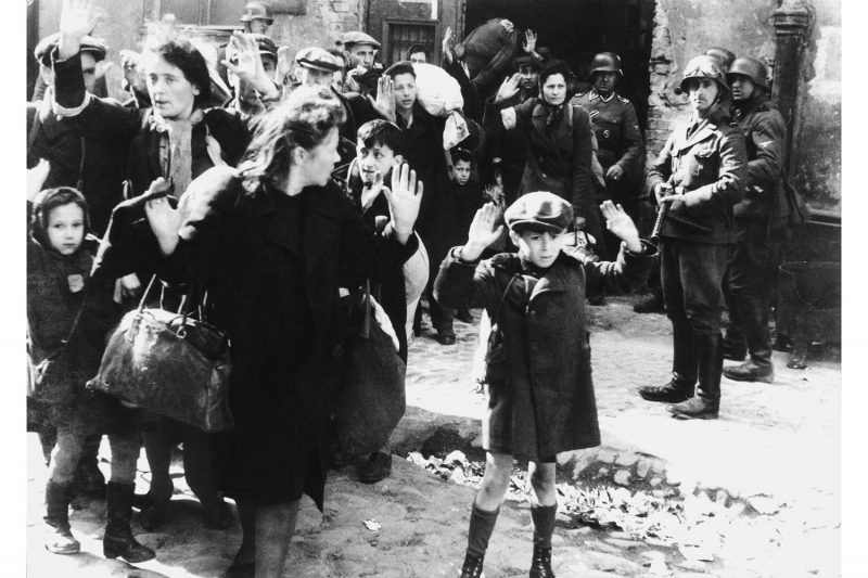
Thinking about the larger world of photography and in particular about photographs, it dawned on me that it really are only photographs of children in their most vulnerable state that still manage to shake the world’s conscience, for however fleeting a moment. Beyond the photograph of the crying toddler, there recently have been the dazed Syrian boy pulled from rubble sitting in an ambulance, the dead Kurdish toddler (Alan Kurdi) at a Turkish beach, or the screaming, blood-soaked Iraqi child (Samar Hassan) whose parents had just been killed. Go further back in time, and you’ll find a lot more, whether it’s Nick Ut’s famous Vietnam War photograph, or the image you see at the top, taken when the Warsaw Ghetto was eliminated.

It gives me some consolation that photography is not entirely powerless in this world, that there can indeed be photographs that rattle people enough to demand some change, however fleeting those moments might actually be. At the same time, it seems the only pictures left to do that are of the most vulnerable members of humanity, children, usually depicted as the most vulnerable members of an already vulnerable population, whether it’s migrants, civilians in a war zone…

I don’t know what we can do to get to a place where collectively we care more about each other to be moved by all pictures of hardship, not just the one inflicted upon children. What I do know, though, is that even as these times seemingly are out of control, with the worst human impulses now coming out and being enacted in our very midst, we might want to pause (those of us who care anyway), to collect our thoughts, to not feed more into the seemingly endless feedback loop of anger and resentment, and to think about how we can do better.

The pictures are there to show us the consequences of the many injustices in the world. The fact that they’re still happening — that’s not on the photographs (or photographers).

That’s on us.

About those ratings…

Article main image

In 2014, I added ratings to my photobook reviews. Ratings are very common for, let’s say, reviews of movies, music, or books. But in the world of photography they were and still are not very common at all. I was aware of the possible pitfall of people scrolling down to the rating without reading the review. But then, the rating I came up with has four components. So even if someone doesn’t read the review text, they still will get some idea of what it might say based on those numbers.

Whatever you, as the reader, might make of the ratings, for sure they have changed the way I approach photobooks. In fact, they have made me look more carefully, and they have also created a more level playing field. While the details of the ratings could be discussed — I thought about refining them until I realized that there would never be such a thing as perfect ratings, their structure forces me to look at every book in the same way.

It would seem that that’s what critics should do, look at everything in the same, dispassionate way. Maybe there are critics who can effortlessly do that. But this particular critic is a human being, and as such I have my moods, my preferences, my stereotypes, in other words my all-too-human failings that interfere with what I do as much as they can.

The ratings pull me back to looking at aspects that I should be looking at, however I initially approach a book. Quite often, they have made me engage with a book differently, often, but not always, changing the review itself. So I feel that the ratings have made me a better critic. Whether or not this is something you, as a reader, have noticed I have no way of knowing. But I hope so.

I left the sciences a decade ago, but there’s enough of a scientist in me to wonder whether some of the more basic ideas that went into the ratings have actually played out. At the time of this writing (June 4th, 2018), there are 185 book reviews with ratings on this site. That’s enough books to look at some statistics. With the help of some basic spread-sheet software, I tallied the ratings — you can see the graph above.

What you see is a distribution that more or less follows a bell curve, which peaks somewhere around 3.5 or 3.6 maybe (actually, a log-normal distribution might be a better fit, but I’m not going to geek out on this idea). The former scientist in me thinks that this might support the general idea I started out with: average books should be most common and lousy or great ones rare. If, however, you take the ratings completely seriously you’d expect the peak to center on exactly 3.0. Why is the peak shifted to higher numbers? Also, the distribution isn’t really fully symmetric — it falls more rapidly towards lower numbers than towards higher ones. Why is that?

I think the reason is simple and pretty obvious. It’s no secret that every year, many new photobooks are being published. A lot of them are very good, a lot of them are very bad. Reviewing a bad book gives me no pleasure, so in many cases I simply don’t do it (I’d like to think that the fact that photoland has problems with negative reviews does not enter into my thinking). In particular, if a not very well known photographer publishes a book I really don’t like I prefer not to review it instead of potentially hurting their career.

In addition, I have my preferences of what I look at; and while I’m trying to move beyond that when reviewing books, there still are certain books that I simply don’t review because I’m not interested in them. I think it’s the combination of those two factors that produces the peak at a higher number (around 3.5 or 3.6) than the theoretical average (3.0).

Given the above, I’ll keep with my ratings. They might not be perfect, but for sure they help me as a critic. And in their entirety, they reflect my thinking around photobooks.  So now onto the next 185 photobooks (and beyond)…


Two Times Twelve Million Black Voices

Article main image

I don’t remember how or where I first came across the book 12 Million Black Voices by Richard Wright and Edwin Rosskam. From the brief description I had read the book sounded not just interesting but also relevant for various aspects of what I do (writing as well as teaching). So I went out to look for a copy of the original 1941 hardcover, which turned out to be relatively straightforward to find (there are more recent reissues). Given the times we live in — the occupant of the White House is a two-bit reality TV star who more or less openly expresses racist sentiments regularly — the book has lost none of its original relevance. It’s a blistering account of the African-American experience in the country. 

That there exists a German-language translation I became aware of just recently through one of the contributions in the excellent The Form Of The Book Book (that’s no typo). Jenny Eneqvist, Roland Früh, and Corina Neuenschwander’s essay 1946, 1947, 1948: The Most Beautiful Swiss Books in Retrospect looks at selections made by various experts, among them Wir Neger in Amerika. The book was published in Switzerland in 1948, and it was designed by Richard Lohse. I wouldn’t have paid much attention to the book, had it not been for the fact that here, the design was stressed so much. The same book, translated, but with different design? Obviously, I had to get a copy (found a nice former library one).

As a quick side note, whatever you want to say about the way books were and are made, once you’ve seen the beauty of gravure printing there’s just no way you’ll enjoy the finest printing available today as much. The printing in these books is roughly comparable (see the pictures for slight differences in the tones; note that the original book is placed at the top when both books are shown). But the Swiss book offers a bit more detail in the photographs, making it one of the finest gravure printed books I own.

I never spent time looking at the “same” book in different translations. In fact, I had always assumed they’d translate the text and leave the rest, including the design. Apparently, that’s not always the case. What’s particularly interesting is the fact that the Swiss design is at times vastly different. Lohse re-arranged the photographs completely. It’s still the same book, but the way the two books use their visuals to support the text is quite different (the narration of the book is carried by the text, with the photographs playing a supporting role).

I think a good and simple way to summarize the use of images in 12 Million Black Voices would be to say that it mostly adheres to the picture-magazine model, where a combination of captions and image pairings is designed to drive the various points home. In contrast, in Wir Neger in Amerika this device is used only rarely. Instead, more often than not, images are left to either stand on their own, or they’re juxtaposed without any text. In the two images above you can see the Swiss layout (which does indeed look very Swiss) plus two of the spreads in the US edition from which the bottom pictures were taken.

A spread from the US edition, with its picture-magazine style combination of text plus captions, exemplifies how photographs are employed to visually support the text.

In contrast, (in an unrelated spread) the Swiss edition uses no text and relies on the photographs themselves — in the US edition, this spread exists exactly in this form, but there are captions under both images.

Lohse even went so far as to produce spreads like the one above, which moves way beyond the layout in the US edition.

The role of design in photobook making all too often is either ignored or treated as some minor aspect. But design actually can play a major role in how a story is being told. In this particular case, the same story is being told in two slightly different ways. While the writing carries the bulk of the weight of the narration in both books, the photographs are used in different ways. I personally don’t think that one is better than the other.

In fact, what these two versions of the same book might demonstrate is that in order to make a photobook, the key is not to come up with the best possible realization of all possibilities — how would you even be able to find it? Instead, it comes down to picking a realization and to then producing the best possible outcome. Clearly, the makers of both 12 Million Black Voices and Wir Neger in Amerika had exactly that in mind.


Rayon Vert

Article main image

Of late, the idea of the female gaze — as opposed to the male gaze — has been gaining traction. The concept of the male gaze was introduced in 1975 by Laura Mulvey in her essay Visual Pleasure and Narrative Cinema. Its core idea is that of a man looking at a woman and of the female body being objectified in such ways that men are empowered: women are being treated as objects of male (predatorial) desire. That type of looking at women is made the dominant visual approach for everybody, men and women alike.

Part of the reason why I prefer thinking about the male gaze this way is not only because it kills the whataboutism that inevitably will be produced by many male photographers (“But what about [female photographer]’s work?”), it also focuses on the aspect of the skewed power dynamics involved.

For me, this aspect of power is crucial in a variety of ways. To begin with, I don’t subscribe to the idea that any group of people ought to have power over other people for reasons other than possibly democratic (and thus correctable) ones.

Furthermore, the idea of a dominant way of looking defeats one of the core ideas of art, namely of allowing a viewer to experience the world in a way s/he might not have considered before. If, in other words, as a man I only get to the see the world through the eyes of other men (the male gaze), then what is the point of looking at all? Having lived on this planet for decades I know quite well what that looks like. I personally don’t need to have my ideas of what the world looks like confirmed. Instead, I want art to challenge me, making me see the world in ways that I’m unfamiliar with. How else would I be able to learn something about myself and others?

Consequently, I do believe that men — and not just women — should have an interest in getting the male gaze challenged and punctured: it’s not just that the visual oppression of women — some of whom might be our mothers, sisters, daughters, partners, etc. — should be unacceptable to us. It’s also that the male gaze stands in the way of art reaching its full potential.

As I noted above, thankfully counter models are now being produced more and more, allowing our collective visual vocabulary to expand while helping shift the still very skewed power dynamics between the sexes. One of the most impressive and captivating recent examples is Senta Simond‘s Rayon Vert, a collection of portraits of young women.

What makes these photographs so thrilling is the sheer variety of approaches used by the artist. For each model, considerable work appears to have gone into figuring out how to portray her. Poses vary considerably, as do the angles with which the women were approached. There are colour pictures and black and white ones, there are tight crops and wide ones — in the hands of a less gifted photographer, this variety would have been a recipe for disaster. But Simond made it work. It’s very impressive.

What is more, the form of book itself helps elevate the work even further. There are blank spreads between the portraits plus slight variations in image placements and sizes. As a result, the viewer has no choice but to see each photograph on its own terms. It’s no gallery of portraits that invites possible comparisons. Instead, it’s a collection of individual portraits that, however, powerfully add up to a larger whole: here is part of the world beyond the male gaze, and it’s magical.

Highly recommended.

Rayon Vert; photographs by Senta Simond; 100 pages; Kominek Bücher; 2018

Rating: Photography 5.0, Book Concept 5.0, Edit 5.0, Production 5.0 – Overall 5.0