Towards a Photobook Taxonomy

Article main image

There are many studies of photobooks that attempt to describe this particular medium. Many of them concern themselves with producing larger histories, whether general or location specific ones. In the seminal books by Martin Parr and Gerry Badger, the study divides into historical parts, geographical ones, and then there are various chapters devoted to particular types of books, such as, for example, “protest books.” There are, in other words, various ways of looking at what photobooks are or do, and studying that can be enormously insightful for anyone interested in the medium.

If you come from the other end, from the position of someone attempting to make a photobook, the utility of these aforementioned studies is great. But it is also limited. Knowing who and what came before you and your book is a necessary ingredient to be able to make one. However, there always is the struggle of having to give the material at hand its proper shape. As I laid out in Understanding Photobooks, that shape ought to be driven by the material: the photographs and, possibly, text. How do you go about that, though? Frequently, photographers pick a book they like or a book that they feel is relevant, to have it serve as a template. This approach works, as long as you’re able to find such a template. But maybe there’s another way?

It might be the former scientist in me that had me think about the need of a photobook taxonomy. Such a taxonomy would divide books into different categories not based on what countries they come from, when they were made, or what subject matter they deal with, but instead on a very basic level, how the books operate, how, in other words, the story is being told (and here I mean the word “story” in the loosest possible sense). The other day, I finally decided to attempt to create such a taxonomy, which I want to present below.

I need to point out that this following taxonomy is very much a work in progress that will require further refinement. In other words, I do not consider it as final. My hope is that looking at photobooks this way, further insight into them might be gained. What is more, I hope that such a taxonomy will especially help aspiring photobook makers. If you find something missing, something to be corrected or refined, please be in touch. I will be more than happy to improve and update the following list.

Catalog
A catalog is a structured presentation of one or more than one bodies of work for documentation purposes usually at the occasion of an exhibition. Often included is critical and/or academic writing by experts. The catalog is typically underwritten by the exhibition venue.
Example: Thomas Ruff (Whitechapel Gallery)

Monograph
A monograph is a presentation of a body of work (rarely more than one) to present the photographs in question. Included writing (where present) need not be critical or academic and often serves to enhance (talk up) the photography. The monograph is now commonly at least in part (if not fully) financed by the artist.
Examples: Sze-Tsung Leong – Horizons; Carla van de Puttelaar – Adornments; Gerry Johansson – Deutschland

Journalistic
Often but not always heavily reliant on text, the journalistic photobook is topic based and relies on conventions from the world of journalism, whether strictly or loosely. The books that fall into this larger group of books can be divided into the following subgroups. Here, these subgroups are clearly distinct, in part because of the different approaches used (which includes differences in how strictly journalistic ideas, in particular an adherence to an objective truth, are being followed).

Photojournalistic
As its name indicates, the photojournalistic book originates in the world of photojournalism. It strictly follows the rules of the profession, and it relies heavily on storytelling devices that were established during what we could call the golden age of the photojournalistic story (LIFE Magazine etc.): text is loosely tied to photographs through a reliance on factual captions, while other, often larger, blocks of text establish context and provide background information that is not accessible through pictures. Concerning both the text and pictures, as much factual information as possible is provided to the reader/viewer, while ambiguity (where present at all) is minimized.
Example: W. Eugene Smith/Aileen M. Smith – Minamata

Documentary
The documentary book follows the conventions of the larger world of the documentary (which includes photography as much as the world of writing or film making). It relies on many established storytelling devices, but documentary photobook makers often attempt to push the boundaries of how stories can be told. Text plays a major role, but its interaction with the photographs isn’t quite as limited as in the case of the photojournalistic book. Both text and pictures acknowledge the possibility of uncertainty, something unknown or unknowable, something ambiguous. Unlike in the case of the photojournalistic book, the idea of an absolute truth is at least questioned, if not outright (implicitly) denied. Often, the text is written by a separate author.
Examples: Rob Hornstra – Man Next Door; The Sochi Project – An Atlas of War and Tourism in the Caucasus

Investigative/Research Based
The investigative/research-based photobook is closely related to the documentary kind, so most of the descriptions above applies here as well. In addition, research and factual background information play a major role. Consequently, at least some of the photography adheres to conventions outside of photography in the documentary mode (this often applies in similar ways for part of the text). Of late, the use of archival materials has become prominent. What is more, some of the photographs might be made to mimic conventions used in scientific or institutional settings.
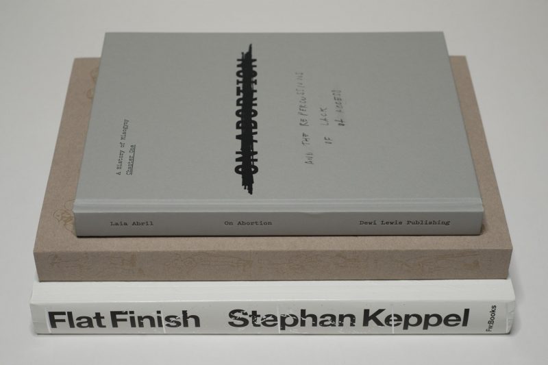
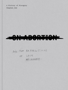
Example: Laia Abril – On Abortion

Encyclopedic
The encyclopedic photobook largely relies on academic and/or institutional conventions, with both photography and text (where present) being very matter of fact, while the subject matter might be outside of academic/institutional interests.
Example: Taryn Simon – An American Index of the Hidden and Unfamiliar

Lyrical
In lyrical photobooks, it is photographs that do the work. Text might be present, but it is kept at a minimum (there might be a longer essay by a writer included, but such text is clearly separate from the photography part). Where text is used, the text often functions in the same way as the photographs: adding an element of written mystery. Lyrical photobooks divide into four different types, with some overlap between them. In other words, the distinctions between the types is not overly strict, and a book might be seen as using elements of two types.

Poetic
The poetic photobook is furthest away from a larger idea of story. There is no story. Instead, there are facets of a story that add up to – pardon the pun – a larger picture. In a sense, the poetic photobook is quite close to the monograph. However, where the monograph truly centers on individual pictures that only in a critical or interpretative sense deal with a larger topic or story, the poetic photobook offers one itself, however fuzzy it might present itself to be. Photographs aren’t poems, and they also don’t operate like ones. But the poetic photobook comes closest to what in the world of written literature the poem would be.
Example: Rinko Kawauichi – Illuminance

Elliptical
Elliptical storytelling involves omitting or withholding part of the events or aspects so that the viewer (or reader) will fill in the gaps. The gaps thus are not gaps in a literal sense (that would make the viewer stumble). Instead, the narrator relies on the viewer being able to provide the content, thus possibly allowing for narrative ambiguity. Due to its very nature, one could argue that photography will always lead to elliptical storytelling. In the case of photobooks, however, there are various models that minimize, if not outright eliminate and/or avoid, gaps in the narration, whether in this or any of the other groups (using, for example, text). In an elliptical photobook, the key is that the overall story does not unfold linearly. Instead, much like when in the presence of fireflies on a late-summer evening, the viewer will be presented with brief flashes at seemingly random locations: the story is fully unfolded only at the end. To make the viewer’s job easier, typically there are interlocking visual symbols that strongly suggest connections between at first seemingly unrelated photographs.
Examples: Kikuji Kawada – The Map; J Carrier – Elementary Calculus; Michael Schmidt – Waffenruhe

Linear
The linear lyrical photobook combines elements of the poetic and elliptical photobook. But it’s strongly reliant on the sequence of its photographs. That sequence can be used to tie the whole set of pictures together, or it can exist in distinct chapters (which might exist only in visual form, lacking clear – textual – delineators). This is not to say that sequence plays no role in, say, the elliptical photobook. But there, it only serves to guide the viewer very loosely (preventing the gaps from getting too large to cross). Here, the sequence does a large part of the job: the story is told through the linear sequence of photographs, with one picture clearly leading to the next. The linear photobook can thus be decoded most easily by looking at its sequence.
Examples: Robert Frank – The Americans; Walker Evans – American Photographs; Trent Parke – Minutes to Midnight

Stream of consciousness
A stream-of-consciousness photobook essentially is a linear lyrical photobook with the larger idea of story removed. Another way to describe it would be to say that it’s strictly sequential, with the end result being a lot closer to what one might encounter in the poetic book.
Example: Jason Fulford – Raising Frogs For $$$

Narrative Driven
Narrative-driven photobooks do away with the restrictions used in the lyrical photobook group. Often, text becomes an integral part of telling a story, much like in the case of books in the journalistic group. In some ways, journalistic and narrative photobooks relate to each other like nonfiction and fiction: one is concerned with reality as is (or as perceived), the other one with a reality created without there necessarily being a truthful equivalent being in the world. The use of text in narrative-driven photobooks is not tied to strict conventions as in journalistic photobooks. At the same time, unlike in the case of lyrical photobooks where text (if present) functions like the photographs, here text operates more like a complement to the pictures. Text and pictures are not treated as very distinct entities (a group of strangers sitting on a train) but instead as interlocking and supporting elements (a family sitting around a dinner table).

Photonovel
The photonovel is a very simple and somewhat old-fashioned way of telling stories with pictures. It is related to the photojournalistic essay, except that its content tends to be fictional. There often are recurring characters and locations, and it is often largely the text’s role to carry or contribute to the narration of the story.
Example: Ed van der Elsken – Love on the Left Bank

Linear
The linear narrative-driven photobook is related to the linear lyrical one. With the focus being on narration, the sequence serves to tell the story, which more often than not is event based. Lyrical photobooks do not contain event-based photographs or, more precisely, photographs that stand for very specific events in a chain that builds a story. Usually, the opposite is the case here. What is more, it is not uncommon for the sequence to follow a series of events in time and/or space. This does not mean that the sequence cannot be interrupted. But much like a flashback in a movie, the overall logic of the larger sequence of events has to remain in place (unlike in lyrical photobooks, where such a structure is absent).
Examples: Joshua Lutz – Hesitating Beauty; Sophie Calle – Suite Vénitienne

Elliptical
The elliptical narrative-driven photobook is related to the elliptical lyrical one. But just like in the case of the linear narrative-driven book, the focus is on telling a specific story, which more often than not is event based. Using an elliptical approach, one in which parts of the story are being withheld to be filled in by the viewer, is motivated by the same ideas and concerns as in other forms of elliptical storytelling.
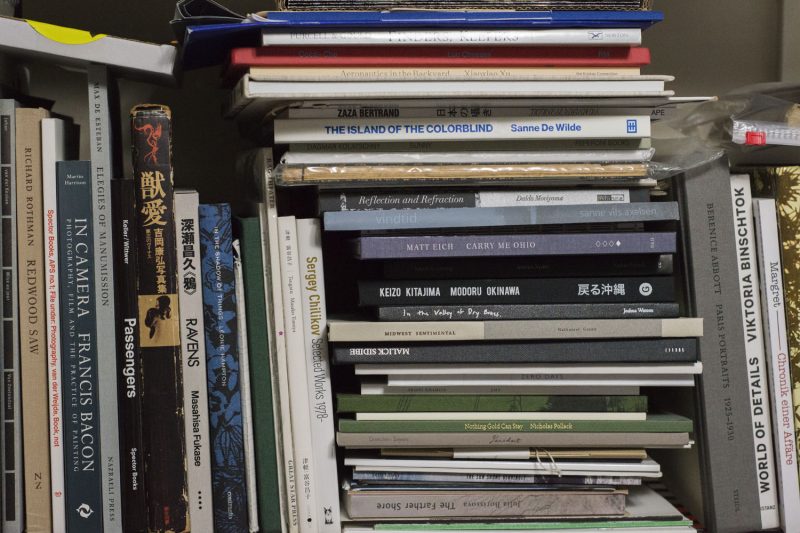
Example: Sanne de Wilde – The Island of the Colorblind

Subjective Documentary
The subjective-documentary narrative-driven photobook is a variant of the documentary-journalistic that does not strictly adhere to journalistic conventions, but that doesn’t do away with them completely, either. Where in the journalistic documentary photobook the overall larger truth is the driving force (while subjective considerations are allowed to remain within reason), here it is the author’s (while larger considerations are still being acknowledged). Text plays a major role in telling the story.
Examples: Christian van der Kooy – Anastasiia (She folds her memories like a parachute); Nicholas Muellner – In Most Tides An Island

First-Person Narration
The first-person narration is a variant of the subjective-documentary book, with all considerations of a larger truth removed, to focus solely on the author’s voice, with text playing an large role.
Examples: Michael Schmelling – My Blank Pages; Thomas Krempke – Das Flüstern der Dinge

Photobook Reviews W08/2018

Article main image

One of the main challenges in the world of photobooks is that there is no such single entity called “photobook.” Instead, there is a fairly large conglomerate of different types of books that all rely on photography to varying degrees. Take Laia Abril‘s On Abortion. Probably the best way to describe the book would be to place it into the larger context of research-based journalism. Having previously produced The Epilogue, this photographer has demonstrated the power of such books, establishing herself at the forefront of its makers. 

I’m writing this review as on social media debates are raging over World Press Photo (WPP) and the many problems swirling around picking one news photograph as the best one for some year. Actually, this year, they changed things and presented a shortlist of six pictures, emulating the Oscars and other awards (thus prolonging WPP Outrage Season on social media). Of the many of the problems the identity of photojournalism is one: what does it do? What does it not do? What does it show? What does it not show?

From what I can tell, for many people its shortcomings are a focus on a (sensationalist) “what?” instead of “why?” Whether this particular problem is at all solvable in the context of photojournalism I don’t know. My hunch is: no, it isn’t. The sensationalism and Western myopia for sure should be tackled, though.

Back to On Abortion. The book does exactly what many of the critics of photojournalism demand of that profession. Abril dives deeply into the subject abortion and, in particular, what happens when access to it is restricted (as is the case in countries such as Poland, for example). No words are being minced: the book is presented as the first chapter of “A History of Misogyny.” And the case is being made very clearly and forcefully why prohibiting or limiting access to abortion is enormously harmful for women. So here is a book that deals with the “why”.

The book does this by relying on the full arsenal of tools available. There is a variety of photographic materials, some taken by Abril, some appropriated from a large variety of backgrounds. There is ample text, varying in length and type between a very documentary approach (with pieces of text very tightly tied to particular photographs in a section), captions, and slightly longer texts without any pictures. The book contains a set of distinct sections that use different approaches to shed light on aspects of abortion. And lastly, in terms of the book production, just the right amount of “trickery” is being used, such as different types of paper and shorter pages that when turned reveal something hidden.

On Abortion is about as good as it can get, and I hope that more photographers will start working along this line of photobooks. With a world of photojournalism mired in what looks like a morass of problems (gender, diversity, Western-centric views, various photography problems), from which it is unable to extricate itself, another world is possible. And that is what Abril presents with On Abortion: she establishes the new gold standard of the research-based photographic book.

Highly recommended.

On Abortion; photographs and text by Laia Abril (with contributions by Rebecca Gomperts and Christian Fiala); 196 pages; Dewi Lewis; 2018

Rating: Photography 3.0, Book Concept 5.0, Edit 4.0, Production 5.0 – Overall 4.2

Possibly my first discovery in the United States was the fact that its cities all are Potemkin villages: there might be a grandiose facade in front, but right behind there usually is something derelict. Actually, Donald Trump’s hair is a very good stand-in for what I’m talking about here: it’s designed to look grandiose, but it betrays its owner’s desperate attempt to literally and especially metaphorically cover up the many flaws barely hidden underneath. In addition, it must be the “not my job” attitude that results in things getting barely patched over: someone gets tasked with, let’s say, painting over a spot, so that spot, and only that spot, will get painted over, however ridiculous the result might look. Doing more would already be beyond the assigned task.

If you’re used to such an environment you will not notice. You will have become eyeblind to it — just like when you get exposed to an odious smell, with time you will become noseblind as you simply stop smelling it (while it’s still there). (I’m aware of the fact that the word “blind” means not being able to see, but what I mean by “eyeblind” is not seeing while physically being perfectly capable of doing so.) If you’re not used to it, you will simply be bewildered.

I suppose Stephan Keppel found himself in such a bewildered state, and he made a book out of it: Flat Finish. It’s a curious book. At first sight, it doesn’t look like a New York photobook. Instead, you might be tempted to mistaken it for a catalog of strangely assembled samples of building materials. But it also says “New York” right on the very first page, plus you’ll find ample visual clues such as a section with pictures of the top of the Empire State Building.

Where books about New York City tend to focus on its people, its city life, or possibly its attractions, Flat Finish literally just looks at the city’s many surfaces. This is not a pretty sight as you’re made to look at things that you’d prefer you would have become eyeblind to already. The strangest thing is that with time, the book becomes oddly compelling. You don’t become eyeblind. Instead, you’re made to develop a sense of heightened awareness that lets you look past the neglect, the lack of care, the notmyjobisms.

It’s a bit like listening to music that requires a bit of time from an audience or maybe an abandonment of preconceived ideas of what sounds good. I recently developed an appreciation of black metal, especially the more esoteric kinds. I think I had a similar experience with this book: you can only enjoy it if you accept its terms. While that’s true for most good photobooks, this one’s especially tricky. I suspect that many viewers might simply lack the patience or interest to invest their time. But as I always tell my students, you want to make books for reasonably attentive viewers. Flat Finish for sure takes this approach to its logical conclusion.

Flat Finish; images by Stephan Keppel; 400 pages; Fw:Books; 2017

Rating: I don’t know how to rate the photography in this book. So no rating.

Humans have been inflicting vast changes on the land they have been living on (and from) for a very long time. The land thus bears traces of humanity’s past endeavours, some of which are obvious, some of which become only visible when they are being pointed out. For example, when I visited Masada in the Judaean Desert around 25 years ago, a siege ramp built by Roman engineers in the year 73 was still clearly visible. While I had seen other changes to the land, this one in particular struck me: it’s sole purpose had been the destruction of human beings, and it must have used a huge amount of labour to build.

A few years ago, I came across Donovan Webster’s Aftermath: The Remnants of War, a book that describes the impact of warfare on the land. The book discusses examples of the most destructive of all human activities and how they affected the land in ways still visible. Examples include World War I battlefields in France and the World War 2 battlefields around Volgograd (previously Stalingrad). The land might as well remind us of our human foolishness by making us face its scars and modifications. But not all of these scars are necessarily clearly visible — or even easily approachable.

Donald Weber‘s War Sand is the most recent photobook dealing with this particular subject matter. Where Peter Hebeisen‘s 20th Century European Battlefields only adopts conventions of painting, showing the larger landscape (albeit obviously without its battling participants), Weber expands this view by literally looking at microscopic traces of war. The book focuses on the sites of the 1944 D-Day invasion in Northern France, without which Paris would probably been liberated by the Soviet troops that at the time were overrunning the German troops whose power they had broken.

A little more than halfway through the book, a chapter entitled Microarcheology discusses minute traces of war materials that can be found in the sand, tiny grains of nickel or steel, produced during the fighting itself and then subjected to decades of further erosion through the combined effects of sand and sea water acting upon them (apparently, some of these little grains are bone fragments). Think of it as a variant of sea glass. “Shrapnel grains,” the text says, “range from very fine to coarse sand size (0.06 to 1mm), and all display a remarkable variety of shapes and roundness, just like snowflakes.” (p. 209)

For me, this particular section of War Sand is where Weber is able to offer something not just genuinely new but also something that expands the viewer’s possible experience beyond what has been covered in the literature quite a bit: if you were to walk these beaches of Northern France, you would probably literally walking on the minute traces of bones and steel, deposited in 1944. I don’t know why, but that idea haunts me in ways that, for example, the seascapes taken by Weber don’t.

And it’s strange, because while I feel there simply is too much somewhat repetitive information in the other sections (do I really have to know all that weather information or which commander was active on each section of the beaches?), here I can’t read enough. I’m no microarcheologist, so there clearly is the attraction of that. But it’s also that of all the things that strike terror into my heart it’s the idea of human beings pulverizing each other, of grinding each other into the dust (or here sand). What’s wrong with us as a species?

Seeing the many pictures of the beaches has me think of the kind of awe that the invasion might instill in people, an awe that ultimately ends up celebrating more destruction. These little grains don’t do that. They can’t. Instead, they speak of the repercussions of the destruction, of people losing their lives for the right or wrong reasons.

Again: What’s wrong with us as a species?

War Sand; photographs by Donald Weber; text by Larry Frolick, Kevin Robbie and Donald Weber; 372 pages; self-published; 2018

Rating: Photography 3.0, Book Concept 4.0, Edit 1.5, Production 4.0 – Overall 3.3

Ballenesque

Article main image

We’re under no obligation to believe what an artist says about her or his work. Out of courtesy or curiosity, we might want to listen or read. But the work is the work, regardless of the yarn spun around it by its maker. At the same time, an artist is under no obligation to make the work we, the audience, want. Out of courtesy or curiosity, s/he might want to listen or read. But her or his impulse must remain that, the impulse, and the work has to arise from there, regardless of whether we (or the artist actually) want that or not.

In my view, the role of art is to make us face the human condition, regardless of how much or little we get to enjoy what we encounter. If we look at the history of art, it’s filled with work that for a large variety of reasons fills us with revulsion. The revulsion is often in part based on the fact that we’re made to connect with what we encounter even though we don’t want to, at least not on a conscious level. This is why art can play such a crucial role: It can teach us something about who we are, something about what we believe in, even when what we’re then facing abhors us on an intellectual level.

In other words, the world of art is one in which absolute truths or certainties often cannot be had. Good art has the power to pull us into the abyss — or at least bring us close enough, making us feel very uncomfortable. Our go-to procedure when faced with something unsettling tends to be to put everything on the artist: isn’t this all her or his fault? Isn’t s/he a bad person? This is an obvious approach, but it feels too convenient to me. However much we like to pretend that we’re only talking about the artists, our condemnation of what we encounter in art is also tied to ourselves, to what we believe, what we hold true, what we have in us.

Anyone who has ever watched Leni Riefenstahl‘s Triumph of the Will might know what I am talking about. Unless you’re an actual neo-Nazi (of whose continued presence these past few years have reminded us in painful ways), an educated viewer in all likelihood will be repulsed by the celebration of an evil tyranny that ended up killing millions of people. At the same time, the film is done just as well as the latest Star Wars movie. It’s an engrossing spectacle that manages to successfully speak to our reptilian brain. Of course, I can only speak for myself, but I’m aware of the presence of the reptilian parts of my brain. They’re just as much a part of me as all the other, somewhat more appealing parts. To deny that they’re there would be foolish.

Plenty of art will speak to that reptilian brain. We don’t have to like it. In some sense, we don’t even have to accept that or have that part of the brain guide us towards our own personal truths. We don’t have to become Nazis just because Riefenstahl’s movie works so well. In fact, seeing that movie might trigger introspection: why am I responding to this, even though I know it is so evil? We need this introspection because it can make us face what we believe in, to either confirm it or have it undergo some changes. Whatever our larger sets of beliefs and our ideology are, if we want to live in a democratic society we have to be able to regularly question them. If we don’t do that, how are we then going to approach the larger body politic?

What makes art so great is that at the end of the day, it’s just art. As much as I love engaging with art, I know that I don’t need it for my basic survival. I need food, I need shelter. And pieces of art are merely artifacts mostly hoarded in museums of galleries, artifacts that, as John Dewey argued in Art as Experience, often had a very different role or presence in the past. Of course, this doesn’t apply to photographs, because at their core photographs have almost no utilitarian value. Nobody needs to hang a piece of paper in their home just because it has some pattern on it and curiously sells for a lot of money.

But that’s what makes photography so great, because while photographs (much like all art) are so useless in that very basic utilitarian sense that has come to dominate our thinking in this neoliberal age, they still have the power to affect us more than, say, our smart phone. That we’ll just trade that in for the next model as soon as we can. While the smart phone will also appeal to our reptilian brain, a photograph (even one made on the very phone) will do it in a way that is more likely to remind us of something at stake.

In other words, this fairly useless entity called art has a lot of power. Or maybe it would be better to say that it offers a lot of promise — if, and only if, we take it up on what it has to offer. Its lack of basic utility and its possible artificial market-based price aside, its actual value can be immense. But to be very clear, this value is the result of our own engagement with it.

I believe this somewhat long introduction contains some things that need to be kept in mind while approaching Roger Ballen‘s Ballenesque, in essence a richly illustrated photographic autobiography. The book is billed as a retrospective, and it is that. But unlike in the case of other retrospective books where curators and critics do the writing, here the artist’s own words feature heavily. I don’t see this as a shortcoming. In fact my assumption is that it will be widely enjoyed. But of course, we’re under no obligation to believe everything Ballen says about his work.

This is not to say that the artist would spread falsehoods about his life or work. We neither have a way of knowing, nor do we have reasons to assume so. Perhaps not surprisingly, there is a rather heavy amount of what in the world of politics is called spin. Ballen is not afraid to attempt to steer the reader/viewer in very particular directions, which, I admit, I find a bit curious. After all, with the exception of the earliest work, the work speaks quite forcefully for itself. It simply does not need the at times heavy-handed performance around it.

Needless to say, this might be just me. I just don’t see the need for the steering. The biographical information I can appreciate, also the work’s larger circumstances. But there are statements like the following: “A photograph is perceived as authentic if the viewer believes that the photographer has captured a moment that can never be repeated. If the subconscious mind does not believe in the veracity of the image, it will have little impact on the viewer.” (printed very prominently on page 140 opposite the image Eugene on the Phone, 2000). Ignoring the fact that this statement is very much debatable – it is based on a rather old-fashioned approach to photographic thinking, it also attempts to define the criteria with which the pictures can or should be approached. To be very clear, that’s not the artist’s job! Leave that to the audience or the critics! In fact, it’s not even really how art works. Art lives from exactly the freedom to be approached in a variety of ways, possibly using avenues that an artist either did not foresee or, as seems to be the case here, would rather not use.

To be fair, most major artists are headstrong personalities convinced of their skills. Each of them has developed a way to talk about their work while bypassing its possible weaknesses, problems, challenges. To point this out here is not to single Ballen out. Instead, it is to simply do what ought to be done for every major artist, but certainly for one who would label his work with an adjective derived from his own name: Ballenesque.

This particular issue aside, the irony is that Ballen’s photographs for the most parts resist their maker’s efforts to steer the conversation. The overall arc presented in the book is one in which the taking of photographs is increasingly being replaced by the making of photographs (this, of course, would explain the insistence on photographic veracity). I suspect seeing the photographer’s earliest work in the first chapter will come as a surprise to many viewers who think they have a good idea what a Roger Ballen photograph might look like. These early pictures are competent, yet not remarkable – they’re mostly straight (at times street) photographs that speak of the artist’s influences.

It is in the second chapter that things get a lot more interesting. Here, Ballen moves to his now signature square format and to the neglected countryside of South Africa. An initial excursion (Dorps, 1986) is followed by the body of work that includes two of his most well known and also contested pictures, Platteland from 1994. Dorps feels a little tentative in light of what was to come. At the same time, it contains some of the ideas the artist would come to pursue extensively over the next decades. For example, a set of jerry-rigged electrical wires against the wall of a room photographed in 1984 clearly foreshadows what by 2001 would become the frightening mess of Twirling Wires.

And, of course, there are the people. Quite a bit has been said and written about both Sergeant F. de Bruin, Department of Prisons Employee, Orange Free State (1992) and Dresie and Casie, Twins, Western Transvaal (1993). These and all the other people depicted in Platteland clearly had no idea what the camera would do. Before jumping to any conclusions, we might as well admit that that situation is probably true for the vast majority of pictures made by professional photographers. While these two photographs are instantly recognizable, they also are not at all sui generis.

Whether one would want to invoke the work of Diane Arbus, probably the obvious reference, or, let’s say, Susan Lipper‘s Grapevine, let alone examples such as Bruce Gilden‘s Faces (described by Sean O’Hagan as “relentlessly cruel” in The Guardian), the art of photography contains a huge section of pictures that fly in the face of what many people would consider the bounds of basic human decency. And they might as well. This is not to argue that photography should be cruel or dehumanizing. It should not be. But how can it not be in a world that is cruel and dehumanizing? The week I started working on this essay, I saw a video of a man saying good-bye to his family because he was being deported from the US, a man who had arrived as a child and who had lived here many years. That act of deportation – that was an act of utter cruelty. There are countless other such acts or circumstances in our very midst. We probably don’t even have to look very far.

Of course, it is one thing to consider the world’s cruelty and quite another to show it in a photograph. The world of art has a long and valuable history of doing just that, however repulsive being confronted with it might be for a viewer. To insist that art not be cruel in a world filled with cruelty would defang, if not outright destroy it. The task at hand is not necessarily to expose what we are looking at, it instead is to remind us of our own culpability. Consequently, I am torn between conflicting impulses when looking at the picture of Dresie and Casie used in Platteland. I’d like to think that a large number of people are equally torn.

The two portraits of the policeman and the twins aren’t necessarily the Platteland pictures that touch me the most. As I already noted, they follow a tradition laid down by Diane Arbus (think that family-outing picture, for example). If we were to demand that these pictures be removed we would be moving along the lines of the recent petition against a Balthus painting. There is a good discussion to be had here, and I believe this discussion needs to be continued. That said, the German in me is very concerned about possible consequences or outcomes that for the right reasons would place us as a society in the very wrong company (“degenerate art,” anyone?).

As I set out to do, I have so far ignored Ballen’s own writing about these photographs. The fact that there has been condemnation of these pictures is acknowledged in his text. “At the time they were published, however,” writes Ballen, “I was unprepared for the attacks on my integrity.” This, for sure, is understandable. What deeper reasons for the condemnation there might be – the photographer doesn’t go there: “But the more I was criticized, the more confident I felt about my work.” (p.79) This reaction feels like a circling of the wagons to me. For sure, it’s a missed opportunity – both for the artist himself and for his audience. I don’t want to speculate too much about possible motifs. Based on the overall tenor of the writing in the book, my guess is that much like many of his peers Ballen is too myopic about his intentions and the ideas that revolve around his pictures. It’s thus up to us, as viewers, readers, critics, to look more deeply.

The inclusion of contact sheets for both photographs ultimately is interesting. But anyone looking for the aha moment – think Arbus’ Boy with a Toy Hand Grenade – might end up being disappointed. Still, I will admit that I was hoping for more insight, more of a deeper discussion of the validity of these pictures, in particular given such a discussion also would not be sui generis. There already exist plenty of problematic photographs, and there is much to gain from talking about what to do with them, about how to approach them, about that strange and potentially awful spot where no simple solution can be found.

Take, for example, W. Eugene Smith‘s famous pieta photographs, Tomoko Uemura in Her Bath, which is part of his book Minamata. In an article published in 2000, Jim Hughes writes “I received the sad news that the Tomoko photograph has been withdrawn from circulation.” Following the family’s wishes, “Aileen Smith agreed to ‘return’ the photograph to Yoshio and Ryoko Uemura, and ceded them ‘the right of decision concerning [its] use.’” (this is, btw, why I’m not linking to the photograph) “This photograph is among the most profound ever made,” writes Hughes (I certainly agree), “beyond a particular horror and tragedy, the image has come to represent compassion and humanity. Whether the universal takes precedence over the particular is, of course, a question that may never be answered satisfactorily for everyone.” (my emphasis) We might never come to an answer that might satisfy all of us, yet as Hughes makes very clear, we all benefit from a discussion that includes all aspects of the photograph at hand.

Not just because of these two photographs Platteland makes for uncomfortable viewing. That is the work’s strength, whether we like it or not. It gets at us. With Outland (2001), Ballen then started to pull back from what we could call Platteland‘s documentary approach, towards an increasing focus on visually performative elements. Whether or not these elements are actually performed or not is besides the point. If we were to apply Ballen’s earlier insistence on the “veracity of the image” we’d actually be doing these pictures a disservice. Who cares if these pictures were taken or made, whether they were found in the strictest sense or whether they were pre-arranged or partly arranged? The only thing that matters is whether or not these photographs work, and that they do. Head Below Wires (1999), for example, is a killer image (there are those wires again!), and I couldn’t care less about how it was made.

Outland for me is a successful variation of a theme hinted at in Platteland, with the photographer’s interior taking precedence over the exteriority of whatever was in front of the camera. Somewhere here, he reached his fullest artistic potential, which carries over to Shadow Chamber (2005). There, however, it gets defused, if not defanged, by too self-conscious an application of what it might mean to make something in front of a camera. Twirling Wires (2001), is another marvelous picture. Here, the jerry-rigged wires from earlier photographs have turned into a threatening swirling mess that clearly overwhelm its subject, a frightened figure at the bottom of the frame.

But it’s almost as if Ballen can’t help himself, relentlessly pushing animals and wires and drawings on the walls into his frame. More of the same can be good, but often it’s not. The cumulative effect of the repetition is one of dilution. Where the performative aspects combined with the documentation in Outland had me on edge, Shadow Chamber is beginning to feel very self-conscious, a trend that continues in later bodies of work, whether they’re Boarding House (2009) or Asylum of the Birds (2014), not to mention the latest ones such as the flawed The Theatre of Apparitions (2016).

I have no way of knowing how I would have reacted to the the later bodies of work had I been unaware of the earlier, career-defining photographs. I want to think that I would have been a bit more intrigued, even though at the end of the day, their heavy-handedness might have bothered me. Not that it matters. The inclusion of all of these bodies of work in this one book makes comparisons inevitable, and I will not be the only viewer arriving at her or his preferences.

Whatever conclusion you might arrive at vis-à-vis Roger Ballen, you will have to admit that his work occupies a fairly unique position. You will recognize a Roger Ballen photograph the moment you’re confronted with one. In all likelihood, it might provoke a strong reaction in you. It’s possible you could say the same about a lot of other photographers, but I don’t think many of them manage to pack their work with as much complexity as this one does. And with everything now being presented in this one book, neatly and tightly packaged by the artist himself, I think all we have to do as viewers is to crack the shell, go past the artist’s words where necessary and needed, and then engage with the work to see what it can tell us.

It’s good to remember that art is made by human beings who often are different than us and who might present us with challenges. There are plenty of challenges in Roger Ballen’s work. Some run along the lines of the ethics of photography. But it would do the artist and us, as an audience, a disservice to remain in that spot. There simply is too wide a variety of photography here for it to get reduced to what one or two pictures might do or not do. As an audience for art we might want to remember that truly good art will exist in a state where conflicting motivations, ideas, and emotions are present.

A lavishly illustrated book with a huge number of photographs, Ballenesque has much to offer. As is always the case with art, it’s up to its intended audience to make the most of it.

Ballenesque; photographs and writing by Roger Ballen; 336 pages; Thames & Hudson; 2017

The Archives

Article main image

This site has existed in its two incarnations since 2002. Up until 2013, there was Conscientious, and in 2013 it morphed into what now is CPhMag. The overall look changed a few times as the site evolved and new types of content were added. Truth be told, some of the changes weren’t just cosmetic. Even before the 2013 do-over, Tim Gasperak had helped me make the blog operate a lot more intelligently. And when I say “help” I really mean that he did the technical work after we had discussed what the functionality might be, both based on what I envisioned and on what was technically feasible. Tim has really had a huge impact on the site, and I can’t thank him enough for all his work.

If you visit CPhMag regularly, you know the focus is on long-form writing (for everything else, there’s Twitter, Instagram, or whatever else). Up until a few days ago, there was a simple Archive, a list of all the articles, plus at the bottom, you’d be sent to the old site. But with over a decade of material, I always thought there ought to be a better way to access what’s there. I’m intensely pleased to say that now, that access is available.

You might not have noticed that the CPhMag front page looks very slightly different. But there actually are a few more changes that, I hope, will make access to the site and its archive a lot easier and convenient (under the hood, the overall machinery got vastly updated). To begin with, there’s a Search function in the form of the loupe symbol at the top right. Click on that, type in your search terms, and you’ll get the results.

If you click on Archives, you’ll be taken to a set of new pages, which offer a variety of ways of accessing existing content. Articles gives you a list of the material on CPhMag, going all the way back to 2013. Unlike before, where there was one long list, the listing now is paginated in the form of cards — a lot more pleasing to the eye.

The second tab, Topics, offers an index loosely modeled in what you might find at the end of a book. There is a group of larger topics, each of which contains a series of subtopics. Each subtopic contains at least one article, often more than one. Before Tim created this new listing, this index existed as a static page that I maintained by hand, and it wasn’t even linked to from the main site. Now, the listing is updated automatically, and it’s right there at your finger tips. While Articles only contains post 2013 material, Topics includes links to relevant articles on the old site.

The third tab, Conversations, takes you to an alphabetical listing of all the interviews I have done over the years. There are 129 of them (if I counted this correctly), and maybe there are quite a few that you didn’t even know existed.

One of the reasons why having these different Archives pages available is my belief that even on the internet, where one listicle (or photoland scandal) chases the next, there is value in something that was published a year ago or more. It’s not that I believe that everything I publish has value — I hope it does, but that’s not for me to decide. The internet’s chase for the new diminishes everything that is, well, not new. That’s not good. Just because an interview is one year old it’s not any less interesting than one published a day or a week ago.

At times I find myself in disagreement with my younger self, even though I still see the validity of (or maybe the reasons for) what I wrote in the past. I find running into such cases as irritating as interesting: it’s a mix of “was I really thinking that?” and “I can see how I might have learned something” to “I wonder what I’ll think about this in ten years.”

My personal reaction aside, I do hope that such instances will be instructive also for readers. After all, there is no such thing as the truth about photography. The best one can hope for is a truth, which, hopefully, is well informed and can sit alongside other truths (we don’t always have to agree on everything), and which might also be replaced by another truth a few years down the line.

I really hope that you, the reader, will find these new tools available for you useful. It should make navigating the site a lot easier, and maybe there are a few discoveries or re-discoveries.