Photobook Reviews W05/2018

Article main image

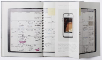
I remember asking Rob Hornstra what he was going to photograph next, given the Sochi Project had ended, and he and his writing partner Arnold van Bruggen had been barred from entering Russia. Rob told me he was working on something about his neighbour, a man next door. Somehow, I was very surprised. But I realized quickly that my being surprised was based on my own assumptions, on who I thought Rob was as a photographer, or maybe on how I thought he would be working.

After all, if you travel all the way to the Caucasus to attempt to untangle the cultural and societal conditions what you’ll end up doing if you want to do it well is to look deeply into the lives of the people living there, to try to infer the larger situation from the many stories you’ll be encountering. At least that’s what made the Sochi Project so successful for me. Rob and Arnold could have adopted the infamous helicopter approach, where you go to a place for a week (at best), take the set of pictures that your audience expects to see, and leave it at that (an approach still widely used in photojournalistic circles). But they didn’t. Instead, they decided to invest time, to look into people’s lives as deeply as they could. And that’s what Rob did with the man next door, which is now available as the eponymous book.

In today’s parlance, Kid, the man next door, was a troubled character (for reasons of privacy, his last name is withheld throughout the book). Rob would hear him argue loudly with his wife, before she left, taking their son with her. Kid, writes Rob, “really liked to help me, for example by keeping an eye on things when I was working abroad.” In return, “I often lent him my phone when he ran out of credit and helped him with his mail because he had difficulty reading.” Kid’s life progressively took a turn for the worse, and at age 42, his body was found floating in a canal.

Through a string of reports produced by Dutch authorities, Man Next Door chronicles Kid’s increasing struggles, a seemingly endless string of events that on their own would have been petty affairs, whether it’s public intoxication or noise complaints. But as becomes clear, the overall effect is cumulative. Rob’s own photographs accompany these reports. But they tell a somewhat different story. Kid’s increasing problems leave their traces in his physique. But given how comfortable he is in the photographer’s presence, as a viewer you start feeling for this man. The book makes use of some archival (family) pictures, and there is a variety of photographs describing the apartment or the pet snake (including its feeding).

The portraits really carry the book. It’s not that they tell a different story. But they manage to pierce the armour that we all have surrounded ourselves with when confronted with those in need. Whatever you might want to say about Kid, he was a man in need, and when society was unable to provide for those needs, there was not going to be a happy ending. Seen that way, Man Next Door amplifies the humanism that underlies all of Rob’s work, a humanism a bit masked by the style of photography and the intensely smart storytelling, with its many different devices.

It’s really simple: if you want to make people care about who or what is being depicted in your picture, you first have to care yourself. Rob cared very deeply for Kid.

Man Next Door; photographs by Rob Hornstra; 96 pages; self-published; 2017

Rating: Photography 4.0, Book Concept 3.0, Edit 3.0, Production 4.0 – Overall 3.6

Growing up, I would see photographs and text combined in photonovels quite a bit. There’s something corny and amazing about them. Maybe it’s that background that has me enjoy Anouck Durand’s Eternal Friendship so much. Durand combined a vast set and variety of archival imagery to tell the story of Albanian photographers visiting communist China to learn how to print colour photographs. The narrative device used is the first-person account: we are made to read the (imagined) words of one of the photographers, following him along, being made to share his anguish concerning the many complex problems created when two weird and brutal communist regimes interacted.

Given the source material, there was the immense risk of the result being too cute or cool. As I noted before on this site, archival materials are tricky for that reason: they’re often visually very stimulating, especially when as a viewer you have no access to symbols that point at something altogether frightening. Their patina can mask what’s underneath. With her narration, Durand deftly avoids that pitfall. As much as I enjoy seeing the materials, there always is that intensely oppressive effect that has me realize that those depicted had to live their lives in a constant state of sheer terror, with minor missteps possibly resulting in major repercussions. It’s a world we now cannot imagine any longer, even though autocrats across the world are trying their hardest to bring it back.

In a sense, the format used for Eternal Friendship is so specialized and the craft itself is so well done that I can’t easily see too many other books being made this way. Maybe that’s a good thing. I’d hate for the photonovel to become a trend now. In light of my thoughts about photographs and text, the book lays down a very clear marker for how pictures can be combined with text to great effect. Even if they don’t want to replicate the way narrative is built here, photographers for sure might want to take note of this book

Eternal Friendship; archival photographs compiled and narrated by Anouck Durand; 100 pages; Siglio; 2017

(not rated)
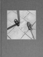
Even though I have been following the world of photography for a while now, there still are new discoveries. Inevitably, many of those discoveries are young artists. But occasionally, someone will pop up on my radar who has been making photographs for a while, leaving me to wonder why or how I had not been aware of her or him. In part, this might be a consequence of my usual modes of engagement with the medium, much of it in the digital sphere. Someone who has been photographing for 30 or 40 years is unlikely to be found on Instagram, say.

But the photobook provides a welcome corrective. Thankfully, there are enough publishers who will produce a book around the kind of work that either gets lost in all the digital noise or that isn’t even included in said noise in the first place. As far as I can tell, that’s the case for Swedish photographer Gunnar Smoliansky. Gerry Johansson sent me Diary in the mail, noting that he (Johansson) had now become a publisher of other people’s work. Holding the book I thought I was able to see appeal of Smoliansky’s work for Johansson. But of course, it isn’t quite that simple.

There is a shared sensibility between these two photographers. Both photograph in b/w, using the square format. Smoliansky will often also focus his attention on visually organizing the square in what on a superficial level one might consider a formal exercise. But he will not stop there. Looking through the book, whenever I thought I had got what he was after there was a surprise that would jolt me. There are a fair amount of essentially street photographs in the book, mixed with other slightly idiosyncratic observations. In addition, if I didn’t know any better I would have guessed the pictures had been taken in Eastern Europe, with a sense of slightly resigned dread going through the work.

Diary was produced with source material photographed from the 1960s all the way into the 1990s. You might imagine this would be apparent when you look through the book, but it isn’t. In part, this might be the editors’ making. But as an editor, there is only so much you can do with what you’re given. In other words, it’s Smoliansky’s world that we are being exposed to here: a photographer going about his business doggedly over decades, producing photographs that now get to hopefully find a larger audience.

Diary; photographs by Gunnar Smoliansky; 204 pages; Johansson & Jansson; 2017

Rating: Photography 4.0, Book Concept 3.0, Edit 3.0, Production 3.0 – Overall 3.4

A Conversation with Laia Abril

Article main image
Laia Abril

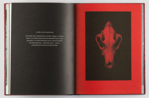
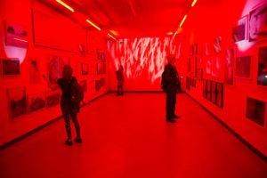
In the world of contemporary photobook making, Laia Abril has become a fixture, having pushed the boundaries of narrative-based storytelling as much as addressing timely and very important topics such as, for example, eating disorders or reproductive rights. Of course, her work is not restricted to the format book. It also is shown at photography festivals and in other exhibition venues. At the occasion of the release of Abril’s latest book, On Abortion, I am thrilled to have had the opportunity to speak with the artist about her background and work.

Jörg Colberg: To begin with, can you give us some background information about yourself and about how you got to photography?

Laia Abril: I studied journalism in Barcelona, and that’s when I came into contact with photography. I guess we can skip that moment when my parents got me a camera – I was 9 years old, and I made a photobook based on my grandmother’s five-house village in the Basque country. Inspired by a teacher who used to be a photojournalist in the Balkans, I made my first trips to that area – although I was still writing at the time. I ended covering some events related to the post-Balkan war.

In class, I was fascinated by the book Non sono obiettivo by Oliviero Toscani, the first COLORS magazines, and the work of Nan Goldin, Donna Ferrato, or Duane Michals. So I started to work as a photographer for the university magazine. After graduating, I went to New York with the intention of enrolling at ICP. There, I began to develop personal projects while attending some courses – see my series Femme Love; still naive as to why those kinds of stories attracted me more than the international and conflict journalism I was suppose to pursue.

It was in the middle of this New York experience that I returned to Europe and moved to Italy since I received a scholarship from FABRICA – Benetton’s artists’ residence and communication center. There, I started to develop my long-term project On Eating Disorders in parallel with working at COLORS magazine as photographer and photo editor for almost five years. It was also there where I met Ramon Pez – former art director of the magazine, starting our creative book-making team.

JC: How would you talk about your general, larger interest as far as your work is concerned

LA: Throughout my projects I focus on telling the most uncomfortable, hidden, stigmatized, and misunderstood stories. I often find myself trying to photograph invisible issues, aspects recurrently connected to mental states, mental illness, prejudices, and taboos. The topics I work on are generally close to my personal experience, since I always thought that it would be easier for me to connect with them and, in turn, be able to translate them for an audience.

Sometimes, I feel my job is actually to get into mental places nobody wants to go to and to digest hard and personal stories, so I can deliver something people would be able to be empathic with and relate to. Indeed, if you ask me about my work methodology, I would say it all started considering the many different approaches to empathy: with my characters and between the work and the public.

It has been said and written about me that I often work on female issues. This might be true, but not all my characters are women, and certainly they are not my only target. But is true that there is a pattern around the politics of difference and human rights. I am connected to topics such as sexuality, ethics, morality, psychology, gender, and identity and how our society handles all these together.

JC: The photobook plays a central role in your practice. Before we talk about individual examples, what is it that the photobook offers for you that has you work with it so much?

LA: I’ve been obsessed with books my entire life. I used to be that kind of kid hungry for getting to the library to devour books and buying them with my family at the flea market every Sunday. I was particularly interested in pure literature, aside from some comic books at my early years. I remember feeling calm being surrounded by books. I still do.

On a more current note, my projects are also research based. My background in journalism allowed me to create a methodology of investigation that precedes my visual documentation in order to achieve a deeper understanding of environments, subjects, and stories. I also grew up with the first generation of modern TV show narratives.

I never understood photography as a “decisive moment” rather than a sequence or a whole. So books allow me to combine photography, text, research, design, and deeper and complex narratives to give the reader time to consume them. Intimate or psychological stories like the ones I do need time to be read, so the reader is able to develop empathy with the subject and finds the mental space to change.

JC: Speaking about projects/books such as The Epilogue or Lobismuller – how do you engage with them? Is there the idea to make a specific book, or do these projects start out with explorations and then end up as books?

LA: I usually work thinking first of the story, then of the platform; then of the tools. I might have been born photographically at that specific time when suddenly we were forced to create content and the platform were the content (images) is going to be consumed and distributed. I could not be happier, since the complexity of the topics – along with my intrinsic urge to always get out of my comfort zone – force me to work across different platforms.

If I believe the story needs to be a book or an installation or a web documentary I will produce it in a completely different way. That doesn’t mean I cannot adapt the project later. But the primary carrier always determines the mood of the content later. Even though I create a story to be shown in, let’s say, a book, later on it can be adapted to be shown in the form of exhibition or something else. But the soul, the mood, the essence of it, is determined by the first platform. This often is a photobook, in the case of On Abortion it’s an installation.

This methodology of work has obviously evolved with time. In the beginning, everything was much more intuitive. Now that also my projects have become more concept based it’s easier for me to visualize the end result in the beginning.

JC: Can you maybe speak a little bit more about the process of making these books? They’re both so interesting, but also so different, so it would be nice to learn a little more about how you made them.

LA: To be honest, it is a very organic process. It has been changing over the years, changing my relationship with photography, with the process of learning, also by changing my relationship with my team and the different stories. With The Epilogue, I produced the story, and when I returned from the trip edit, design, and production merged into one. The visual research process gave us the keys to configure and translate the key elements of the story into an object, the book.

Lobismuller was different. At times, the book had more of the design developed than the story itself because I still needed to photograph pending aspects, and I was stuck. All of these process issues are often also affected by external factors, such as deadlines, creative blocks, production blocks, budgets, etc. As I said for each story, each project, I tend to leave my comfort zone. Lobismuller was my first book based practically on landscape photography, black and white, and analog; I was trying to tell the complex psychology of a character without the character itself being available. The process of editing and design was affected by the search for a solution for the storytelling.

With On Abortion, it was the first time that a project was born as an installation. I photographed strictly thinking about how it was going to be seen – just like when I photograph for a book. But then I had to translate it into a different narrative format, like the one the book offers. It also was the first of my personal books where I had took on the role of creative director. In the beginning it was a struggle. But when you then understand how to fit it into a book, you simply benefit from what the format offers you: in this case more space and time to read, to reflect, to leave and return to it, a more intimate, more personal engagement.

I suppose that if I have to look for what these projects have in common, it’s always the same: visual and production research linked to a concept, the search for a balance of the three, constant empathy with the characters, the reader, and the sensations that they can have or that I want them to develop with their reading, a coherent justification for each decision made, a balance between the conceptual and the sensory, and a great responsibility in tone and content since I usually touch sensitive topics.

JC: Given you’re so invested in the photobook, whose photobooks do you particularly enjoy? What are your favourite books and why?

LA: Books that I like – not the best books: I prefer those books that you have to “chew on”, books where you cannot turn the pages quickly, that make me “stop” to read, to analyze, to understand. I like stories that can be explained to me in two sentences but then have used 200 pages to develop. I like it when there are several different elements. They do not always have to have text. But I do have a certain fascination for when disparate elements fit well. And the design has to be balanced and at the service of the story.

I have a certain weakness for archives, for the anthropological, the strange, the human. Quite often, I also like the opposite. Beautiful books, printed with very high quality in which you can lose yourself in a photograph… But I almost find that to be an experience more similar to what you have in an exhibition.

One thing that I often look for in a book, and especially in my own books, is that when I touch it has to be solid. That does not mean that it is a hardcover, but that has a certain consistency between what it says and what it is. I also like books that take a risk in some element, but I cannot deny that I have a tendency towards the classic and elegant at the same time.

That is why books published by Xavier Barral often fall into my hands with pleasure; I also follow practically whatever they do, authors like Christian Patterson, Sophie Calle, Will Steacy, Rob Hornstra, Rafal Milach, Taryn Simon, or Broomberg and Chanarin. Although I consume a lot of books, I am not a collector. So often the books I buy are for research reasons, for a certain fondness of the story or the author, or because – sometimes, I feel I have no choice but to take it home.

JC: Spain seems to have evolved into one of the new powerhouses of photography, both in terms of the book, but also just in terms of the photography emerging from there. Can you talk about the scene there, how things evolved and blossomed so much lately?

LA: Since I developed myself and my career abroad sometimes it’s hard for me to keep up with the scenes as we are all very much blended nowadays. However, since modern culture in Spanish is intrinsically related to our repressive history, on the one hand it’s true that our generation has found itself with certain disadvantages compared with other societies with a longer tradition of freedom — such as the French one. But at the same time our youth gives us a freshness and freedom of innovation that can be seen in the desire and amount of high-quality projects that are taking place nowadays.

Pictures and Text, Text and Pictures

Article main image

I recently came across an interview with Moyra Davey in which the role of text alongside photography was discussed. “Writing holds ideas and feelings in a way that is much more stable,” Davey asserted, “whereas a photograph is ambiguous and has the ability to distort much more than a text.” Reading this, I initially found myself nodding. Yes, that’s how it works, or rather that’s the difference between text and pictures. But the more I think about it, the less certain I am that I actually agree with this statement. I’ve now arrived at a point where I think that maybe Davey’s statement is true if one takes text and pictures as separate entities. However, the moment they are made to interrelate, I don’t think sweeping statements about what text or separately pictures do can be made any longer. Instead, one would have to look at what text and pictures do together, how one informs the other in what seems to me a possibly complex relationship.

In the world of photography, this approach doesn’t appear to be very common — at least as far as I can tell. Here, photographs are almost always taken as being in the driver’s seat, with text riding shotgun (at best). I think I can understand where that approach is coming from, given that if you’re a photographer it ought to all be about the pictures. Consequently, most photographic bodies of work contain either no text or if there is text then its role is very severely limited.

In an obvious sense and at least in part also for historical reasons, the usage of text differs from one context to the next. For example, the world of photojournalism uses captions and often will have pretty intense discussions over their validity and/or veracity. Documentary photography will incorporate often very elaborate pieces of text that, however, often are produced by a different author and that usually almost lead a life of their own.

In the context of fine-art photography, text is very severely limited, to the extent that pictures might not even have titles, let alone captions. This is a very valid approach that can lead to very good results. At the same time, it’s oddly limiting. Why omit text, one might wonder, if it could elevate the work beyond what the pictures in question are able to do? This brings me back to the Davey quote, because it seems to lie at the core of why so many photographers are so hesitant to even consider using text (let’s ignore the “If I had wanted to use text, I would have become a writer” sentiment — that’s little more than an incredibly silly cop out). Text, it is widely believed, is a lot more specific (or, in Davey’s words, “stable”) than pictures, and it thus places limitations on the pictures. Over the course of the past decade, I’ve heard this expressed in a variety of ways, and I don’t think it’s true at all.

The topic gets incredibly interesting once you start looking at artists working with text and pictures. Take Sophie Calle. If you flipped through at any of her books without reading the text, you’d probably end up being completely baffled. Most of the pictures are not terribly interesting in their own right. In fact, Calle doesn’t even necessarily take them. If you were to approach the work the other way around, reading only the text and ignoring the pictures, you might end up in almost the same situation. It is only when you take everything together that the full beauty of the work unfolds. Taken together, Calle’s text and images lift each other to the heights this artist has been able to reach.

Take Jim Goldberg. If you ignore the writing, possibly because you don’t want to bother deciphering the often hard-to-read handwriting, you’ll probably end up wondering what the big deal is. What’s with all those different camera and/or film formats, and why is this all so messy? It’s only when you start reading the text while looking at the pictures that the whole unfolds, and again, the pictures work with its associated text (and vice versa) to arrive at a larger truth that neither of them have if taken on their own.

Those two artists use text alongside or, in Goldberg’s case, as added parts of the photographs. Of course, there also is the option of using text that is in the pictures. There is, for example, Lee Friedlander’s Letters from the People, which basically is the simplest possible approach to using text in pictures. The utility of this approach exhausts itself very quickly. It gets a lot more interesting when you consider Gillian Wearing’s Signs that Say What You Want Them To Say and Not Signs that Say What Someone Else Wants You To Say. In a sense, this marries the Friedlander and Goldberg approaches. For what it’s worth, the I’m Desperate picture amazes me every time I see it (and I’ve looked at it a lot).

These different examples point at the basic fact that the combination of text and pictures includes a very large variety of possibilities — which makes it even more baffling why photoland as a whole is so resistant to working with text. When I discuss text and pictures with students, inevitably the question arises which artists to look at. Often, a student’s response will run along the lines of “That’s not what I had in mind.” The lack of a clear role model for artists interested in working with pictures and text again points at the fact that there is no single model of how pictures and text work together. Instead, it’s up for grabs. It needs to be worked out for the particular body of work in question. That’s not a problem. That’s a great starting position to be in.

Text and pictures can be made to work together in a variety of ways, ways that might include the text being completely ambiguous and the pictures being “stable” (to use Davey’s phrase), the other way around, or any situation in between. An artist has to figure out how to make text and image work together for their particular case. This entails figuring out their individuals roles and how they will inform each other — given their underlying basic parameters.

A positive consequence of the Peckerwood Effect has been that photographers have in fact started to incorporate some form of text in many bodies of work. But often, this text exists as part of some ephemera. Not that there’s anything wrong with that. But it also is a very limited way of working with with very limited form of text. Whatever you want to say about text, it actually is a lot more malleable than pictures (just look at the history of poetry, not to mention the canon of literature).

It’s not the fact that I spend a lot of time writing that has me interested in text. And for sure, I don’t need to see text now becoming a fad in the world of photography (I’ll admit it would be a lot more interesting to me than plastic sandwiches or New Formalism, though). But text can be such a great tool to work along a purely visual medium. As Sophie Calle, Moyra Davey, Jim Goldberg, Gillian Wearing, and many other artists have demonstrated, the use of text can enrich photographs in a way that you simply cannot achieve otherwise. And that then is another reason why I think photographers should spend a lot of time reading (and not just looking at their colleagues’ pictures): the more you read, the more of an understanding you get how words can be used to express thoughts, ideas, and feelings, the more you learn about the undiminished power of the word.

As a final thought, photographers treating text as an afterthought (if that) when attempting to make a photobook isn’t all that different than them treating design the same way. The risk here is that you’ll end up with an essentially glorified catalog. There’s much to be said for the catalog format (in fact, this might be a future article). But if you look into the world of catalogs, you’ll find a wide variety of approaches, with the very good ones working with design and text in very conscious fashion. So there really isn’t any way around treating photobook making in what you could call a holistic fashion — unless you’re happy with sticking with a now very, very dated model of photobook making that mostly produces boring books (even if the pictures aren’t boring).

(French: Images et texte, texte et images)

The Danger of Trends

Article main image

It’s probably fair to say that the emergence and dominance of social media has had a profound effect on the world of photography. The idea that every artist ought to have a presence online has translated into the idea that every artist also ought to be active on social media. While I do believe in the former — a properly maintained website simply is today’s equivalent of a portfolio plus business card, I’m not at all convinced of the latter. In particular, having spoken with countless artists I have come to realize that social media are more of a drag, if not outright burden, than a blessing. Countless artists have confided how seeing everybody else getting awards and recognition while they’re struggling has had a negative impact on their overall well being. Of course, you cannot really blame anyone for posting on, let’s say, Facebook, how their book is shortlisted someplace while not mentioning all the other competitions that only resulted in a “thank you for submitting your book” email.

While there thus is a psychological cost to the use of social media that can be pretty heavy (I’ve heard some grim stories), there is another consequence of rampant social-media use. From what I can tell, trends or fads have become even more amplified than they already were before Facebook or Twitter. Especially runaway success stories — think Christian Patterson’s Redheaded Peckerwood — have come to acquire an enormous level of influence. The Peckerwood Effect (yup, I’m coining that term right here) has been twofold. First, there has been an explosion of books that include reproductions of found materials (or of materials created to look that way), often in the form of facsimile inserts. Second, a large part of photoland has become obsessed with the idea of narrative — without really understanding what that means.

Obviously, fads come and go. Around ten years ago, it was enormous prints in plastic-sandwich form (Diasec — courtesy the excesses of the Düsseldorf School). Now, we have the narrative-photobook craze plus New Formalism. If we all just wait a little bit longer, those are likely to disappears, to be replaced by something else (thankfully, that New Formalism stuff is already on its way out). It’s relatively easy for a critic to wait out trends. But it’s a lot harder to do that if you’re teaching photography as I also do. And even the critic in me has a hard time with trends that are being mindlessly followed, because the outcome is a lot of subpar work.

Just to give an example, in my own teaching and in photobooks I’ve witnessed artists adding archival materials hoping they would make a project work. Of course, if, for example, you’re working on some family project, then adding those pictures from albums seems like a very good idea. If Larry Sultan was able to do it… And it might work, but there is no guarantee that it will. In all likelihood, adding archival materials that always come with their own patina might only amplify the problems with the other photographs. It’s a little bit like adding a really good musician to a band that can’t hold a tune. That added musician isn’t going to solve the problems.

Instagram can provide a related challenge for photographers. It’s a great way to work with photographs. But there are the infamous “likes.” And the number of likes isn’t necessarily correlated with considerations that otherwise govern photoland. There appear to be some overall and very basic trends according to which, let’s say, “mostly-blue images receive 24 percent more likes than photos with high concentrations of reds and oranges.” Obviously, one could now start one of those populist discussions that (as a consequence of the explosion of social-media use) have become so prevalent: “Well, who is to say that what people like on Instagram is worse than what’s hanging on the walls of galleries?” Ignoring such populism, there clearly is a vast difference in engagement in these two settings. Most artists I know would rather have viewers spend a little bit of time with their pictures instead of having them as something on a small screen that scrolls by very quickly, possibly with inane advertizing right after.

Consequently, that’s something you need to keep in mind if you share work on Instagram: the level of engagement by viewers is very different than for a print on a wall or a printed picture in a book. And regardless how you feel about Instagram, this is what it all comes down to in the end: what do you want your work to do, and what’s the right form for that? How do you get to that form? Does a narrative-driven photobook provide that form? Do you need to use archival materials? Should the pictures be part of your Instagram feed? Those are all important questions. If you realize that, no, Instagram is not the right platform for your pictures because of the relatively shallow and superficial engagement it offers, then stay away! The opposite is also true: if you realize that your photos work best on Instagram, then maybe you don’t need to make a book. Maybe your pictures don’t hold up so well if someone can spend a lot of time with them (I can think of plenty of examples).

The worst aspect of all of those trends and fads is not what they’re about. There is no problem per se with plastic sandwiches, with New Formalism, with narrative driven photobooks, with archival materials, or with anything else that gets to dominate what people are discussing in photoland. The real problem is artists not fully considering whether their work can operate along any of those lines. As I mentioned a few weeks ago, if your work consists of, say, portraiture without any narrative attached to it, that doesn’t mean you’re currently out of luck. It means that when you make a book, your task involves making it work. Obviously, your book will not follow a currently hot trend. But yesterday’s hot trends often are today’s embarrassments (plastic sandwich anyone?).

With social media amplifying hot trends and quick, short-term success, it has become a lot harder to play the long game that artists really need to play. Even if you stay off social media, chances are your friends and colleagues will be on them. I know people who are not on Facebook, but who magically know everything discussed there. I don’t think such an approach works in your favour if you want to be an artist. After all, the one trend you really want to follow with as much dedication as possible is this one: what drives you, what provides your mental energy to pursue whatever it is you feel strongly you need to go after?

Everything else is just a pointless diversion.


Photobook Reviews W01/2018

Article main image

Before getting to business I want to wish everybody visiting this site a hopefully very Happy New Year!

I don’t know how you perceived the year that just ended. I couldn’t help but notice that if there is one thing the populists and neofascists in power in so many countries have achieved, it’s to bring down not just their followers but also the rest of us to a level of nastiness and anger that I feel has contributed widely to 2017 being such a shitty year. As iffy as New Year’s resolutions can get, that’s something I personally want to disengage from. As a first consequence, I will strictly limit my use of and the time I spend on so-called social media, mostly Twitter (I have been off Facebook for year, never looking back). I will only use it to distribute links. If you want to argue with me, send me an email or a postcard.

Over the course of the past few years, I have become more and more weary of social media. This might be in part because this website started out as an old-fashioned blog, which it essentially still is. To follow blogs, you would subscribe — instead of scouring through social-media feeds. Of course, there is a lot to be said for articles being recommended to you by someone whose judgment you trust. But that mechanism has now become embedded in an outright toxic environment dominated by pointless listicles (“The ten German artists that really have you reconsider sausages”), shouting matches and constant outrage over an endless string of scandals and non-scandals, shameless advertizing barely disguised as editorial content, etc. (not to mention the actual fake news, Nazi trolls, and the corporations maintaining social-media sites shredding your privacy).

Obviously, I have no idea how to navigate this online world bypassing social media given that rss — the good old way to disseminate blog content — is all but dead. As a consequence of my 2017 fundraiser, I started writing supporters-only articles, which I send out by email. I have become more and more interested in the idea — reaching possible readers directly. This might entail some form of email newsletter, tailored specifically to only distributing content. There are too many newsletters already, though — do I really need to start one? I haven’t decided whether or how to do it. In the meantime, the easiest way to follow this site is to simply visit it once a week.

Here are some new books:

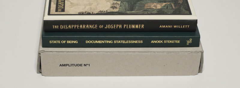
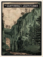
“The hermit lived by himself in the woods for 69 years, a result of a childhood desire to be alone.” These words can be found on the reproduction of a small piece of paper in Amani Willett‘s The Disappearance of Joseph Plummer. I don’t know what it is about hermits that has so many photographers curious about them, most famously possibly Alec Soth and his Broken Manual. Actually, I have an idea, but maybe that’s for a later piece. Regardless, the book in question here centers on the idea of a man — and it always is a man, isn’t it? — disappearing in the woods, here first a certain Joseph Plummer and then the photographer’s father who bought himself some land in the middle of nowhere.

The story is told through what of late has become one of the most dominant models of photobook making, using photographs and archival materials of all kinds, blending facts (or what look like facts) with fiction. Thus Joseph Plummer becomes Walter Willett, or Walter Willett is Joseph Plummer, as are any of the countless other men who toy with the idea of really just disappearing, possibly because the weight of the world on their shoulders has become a bit much.

I suppose I should admit that as much as I find the idea of disappearing attractive (at least for a while), my own idea of doing so would certainly not to move into some cabin in the woods. Instead, I prefer disappearings in the middle of hundreds of thousands of other fellow men and women, visiting a larger metropolis in an industrialized country where nobody knows me (I also find the countryside profoundly irritating). But my idea of disappearing is probably at odds with the one pursued by the two men in the book, by the idea of disappearing visually described by Willett. Theirs is romantic. Mine certainly is not. And I rub against the idea of romanticism that is expressed — or at least hinted at — in a variety of ways throughout the book. That’s on me, of course, not on the book’s makers.

Coming back to the way the story is told, through all those different types of photographs and documents (which might or might not be real), one of the challenges is to make the viewer see past the artifice of the storytelling itself. For all its success, Redheaded Peckerwood by Christian Patterson — maybe the seminal book of this kind — suffered from it being a tad too cerebral, a tad too perfect. To make a successful book of this kind you will have to control all aspects — otherwise, the whole thing just falls apart. But, and this is where it gets iffy, if you’re too controlling, it’s very hard to get the degree of uncertainty into the book that makes for the crevices in which the unknown might lurk. “Just as in other forms of art,” Robert Frank wrote about The Americans, “there has [sic!] to be mystery (enigmas) and uncertainty somewhere!” (I’m quoting this from a handwritten note reproduced in Looking In: Robert Frank’s The Americans).

I don’t know if there are mystery and uncertainty in The Disappearance of Joseph Plummer. But as I noted, this might be just me, given I cannot relate to this type of disappearing. As far as I can tell, the book does what it sets out to do well, possibly a bit too well. At the very least, I wish the photographer had refrained from giving it all away in the afterword.

The Disappearance of Joseph Plummer; photographs and short text by Amani Willett; 136 pages plus tipped in materials; Overlapse; 2017

Rating: Photography 3.5, Book Concept 3.0, Edit 3.0, Production 4.0 – Overall 3.4

Whether as humans we have moved far from the mindset of cave people I don’t know. It’s true, we have our smart phones, and we dress smartly. But the degree of tribalism that dominates our lives is as shocking as it is sad. Not to be a member of any tribe, however, also is no option as Anoek Steketee‘s State of Being: Documenting Statelessness demonstrates. Turns out if you’re stateless, the tribalists turn your life into a pretty hellish affair, with states’ bureaucracies creating the world familiar to anyone who has ever read Franz Kafka (or, to give an example from the real world, has ever dealt with US health insurance). 

Typically, you need some document (that you don’t have) to get another one (that you thus won’t get). And that other document (that you won’t get) would help you getting the one that you don’t have. This will be explained to you by some bureaucrat in some anonymous office someplace. And given you’re stateless, there is no tribe that could lend you a hand in the form of a consulate or embassy. You’re literally on your own, and the rules are of course always the rules, regardless of whether they make sense or not. The rules are the rules for their own sake, for their own existence.

Possibly the most infuriating example given in the book is one that reads like little more than a cruel joke. Chisom and Vanessa were both born in The Netherlands, to a mother who had registered as Sudanese but who probably was Nigerian. The mother had got a temporary residence permit, unlike the father who then vanished. Chisom was born prematurely, and the mother died, leaving the two girls as having “no known nationality.” For years, the now young women have attempted to have their status changed to “stateless” (I didn’t even know there was that difference), which would then enable them to apply for Dutch citizenship. And the details keep going from there, literally a series of what can only be described as state-sanctioned cruelty.

“I understand your pain and your despair,” a Dutch judge is quoted as having said, “but I have to act within the legal parameters.” To paraphrase German politician Oskar Lafontaine, that’s the mind set needed to run a concentration camp.

State of Being combines photographs and ample amounts of text to have the viewer/reader get a glimpse of the hellish existence some people have to endure simply because of the kind of tribalism that informs the legal parameters that judge referred to. In light of the fairly large number of similar books that have been produced in Holland over the past decade or two it might be time to speak of the Dutch documentary photobook as a model for how these types of stories can be told, employing a smart and very effective combination of photography, text, design, and production. This book certainly is a very good example.

State of Being: Documenting Statelessness; photographs by Anoek Steketee; text by Arnold van Bruggen and Eefje Blankevoort, 164 pages; nai010; 2017

Rating: Photography 3.5, Book Concept 3.5, Edit 3.0, Production 4.0 – Overall 3.6

Lastly, there is Amplitude No. 1, published by St. Petersburg’s FotoDepartment, a box set of booklets/pamphlets/zines showcasing the works of ten young Russian photographers: Alexey Bogolepov, Margo Ovcharenko, Irina Ivannikova, Anastasia Tsayder, Igor Samolet, Olya Ivanova, Irina Yulieva, Irina Zadorozhnaia, Anastasia Tailakova, and Yury Gudkov (you can buy the set here). Before seeing the set I was familiar with roughly half of the artists. That doesn’t necessarily mean much, given I don’t consider myself as an expert of what’s going on in the world of photography in Russia. But it hints at the kind of exposure many of these photographers might now be getting, given that their work is being disseminated in this form, with the inclusion of English translations of all the texts clearly aiming at an international audience. Also, seven of the ten artists are female — it would be refreshing to see this approach copied gratuitously in the still so male dominated Western world of photography.

The booklets all follow the same basic parameters, 32 stapled pages with a slightly more substantial cardboard cover that has a photograph attached at the front. In addition, each booklet contains a separate sheet of paper in the back with information about the body of work in question. For me, this type of production makes for a refreshing and appropriate format: there certainly are zine elements, yet at the same time, the pamphlets feel more like a book than a zine. I personally prefer this format over a single book, say, in particular since the separate booklets manage to preserve the individual photographers’ voices.

In terms of the type of photography covered, very roughly there are three somewhat distinct directions. There are bodies of work around Russian villages, there is youth culture, and there is photography around photography (some along the lines of New Formalism). To what extent this selection reflects the larger interests of the Russian photography community I don’t know. Should there be more editions of this type I’m sure we will find out.

For all of those interested in getting more of an idea of what’s going on in the world of emerging Russian photographers, Amplitude No. 1 would be a very good start. The larger world of photography and certainly our Western branch can only gain from being exposed to a wider selection of photography done around the world. And in light of the kind of exposure Russia is getting especially in the West these days — to a large extent of course because of its leader’s shameless power plays, the work of these photographers is a good reminder that there is a lot more to the country than any of the things and events that dominate the news.

Amplitude No. 1; photographs by Alexey Bogolepov, Margo Ovcharenko, Irina Ivannikova, Anastasia Tsayder, Igor Samolet, Olya Ivanova, Irina Yulieva, Irina Zadorozhnaia, Anastasia Tailakova, Yury Gudkov; 10 books of 28 pages each; FotoDepartment; 2017

(not rated)