The Photobook as Object

Article main image

Of all the things that surround me right now, the photobooks stand out. Much like the desk I’m sitting at, or the computer I’m writing this on, or the chair I’m sitting on, they are mass produced. But unlike those items, they have a sense of personality, well some of them, the good ones, anyway.

When speaking about books, one of the first aspects I tend to mention is that they’re physical objects. This is almost too obvious an observation to make. But it’s not obvious enough for many photographers (or publishers). Physical objects have qualities that appeal to all of our senses, however conscious we are of this. It is easy to be amused by — or make fun of — photobook experts who will obsess over the printing, the type of paper, the binding, even the smell of a book. However, all of these aspects come together to create a book’s personality — or lack thereof. So it’s not just the pictures and their edit that make a book. It’s also not whether or not a book is designed well, whether it’s produced nicely. It’s whether or not the whole package, down to the seemingly most irrelevant detail, works to create something unique (however mass produced it might be).

Taschen provides a good case in point. Somehow, this publisher manages to produce quite a few good books, all of which for me lack any sense of personality. They’re profoundly unattractive objects. And Taschen get away with that. Much like the makers of the admittedly rather shitty desk I’m working at, they know their business. They seem to be quite successful selling really quite awful looking books containing often very nice material. Good for them. I even own a small number of their books. I rarely look at them, because they’re so profoundly unattractive. They’re like Tupperware containers filled with goodies.

Consequently, unless as a publisher you want to become the IKEA of photobooks, you will have to do better. If you’re a photographer making a book, even with a publisher, you have a stake in that game as well. In fact, more often than not the whole chain of events starts with the photographer: there is a body of work, and there is the idea of making a book. For most photographers it does not really mentally move much beyond the pictures, though. Most photographers approach photobooks as if they really were merely containers.

It is true, in the most basic sense, a photobook is a container for photographs. But that doesn’t mean that making one should be approached like, say, making jam. If you’re making jam, you put your energy into the jam, which you’ll then put into whatever containers are at hand. Maybe you’ll spend a little bit of time on the labels. That works great for jam, because the containers are really just that, necessary receptacles that play no role for the actual enjoyment of what they contain.

That’s really not the case for photobooks. The book itself is the thing to be enjoyed, however important (or not) the photographs themselves might be. Unfortunately, modern technologies have been enabling the Tupperware container approach. Why bother thinking about a book, when you can just grab some template? Why deal with messy physical dummies, when you can look at a pdf on a computer screen?

In Understanding Photobooks I outlined the many realities behind photobook making. In the book, I argue that it matters that you take each and every aspect of a photobook into consideration. But there is one aspect that I’m relying on in the book that deserves to be stressed a bit more. In the first chapter, I ask readers to take a book from their shelf and to pay attention to all those details that otherwise often go unnoticed, in particular production and design choices: the object itself. You have to have an understanding of that, the object, if you want to make one.

You would imagine that photographers spend enough time with photobooks to get to that understanding. I am not convinced any longer that that’s the case. What I’m seeing is that knowledge is broad, but not deep. A lot of people seem to know every book that has just been published, what’s “hot” right now (this effect is especially pronounced in places like New York City). There are so many photobooks out now — and so many photobook fairs — that hardly anyone appears to spend time with individual books any longer. It all seems to revolve around sheer numbers.

In fact, one of the most frequent question I get asked is how many photobooks I own. I actually don’t know, since so many are so forgettable, and I don’t care about the actual number. One of the least frequent questions is whether I have seen a great book recently. I really believe that this reflects the idea that photobooks are just these containers that are essentially all alike, maybe with some very minor differences. Note that this situation is a little bit better in parts of Europe where the tradition of photobook making is a lot more tied in with both a larger book culture and a lot more refined ideas of design.

It’s partly for this reason that in Understanding Photobooks I look at a number of photobooks in detail, outlining not just how they provide solutions to the challenges discussed in the various chapters, but also to talk about them as the genuinely exciting objects they are. That’s such an important aspect of photobooks, not just that they have great pictures, but that as objects they’re great. That’s really the main reason why I keep looking at photobooks, regardless of how many there are, because I want to live with such great objects, with books that have a personality.

So I went to look through my pile of unreviewed books, and I thought I’d present some with this aspect in mind first, whether or not as objects they’re attractive.

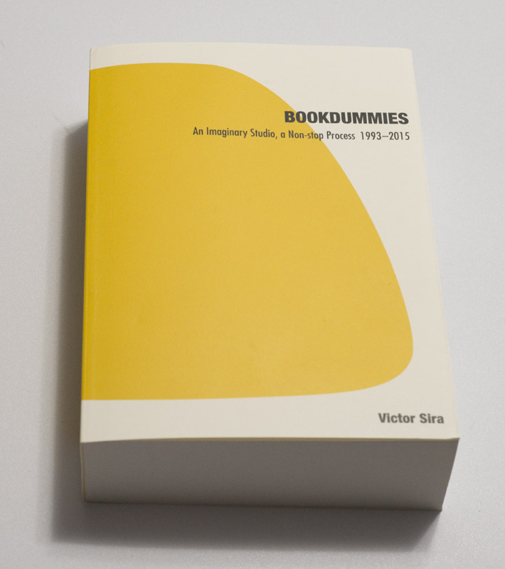
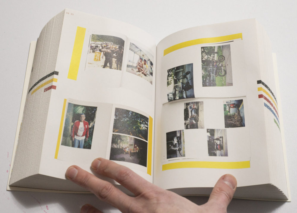
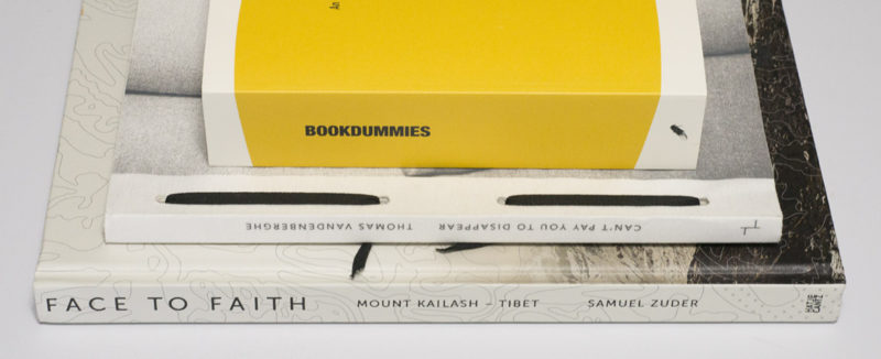
In light of the preceding, Victor Sira‘s Bookdummies is a very good book to look at for more reasons than one. To begin with, as the title indicates, the book collects a very large number of book dummies made by this artist. These dummies often refer to each other, with one being an improved, or changed, variant of an earlier one. For Sira, the end goal doesn’t necessarily appear to be the final, perfect book. Instead, he seems to be a lot more interested in the process of making dummy after dummy, aiming to distill the essence emanating from a set of pictures.

When speaking about photobooks, I usually avoid voicing this idea that there might not be that one perfect form or realization, that a body of work might in fact translate into more than one realization as a photobook. Please note that I’m using the word “might” here, because this clearly can’t be a generalized statement. But this idea might still help photographers working on a book, because instead of finding the perfect book (which can easily become an utterly frustrating endeavour) aiming for maybe a form of a book that works really well can be liberating (I’ve witnessed this very struggle at times when teaching).

Looking at pictures of dummies in Sira’s book obviously is not the same as being able to see the actual objects. This is the usual conundrum faced by the makers of books about photobooks. The usual solution is to provide pictures of open books, usually with drop shadows (for what it’s worth, I personally prefer actual drop shadows over fake ones). But that only offers so much. In this particular case, though, the materiality of Bookdummies itself brings me closer to the dummies’. It’s almost like I’m being tricked into thinking these dummies are right in front of me. I know that’s not the case, but it works.

Bookdummies is an object that just asks to be held and looked at. It has personality. Maybe a good way to describe it would be to say that it feels considered. Obviously, all of those various books on photobooks are considered. Yet most of them lack this particular one’s sense of personality. This one is a little brick of a book, that is lighter than one would imagine. The book is relatively small, so it’s easy to hold in one hand, while one looks through it with the other. The design is minimal in the best possible way. The production comprises what I usually call pouch pages, a type of binding that has a long tradition in Asian book making: each page is a piece of paper folded onto itself (a more widely known example would be Rinko Kawauchi‘s Illuminance).

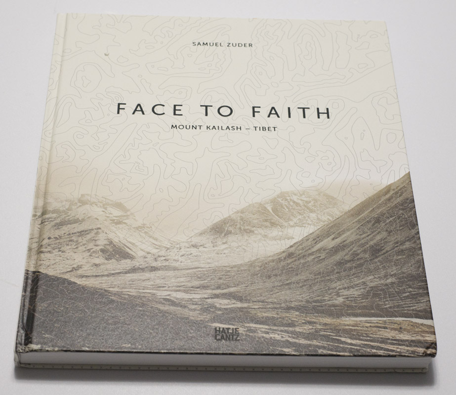
In contrast, Samuel Zuder‘s Face to Faith is a very different kind of book. It’s almost a coffee-table book. I’m using the term “coffee-table book” on purpose because, frankly, there is exists so much needless snobbery in photoland circles about it, in particular about the fact that coffee-table books are made for people whose engagement with photography doesn’t quite measure up to whatever photoland thinks it should be. In other words, it’s photobooks for ordinary folks. This particular book could be such a book. It clearly has a large cross-over appeal if it isn’t in fact made more for regular folks than the kinds of people who hang out at art-book fairs.

Face to Faith contains photographs taken in Tibet. I’ll be honest and admit that when I heard that my interest vanished immediately. That’s not because I’m not interested in Tibet. But the country has been covered so much with so many awful visual cliches that I really don’t need to see any more pictures of prayer flags and rugged people. It’s like seeing a book about the US, and all you get are cowboys and Disneyland. This particular book, however, works very hard trying to do a lot better — and reaching people like me. To begin with, the usual cliche pictures are absent. Instead, there are two groups of photographs, rather majestic looking landscapes and portraits.

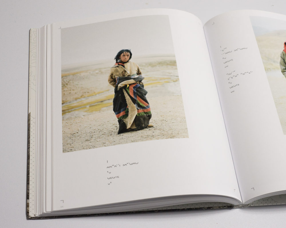
The book’s focus is Mount Kailash, which is sacred in the traditions of, say, Buddhism or Hinduism. The mountain is approached from various sides, and it appears frequently, but not always, in the landscapes (a strategy familiar to those who know Katsushika Hokusai‘s Thirty-Six Views of Mount Fuji). The portraits show pilgrims. The photographs were all taken with a 4×5 view camera, which results in a sense of stillness that is at odds — and thus reinforces — the ruggedness of what is being depicted.

But Face to Faith works hard against what makes most coffee-table and art-fair/photoland books so bad. Design and production come together to create a sense of personality, a sense of a highly considered and well crafted object. I’m no design expert, so my description of the design as being conservative, yet contemporary in a very German sense might not be overly useful. But still, the design looks and feels a lot more interesting and engaging than what you’d see in comparable US books (think Radius).

While I feel there are probably too many pictures in the book, diluting the overall effect, many of the landscapes are very good, with echoes of Walter Niedermayr, say. Occasional gatefolds offer additional vistas. The portraits are more mixed, but the good ones are really, really good, making me want to look at them for a long time. All of this is brought together very strongly in the book and through its form, proving that there need not be that firm separation between art-fair/photoland books and photobooks for those who aren’t part of the clique.

As we’ve seen so far, a book’s mass production and personality (or lack thereof) are not necessarily correlated. With the right attention to detail, a mass produced book can indeed have a lot of personality. Mass production so far has meant the use of machines. But you can mass produce a book by hand — it just takes a lot longer, often resulting in vastly higher costs. A maker’s hands almost automatically guarantee more than a whiff of personality, because because hand binding a book rarely results in something that looks and feels machine-mass produced. The binding is either a lot better and elaborate, or it’s quite a but less good. Interestingly, both cases can enhance a book quite a bit.

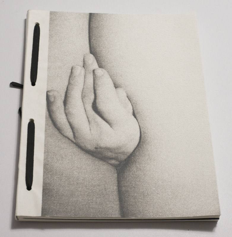
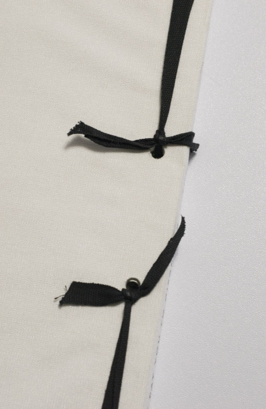
A friend of mine is a master hand book binder, and whenever I show him hand made books, he tends to prefer the ones that aren’t so perfect. I suppose as someone whose books are beyond perfect, I can see where that appear might be coming from. But it really is the obvious presence of a maker’s hands that add considerable personality to a book. A good example is provided by Thomas Vandenberghe‘s Can’t Pay You to Disappear, published by Akina (who seemed to be taking a break, but are now back to publishing). In the book’s back it says “Handcrafted by Alex in 200 copies,” and it does indeed look that way.

Part of me has problems with books that come in such small editions, even though another part is very much in sync with them. In the case of books that aren’t fully machine made, an edition of 200 looks perfectly reasonable. After all, someone has to actually put 200 of these books together. If you’ve ever made a book dummy by hand, however well it turned out, you know how time consuming the process is.

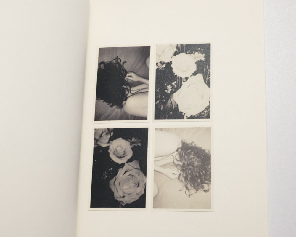
But in the case of Can’t Pay You to Disappear, there is a connection to what is inside, the photographs. Vandenberghe is not only another photographer who I’d file under the “New Male Gaze” category. Similar to artists like Daisuke Yokota, he is also deeply committed to the photographic print as a unique outcome of the analogue photographic process, with the kinds of considerations that drive editions of prints thrown out of the window. Instead of aiming for a number of identical looking prints that follow the demands of a gallery-oriented marketplace, he is happy with variation, with imperfections, with each print looking a little different. With such an approach to photographs, the production of the book itself makes perfect sense.

The photographs in the book, many (possibly most) of them pictures of a young woman, are in fact reproductions of physical prints, either shown on their own or as collages or groups. With added text, the book tells the story of a relationship. I’ll be honest and say that I’m not entirely sold on the text — it feels a bit too obvious to me, and I’m also not a big fan of the final quarter of the book, in which increasing repetition of individual images just comes across as trying a bit too hard, where no such effort would actually have been necessary. But those quibbles aside, Can’t Pay You to Disappear is a tremendously engaging book, which for sure would not have worked nearly as well without the hand-production aspects. The intimacy the hand-made object manages to allude to would be entirely absent.

In each of the three cases I discussed here, the photobook itself looks and feels very considered, whether it was mass produced or hand made. Specifically, the object itself, the way it handles and feels, contributes to each of these three books being more than, well, one of the many forgettable Tupperware style photobooks being made these days. The object “book” truly matters. The object itself determines to a large extent what we take away from it. It’s not just the pictures, possibly with some clever text and some cool design added, that makes the books. It’s the whole package. So when making a photobook, a photographer would be well advised to spend some time thinking about this: how can I give my book a bit of personality? While there is no single obvious solution to the answer, finding one and them implementing it is so important, especially given there are so many books being made these days.

American Destiny?

Article main image

“From agricultural workers to those toiling on the factory floor,” write the editors of Aperture magazine #226, American Destiny, “from regional cities weathering years of postindustrial decline to refugee populations assimilating into the heartland, the projects in this issue are bound by an urge to explore the social and political landscape of the United States.” I cannot take offense at that for a variety of reasons. To begin with, as I have probably made clear on this site for years now, I very much think that exploring “the social and political landscape of the United States” is a necessary and worthwhile goal. What is more, I have the highest regard for many of the artists featured in American Destiny — they are at the forefront of American photography.

Still, there is a gaping hole. Having looked through the magazine a few times now, one group of people is completely underrepresented. It’s the group that most powerfully shapes all the various things on display: the wealthy. As far as I can tell, there is one photograph of wealthy people — Mark Neville photographed what looks like a wealthy couple at an art fundraiser (you want to keep that word in mind, fundraiser). Maybe there are more pictures of wealthy people in the magazine. I just haven’t found them, yet.

Indirectly, though, wealth is present through both the form of the magazine and its advertizing. The folks photographed by, say, Jim Golberg and Donothan Wylie or Katy Grannan are probably unlikely to go to Art Basel. They’re unlikely to use the services of Swann Auction Galleries, and I’m not sure how many of them will consider the Fujifilm X-T2 camera (which comes at a price tag of $1,599 at the time of this writing, body only). The ads in American Destiny, in other words, are aimed at a very different socioeconomic group, the one missing in the pictures.

There’s a lot of talk about privilege in the art world, for many good reasons. The way this usually is explored is to focus one’s camera, or (metaphorical) pen, or paint and canvas, or whatever else on other people’s privilege. In the world of photography, this is usually inverted by focusing on other people’s lack of privilege — hence all those photographers traversing the country with their expensive cameras to photograph underprivileged people who, conveniently enough for mental stereotypes, live in “the heartland,” and who are poor, or they live in “regional cities weathering years of postindustrial decline” etc. Again, I don’t really have a problem with that, because obviously, there are many stories to be told.

What I do have a problem with, though, is the fact that the wealthy tend to get a pass. The wealthy tend not to end up subjects on the walls of expensive art galleries, their depictions to be sold off to serve as wall decorations. The wealthy, in other words, either have the power or are given the power to get excluded from the critical gaze that is “explor[ing] the social and political landscape of the United States.” Given what cameras can do, that is tremendous power. That is tremendous privilege. And this is all the more confusing given that many of those going on those explorations are essentially liberals, where not progressives.

I believe that an exploration of “the social and political landscape of the United States” is essentially useless if it systematically excludes the most dominant group, the group whose economic and political power shapes the country.

I believe that an exploration of “the social and political landscape of the United States” is essentially useless if it systematically excludes the most dominant group, the group whose economic and political power shapes the country. That’s what this all comes down to. This statement does not deny the clear merit of the works assembled in American Destiny as individual projects. I have and will happily spend time with these photographs. But the collection, the magazine, does not represent a proper exploration of “the social and political landscape of the United States” as the editors want readers to believe.

The other day, I found and read an article about the art world trying to come to terms with the fact that Ivanka Trump, who previously was apparently considered a very good and worthwhile client, is now… well, not that any longer. This isn’t very new. Ever since her father got elected, artists have been grumbling about finding their works on Trump’s walls (here is another example; also don’t miss an article on Trump’s website about how to start collecting art). There’s just so much wrong with all of this, it’s hard to find a good starting point.

I’ll make this short. I find the idea that an artist can somehow decree who should be allowed to be her or his art disagreeable to say the least: if you agree to be part of the art market, trying to cherry pick your buyers based on ideological or political criteria is reminiscent of some the worst abuses art has suffered over the past one hundred years. Honestly, if you can’t stand the fact that the art market is frequented by a lot of very right-wing characters (for example, New York’s Metropolitan Museum has its own David H. Koch Plaza), then don’t be part of the market. It’s that simple.

What is more, if as an artist you lack the confidence that your art might change people for what you believe to be the better, then I might question what exactly your art is supposed to do: wouldn’t you want to sell your art to Ivanka Trump, hoping that it might guide her to realize something? I’m only partly facetious here, because at the same time, I believe that art ought to be able to change people, and it’s an artist’s responsibility to be part of that (however you want to define “change”). At the same time, I’m fully aware that the art market really only is a big bazaar for wall and/or room decorations, and many artists participate in it knowing full well their art will never be anything else for their buyers.

How is this connected, though? What does American Destiny have to do with artists and Ivanka Trump? The nexus obviously is money. It’s class privilege that allows the wealthy to funnel substantial amounts of money into the art world, to receive back wall/room decorations and/or nice magazines to look at. And that is a noxious problem, especially given there is so little public support for the arts in the United States. It’s simply not a good position to be in for many artists who can’t afford not to participate, but who also can’t afford to bite that very hand that feeds them.

In 9.5 Theses on Art and Class, Ben Davis looks at the issue at hand in detail: “In an era of trickle-down economics, policies that favor the rich have caused massive redistribution of wealth to the top. This, in turn, creates giant amounts of surplus wealth that can be channeled into art. And so, as income for average families has stagnated and inequality has soared, there has also been an unprecedented expansion of the art market.” (from the chapter “Art and Inequality,” Kindle Locations 1454-1457) And: “It is impossible to say whether the current unbalanced growth of the visual arts economy will produce some similar sea change or lead to new channels of artistic distribution—or even fresh artistic currents tied to social movements generated by the current instability of capitalism. What we can prophesy is that the sphere of the visual arts, buoyed by the developments of neoliberalism but also distorted by them and increasingly stretched and unequal beneath its patina of glamour and luxury, has created a situation that is highly combustible.” (ibid., Kindle Locations 1647-1651) How these economic inequalities then trickle down towards the issues the art world would rather talk about — such as the vast imbalances of male and female artists, say, Davis lays out in convincing detail in a different chapter of his book.

My point is that in a system that to a large extent is being bankrolled by one class, we simply cannot expect that that class is being treated in the same critical fashion as all the other classes.

So the economics of the art world (which includes vast parts of photoland) are incredibly problematic, and the power relationships inherent in the art market have massive effects beyond whose pictures get to sell for how much. Just to make this clear, my point here is not to claim that all wealthy people are problematic. They’re not. Some are, some aren’t. My point is that in a system that to a large extent is being bankrolled by one class, we simply cannot expect that that class is being treated in the same critical fashion as all the other classes. It’s just not happening. To pretend otherwise would be a futile exercise in attempting to kid ourselves. Wealthy people’s privilege essentially includes the privilege of not being subjected to the same photographic scrutiny as everybody else (of course, this is just a small part of the general lack of scrutiny that class is being subjected to).

As long as that is the case, any exploration of “the social and political landscape of the United States,” one of the most important tasks or our times, will be incomplete, lacking a depiction of by far the most dominant group — regardless of how artistically competent and/or morally well-meaning those aiming their cameras at poor people are.

You might be tempted to classify (or, possibly, dismiss) this article as yet another example of the kind of populism that is riding that big wave right now. To some extent, it is. I do believe for photography produced in photoland to become more relevant it needs to break out of its wealthy gated community (I suppose the preferred term these days would be “walled garden”). Feel free to call that populism.

But there is more. After all, what I’m really interested in is for photoland to have a good look into the mirror: what can we learn about ourselves when we look at the structures that underpin what we do? Who are we? If we like to bemoan other’s people lack of economic privilege while never even considering the considerable economic privilege this endeavour relies on — what good does that do?

A Conversation with Dragana Jurisic

Article main image
Dragana Jurisic

Photography clearly has a relationship to memory and identity, but I personally am not sure it’s quite as simple as it’s usually made out to be. Maybe this all comes down not so much to what photography is, but rather how we use it. Then again, those engaged in this particular nexus might just know more than I do. I had followed Dragana Jurisic‘s work for a while, and I had also wanted to have a conversation with her for some time. After I decided to continue my somewhat dormant series of conversations again, Dragana was high up on my list of photographers, and much to my delight, she agreed to speak with me. The following conversation was conducted via email.

Jörg Colberg: You were born in a country that doesn’t exist any longer, and you now live in a completely different location. Given this has relevance for your work, can you speak a bit about you biography and evolution as a photographer? Why photography, for example, and not, say, writing?

Dragana Jurisic: Photography came into my life in early childhood when my father, an ardent amateur photographer, showed me how to operate a camera and work in the darkroom. However, I did not take photography seriously until the first day of war in my hometown Slavonski Brod, when our family apartment got burned down, together with thousands of his prints and negatives, and all of our family albums. Suddenly from being photographed every day of my life, I became one of those refugees with no photographs and no past. It seriously affected my memory, that I almost have none before that Sunday in September 1991. My father stopped taking photographs due to this event. I started. It was a way to survive, to try and make some sense out of the chaos of war, it also provided me with a semblance of control. I felt with a camera I had a voice and I became an active agent in my own destiny.

A BA in photography was not possible in Croatia in the 1990s, so I went on to study psychology and later worked in this field until 2008. But after growing increasingly restless – feeling I was not in a right job – I quit that safety net and dove into the unknown. I began with an MFA in Documentary Photography in Newport, Wales and later went on to complete a PhD in 2013.

Regarding why photography and not writing – I do not consider myself an either/or person, although admittedly, images come to me easier than words. Maybe growing up on comics, the relationship of visual images and words became very familiar to me; in a way it became my language. I like the tension that exists between image and text. It is very exciting when you find the right balance.

JC: Can you talk of that tension between image and text a bit more? In what way is there a tension, and how/why is this exciting for you?

DJ: I think the tension is created as a result of the competition between image and text for our attention. What is exciting to me is this matchmaking game of trying to put things together. If you put two items that are too similar in meaning and connotation next to each other, the tension will not be there – the relationship will flat-line and flop. Similarly, if you put two items next to each other that are so widely different that it becomes nonsensical, it will not work either. Still, I do not believe there are clearly defined rules on how this works. You experiment, practice, generate both vocabularies, keep pairing up and playing until the magic occurs.

JC: Also, and I don’t know if this is relevant (or how), but I’m still interested: You live in Ireland. Why Ireland? Do you photograph there as well?

DJ: I like the rain, open spaces and sea air. The fact that it’s a small island surrounded by the ocean appeals to me. I like that no one honks their horn unless there’s a real danger, that the police do not carry guns and that people like to have fun. I also think that subconsciously I was trying to find a place in Europe least likely to experience warfare in the future. Once in a lifetime is enough.

I do photograph here continuously, but Ireland for me is a place where the real work is done, the one of editing.

JC: There’s YU: The Lost Country, tying in with your biography – and more. Can you speak about its genesis? There is a connection to writer Rebecca West?

DJ: I came across Rebecca West’s Black Lamb and Grey Falcon (1941) when I moved to Ireland. A friend who was studying International Relations said I should read it. So I did. I read it first in 2000, then over and over again as I was working on YU: The Lost Country. Every time the book provided new revelations. I was amazed at how this foreign woman understood Yugoslavia – a place so complex and perplexing – so well.

What is significant about Black Lamb and Grey Falcon is that Rebecca West never othered Yugoslavia. She felt kinship with Yugoslavs because she was also displaced. Rebecca West was the other herself. She said that she knew Yugoslavia would disappear, and so it did, twice, since the book was published, first in 1941 and then again 50 years later. Rebecca West said that the reason she had written half a million words about Yugoslavia was because she did not want to forget anything about it, and because she wanted to preserve that memory for millions of Yugoslavs, who now live in exile.

So, a decade into my own exile, I decided it was time to try and deal with the conflicting memories and emotions I had about my lost country and to attempt to engage with the meaning of identity. Is identity tied to a nation or a place, or can a person build his or her own metaphysical home, one that can’t so easily be annihilated and taken away? The subject I was attempting to investigate in YU: The Lost Country was incredibly complex: Yugoslavia, exile, national identity and memory. I needed a definite road map, something to adhere to. It would be, otherwise, too easy to get lost in the project. And who better to follow than another displaced person, traveling through the land of the displaced? Rebecca West’s huge tome provided the itinerary down to almost an hour. So, I followed her itinerary ritualistically, starting as she did – on Easter Eve, 75 years later.

JC: Photography is often tried to memory, but just like memories, photographs are just so unreliable. How did you approach photographing a country, your birth country, that doesn’t exist any longer? How does one go about photographing feelings and things that are invisible, such as, let’s say, “home”?

DJ: I love what Brodsky wrote about memory:

Memory betrays everybody, especially those whom we knew best. It is an ally of oblivion, it is an ally of death. It is a fishnet with a very small catch and with the water gone. You can’t use it to reconstruct anyone, even on paper. What’s the matter with all those millions of cells in our brain? What’s the matter with Pasternak’s “Great god of love, great god of details”? On what number of details must one be prepared to settle?

Joseph Brodsky (1985)

Memory, or rather the obliteration of memory is crucial to what happened in former Yugoslavia. A collective amnesia was forcefully imposed by the rulers of the new states born from Yugoslavia’s ashes. Suddenly we had to forget everything that related to our common Yugoslav past. The street names were changed, the shared pop culture – deleted, the national heroes we worshiped as kids suddenly became the enemy of the people, written out of history books. All this happened overnight.

There is a natural enemy to the obliteration of memories, and that is nostalgia. So nostalgia is also outlawed in ‘our’ new countries. The term was coined: ‘Yugo-nostalgia’. The Yugo-nostalgic is seen as a suspicious person, a ‘public enemy’, a person who regrets the collapse of Yugoslavia. A Yugo-nostalgic is the enemy of democracy, a ‘traitor’. So, I said ‘well, screw that!’ and decided to purposely use nostalgia when making my project. I see photography as nostalgia’s secret weapon. Photographs do not only stand in for memories, they also help us recall our past experiences, they serve as proof of identity and as material evidence of the past. Photographs are important in the creation of self-narratives. I believe that the camera, like some kind of a magical device, has the capacity to bear witness to the vanished past.

JC: There’s something problematic with nostalgia, though: doesn’t it too often lend itself to the same distortion of the past as the decreed obliteration of memories you spoke of? Don’t we all too often remember just as selectively when we’re nostalgic as when we try to wipe off events from our mental maps?

DJ: As a result of what happened in my former country – living through an upheaval like war and witnessing how history can be rewritten according to who is in power – I stopped believing its validity. Who writes history books and whose account is it anyway?

Memory is highly unreliable. It’s like a low-compression jpeg file – every time you open it, it looses some of the original information. When I say I used nostalgia as a weapon, I mean that I use visual imagery and symbolism that would be familiar (nostalgia provoking) to many who grew up in Yugoslavia, symbolism that has an ability to trigger the traces of the memories that had been repressed.

JC: Related to what you said about memories, you’re the only person who has access to yours. For the rest of us, there are the photographs. I guess what I’m interested in is how you deal with trying to make people see in the photographs what is connected to your memories. Not sure I’m making this so clear, but there seems to be a bit of a leap of faith here (which I know many photographers would be uncomfortable with): people will see what I want them to see. But they might not – and then what?

DJ: This stems out of hope that our minds are, as George Saunders wrote, “built on common architecture – that whatever is present in me might also be present in you.” To create art, we often need to make this leap of faith. We need to believe that our audience will have the necessary tools to decipher the artwork encountered. Symbols encoded into the artwork might provide a key to unlocking an encrypted meaning. Also, in my opinion the work is successful not when I “make people see what I want them to see,” but when they see much more than what was intended. Then it transcends.

JC: If I understand this right (correct me if I’m wrong) your ongoing project My Own Unknown comes in a variety of chapters. Before going into details, what is the general idea behind it? What’s the idea behind the chapters?

DJ: The general idea behind My Own Unknown is an attempt to learn about the immensity of what is unknown in ourselves. What we do not know and what we do not understand seems infinite. And understandably, it makes many people scared to even try to look into these shadowy corners of self. So we accept the identities that were pre-made for us, as it is easier, admittedly, than looking into the unknown and possibly unknowable.

My Own Unknown is a personal quest of discovering who I am, why I am here, what my purpose is, and what it is to be female today. The work is primarily for women and about women. The reason it is done in chapters is that I did not want to take a linear trajectory. I felt it would take too long to get to any kind of an answer. So I decided to look at it from different perspectives. Each chapter represents another point of departure but they are all traveling towards the same destination.

JC: Could you spell this out a little more, the part about the work being “for women and about women”?

DJ: The main protagonists of all the chapters of My Own Unknown are women; my aunt in “She was so beautiful, like she was her own creator” – a woman who desperately wanted to be free, escaped the oppressive system and family (arranged marriage and poverty), only to end up being oppressed again by the same culprits. L’Inconnue de la Seine, a young woman who allegedly drowned herself to escape her own torment, ending up as the face of Resusci Anne – a CPR practice doll – nicknamed ‘the most kissed girl in the world’; and in a wider context a nameless anonymous woman many artists have projected imagined identities onto. And most importantly, a hundred women who have come forward to participate in the 100 Muses chapter, who have all shared their stories of what is to be a woman today.

JC: In that chapter, 100 Muses, you photographed 100 nudes. Referencing the male gaze you asked “What are the characteristics of the female gaze?” Do you have an answer now?

DJ: I guess the only answer I can provide here is what the characteristic of my own gaze is. I discovered that my gaze is highly maternal. I feel very protective of everyone who participated in the project. Not in a patronizing way of thinking myself as some great mother figure, but in a way that I feel connected to each and every woman who took part. I want them to feel empowered by the experience. My gender probably has a lot to do with the nature of my gaze. The power relationship between an artist and a muse seems primarily to be one of exploitation. The female muse is often seen as passive. And I did not want this to happen with my project. When the hundred women came forward to be photographed nude, I made sure they became active agents in the process and took their representation into their own hands by claiming ownership over their bodies. This is very important in the Irish context. Here we are in 2017, in a first world country in which women are denied their basic human rights to choose. Once we get pregnant; our lives no longer belong to us but to the State; our reproductive choices are taken away from us. One hundred Muses tries in some small way to readdress these and other power issues.

JC: Can you provide more details about what you did to give your subjects more agency during the shooting?

DJ: At first, it started as an experiment. It was really the first person that volunteered that made me realize there was only one correct way of approaching the project. And that was to give women both directorial and editorial powers. So they decided how to stand, sit and move, and also they chose the final image that would represent them. I did ask one thing, and that was to make direct eye contact with the camera. The reason for that request was that through previous experiments with photographing nudes, I had realized that when there was no direct eye-contact, images and poses would very quickly slide into a well recognizable tropes from the history of the (often submissive) female nude in the Western Art tradition. Women who have participated co-own this project – one of the AP prints goes to the sitter and the other one to me. Also from the edition sales, a significant amount of proceeds is to go towards funding women rights organizations of the country where the work is going to be shown.

Photographers have a responsibility to engage with the ethics of image making. Particularly when the work is about sensitive subjects such as war, poverty, and immigration. When you turn social issues such as this into a spectacle, re-package it as artwork and produce it at a scale so great and at a price so high that only corporations and/or institutions can afford to own it, the problem becomes even more pertinent.

(French: Une conversation avec Dragana Jurisic)

A Conversation with Gábor Arion Kudász

Article main image
Gábor Arion Kudász

Gábor Arion Kudász is one of the 2016 Conscientious Portfolio Competition winners. Juror Felix Hoffmann wrote the following about the submitted project, Human: “The series contains different aspects of thinking. There is a documentary approach to a site where people are working with clay. There is a surrealistic approach, a reflection of the material and physicality of the objects. And there is a scientific interaction in these pictures where the viewer doesn’t know any longer why they might have been taken. The project is an interesting mixture of different directions in photography, involving us as viewers.” Kudász’s work had been on my radar for a while (I own several of his books). I also had the chance to meet and talk in person roughly two years ago in Budapest, where I saw an early version of Human. The following conversation was conducted via email.

Jörg Colberg: Can you speak a bit about your background as a photographer?

Gábor Arion Kudász: I come from a family of artists, both of my parents were painters and in my childhood it seemed natural to grow up to be one too myself. Knowing the difficulties of existence as an artist, my parents encouraged me to choose a proper profession instead. As it happens, in high school I met a lovely young photography teacher and an open platform for intelligent discussion at the photo study group. Sometimes me and my friends skipped classes just to be there and talk in the darkroom. I remember one special thing that would be impossible today: we used to smoke in the darkroom blowing the smoke into the filter of the air exchanger. The orange light became bright with each sip and mythical outlines emerged from nothing. The flexibility of that environment was a decisive step towards becoming a photographer. In the last year of high school my parents sent me to study in the US, and in school there was a fully equipped color lab that nobody except me wanted to use. When I came home I left one of my favourite negatives in the enlarger, I wonder if it’s still there. But in retrospect there were many more subtle influences causing a continuous drift towards photography.

I studied at the Hungarian University of Art and Design (the predecessor of MOME). Hardly finished my studies when I was put in charge of maintaining the photo department computer room, simultaneously I was assisting an advertising photographer. It was an exciting and exhausting time of my life, had to juggle my part-time at the university, to meet demanding commercial jobs and also to find time for my own work. It was then when I only found time for my art project at night, so I was working around the clock. It was fifteen years ago and I’m still teaching at the same place.

JC: Can you give us an idea of the program you’re teaching in, its scope, maybe some of its students and activities?

GAK: Did you know that the idea of Rubik’s cube emerged from a school studium? It was originally a design for a teaching tool, so the sides were colored to better display how the planes can be rotated in three dimensions, then it became the toy and then the visual icon for creativity. (he invented his cube while teaching at MOME.)

When our university changed its name to commemorate the legacy of László Moholy-Nagy we wanted to commit ourselves in education principles to the wide horizon represented by him. The former and current rectors, Gábor Kopek and József Fülöp succeeded to bring out MOME from the isolated position of a small eastern european art school. We’ll celebrate the 33rd anniversary of the photography department next year, so I spent the last couple weeks digging through the archives which pretty much covers contemporary Hungarian photography, just to mention a few names Ágnes Eperjesi, Miklós Gulyás, Imre Drégely, Anna Fabricius, Peter Puklus, Sári Ember, Andrea Gáldi-Vinkó, Viola Fátyol, Éva Szombat, Ildi Hermann.

The photography master program is open to socially committed young artists who want to speak of the challenges in our society. A couple years ago we started a series of workshops, field trips and exhibitions dealing with the effects segregation and the long history of migrations. Experts from different disciplines like sociology, future studies, anthropology, urbanism assist us to use the medium of photography to better understand what is going on around us. In recent years it may have appeared to some that migration is a brand new challenge, but it is one to the most common processes in European societies. There are centuries of experience in all our cultures to learn from. Most of our traditions and precious minorities we struggle to preserve are the result of segregation and coexistence of communities, while in the eastern block we experienced a uniform ideology, sort of a destructive integration. It is vital for photography as an art to address sensitive topics and for artists to take a stand.

JC: Why do you think it’s important to do that? Maybe I’m mistaken, but to me it seems the world of art photography has more and more moved into the opposite direction, into art making while avoiding sensitive topics and especially taking a stand.

GAK: Art and sensitive topics are not mutually exclusive. We can’t be surprised if policymakers become indifferent towards the arts when artists become indifferent towards the problems of society. During the 90’s it was a popular slogan in Hungarian politics that art has to become apolitical. Probably what they (some politicians) meant by this was that politics (their opponents) should not interfere with arts (and its power to influence). Of course this is absolute nonsense, because art was always political, even when many artists rejected politics, which is also a statement. The fear to enter into a discussion leads to castration. The same stands for science, sport, culture, and so on. And here I don’t make any difference between photography and the other forms of art, except for photography is a very accessible art form.

The concept of an artist being the consciousness of society is appealing to me. I’m not sure whether my work succeeds in addressing important questions, but my intention is to do so. It’s hard to imagine an artist without a mission, without the demand for change. The work gets its energy from public debate or the confrontation around it. The most accurate measure of quality is honesty, the condensation of truth. But it’s confusing young people to see the amount of reference, wittiness, intellectual fortresses and objects camouflaged as art. Why would you make any kind of art if you don’t have something important to express, something you desperately want others to understand, something that can’t remain untold? The work and the person who makes it stand in a parental relationship and that doesn’t work with a smoke-screen opinion. ‘Art making’ sounds like something that can be done on a production line, but definitely something disconnected from the real motivation to make art. We are constantly dealing with obscure concepts as if the elongation of an intellectual hide-and-seek was the goal itself, but serious problems can’t be avoided without serious consequences.

JC: Coming to your work, Human strikes me as a bit of a deviation from your earlier, more “straight” work. How did you come up with the basic idea, and how did you pursue photographing the project?

GAK: Predictability is a tremendously dangerous mistake an artist can make. Human is definitely more playful than my earlier work, but I wouldn’t call it a deviation. There is the same worldview behind it as my earlier projects. Actually my previous work, Memorabilia had a much bigger impact on me and the way I use of photography. The foretold death of my mother was a powerful reason to let go of almost everything that characterized my work. In the following four years I tried to answer how does a person dissolve into memories, and it needed radically different ways to make use of the photograph. Pleasing images were deceiving and my ambitions were overshadowing her personality, but the objects could speak for themselves, I only had to step back and allow them to be heard. My earlier work is often seen as documentary; probably this is what you mean by “straight”. But the circle of problems, the thinking and attention have not changed since the beginning. I’m not obsessed with developing a signature visual style which in return would restrain my spectrum of inspirations and experimenting spirit. I want to learn from my own practice.

The inspiration for Human, or more precisely the subject of examination came from a commission that reached me a couple days after Memorabilia was published and I was there without anything left to do. Wienerberger, a global brick producer commissions artists (Gregor Sailer, Charles Fréger, Hubert Blanz, Friederike von Rauch, Martin Kollar, Janne Lehtinen and this year Peter Puklus and Andrew Phelps) to produce art work related to their business as the company decided to build a collection. I did some research, because I was trying to find an excuse to turn down the job. But instead of an excuse I realized that this simple object, the brick, was the perfect symbol I was searching for for years. It was a lucky accident. To give a little background, for almost a decade following my graduation I was immersed into how urbanization and globalization works on the local level. My doctorate research focused on the visual traces of the global-local phenomenon. In the thesis project I investigated how the visual appearance of a landfill, or more precisely the experience of seeing the chaos and entropy of a landfill changes the way we perceive our world, and that this change can be detected in the use of space in contemporary urban planning. The new aesthetic of a polluted environment alters how we accept the world, and that gives a strong feedback into the system. My thoughts circulated around the role of pollution, competing standards, the invasion of technology and the idea that evolution is stepping over us. It is a strong feeling that pollution and a maturing technology are just as legitimate actors of life as meteors and dinosaurs.

I’ll try to sum it up before it gets too long: the core of Human was the analogy between the brick as an object, which is basically a unit of gravity, as opposed to the moral weight one can carry, which also comes in rations. Some of us can take more some of us can handle less. Jacob Bronowski argues in his book The Ascent of Man (which is a wonderfully humane overview of the history of science) that at the cradle of our civilization the simultaneous invention of the brick and formal mathematics can’t be just a coincidence. He points out that the coming to existence of uniform building blocks marked a shift in the understanding of the physical and mental world. For me this was elemental reinforcement, because I think our civilization is a tool of metamorphosis from the epoch of biological into the epoch technological evolution. As life is literally banging its head against an invisible wall, each time the skull brakes until with our help the transition into a different structure becomes possible.

On the morning of my first visit to a brick factory as I was still at home preparing my equipment, in the factory a worker was crushed to death by a pallet of bricks. I couldn’t help the feeling of guilt and responsibility sneak up on my back.

JC: Human mixes a variety of photographic approaches. Can you speak of your thinking behind this?

GAK: I never hesitated to alter my images or to interfere with my subjects when I believed there’s a better chance to uncover what I was searching for. Manipulation is a tool in the search of truth, and this is by far not a contradiction. The Hungarian poet Attila József sums it up so well. I better rely on his words, unfortunately far less brilliant in the English translation by Watkins Vernon: “You know this well: the poet never lies. The real is not enough; through its disguise, Tell us the truth which fills the mind with light”. A line cannot be drawn between documentary and staged photography, although many (like World Press Photo jurors) struggle to define it. But it is razor sharp between the photographer’s intention to tell the truth or to tell a lie.

Human builds on a vast heartland of images under the surface. These collected pictures often come from the early 20th century when a naively optimistic view of technology was more prevalent. During the first visits to the plants it became obvious that brick production is one of the most automatized processes today, although the clay it uses hardly changed in the last ten thousand years. I decided to concentrate only on the factory environment, and that I will draw the visual horizon of this work as narrow as possible, while at the same time I was attempting to bring into play as diverse feelings and associations as possible, to address everything (culture, history, science) by seemingly talking about only one thing.

It was stunning how little the workers thought of their profession, so they became the mediums of several semi-serious experiments we started to call “responsibility practices”. I was curious to involve them in the search of my definition of the human scale. A determinative part of the images resulted from these practices. Combination, transformation (transfiguration) and repetition were used in a rather rigid system where the brick represented the intersection between the human and technology. For me working with photographs is always a learning process, and ideas formulate alongside the series itself. Photographs are not necessarily the result of a distilled thought, but rather a catalyst, a crutch to help me think.

Evidence (by Sultan and Mandel) had a great influence on me. I knew of the existence of this book, but it revealed its secret to me not so long ago. Contrary to the general interpretation I think it is less about the discovery of a new aesthetic in photography than about how segmented our culture structures had become. The distance between different fields of science is now greater than between people a century apart. Its enigma is in the graceful way of showing how little we are able to understand our own world, and this has little to do with photography. They made this book in the year I was born and things got far more out of hand since then.

I reached the point where Human is ready to be published. But there are so many photobooks out there, one might have the impression that all work ends up encapsulated in a book, and it’s a bit numbing. So I decided to wait for an offer to knock on my door.

JC: The photobook has played an important role in your practice. Why books? What do books offer for you?

GAK: In my childhood I was surrounded by an almost inexhaustible library of art books and old illustrated albums, so the form infiltrated into my own practice quite naturally. I can remember paging through Grünewald and decades of National Geographic magazines instead of children’s books. I found it fascinating how all the world can be summed up in such compact and accessible units.

The photograph is a possibility of multiple interpretations. It’s not the exhibited object, not the screen of a computer and not a page in a book, but it can be any of them. It’s very important to make the distinction between the book and the exhibition. If the exhibition piece is like a body part cut out from the entire work, comparable to an autopsy, then the book is more like the genetic code of the work, a carrier to multiply the idea instead of dissection of the form. Books also open another possible path the work could have taken. In this sense the making of a book is the link between the finished work and a new idea, a new project emerging on the horizon. I never make work to be a photobook, that just wouldn’t be interesting enough. But I find it fascinating how a circle of thought works out its shape in the book format.

Books that only look good if they’re immaculate don’t really make sense to me. It’s the feeling of being cheated when I need to pull on gloves to page through a book. Instead I prefer the idea of the book as a living organism that has a life cycle, aging and memories, a life which disintegrates in the long run. The books I own have scars, crooked covers, dog-eared corners, fingerprints and other markings, and most of the marks come from previous owners. This all adds layers to their content, while the sterile object is at most an idol, incapable of breeding new ideas.

Recently I was asked to send replacement copies of my Memorabilia book to the bookshop of Le Bal, because the copies I originally gave them had a few marks of wear on them. Ironically, this book is an inventory of the objects my mother owned and touched, it’s all about marks that remind you of a life lost. It was designed in a way to absorb information from its environment. It has a slightly light sensitive cover, thin pages that are larger that the cover so the outer pages get worn easily and there are some additional treasure pieces hidden inside the book. The copies asked to be replaced I carried around for a couple days, I hand folded a poster into them, added secret marks into them and signed them. The books I make often reflect this attitude. My books are never ready, they first have to be used, completed and contributed to. There are so many identical copies. How do you make any copy you own the one and only book?

Last night I read from a collection of Bechstein tales to my son (what horrors a child has to endure!). When I was his age it used to be my book and I tore out some half pages, which my mother cautiously glued back in, but a part here and there went missing. I have to fill in gaps every other evening, as if they weren’t there. As if absence wasn’t real.