Photobook Reviews W48/2016

Article main image

There are so many photobooks still waiting to get reviewed here that I am literally surrounded by piles of them. Until the end of the year, I will attempt to reduce their heights as much as I can. There will be, however, no “best of” list from me at the end of the year. I think this whole list business at the end of the year is completely out of control, and I don’t think it does photobooks any good to spend four or five weeks out of 52 obsessing over which book got on which list. In much the same fashion, there are now way too many awards with shortlists (that usually aren’t so short) attached. I spend a lot of time looking at photobooks. But if even I can’t keep up, I don’t even want to imagine what it looks like to the casual viewer.

But how, you might wonder, might we find a good photobook to buy when there are so many? OK, sure, it’s nice to buy a book because any of the usual suspects (incl. me) suggests so. But that’s a very passive way of approaching a problem, at the core of which should lie art and, by extension, enjoyment, a lifting of the spirit. As much as I get the idea of following someone’s advice, the true enjoyment is to be had in the discovery. So if you’re unsure which book to buy, take a little risk — get something not because it has been vetted by the aforementioned usual suspects, but because it intrigues you.

Along these lines of thinking, these reviews here (or in the full archive) are not intended to establish a fixed hierarchy, a canon of sorts. Instead, I see them as starting points of a discussion, as the impetus for every person’s engagement with a book, at the end of which there might be full agreement or disagreement with what I write. As much as I still enjoy the usefulness of my rating system (it helps me focus), what really gets me is when people only talk about books based on what rating it got. The ratings only cover a part of what’s important about a book, and often enough the ratings are also at odds with the actual review. Having said all that…

If I had not finished writing my own textbook about photobooks, I would have certainly included Peter Dekens(un)expected as a prime example to study. When making a photobook, the task at hand is to give a body of work the appropriate form in such a way that the resulting object supports and enhances what needs to be conveyed in the best possible way, without drawing attention to itself. This simple description of the process is fraught with difficulties, some of them inherent to photography (editing and sequencing), some of them coming with a territory where a lot of artists have only a partial understanding of the role of, let’s say, design (I’m being a bit generous with my wording here). Consequently, most photobooks fall short of what they could have been, because they’re badly edited and/or sequenced, or they’re boring or too flashy, or whatever else.

They key to any photobook is that while the underlying idea of how to make it is what I wrote above, that process will have to be approached on the body of work’s terms: what does this body of work need, for the resulting object to convey exactly what’s going on? As I noted already,  (un)expected does this perfectly. Given the work itself, which centers on the frequency of suicides in a small area in Belgium,  I don’t see anything that could have been improved in this book.

The approach itself is simple, and simple solutions are the ones that tend to win out in good photobooks in nine cases out of ten. There are two subgroups of images, the first one black and white photographs of the kinds of somewhat anonymous urban buildings commonly encountered in this part of the world. People are absent, and in many of the houses, their shutters are drawn down, hinting strongly at a sense of isolation.  The second group of photographs features colour images, and they are a lot more diverse in what they depict, ranging from portraits to landscapes to still lifes, even to images of documents. In the book, the b/w photographs form the shell of the book (much like the houses do). The colour photographs are interspersed in sections in between, using a slightly reduced paper size.

As a book, it’s really just one signature. But the way the folios are stacked creates very distinct parts, in which each colour section introduces someone who has lost a loved one who committed suicide. In these colour sections, text is used to tell that survivor’s story — there really is only so much you can show in pictures, after all. So it’s really a documentary photography project that uses the form of the book to convey and amplify its message. It is precisely the way the colour and b/w sections alternate that helps drive the intensity of the survivors’ stories. It is as if as a viewer one went from one house to the next, to encounter these people and to have them tell you their stories. The addition of the photographer’s own story only adds in intensity (his mother committed suicide).

Photographers tend to get very hung up on ideas of storytelling. If we were to dissect (un)expected we would find it connect the individual survivors’ stories not just through their connecting thread. Through its physical form — production and design, the book manages to involve the viewer in ways that a more traditional documentary photobook probably would not have been able to achieve.

(un)expected; photographs and text by Peter Dekens; 144 pages; The Eriskay Connection; 2016

Rating: Photography 3.0, Book Concept 5.0, Edit 4.0, Production 3.5 – Overall 3.8
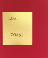
Photobooks really are like dogs. All dogs have a lot in common, but it’s sometimes hard to believe that when you see two very different breeds of dogs next to each other. Just like (un)expected is a very good photobook, so is Curran Hatleberg‘s Lost Coast, albeit for mostly very different reasons. It looks differently, it feels differently, you’ll engage with it differently, and it even smells differently. This is all too obvious to point out you might think, but it still is a point worthwhile making: there simply isn’t that one type of photobook. What we sum up under the term “photobooks” is as varied a collection of different types as the animals we call “dogs.”

Maybe the most obvious difference between these two books is the general way their stories are being told. As I already noted, in the world of photography you run into the strangest ideas concerning storytelling, starting maybe with the idea that photographs are very bad devices for storytelling. This is very obviously not true at all, as should be very clear from all those photobooks that tell their stories in a convincing manner.

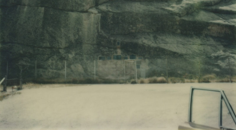
Dekens’ (un)expected tells its very specific, yet ultimately amorphous story (suicide in a small region in Belgium) through a collection of very specific stories (individuals who lost a loved one). Lost Coast, in contrast, cannot be described this clearly. Instead, it follows in the well-established tradition of books where a sequence of carefully edited pictures add ups to a lot more than, well, an album does. With a few exceptions, each spread presents a single photograph on the right page, offering no text, not even page numbers.

As is probably obvious, such an approach to photobook making can only succeed if the pictures in question can carry the burden that is being placed on them. As anyone familiar with this photographer’s work is well aware of, they can. But given that I engaged in this cross-comparison of two very different books, one approach to book making is not better than the other — at least not for me. I’m perfectly happy to live in a world where I can have both (in fact, there are a bunch more). If every book were made along either one of these two lines, I’d be bored out of my mind. Consequently, I’m happy having different books where photographs play different roles, with different weights. Lost Coast had me dive into its pictures a lot more — this is both a necessity, not just for me, but for any viewer: you only have the pictures, so you need to explore them carefully.

But it’s also a reward, given that Hatleberg is one of the very best American photographers right now. In many of these pictures you can see echoes of those that came before him. But unlike the imitators who successfully take an earlier artist’s mode of work, to continue it without much (if any) variation, this particular photographer appears to be synthesizing what came before him into something else, along the way redeeming some of the ideas that went into the staged-narrative dead end (remember how hot that was before the New Formalists finally put us all to sleep?).

Lost Coast‘s view of the country is bleak. Ostensibly only focusing on a specific region, much like in Gregory Halpern‘s ZZYZX there is a lot more resigned existence than anything else. In part, that is the American tradition in the photobook: books about America tend not to be cheerful. Where they’re not outright bitter or cynical, they’re resigned and filled with sadness. This ought to tell us something. There are lessons here. Maybe these lessons will be learned before the next election.

Lost Coast; photographs by Curran Hatleberg; 100 pages; TBW Books; 2016

Rating: Photography 5.0, Book Concept 3.0, Edit 3.5, Production 3.5 – Overall 3.9

Barbara Probst is one of those singular photographers who single-handedly pushed the boundaries of photography in a very specific direction, forging ahead on her own. Seeing her work online or in a book almost makes no sense, because it is in the installations of her multi-panel pieces that a large part of their power is revealed. A piece might consist of two, three, or many more photographs, each of them showing an aspect of the very same moment, employing a variety of different vantage points (at times, colour and b/w images might be mixed).

As photography centered on the very nature of the medium, maybe the only other comparison that comes to my mind are some of Paul Graham‘s most recent bodies of work, such as A Shimmer of Possibility or The Present. Where Graham dove into the dimension of time and less so on vantage point, Probst has been drilling deep into the latter’s bedrock, creating ever more complex and dizzying pieces. Curiously enough, for me, it’s Probst’s pieces that ultimately feel more convincing and thrilling, even though in terms of how cerebral they are they outgun Graham’s by a lot. Probst’s sense of discovery somehow feels a lot less forced than Graham’s.

Probst’s latest work might be the one most suitable for the format book. Published as 12 Moments, these twelve pieces attempt to distill the overarching ideas of the past decade’s work into two separate photographs. Unlike previous two-image pieces, which tended to involve minute shifts, resulting in very small differences, these newer attempts are a lot more daring. There inevitably is that moment of recognition, when the viewer is able to connect the pictures.

But this moment of recognition arrives at different moments in these pieces, making some more successful than others. Ultimately, all of Probst’s pieces rely on an astonishing degree of visual cleverness. Where they succeed, as they often do, is when they manage to move beyond being merely clever, where, in other words, that viewer’s moment of recognition is dwarfed by the unbroken power of visual delight.

12 Moments; photographs by Barbara Probst; essay by Robert Hobbs; 68 pages; Hartmann Projects; 2016

Rating: Photography 4.0, Book Concept 3.0, Edit 3.0, Production 4.5 – Overall 3.7

Another Photo World is Possible

Article main image

Last week, I argued that in light of the fact that Donald Trump is going to be the next president of the United States, the world of photography (“photoland”) might want to take a good, close look at itself and consider changing things up a little. To what extent change is going to happen I’m not sure. After all, however limited and outright self-serving large parts of photoland actually are, however limited the options are for many of those eager to be a part of it, the current system works well for enough people (much like politics itself). And many of those people will resist change.

It’s really up to all of those for whom the system does not work so well to demand change, and to make it happen. I believe that there will be enough people who are part of the system, in whatever capacity, who will ask for and work towards change as well. That change will have to entail breaking out of established structures, to find new ones. This is not an impossible task. The gallery system, for example, has not always existed the way it does now. It was established not so long ago. In a similar fashion, the kinds of discussions around photography now happening online, of which this site is a part, have also been started not so long ago.

When I started working on the earliest version of this site, I didn’t have a master plan. I believed (and still believe) that the internet was (and is) a great way to look at and discuss photography, and whatever I could (and can) do to contribute I would (and will) want to do. It hasn’t always been easy working on this site. I have at times been wracked by doubt and uncertainty. But I also know that that comes with the territory.

Given last week’s piece did not include any specific examples of what could be done differently, I thought I’d follow up by doing that. I will say this, though. The key to change in photoland is to get rid of the expectation that there will be easily available solutions. While the ultimate goals can and probably should be crystal-clear, the paths getting there are not. These goals might include, but are certainly not limited to, reaching out to much larger segments of the population, including and reflecting a much wider range of voices beyond the often narrow range of middle-aged white men (the irony of me being exactly that does not escape me), and more.

If what I did with this site can in any way serve as an indicator, doing what one believes in is the thing to do: a goal in mind, an uncertain path ahead. What makes good photography good — an absence of clear-set answers in the presence of the right questions — might here help get things off the ground as well.

How then do you reach other people, people who are not part of photoland? How do you reach those who might be subjects of photoland, subjects of any of the products produced, first in the pictures, and then maybe in the books?

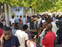
Two years ago, I wrote about Paolo Woods and Arnaud Robert’s Haiti work. There was a book, State, one of those standard photobooks. Really, nothing wrong with that. I quite liked the book. But it was also a book whose price was way beyond what many of its subjects would be able to afford. Not the rich people depicted therein, no the vast pool of the population in Haiti. So Woods and Robert made a version of the book for Haiti, produced there, with text in the local language. And they made an outdoor exhibition, putting up poster-size copies of their photographs in a public space. You can find all the details in the piece I published.

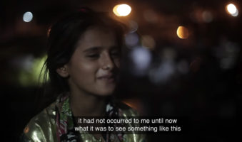
There’s a video at the top of the Just Another Photo Festival website that ends with the words “We take photography to the people.” After all, all you need to do just that, to take photography to the people, out of the white cubes and the Grand Palais, is a projector, some electricity, and a screen to project on (a big piece of white cloth will do). And then you’re in business.

Mind you, Just Another Photo Festival (JAPF) is exactly not that. It doesn’t offer the usual circus (portfolio reviews, talks, etc.). It brings photography back to what the medium does best. It brings it back to the photographs themselves, and these photographs are shown to people who otherwise wouldn’t have access to them. Started by Poulomi Basu and CJ Clarke, JAPF shows what you can do if all you have is a simple, basic idea and the will to make it happen.

While the Trump presidency still is some time off, other countries have experienced having to deal with toxic governments already. Right now, Trump is merely following in the footsteps of the authoritarian governments currently in power in places as diverse as Russia, Turkey, Hungary, or Poland (to name just a few). It’s easy to look at Canada right now and think there’s much to be admired there, but things looked a little different under the previous prime minister, Stephen Harper.

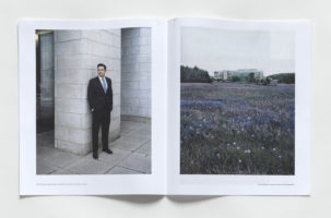
In an email to me, Tony Fouhse writes that he photographed Official Ottawa as “a reaction to the chill in the capital (and across the country) brought on by Stephen Harper’s policies and approach.” He then published the work using newsprint, which he gave away for free: “I have noticed a big difference in how my work is approached and consumed when it is on a gallery wall vs being distributed at random for free. People go into a gallery primed to look at art, they are in that mode and, so, regard the work from a mind-space  that is ready, if you know what I mean. Then I’ve seen folks bump into the Official Ottawa  newsprint and, more often than not, flip through, look confused or bored, set it aside, flip open and begin to read the local tabloid newspaper.” There obviously is the fact that the context in which your work is being seen matters.

Taken outside of the context of the white box, your pictures will not be treated any longer they way they do when they hang on those walls, with a price list available at the reception desk. In other words, to reach those not part of and not familiar with photoland might require a rethinking of one’s strategies. And even ignoring that, there will always be the possibility that something does not have the intended effect. Of course, that can also happen inside photoland. People might prefer their local tabloid newspaper.

This can be a bit dispiriting.” writes Fouhse. “But I have come to understand that once you try to reach outside the box the results are less assured. But I have always held assured results with a certain amount of contempt. What, after all, is the point in executing a plan designed to arrive at a foregone result (unless you are an engineer or a manufacturer of widgets, or something)?” To me, that would be the key here: Once you’re outside the white cube, things will look a lot different, and you will not run into the same reactions. But that’s really the beauty of it, because it opens up possibilities.

As stifling as being part of that narrow white-cube-plus-photobook scene is for most, there also is the comfort that you know what to expect. Your friendly reviewer will write the right things about those working-class people in your pictures — a world that neither of you is actually part of.

Consequently, a change in thinking is required, not just about how to break out of photoland. What does artistic success actually mean? What can it mean? What should it mean? In its current form, photoland is unlikely to offer much, if any success, to those inside (if you haven’t done so already, you certainly want to read this piece). If you get some success, you know what it looks like (some blog featuring your work, your book on any of the five million short lists, or whatever else). But outside? It’s not so clear. And that’s the beauty of it.

Now What?

Article main image

Not much is there left to say about the United State’s 2016 presidential election other than that the Republican Party (“the party of Lincoln”) has become just another incarnation of any of the neo-fascist parties that have been plaguing Europe for a while now (think France’s National Front). A racist, sexist, two-bit real-estate developer turned reality-TV entertainer who was caught on camera bragging about physically assaulting women is going to be the country’s 45th president. Right now, this is a travesty. No doubt, soon enough it will be a tragedy for all those at the receiving end of the next administration’s policies.

Sixteen years ago, as the Supreme Court handed George W. Bush the presidency, I sensed a similar feeling of shock and dejection in large parts of the population. What was to be done? That was the question then. Honestly, I don’t think there was a convincing answer; much like there is no such answer today.

What does any of this have to do with photography anyway? I’ll get there.

It might be too much to hope there would be a way to find an answer. Then again, maybe that is exactly the problem, the idea that there need to be answers, that there need to be solutions. Also, isn’t it interesting that the blame for all of this always lies with others? So let’s turn this around. If the fact that Trump won is a sign of a deep unhappiness with “the system,” and if that same unhappiness also fueled the ill-fated Bernie Sanders run for the Democratic nomination, then we might as well start out by asking if we, the creatures who in some capacity are part of that larger, mostly amorphous body called “the art world” or “the photo world,” are unhappy, and if, yes, what exactly we are unhappy with.

I’m writing this while a considerable part of my Instagram feed is taken up by photographs taken around Paris Photo, while fending off, or rather: deleting a large number of emails about special-edition-this or we-are-booth-that sold there. Can one seriously feel dejected about the election and not get absolutely furious that the circus run for the entertainment of those of the rich who buy photographs goes on as if nothing had happened? OK, it’s not that I would expect Paris Photo to get canceled. After all, too much money is at stake. And it’s France anyway, where the National Front has not yet won the presidency.

But still… Maybe we ought to be a tad more incensed. Maybe we really need to start asking more questions about how this medium photography operates. A few weeks ago, I went to see one of those exhibitions of a private collection that simultaneous strokes that collector’s ego and offers them a way to save some taxes while throwing some hapless art gallery some good (albeit mostly second-rate) work to show. I was with students, and there was a discussion about what was on view.  At some stage, I asked my students why they would be surprised that only the 1% bought art, given that 99% of the population was given no access to it, both literally and metaphorically.

You see what I’m getting at here?

Of course, it’s a bit too easy to claim that all photography is done with the ultimate goal of selling it to the rich. It’s not. But you’ll have to admit that an awful lot of discussion centers on just that. Meanwhile, photographers can’t understand why, for example, the number of people buying photobooks isn’t growing. Show someone not part of our circle any of those books we go gaga over, and you’re likely to at best receive a blank stare: what is this? This is not necessarily to say that per se there’s something wrong with these kinds of books. But I believe there is a lot wrong with our insularity, our inability (if not unwillingness) to cross a divide, while, and this is where this gets really ironic, a lot of the work in our books might even be made about the very people who will just shake their heads since they can’t understand them.

You see what I’m getting at here?

While there is some truth to the faux-populist talk of those “gatekeepers” who somehow always tend to keep out the truly deserving while letting in other people, it is centered on the idea that there is a gate, something that separates where we all exist, as citizens, from whatever that other area might be called, where the select few get to exhibit their wares and sip their cheap wine from plastic cups. Attacking the gatekeepers really isn’t a complaint about the status quo. It’s really just a grievance over not being allowed in.

As far as I can tell, the Bush jr years didn’t change this whole dynamic one bit. Neither did the Great Recession, which, curiously, ended up being photographically completely underexplored — as if photographing those being left in the dirt (and that’s a lot more people than merely the Rust Belt folks everybody suddenly has an interest in) by a ruthless financial complex (that buys our wares) somehow wasn’t deserving of our attention.

So yeah, we can march down 5th Avenue chanting something (not that there’s anything wrong with that — at the very least it makes voices heard), or we can continue our hashtag activism, clicking here or there (no, really, that’ll show ’em!). But I’m afraid that’s not going to do much, other than somehow convince us that we did our easy bit. This time around, with the stakes vastly raised, we might want to consider other, additional options — assuming we’re actually serious about our claims that the outcome of this election and by extension what that stands for are not right.

It’s not as if there aren’t any options. But some thinking outside of the white box, outside of the Grand Palais might be required. What if, for example, instead of thinking about how to get into the club, we start thinking about whether there are other gates? What if we extend that club? Or make our own club? I know a lot of people are really happy to go to Paris Photo. I have to tell you, though, that’s not a club I am very eager to join. Your mileage might vary.

Is there a law that says that we can’t change the rules of the game?

After all, the world of photography has changed a bit over the past decade and a half. Now, there are sizeable communities online, and you can see photography made anywhere in the world with the click of a mouse. Photobooks are a lot easier and cheaper to make. What does that add up to, though? We need to ask this question and face the possibility that what we might find out isn’t quite enough. Then what?

Correct me if I’m wrong, but whenever someone does something really different, that’s really not OK, either. Let’s just take Humans of New York as an example. Mention that site to anyone inside photoland, and chances are they are going to make a face, talking about how bad the pictures are or whatever else might be wrong with it. Funny, though, at the same time those same people have trouble selling the 300 copies of that book they made.

You see what I’m getting at here?

What if we finally thought about breaking out of that narrow little world I call “photoland”? If we’re really serious about it, that would not entail giving up all of the things we believe in so dearly. But it would mean thinking about a lot of them a bit differently. You don’t like Humans of New York? Well, try to do a site that does the same thing, but better (whatever your idea of “better” might be).

Because there is a lesson here: it’s not that art photography is a niche because there is some universal law decreeing that. Art photography is a niche market because we like it that way. And the reason why art photography reaches so few people is directly related to that.

Do photobooks, for example, always have to be luxury objects? Couldn’t we be making newspaper-style publications and just give them away for free? Place a few copies at the local diner, say? Oh, I know, that’s not the most original idea, but right now, to me it sounds a lot more interesting than another fancy book in an edition of 300 or 500, designed to end up on some shortlist.

Honestly, what really gets me is how a field that prides itself as being progressive ends up happily playing by the rules laid out by people for whom a picture of a homeless person is only considered based on home-decoration criteria (actual story, btw — someone I know overheard two collectors debate this over a fancy dinner). Somehow, to me that doesn’t compute. But again, that might be just me.

In the end, it’s not even that clear how this whole system we have right now is going to be sustainable. There are only so many resources available, to many jobs to be filled, so many galleries willing to show work, so many people who’ll buy photobooks. It would seem to me that the options are either to try to get a foot in the door and snatch up some little crumb (while taking it from other people), or to vastly expand our thinking around what our photographs should be used for, how and where they should be seen, how we define our success.

So what we need these days, especially once Trump is in the White House, is a lot more inventiveness concerning photography’s dissemination. We have a lot to say, and now it’s time to reach more people potentially interested in looking. We owe it to them, as citizens, and we owe it to ourselves, not just as artists, but also as members of a crowd that is already too large for the way too restricted and way too restrictive environment we currently operate in.

Related:

“An artist’s duty […] is to reflect the times.” – Nina Simone

Partisan versus Balanced Honest versus Wilfully Ignorant (Colin Pantall)

The Trump Nightmare Is Here (Hrag Vartanian/Hyperallergic)

The Tears That Donald Trump Brought (Paddy Johnson/Art F City)

A Culture War is Coming (Christian Viveros-Fauné/Momus)

Why the Art World Must Not Normalize Donald Trump’s Presidency (Noah Fischer/Hyperallergic — added 15 Nov 2016)

Ideas and Intent, Form and Content

Article main image

The topic I want to address in the following is not restricted to the world of photography at all. Here is David Salle in his introduction to How to See: “A visit to any of today’s leading art schools would reveal one thing in common: The artist’s intent is given far greater importance than is his or her realization, than the work itself. Theory abounds, but concrete visual perception is at a low ebb. In my view, intentionality is not just overrated; it puts the cart so far out in front that the horse, sensing futility, gives up and lies down in the street.” It would be straightforward to apply this line of thinking to photography, which is what I intend to do here.

The younger forms of art, photography or video, do not feature very prominently at all in Salle’s book. The painter seems most comfortable with what he is familiar with, and that’s his own medium, plus some sculpture. It would be somewhat tempting to think that his argument cannot be extended to these machine-based forms of art, given it rests so much on physical form, the layers of paint and the way they are being put into place. In photography, we don’t (can’t) consider form this way. Photographs, as we know, have no surfaces. There are no slowly accumulated materials. Especially these days, every printed photograph basically looks the same, some semi-generic inkjet print produced after the file was made with an equally generic camera (some photographs just telegraph “Mamiya 7,” don’t they?).

But the absence of the maker’s execution in the painterly sense that Salle discusses needn’t deceive us. In photography, there are a few exceptions, to be found in heavily processed-based photography, whether it’s analog (where materials might be added on top of each other) or digital (where the process itself might include a large number of building blocks). But these days photography contains its own type of accumulation, with individual photographs playing the role of paint and the final project being the painting, the final “thing” to be considered. Seen that way, the Sallean argument can be applied here.

Photography fights the same battle over the roles — or weights — of idea and intent over what’s in the pictures, form and content. That battle is fought everywhere, and it’s mostly a battle over interpretation. It’s being fought in art schools, and it’s being fought wherever there are discussions about photography.

It’s not clear to me whether there are different factions fighting at the extreme ends. I suppose in the strictest sense, one could place conceptual photographers squarely at the “ideas and intent” end, and maybe photojournalists and orthodox documentarians are at the other one, “form and content.” That separation feels a little simple (if not simplistic), but there is a grain of truth to it.

Of course, mere ideas and intent without proper form and content (or, to maybe phrase this more accurately, with form and content lacking) are not particularly interesting — think of all that tedious conceptual photography where you spend at most five minutes looking at the pictures. And mere form and content without proper ideas or intent behind them fall equally short, even though here, the problem can potentially get tricky (see my earlier piece Why does it always have to be about something?).

There are some recent developments that have muddied the waters even further. There is the prominence of the photobook. It’s not that difficult to make a fairly OK looking photobook with pictures that really aren’t that good at all, especially if you add lots of bells and whistles. Even if your pictures are really not very good, a well executed exercise in cleverness, printed in an edition of 300 copies, is likely to get you considerable success — a place on at least one of those many, many shortlists for sure.

In addition, on the internet the need for constant material by larger news sites has also not necessarily helped photography much. There really is only so much good material available. The rest will have to get dressed up with gratuitously added hyperbole, and by throwing lots of overblown adjectives, claims or promises (or all of those) at the viewers. So it goes.

But the choice to buy into any of this is ours, and it really is a choice. I personally believe that there will have to be a balance between ideas/intent and form/content, and I long to see the best. That’s what it comes down to. That’s what makes photography so hard. It’s so easy to press the button to get a picture. You do it 50 times, and you got your project. But that’s usually not what will give you something that holds up to much, if any, scrutiny. It’s a lot harder to get a good picture, and then even harder to get a good project filled with good pictures.

As a photographer, you will probably have to address the problem ideas/intent vs. form/content simultaneously from both ends. This is difficult, because it’s much easier to have an idea and then produce something around it than to be able to have that idea evolve, based on what is coming out of the pictures.

By “easier” I mean easier in all senses of the word, in particular thinking of one’s comfort. Ideas tend to come properly formed, unlike pictures. Who would want to go somewhere without having a properly defined target? But that’s really how this should work, assuming we’re in the realm of the arts. Even outside, let’s say when we’re dealing with the documentary form, there will have to be some discovery (otherwise, it’s really just propaganda, isn’t it?).

Maybe it’s easier to grasp this by looking at examples. The balance between ideas/intent and form/content is as important in Bernd and Hilla Becher’s typologies as it is in Robert Frank‘s The Americans. That’s really what this comes down to. Unless you are a dogmatic grouch, you will have to admit that experiencing a set of water tower photographs on the wall of a museum provides just the same level of amazement as looking through The Americans — even though the amazement will manifest itself in very different ways (and that makes both so exciting). You might prefer one over the other. But you will be forced to tip your hat to the one you don’t prefer. Both are so rounded, so well done, so utterly visceral that in their presence your resistance will simply be futile.

That’s a good definition of great photography: it’s photography perfectly balancing ideas/intent and form/content in such a way that the photographs will enthrall you, even if you would never hang them over your couch. In other words, it’s not about what your preference or sense of taste dictates, it is about what the work in question dictates. And the work can only do that because its maker pushed her or himself very hard to achieve that proper balance between ideas/intent and form/content.

Thus, as a photographer, you will have to tackle the problems all at once — if you really want to have that well rounded body of work that offers so much, regardless of how long a viewer looks at it. Regardless of where you live on that spectrum that says “ideas/intent” at one end and “form/content” at the other, you will have to look at your photographs taking both ends into account.

And you can’t… Well, you can, but you shouldn’t give in to the temptations — whether it’s making a quick book, or dazzling a young curator whose background in, let’s say, curatorial studies doesn’t allow them to understand the full intricacies of photographic form and content.

Instead, you will have to want it all.

(French: Idées et intentions, forme et contenu)