Photojournalism and Manipulation

Article main image

There’s a German saying that translates as “chasing a pig through the village.” You might not want to know where it comes from, especially if you like animals (there actually isn’t much to imagine). These days, it’s used metaphorically. It doesn’t mean that someone (or a group of people) is a pig. Instead, it’s employed when there’s a huge kerfuffle around something, where the noise and commotion ultimately is intended to garner a lot more attention than the eventual outcome. Think manipulation in photojournalism.

At the time of this writing, the latest example would be provided by photographs taken by Steve McCurry. Large parts of this latest “scandal” happened while I was traveling, but honestly I probably wouldn’t have paid much attention to it anyway for reasons that I will outline in the following. This is not to say that most of the writing produced around it is without merit — on the contrary. Lewis Bush’s article about the topic provides the best take I’ve seen on the topic, and it also contains quite a few links to articles dealing with the actual problem.

A few weeks earlier, Teju Cole had written a piece about McCurry that, to me, felt a bit like shooting fish in a rather small barrel. Cole’s piece didn’t talk so much at all about the kind of manipulation that moves pixels around and changes an image’s saturation. Instead, he pointed out the rather particular gaze employed by McCurry, a gaze that, in the case of the photographs in question, aestheticizes India in ways very palatable to Western audiences. Unfortunately, instead of then directly taking his audience to task (we’ll come back to why this matters), Cole stayed with the photographer, comparing him with Raghubir Singh. This then led to a conclusion that I don’t think holds as much water as those who vigourously applauding the piece might think it does.

It is true, the onus to make work is always on the photographer. It might say something about McCurry that he would portray India the way he did. But I don’t think it says something only about McCurry, the photographer, as Cole implies, while completely leaving out McCurry, the businessperson who has to make a living (much like Cole, me, and pretty much everybody else). In fact, McCurry has made quite a successful career out of photography. For me, the problem with his work isn’t so much that he “manipulates” his pictures (seriously, people, it’s photography). It’s that for the most part that they’re such insufferable kitsch. Oh, and there’s another problem: there is high demand for that stuff (how many of those subscribing to the New York Times might have one of those McCurry books at home?).

If a photographer very successfully provides the pictures that people want (both the publishing industry as much as viewers at the end), why are we talking about what that photographer does to get them? Why aren’t we talking about what it says about us that those are the images we want? It obviously is a lot easier to simply leave the onus on the photographer. But honestly, in most cases I am just not willing to go there any longer. It just feels too disingenous to me, to suddenly start a mob around a photographer who’s just doing what is in such high demand.

As much as I enjoy the metaphor of the naked emperor who gets “unmasked” by a child, there’s something strange and unsettling seeing it applied it to these kinds of photojournalistic “scandals.” Sure, we could discuss the role of the tailors/weavers, as we usually do. But I’m not sure that’s really the point of the tale.

In the McCurry case, fortunately, there was a very different take. A.D. Coleman published a letter written by Robert Dannin, who worked at Magnum and with McCurry in the late 1980s. Dannin squarely puts the onus on the publishing industry in general, and on National Geographic in particular. These are the kinds of discussions we — as the general public — are rarely exposed to. But to me, it seems completely obvious that we have to talk about this aspect of photojournalism, which is immensely important: the role of the publishers (who might or might not also still commission work). Given McCurry’s photographs are such kitsch, why are they so widely coveted by the likes of National Geographic? What does that tell us about the publishing industry?

And what does it tell us about ourselves? What does it tell us about how we like to get the world presented? This is where each and every discussion of some “manipulation” scandals has completely and utterly failed to do anything meaningful: sure, you can pretend that photojournalists are those independent voices that solely determine both what’s in the pictures and what those pictures look like. But seriously, that’s as infantilizing as it is insulting — both to the photographers in question and to us as the larger audience.

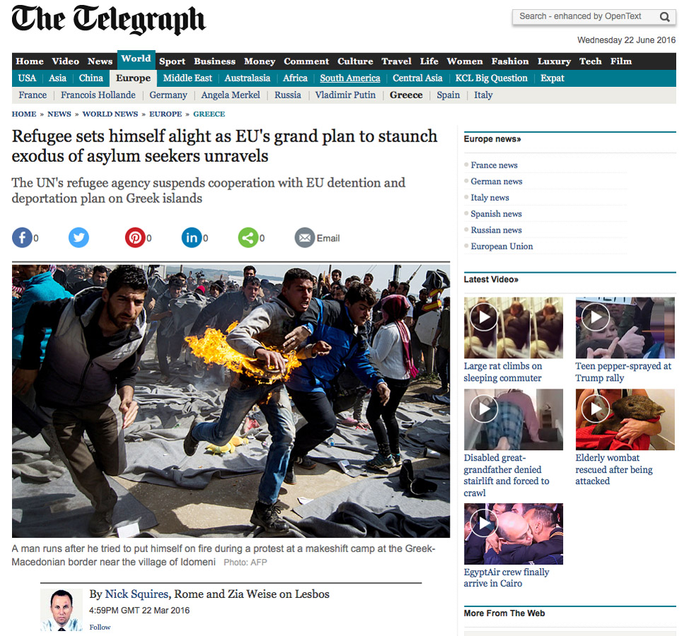
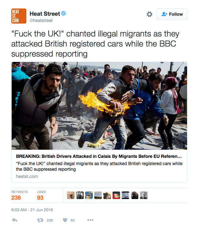
The reality is that manipulation is very common in the world of the media, and photographs play a large part of that. Most of the manipulation comes not through the photographs per se, but through how they’re used and presented.  Let me give you some examples. On June 21st, 2016, Benjamin Chesterton (Duckrabbit) noted on Twitter that a recent “article” by Heat Street about “British Drivers Attacked in Calais By Migrants Before EU Referendum” was using a photograph that wasn’t taken anywhere near Calais. A day later, the news outlet, part of the Rupert Murdoch media empire and set up by Louise Mensch, had changed the picture. The photograph in question was taken by Andrej Isakovich near Idomeni in March 2016. According to the caption, the man on fire has actually done that to himself, as a form of protest. That same day, both The Telegraph and the Daily Mail ran the picture in articles, whose headlines both stressed that very fact, namely that the refuge had set himself on fire (click on the links to see the articles).

I might not have to explain how using a photograph of a man desperate enough to set himself on fire to essentially support a campaign 50% of which was nakedly xenophobic and racist (and opposed to having maybe the duty to take care of people who are so desperate that they will set themselves on fire) is really just shameful. Basic aspects of human decency aside, it’s a very obvious case of manipulation by what supposedly is a news outlet. Of course, the manipulation is not centered on what’s in the picture (or what it looks like), it’s centered on how the picture is used, completely out of context.

You’d imagine that this couldn’t get any worse, but it actually did. Confronted by someone on Twitter about the misuse of the photograph, Mensch responded (buckle up!) “it is just a generic picture of migrants rioting, as NY is not up yet to include photos of migrants attacking Britons.” Well, it is not just a generic picture, as the Getty page makes very clear. But going beyond the literal, it’s positively mind blowing how anyone could approach such a photograph as a “generic picture.” Someone else then took Mensch to task about just that, noting that “It is basic journalistic integrity to match headline to pic” to which the response was: “and I have done so. When migrants riot, that is the stock image we always use.” As is quite obvious, the words “basic journalistic integrity” have a very different meaning in the world of Mensch, who either doesn’t understand the main idea or is willfully ignorant.

What is clear is that in the hands of the likes of Louise Mensch, photographs become welcome tools to aggressively manipulate an audience. That we need to talk about a lot more.

So let’s do it. Here’s another example. I don’t know whether you’ve heard of Another Crimea. I had not until I went to Poland in early June, where a lot of photographers were talking about it. In its own words, Another Crimea is “is an unprecedented documentary art project. These are 6 true stories by the world’s best photo and video journalists of leading photo agencies MAGNUM PHOTOS, VII and NOOR. Each of these authors spent 10 days in Crimea in Spring-Summer 2014 and captured their own precious moments of Crimean life. Come and see the dawn of the peninsula and its people’s new old chapter beyond all political and ideological barriers.” Well, that sounds great, doesn’t it? An “unprecedented documentary art project” with six “true stories,” done by “the world’s best photo and video journalists of leading photo agencies MAGNUM PHOTOS, VII and NOOR.” How exciting!

Let’s learn a bit more. Here’s part of the description of Crimea from the About page: “The world also knows Crimea for the bloody Crimean War between Russia and an alliance of the Ottoman Republic, Great Britain and France in the 19th century and for the 1945 Yalta Conference, where Soviet Premier Josef Stalin, US President Franklin D. Roosevelt and a British Prime Minister Winston Churchill sealed the postwar division of Europe. In March 2014, after the majority of the local population voted to join Russia, the Crimean Peninsula once again became the focus of the deepest East-West crisis since the Cold War.” This is all true. The only problem is that it’s woefully incomplete.

Here’s another description of Crimea (again, I’m just quoting parts): “In early 2014 Crimea became the focus of the worst East-West crisis since the Cold War, after Ukraine’s pro-Moscow president Viktor Yanukovych was driven from power by violent protests in Kiev. Kremlin-backed forces seized control of the Crimean peninsula, and the territory, which has a Russian-speaking majority, voted to join Russia in a referendum that Ukraine and the West deem illegal.” What do you know, there’s something the Another Crimea site, which is supposedly interested in presenting something “beyond all political and ideological barriers” simply omits, namely the Russian invasion. Of course, omitting widely known facts (however contested they might be) is just that, an exercise in politics and ideology. So from the text already, the makers of Another Crimea are engaged in a blatant act of manipulation.

The six photographers who contributed to the project are Olivia Arthur, Pep Bonet, Yuri Kozyrev, Christopher Morris, Gueorgui Pinkhassov, and Francesco Zizola. As I mentioned above, I’m not particularly interested in putting the onus on them. Each and every one of them might have thought about whether it was a wise choice to contribute to what essentially looks and behaves like a Russian propaganda website. Their agencies in question, MAGNUM PHOTOS, VII and NOOR, might also have some thinking to do: is that what you want to be known form, providing pictures for propaganda website? If you’re curious about reactions by a large group of mostly Eastern European photographers look here.

As before, the onus is on us, as viewers, to figure out what’s going on. As David Campbell noted on Twitter (responding to the Heat Street case I discussed above), “Photographs are potent ammunition in political struggles -we need verification more than ever”. Given verification can often be done so easily using the internet, there is hope. But, and this is a big but, can we really expect every person to verify all information all the time? Obviously, we can’t — and that’s what the makers behind Heat Street or Another Crimea are counting on. That’s why it is so important to call out such manipulation with photographs — or with very selected bits of information around photographs.

Coming back to a very basic level, obviously all photographs manipulate their viewers in some form. Any time a photograph does something to you, whether it informs you, makes you feel good or bad, or whatever else, you’re being manipulated. And honestly, I wouldn’t have it any other way. I’m craving for photographs that do something for and to me. Some photographs do it a lot better than many others.

In the context of the news, this basic property of the medium photography becomes a problem. Well, I need to be more precise: it becomes a problem if (and only if) you’re interested in what has been established as good, traditional journalism. If, in contrast, you are interested in journalism along the lines of Heat Street, then those pesky rules and restrictions disappear. I personally want to think that ultimately, the rules of traditional journalism will prevail, especially given how toxic bad journalism can be (just look at the Brexit campaign).

Assuming we’re interested in what I just called good, traditional journalism, the topic of manipulation involving photography is of utmost importance. It cannot only revolve around calling out photographers like Steve McCurry, who somehow are now guilty of “manipulating” their photographs after we asked for exactly that for such a long time. Instead, we need to vastly expand the scope of what we’re talking about and include the role of publishers: which stories are being featured (and which ones are not — this is where things get a lot harder), and how are photographs being used. While photographers have (ideally) complete control over their pictures (assuming they quality-control the work of their interns), once their pictures are out of their hands, there’s very little or no control.

We also need to talk about what we want to see, about what we don’t want to see. We need to interrogate why we’re so drawn to dramatic or kitsch pictures. Do those kinds of pictures serve the large variety of stories we might have to deal with? Furthermore: how can we learn better to engage with pictures presented to us (in any given context really), to see to what degree we’re being manipulated?

Let’s realize that being manipulated isn’t necessarily a bad thing. Being manipulated only is bad, if things are completely out of our control, if, in other words, we lack the means and ability to detect it, to question what’s going on. We might then still decide that yes, it’s good we were being manipulated: it’s good we learned something that made us change our minds. But we need to have more critical agency in this process.

In the world of photography, we’re not going to have this agency if we focus only on what photographers do (and/or how they do it). We need to expand out to include the dissemination and use of photography just as much as our own reception. I understand that’s a lot of work, possibly more than many of us are willing to do, but life in a democracy ultimately requires work. Democracies need to be defended against those who want to undermine them. If we don’t want to do that work, if instead we’re happy to keep chasing pigs through the village, then nationalists, xenophobes, homophobes, and sexists will happily continue destroying the basic fabrics of the societies we live in.

(French: Photojournalisme et manipulation)

Don’t complain about problems, solve them!

Article main image

I don’t know what it is that makes the world of photography so neurotic. Try to wrap your mind around it: here we have arguably the most popular — and important — medium there is, and everybody is intensely worried about something. A few years ago, an actual museum held a two-day symposium entitled Is Photography Over? And that was just the possibly most absurd tip of the massive iceberg of silliness.

There now is “post-photography,” whatever that’s supposed to be (don’t tell me, I don’t want to know). In parallel, the world of photojournalism is chasing its own tail like a rabid dog, trying to figure out how to possibly do a decent job in this new era (I have an article about manipulation forthcoming!), cultural theorists and/or commentators are writing long think pieces about how the selfie really amounts to the end of all civilization, etc. etc. etc.

Not to be outdone, the part of photoland dealing with photobooks is caught in spasms of being neurotic that make any of Woody Allen’s characters from when he still made good movies look positively well adjusted. I’m sure you are aware of all the “problems”: there are too many photobooks, and the market is too small, and collectors make everything too expensive, and there are too many prizes/awards, and it’s all too expensive, and it’s just a niche, and there are too many “best of” lists…

For crying out loud!

The sad reality is that people will complain about the (supposedly) select-few “gate keepers” and about there being “too many” “best of” lists at the end of each year. Well, which one is it now?

Is this really how we want to engage with what to me looks like an incredibly active and exciting way to use photographs, telling stories and then fairly easily and relatively cheaply sharing them with other people (who might live a continent away)? Where is all this neurotic anxiety coming from? I just don’t get it any longer.

I seriously think we would be a lot better off if we ditched large parts of all that bitching, moaning, and whining that’s so prevalent in the world of photobooks (or photography in general, but let’s stick with books for now), especially online.

Sure, photobooks come only in small editions, and they don’t sell to very large audiences. Have you ever talked to someone who, let’s say, self-published a book of poetry, though?

In much the same fashion, many of the supposed problems of photobooks just disappear once you put them into a perspective that’s not just created in that tiny bubble of photography. After all, here we are in a day and age where it’s relatively simple and easy for any photographer to publish their own photobook, and regardless of whether you see the fact that there are many books out there as a problem or not, I don’t think that’s something we should be eager to give up.

Almost two weeks ago, I gave a talk about photobooks in Warsaw (Poland). During the Q&A part, someone asked whether all photographers should make a photobook. The — for me — obvious answer was and still is: no. This question really is just a variant of what people would ask me around 2007/2008: do photographers need to have a blog? (Remember those days?)

What this all comes down to is the following. For a start, I personally don’t think that anyone should feel there is any sort of obligation to do what a lot of other people are doing (unless you think of yourself as a sheep, in which case just go ahead). The first reason for the existence of a photobook should be that it make sense for its maker.

There are many very well-known photographers who don’t seem to worry about photobooks at all. Their work lives in what essentially are catalogues, often published at the occasion of an exhibition. Sure, that’s a type of photobook, but it’s a very different beast (that you rarely see in any of the many shortlists of photobook awards). And I could easily make a case for the catalogue being a useful tool for a lot of photographers who don’t want to (or need to ) create other types of books. It really isn’t just a case of “good” vs. “bad.” We have to start moving on from those simplistic and infantilizing discussions concerning photobooks.

So: If it somehow doesn’t make sense for you to publish a photobook, for whatever reason, just don’t do it. It’s that easy. Problem solved.

I could further go through the list of supposed problems with photobooks one by one and offer alternative solutions. But I really want to approach the whole topic differently.

If you start thinking about it — forgetting about all those oh-so serious problems for a while, photobooks really are incredibly versatile and flexible beasts. They come in many shapes, sizes, editions, … Now, given that nobody is legally required to make a photobook, and given that if you wanted to publish a photobook you could literally do anything you want (as long as it fits the work), isn’t that the best possible situation to be in? Shouldn’t that trigger exactly that creative urge that photographers usually profess to be interested in?

In other words, if you have a problem with how things are being done by other people, find you own way! Show them! Do a better job! Solve the problems, instead of complaining about them! Problems, after all, are the very best thing that can happen to any creative person: problems require solutions, and finding solutions usually requires a fair amount of creativity and ingenuity.

Any of the books that received a lot of attention over the past few years in one way or another was created working against a set of limitations and problems. That’s actually why they were all so successful (artistically, I’m not talking about money here). In a recent article, Colin Pantall spoke about just that: “Photographers, designers, publishers, booksellers, everybody’s pushing the book form in a different way, and those ways are not always in the same direction. There’s a lot going on. What it all means is, as always, another question that neither I nor anybody else seems to have an answer to.” You’ll have to find the answers — that is a large part of the enjoyment coming out of making a photobook. It’s not about merely sticking pictures into some simple Indesign template.

So problems exist not to be bitched about, but to be solved, whatever your particular solutions might be. That’s what people actually are looking for. That’s why and how good photobooks stick out.

Thing is if you can’t muster the creativity and ingenuity required to solve the problems, I’m tempted to think you also don’t have it in your work. And really, maybe that’s the real problem?


(Photo) Book Reviews (W23/24 2016)

Article main image

I have another trip coming up, this time to Poland for a little less than two weeks. So I’m going to try to pack as many reviews as I can into this piece, which will remain on the site until I’m back (June 16th). Up until now, I have been publishing pieces at least once a week, and the reality is that that’s simply not doable right now. In the meantime, those new(ish) to this site might want to check out the extensive Index, or the list of previous rated photobook reviews.

Photojournalism is in crisis, for more reasons than just one. Part of the crisis is being enforced upon the profession by the media trying to adapt to business challenges following the standard neoliberal play book: cut costs, even if quality suffers, to make sure the dollar numbers add up for those at the top. As if this wasn’t a bad enough environment to exist in, photojournalists unfortunately have been caught like the proverbial deer in the headlight concerning their own medium’s development. Hardly a week goes by without yet another completely inane “scandal” over image “manipulation.” Where is this all coming from? How is it possible that so many otherwise so talented photographers struggle to mightily facing challenges that even most teenagers hardly bat an eyelid over when working with pictures on their smartphones?

Stuart Franklin‘s The Documentary Impulse provides deep insight into photojournalism’s problems. Mind you, that’s not what the book intends to do. On the contrary, Franklin set out to explore what he calls “the documentary impulse.” What exactly that is I’m not sure. For my taste, it’s not quite as well defined as one would expect, foreshadowing other problems in the book. That small problem aside, the book attempts to explain photography from the point of view of classic, orthodox photojournalism.

And that, perhaps almost inevitably, leads to the problems that are so common in photojournalism: things just rely too much on a combination of a well meaning, yet somewhat unresolved ideology and a rigid photographic orthodoxy for the wide field of photography being easily explainable. Things make a lot of sense for the kind of photojournalistic/documentary work so widely used around seventy to fifty years ago, but once it extends out from there, it gets incredibly problematic. This is not to say that the ideas, maybe even the ideology behind orthodox photojournalism is bad. On the contrary. But it’s just completely at odds with today’s realities. Problems cannot be resolved by being rigid about the supposed rules of photography, while letting media overlords get away with the murder of their own core businesses.

Still, despite these shortcomings The Documentary Impulse is a truly recommended dread. This is simply because it combines deep insight, and a longing for a better world, combined with an inability to see how the good old days are simply over, how our desire, for example, for that one iconic photograph that explains something — Franklin’s claim to fame is his “tank man” picture — simply makes no sense any longer. It’s a bit like the inverse of large parts of the art-photo world, which ignores basically every more important societal issue, to quite smartly “explore” what photography does today. If it only were possible to bring the two together…

In a world ruled by computers, algorithms, and data, a mistake is a bug, and bugs need to be removed. There’s a “patch” for that, which then, almost inevitably, requires another “patch,” and then another “fix” etc. ad infinitum (I’m writing this using a browser with the version number 46.0.1). As should be obvious to anyone but the proponents of conceptual art, art without failure isn’t art. It’s just boring or tedious, however nice or alluring or seemingly beautiful it might appear at first sight (good examples are provided by, for example, most of Taryn Simon‘s bodies of work).

Given it’s a technical medium, photography has struggled with exactly this problem for a long time, and it continues to do so. For example, cameras have been getting better, but we can’t say the same about the pictures. If you look at, say, a Carlton Watkins photograph, one of those contact prints from glass plate negatives he made in situ, your iPhone 6s photographs suddenly look a lot less amazing (and the same is true for roughly 95% of all art photographs on view at any Chelsea, NY, gallery). The lenses that man used, were truly terrible compared with today’s standards. Yet the photographs are a lot more detailed and amazing than what’s being made today.

Actually, we’ve now come to the point where the perfect little machines we all use to take pictures often have ways built in to create imperfections — an absurdity if there ever was one (usually, it’s just some presets, which produces the same small set of seemingly imperfect effects over and over again). If that words wasn’t so overused, I’d say there’s an irony here. We want imperfections, we want technical failures, because, well, they’re beautiful! Now why didn’t we stick to the original stuff in the first place? Oh, I know, Watkins couldn’t call his friends with his camera.

But there’s a lesson here, and it’s the lesson Erik Kessels explores in Failed It!, namely the fact that failure tends to come in a random manner. Randomness, something that exists outside of the world of proper calculations, often comes with beauty, opening up a previously unexplored, unimagined world. Of course, you can’t will mistakes to happen. They just do. So the real key to accepting failure is not to try to control it, but to let go of control, of that one desired end result. While this is getting harder and harder with ever more refined computerized cameras, it’s possible. Kessels shows the way, with charm and wit.

The vast majority of photobooks in my office is part of my library. My collection, in contrast, only contains a very small number of books. This distinction, which Josef Chladek made me aware of, is important. The books in my library are mostly good. Some of them aren’t, but they’re also nice to have around, in particular for teaching. In contrast, I cherish the books in my much smaller collection. Those are the books I love returning to. Those are the books that are great.

I’m fortunate enough to have almost a complete set of books by Swedish photographer Gerry Johansson, and almost all of them are in my collection. It’s somewhat straightforward to describe the pictures: with human beings mostly absent, they organize physical spaces in usually surprising and clever ways in their two-dimensional planes. Of course, this kind of description applies equally well to many other photographs. Needless to say, this description hardly does this photographer’s work any justice. But there really isn’t much more to them, and I mean that in the best possible way.

Most of Johansson’s books are modest affairs, featuring rough materials on the outside and surprisingly small pictures on the inside. In them, the photographer has mastered the art of organizing the square, his favourite format of choice. The pictures are little gems, whose visual cleverness somehow doesn’t get in the way of them inviting repeat visits. Recently Johansson has expanded, though, using different cameras — and larger books. Having started with Antarktis, there now is Tokyo, both employing an 8×10 camera.

The book reveals the artist being on a lot less secure footing with the rectangle, even though in many cases, the brilliant spirit of the squares manages to sneak in. In fact, the best photographs feel like extended squares. That said, there also are a few duds where things either become too static, or they don’t just come together. I find this very interesting: if anything, a clunky 8×10 camera would invite an obsession over the frame that could cause just that, an overly static frame, whereas the smaller, a lot more flexible Rolleiflex won’t get there. Johansson ultimately might be more of a flaneur than anything else, and only on a surface level such a statement might pose a surprise.

Interestingly enough, another thing I learned from Tokyo is that the lavishness and size of the production don’t actually add much for this photographer. There’s this old idea that every photo looks a lot better once it’s bigger, but Johansson’s don’t. Mind you, this isn’t a criticism, it’s an observation, pointing at what a great photographer he really is. So for the fans or fellow collectors, this is a must have. Everybody else probably might want to experience books like, say, Deutschland first.

Tokyo; photographs by Gerry Johansson; text by Kamo no Chomei, 160 pages; Only Photography/Johansson&Johansson; 2016

Rating: Photography 3.5, Book Concept 3.0, Edit 2.0, Production 4.5 – Overall 3.4

Up until I saw Charlotte Lybeer‘s Epidermis II, I had never heard of zentai (which, according to Wikipedia, is not the be confused with either sentai or hentai — I have no idea how people would confuse that, what with the different starting characters, but I could see why they might add that disclaimer nonetheless). Luckily, I’m at the age now where the amount of anxiety caused by such ignorance is pretty much zero: I don’t really have to be cool any longer by trying to know each and every somewhat obscure trend or fad or fashion.

Anyway, zentai practitioners (let’s call ’em that) wear full-body suits that cover absolutely every part of the body. As you might easily imagine, that just screams for a photographer to take pictures, because you almost get good pictures for free. Almost. Of course, the reality is that you might have your subject, unusual as it is, but you still have to produce good pictures.

Needless to say, in a day and age where the media just crave for unusual pictures — that then can be used in any of the ubiquitous 20 Pictures You Really Need to See Right Now galleries — you might get away with shitty pictures. It’s unclear to me whether the picture editors of such galleries are overworked, lazy, or simply lack the expertise to separate the wheat from the chaff (it might be a combination of all three). Still, our collective bar for what is a good picture appears to have been lowered quite a bit over the past decade, as long as what is being depicted is sufficiently unusual.

Anyway (again), Lybeer’s pictures are good, are very much worthwhile looking at. Initially (see the above disclaimer) I thought I would be dealing with a result from one of those performancey art/photo schools of which there appear to be a few in places like the Netherlands, Belgium, or Switzerland. Of course, your desire to dress yourself head to toe in some material might be someone else’s idea of performance. But no, the photographs show “real” models posing (or maybe more accurately being made to pose) by someone who knows what a good picture looks like.

You might wonder how much mileage a photographer might get out of photographing zentaiists. The answer is at least 72 pages worth, because that’s the size of the book, and it doesn’t get boring at all. It’s really quite interesting (to the extent that seeing photographs of people dressed up head to toe in a monochromatic material might be interesting). And the makers of the book added just enough bells and whistles to keep things as interesting as possible, without adding unnecessary gimmicks.

Epidermis II; photographs by Charlotte Lybeer; 72 pages; Art Paper Editions; 2015

Rating: Photography 3.5, Book Concept 3.0, Edit 3.0, Production 3.5 – Overall 3.3

If you wanted to be very orthodox, enjoying discussions along the lines of whether a photograph should have a caption next to it in an otherwise empty spread or along the lines of rejecting a lot of text, then Ruth Stoltenberg‘s Objekt I isn’t really a photobook. I personally think such orthodoxy — much like any other one — is incredibly useless, given it both denies the medium photobook its full potential and it refuses to acknowledge that there are some things photographs simply can’t do.

Of course, you could just ignore the text in Objekt I. You’d probably conclude that the photographer’s photographic competence notwithstanding, it’s not necessarily a terribly exciting book. OK, sure. After all, with a book in your lap there’s nobody who will prevent you from shooting yourself in the foot. And an artist working with (or maybe even relying on, possibly having to rely on) text will have to live with such behaviour. But you can’t make a photobook to each and every person’s linking. You can (read: should) make the book that most perfectly delivers the right experience for a reasonably attentive and willing viewer. So here, the viewer will also have to be a reader (English translations of the text come in a separate booklet btw).

The photographs in this book were taken in a variety of buildings operated by East Germany’s “security” services — those of its organs designed to harass, intimidate, and mistreat those of its citizens who, for example, would rather be not that any longer. After all, much like North Korea today, East Germany was a vast open-air prison. So you can probably imagine what those places looked like, even when at least in principle, they were intended to tend to the needs of people, such as a prison hospital.

The text in the book is provided by the voices of some of those who had to endure treatment in the locations depicted in the pictures. There’s only so much photographs can show. Intimidation, violence, mistreatment — after the fact those can’t be shown any longer. As most photojournalists know full well, even when they’re being recorded, they don’t necessarily always convey what really happened. Being witness truly is not quite the same as being victim.

So those voices, those tales of abuse and mistreatment matter vastly in the book, because they up the viewer’s ante considerably. It is the possibly quite German matter-of-factness in the narration, of the pictures and of people recounting their treatment, that drive home the book’s point: People will do terrible things to other people when they can, when they are being handed a little power by a state.

Objekt I; photographs by Ruth Stoltenberg; text by various contributors; 128 pages plus 24-page English booklet; Kehrer; 2015

Rating: Photography 3.0, Book Concept 4.0, Edit 3.0, Production 4.0 – Overall 3.5