Photobook Reviews (Week 31/2014)

Article main image

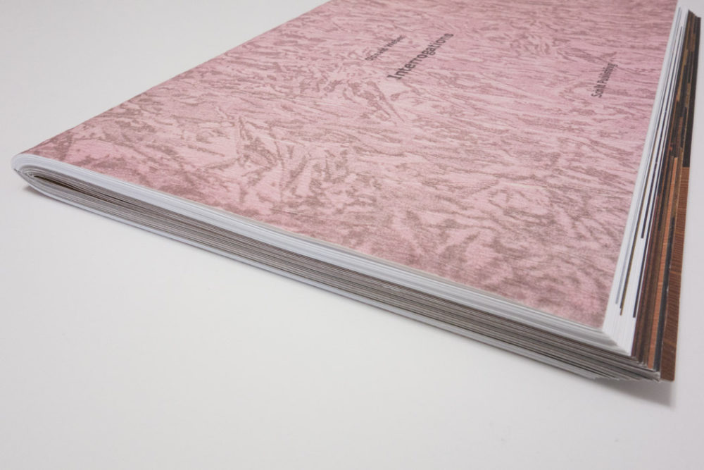
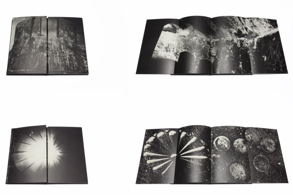
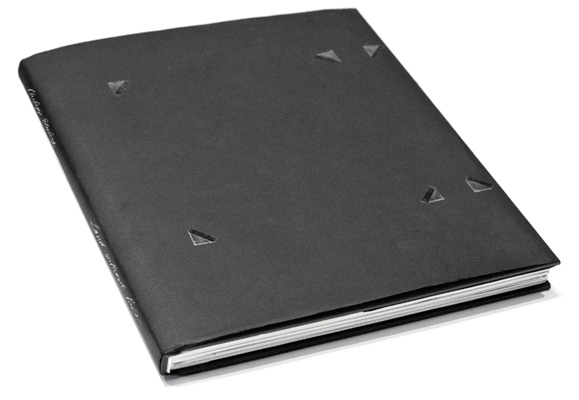
Andrzej Kramarz‘s Invisible Maps really only appears to be having a beginning and an end, because it has to. It’s a book, after all, and all books have a beginning and an end, at least as far as their physical form is concerned. There is some information concerning the book hidden inside the dust jacket. This includes the title and the colophon. There also is an essay, printed on a folded sheet of paper, included in the book (albeit not bound – it’s a loose sheet). So we are not supposed to know much. Instead, we are supposed to look and figure it out.

The idea of images working as a map of sorts is well known from Kikuji Kawada’s The Map, about which I wrote before on this site. Invisible Maps revolves around some of the same ideas, without The Map‘s extensive use of gatefolds. Unlike The Map, Kramarz’s book relies less on heavy, high-contrast abstraction, instead working with the simple fact that photographs often enough don’t reveal as much as we would like them to. This is dangerous territory to enter, given that you have to do it well for it to succeed; crucially, you have to rely on your viewers’ willingness to play along.

I’m tempted to think that Invisible Maps succeeds, but it doesn’t make it easy or simple for its viewers. If you prefer your photography to reveal itself, telling you something, without letting you hang there to figure it out yourself (in fact without requiring you to walk down the possibly wrong rabbit hole), this might not be the right book for you. I still don’t know what the hell I’m looking at here, but I’m enjoying the ride – and it gets more and more enjoyable every time.

Invisible Maps; photographs by Andrzej Kramarz; essay by Dariusz Czaja; 88 pages; Muzeum w Gliwicach; 2014

Rating: Photography 3, Book Concept 4, Edit 3, Production 3.5 – Overall 3.4

Over the past few years, Michael Wolf appeared to be content aiming for rather low hanging fruit, whether it was people flipping off Google’s Street View car or photographing the faces of people jam packed in Japanese subway trains. Make no mistake, that worked pretty well: Parr/Badger included the subway work in their latest photobook-history volume, and with online publications eager to get enough “eye balls” flashy projects are always good. But still… Thankfully, there now is something very different, something much, much better, in the form of not just one, but two books, Hong Kong Trilogy and Hong Kong Flora (there is going to be a third book coming out this fall).

Both books center on Hong Kong, looking at the kinds of details only very few people would notice, arrangements of mops or chairs or gloves or plants somewhere in the back alleys – the kinds of places you don’t necessarily go, unless you have to (because it’s part of your job). Needless to say, this description might not sound overly enticing. But the photographs do their job very well, especially given how they are put together. Hong Kong Trilogy, for example, starts out with photographs of mops, propped up or standing somewhere to dry off. How can this possibly be interesting? Well, the book shows you.

As individual images, most of the photographs aren’t that interesting (some of them are very good, though), but seeing one after the other makes the viewer appreciate what s/he is looking at more and more, to the point of wanting to go back and look again. Who knew photographs of mops could be so interesting, so much fun to look at (there is, after all, nothing wrong with fun), and, at the same time, so informative of some odd part of the human imagination?

There’s a Seinfeld episode, in in which George Costanza’s “trick” to get a date with someone is to show up repeatedly, the idea being that as annoying as the woman might find him, repeated exposure will turn him into the equivalent of some product from advertizing that you just need to have. In a sense, the pictures in these two books operate the same way. Repeated viewings of the same objects found in similar ways brings out their – and their arrangers’ – various idiosyncrasies. After a while, you don’t really want to put aside the books, given there is so much to see.

As objects, these books are done just the right way – modest in size, often with relatively small pictures inside. All in all, the photographer and publisher play a tricky game here, a game that could have gone very wrong with the wrong approach. They manage to pull it off very well. Bonus point for the following fact: the “second” edition of Hong Kong Trilogy was published in 2013, the “first” in 2014.

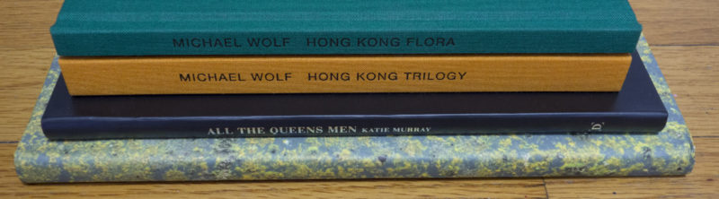
Hong Kong Trilogy/Hong King Flora; photographs by Michael Wolf; 152/80 pages; Peperoni Books; 2013/14

Rating (each): Photography 3, Book Concept 5, Edit 3, Production 4 – Overall 3.8

“It’s hard being a man
Living in a garbage pail
My landlady called me up, oh
She tried to hit me with a mop”
The Velvet Underground, I Can’t Stand It

One might wonder what could possibly be interesting about making a book of photographs of men living in a completely male-dominated society like the United States. Needless to say, I’m viewing the topic as a man, albeit as one who grew up and spent the first three decades of his life in Germany. There are pretty significant differences between the US and Germany in all kinds of ways, differences that are often overlooked and/or ignored, given that on the surface the countries appear to be so similar. But dig just a little beneath the surface, and things are very different. Having a rather different idea of masculinity, I’m often surprised what American men appear to think they have to conform to, as a consequence of which, just to make this very clear, the American society looks and feels a lot more patriarchic (and violent) to me than Germany’s (which, obviously, is bad enough).

So when I saw Katie Murray‘s All the Queens Men, that was the first thing that came to my mind. On the surface, the book mostly portrays men, to be precise men living in a very particular part of New York. But I do think by extension, the books can also serve as a portrait of the various consequences of those men’s behaviour, regardless of whether it is self-imposed or imposed by society — a portrait of, yes, the United States, a country that often enough showcases the same almost cartoonishly exaggerated swagger, completely ignoring the rather shaky foundations said swagger is trying to operate on. The swagger works, at least until nobody calls the bluff.

Now the question is whether All the Queens Men calls the bluff or not. I’m not sure. I want to think it does, but it’s quite subtle. Don’t get me wrong, attacking the male swagger in kind would merely result in cartoonishness in photographic form. But I do wish Murray would have been just a tad bolder. Just a tad. The photographs are good, some very much so, but they are also polite. I just wish they were a little bit less polite. After all, if you don’t want to call the bluff, you can always let it be known that you could do it.

All the Queens Men; photographs by Katie Murray; essay by Maria Antonella Pelizzari; 80 pages; Daylight Books; 2013

Rating: Photography 3.5, Book Concept 3, Edit 3, Production 1.5 – Overall 2.8

Cortona on the Move 2014

Article main image

As far as I can tell, small and/or new photography festivals are the best. Not having had the chance to turn into a circus might just be the best thing for any festival. I probably shouldn’t even write about Cortona on the Move (COTM), so it can remain the precious gem it is. Featuring exhibitions, portfolio reviews, workshops, and talks/presentations, all in what must be one of the most beautiful settings on this planet, COTM is fully centered on looking at and enjoying photography (and not on buying/collecting or on trying to define the medium in some way that stops making sense the day after).

Having been invited to give a talk, I had the chance to see this year’s festival in person. Much like PhotoIreland, COTM utilizes various buildings all over town to showcase the photography chosen by the curators. The town of Cortona is fairly small, so it’s easy to simply walk around and visit the different venues. Many of side streets provide rather steep climbs – who knew looking at photography can be part of a healthy dose of exercising?

Much to the credit of the organizers of the festival, careful attention was being paid to the presentation of the work – something I always look out for. An exhibition, after all, is not just a set of pictures on a wall (just like a photobook isn’t just a collections of pictures on paper). You have to do work to engage with the viewers, meaning you have to pick the right materials (surfaces to print on, frames, etc.), and you then have to display the images in such a way that they are being shown in the best possible light.

In Cortona, each of the exhibitions was set up basically perfectly, whether it was, say, Jacob Aue Sobol‘s work in an old church or The Sochi Project in an old disused hospital (see images). Some photographs would be pinned to the wall, others would find themselves in frames. Part of Anastasia Taylor-Lind‘s photographs were shown in light boxes on the floor. Large images of Mathias Braschler and Monika Fischer‘s portraits from China could be seen all over town.

There was only one exhibition that fell woefully short of the high standard, and that was Goin’ Mobile, curated by Kathy Ryan and Scott Thode, a collection of photographs from the Instagram accounts of five photographers. There’s nothing wrong per se with lifting images off Instagram and using them elsewhere, the editorial and/news contexts being prime examples. But the moment you put such images on the wall of an art exhibition as a curator you better realize there’s a higher bar. Those images better be able to hold their own weight. Sadly, most if the work in Goin’ Mobile failed almost spectacularly to do that. Just like in the case of probably 99% of all Instagram images, the maxim might just be: what is on Instagram should stay on Instagram. Those photographs can be enjoyed on tiny phone displays, all those pictures of food and cats and selfies (incl., of course, this author’s) and “unselfies.” In Cortona, I caught myself trying to swipe things away, just like on my phone, where what amuses me for a second is gone the moment after. But on those unforgiving walls, there was no swiping. Instead, each and every picture that didn’t hold up to more than a spilt second of scrutiny looked worse and worse and worse as time went by. As I said, what is on Instagram probably better stay there.

An exhibition I particularly enjoyed was Alessandro Penso‘s European Dream – Road to Bruxelles. The story of refugees trying to enter the safe and wealthy haven that is the European Union, the photographs were displayed in a container on a truck. The truck itself was driven across Europe – an art exhibitions on the go. I just love this idea. What better way to get more people interested in photography than bringing it to them – instead of waiting for them to come? It’s about time we got art photography out of the Augean Stables that are museums charging $25 admission fees and high-falutin’ galleries catering to the rich! Load photographs on a truck and drive that truck around so as many people as possible can see and experience the power of photographs!

It’s not that I needed my faith in photography to be renewed. Unlike many people, I am thoroughly enjoying what might be photography’s golden age. But COTM reminded me what can happen with photographs when they are given the best possible attention, to be presented to everybody who might be interested – all of that in a wonderfully easygoing atmosphere of a little Tuscan village.

Forms and Functions of Photobooks (Part 2)

Article main image

In part 1 of this series, I discussed two fairly uncommonly used ways to construct a photobook, the Japanese Stab Binding and the accordion. In the following, I want to focus on two more conventional methods.

You’ll remember from the discussion of the stab binding that a book can be made by stacking a set of paper and by then fixing everything with a thread that is woven through holes (perfect binding replaces the holes and thread with a slab of glue). Another, very simple way to make a book also uses a stack of paper. Instead of fixing everything at one end, the stack is folded down the middle, and the book is created by running either a thread or staples through the gutter (in reality, you don’t have to fix anything – think of newspapers): Saddle Stitching.

The binding aside, there’s a difference between Japanese Stab Binding and Saddle Stitching: if you add another piece of paper to a stack of paper, you get two and four additional pages, respectively. In the case of the Saddle Stitch, you get four pages because you fold the piece of paper in half (“folio”). This might not sound like a big deal. But when you make a book that is saddle-stitched, your total page number will be a multiple of four. There are other types of bindings that place similar limits on the available number of pages.

A great example of a saddle-stitched book is provided by Donald Weber‘s Interrogations. The book very clearly is the result of stacking a lot of folios on top of each other – at one end of the book, you see them bulging out. You don’t get to see this effect often, simply because most saddle-stitched books don’t quite use this many folios, and books are trimmed after the binding (you simply guillotine the edges to get everything straight).

Another thing to note about a saddle-stitched book is that it doesn’t have a spine. There simply is a thin line running across, which will either show you the staples or, in this case, the thread used to bind the book. Interrogations solves this problem by housing the book in a cardboard sleeve. One of the edges of the sleeve serves as the spine. What is more, the sleeve also protects the edges of the book, at least to some extent.

Overall, Interrogations comes across as a pretty rough book (please remember from part 1 that in this series, I’m mostly interested in making observations without value judgments being implied). The cardboard used for the sleeve is most basic and not overly sturdy. The book’s cover paper stock is textured and has a rough feel to the touch. The cover’s pattern mirrors some of the backgrounds in the actual interrogation photographs inside, photographs many of which portray a fair amount of psychological violence. You probably wouldn’t want to make an overly precious book out of a subject matter that itself is rough. So the book’s form takes the material it is presenting into account. At the same time, given it’s somewhat unusual, the form also makes the book stand out from the crowd.

The second example concerns the use of gatefolds (which I already mentioned in part 1). What better way to talk about gatefolds than by picking a book that uses them as much as possible, and by “as much as possible” I literally mean just that. This is Kikuji Kawada‘s The Map (rather the 2005 Nazraeli Press reprint, which, alas, is sold out).

Almost every other spread in The Map uses gatefolds (I suppose one could construct a book where every spread had a gatefold – I’ve never seen such a book). You open such a spread, and you see a photograph that is cut in half, showing the two closed wings of the gatefold (see images). Open the wings, and there is another, much wider image (which occasionally consists of more than one part). There are  23 gatefolds.

One would imagine that having to open and close 23 gatefolds would be an incredible chore. It is not. Instead, looking at the whole book becomes an almost meditative experience, as new images are revealed and then hidden again. In other words, the viewer’s engagement is part of the overall experience of the book. This is a very bold way to make a photobook. If you lose your viewers somewhere, if the viewers feel the physical aspect of looking at the book becomes too much of  a chore, the book essentially fails.

But The Map never fails. Every year, I present my copy of the book to MFA students as part of a photobook-history class; every year, the room goes incredibly silent as the students are being drawn in. It’s quite amazing actually. I don’t think any other book I’ve shown over the years has ever even come close to getting the same reception as The Map (another student favourite: Weegee’s Naked City).

In terms of the construction, there are a few interesting details to note (see the image above for an illustration). For a start, the book is constructed in such a way that the gatefolds open easily, and the book lies flat. You wouldn’t want the book to bulge up when the gatefolds are open, in particular since the best way to look at the book is to place it on a table. The wings are slightly shorter than the main pages, preventing problems when refolding them. This is an important detail as well – if you’ve ever had a book where a gatefold’s wing was too long, you know what I’m talking about.

So the object is made in such a way that none of the possible problems that could arise from the format interfere with the process of looking at the book. Opening 23 gatefolds never becomes difficult or tedious; instead, the object allows its content to (in part literally) unfold itself in front of the viewer, drawing her/him in.

It’s unlikely you will want to make a book that uses as many gatefolds as The Map. Each photobook requires its own solutions for what it intends to do. But then, maybe you do need a book with a lot of gatefolds. Or you need an accordion book, or a book that is printed on newsprint, without any binding (like a newspaper). As I noted in part 1, the key to making a photobook always is to find the right form, a form that derives from the book’s function, which, in turn, is very closely related to the experience you want the viewer to have.

I want to say this, though, and this is extremely important: Never, ever add something to a photobook simply because you think it’s “cool”. I see this all the time. If any of the elements your book’s form requires happens to be “cool” – good for you. If not, resist the temptation to add stuff the book doesn’t need.

When making a photobook, it helps looking at other photobooks to see what might work. Books can serve as templates for other books. At the same time, given that photobooks (ideally) aren’t just templates, but fully realized books, it’s important to try to understand the possible decisions that went into their making carefully. Reverse-engineering photobooks is a great way to understand them: What does this do? How does this work? How is this constructed? How does the form support the function? And what went wrong here (if there’s something that went wrong)?

While each photobook requires its own unique solution, there also are a lot of things that boil down to personal preferences. It’s impossible to make the book that will make everybody happy. Compromises will have to be made, and you might have to give up on a few things you really thought you wanted or needed (for whatever reason). But photobook making, just like photography itself, starts with looking, in this case looking at other people’s books.

Oh, and do yourself a favour and never, ever try making your photobook on a computer, using InDesign or whatever other tool you might love. Work with physical dummies. It doesn’t matter whether they’re constructed perfectly or not. But you will see whether a gatefold works easily when you have a shoddily constructed dummy – try that on the computer, and you’ll probably fail. It’s fine to figure everything out on paper and then go back to the computer – doing it the other way around is almost certainly a guarantee for failure.


Forms and Functions of Photobooks (Part 1)

Article main image

The physical form and shape of a photobook matter immensely. Photobooks are objects, designed to be looked at, to be handled, to be stored. This is a fairly obvious statement. But while the production might involve rather elaborate ways to construct the book, often enough the aspect of how it handles appears to have been ignored. I have come across the most amazing photobooks, which, unfortunately, were impossible to properly look at, or which I had trouble placing somewhere in my library.

Just to make this clear, I am not merely talking about convenience here. Whether or not a book can be handled conveniently needs to be thought about by its maker(s) in almost all cases. This does not mean that every book should always be convenient. However, whatever inconvenience is involved has to have a clear purpose for the book in question. That’s the key point.

When confronted with having to make a decision about a photobook in the making, it is important to ask: do the possible options make sense? Do I actually need what I’m working on here?

This boils down to thinking about whether the various aspects of the book fit its overall concept. The concept better be fully resolved, because any uncertainty will almost automatically translate into a problem in the end. Consequently, a series of very clear decisions about every aspect of the book is needed.

But there are other issues as well, those fairly annoying problems: can I afford the production of this book (meaning: do I have the money to pay for it)? Given the production of the book and the resulting price, will a potential buyer be able to afford it? Will s/he be able to handle and look at the book? Will s/he be able to simply put it wherever s/he stores her/his other books? Etc.

These questions open a Pandora’s Box of problems to be thought about and solved. In all likelihood, compromises will have to be made. How does one go about that?

In order to address this question, I want to discuss the relationship between the form and function of a photobook. The idea of “form follows function” is well known, and as far as I am concerned it applies to photobooks. I like stressing the idea of “function,” because I don’t think many people consider it when making or looking at a book. After all, isn’t the function of a photobook to be looked at? Yes, it is. But the function of a photobook is also related to its concept. The concept informs the function. The way a book is constructed is (or at least should be) informed by what the book aims to do.

If this sounds too abstract, just think about gatefolds. A gatefold adds a very specific aspect to a photobook. The viewer is encouraged to unfold and refold a page (it’s good to keep in mind that nobody is forcing them to do that). Clearly, the use of gatefolds should be informed by a book’s concept. What’s the point, after all, to make the viewer go through all the extra work – plus to vastly increase production costs – when there’s no real reason for it?

The question ultimately is: does the concept of this book require the use of gatefolds, which will have the viewer interact with the book in a very specific way, and which will drive up production costs?

It’s simplest to study these kinds of aspects of photobooks making by looking at specific examples. It would seem that there almost is an infinity of problems to be solved. The number is finite, but it still is a daunting challenge to face them. A good way to approach them is to look at existing photobooks in more detail. If you can critically “reverse engineer” photobooks, doing it the other way around – making a book – becomes much easier.

I also want to mention that this short series of articles is intended as an experiment, to, I hope, augment discussions of photobooks online. I feel that all too often, they end up being too short on talking about the form of a photobook. As objects, photobooks have a lot more to offer than merely being collections of pictures. Given electronic media will never be able to replicate most aspects of materiality and given so many designers and other photobook makers put such large efforts into shaping the physical forms, I feel they need to be discussed more.

In the following, I want to look at some books in more detail, focusing on the way they are made. The idea is not to talk about whether they’re good or bad books. Instead, I want to focus on their construction, on their physical shape, to look into different aspects of the actual – physical – making of a book. This is going to be a two-part article. Here, I will pick two somewhat unusual (or uncommon) ways to construct a photobook. Next week, I will talk about aspects of photobooks that are more common (and that are thus easier to overlook).

A book is a set of pages that are somehow held together. People don’t think about this much, until they come across a book that is a little different. The regular edition of Daisuke Yokota‘s Linger was made using a Japanese Stab Binding. This type of binding essentially works with a stack of paper (with a slightly thicker/heavier stock for the covers) with fives holes, which is held together by a thread woven through those holes. It’s a rare type of binding for photobooks. Another example is provided by Diana Scherer‘s Nurture Studies (click on any of the pictures to see them larger, with some commentary added).

Using a stab binding is a great way to make a book, in particular if you want to incorporate different types of paper. In the case of Nurture Studies, the pages the photographs are printed on alternate with sheets of vellum paper. The result is very elegant, a prime example of the beauty of Japanese Stab Binding.

This choice of binding comes at a “price,” though. Any type of binding has its advantages and disadvantages. Japanese Stab Binding creates a block of paper, held together firmly by the thread. If you want to have an image across the gutter, things get a little iffy. You have to line the parts up perfectly, and that’s almost impossible to achieve. In the image above, you can see me holding Linger open with an image across the gutter. The image aligns very well, but there still is a gap formed by the gutter.

Just to make this clear, none of these comments are intended to be a criticism on my part. They are observations. I think Linger is a fantastic book, certainly one of this year’s highlights. I love the way the book uses this particular binding; but just like any binding it has its drawbacks.

In the image, you can also see another effect of the binding, given the choice of paper (which, I think, is utterly marvelous – you’ll have to see a physical copy to experience it). The paper stock is fairly stiff, so the book doesn’t open easily (you’ll get the same problem with perfect bound books). Again, this is not a problem for me – usually I hold the book with two hands (for the picture, I needed to operate the camera). Nurture Studies, btw, behaves the same way.

I quite like both Linger and Nurture Studies, and I think the choice of binding is brilliant in both cases. Conceptually, it makes a lot of sense – in both books, it adds value to the pictures. Yokota’s work is heavily process oriented, even though thankfully that is not all there is to it. Linger (the book) reflects the idea of process beautifully. While most types of binding manage to hide the way the pages are held together, the Japanese Stab Binding puts it center stage. In contrast, Scherer’s work certainly has strong echos of flower arrangements and the way those are usually photographed. Using this type of binding thus is an obvious and very good reference.

Just as an aside, both books have no text on the spine. With this type of binding, getting text on the spine isn’t straightforward (you could conceivably print something onto the spine or glue a label to it). So I store these books in a way that allows me to find them easily. Having no information on the spine is one of those things photographers often forget – how do you find a book on your book shelf, if there’s no information on the spine?

A lot of these aspects come down to a matter of taste as well. I certainly don’t want to pretend that there is a perfect solution for (m)any of these problems. Some people really hate seeing pictures go across the gutter. Other people get very annoyed if the spine has no information. If form follows function, though, you’re on a good path.

There is another way of making a book that I am a huge fan of (provided it’s done well), a type of book that I feel is very much underused in the world of photobooks: the accordion. You could argue that an accordion isn’t even really bound or a book, and sure, over a beer I might be up for that discussion. Without the beer, an accordion simply is a very specific way of making a book.

This is Peter DekensTouch. It’s an accordion book in it simplest form: a single strip of paper, folded up to form the accordion.

In reality, though, it’s not a single strip of paper. Instead, various segments were very carefully attached to each other. When you hold an accordion book, you can look at it just like a regular book, turning pages. Since the pages are held together by themselves (there is no supporting spine), accordion books usually use a strong/think paper stock. That way, the pages don’t tear easily; and when unfolding larger parts of the book, the object itself remains stable.

A notable exception is provided by Anne Carson‘s Nox (which isn’t a photobook). Its rather flimsy pages are housed in a sturdy clamshell style box that opens like a book. So there is support for the object. Especially with accordion books, the question of support becomes crucial.

Touch does not come with a cover. Or rather, the front page serves as the cover. But there is no support for the accordion other than a belly band. The belly band holds the book together, but the overall object is rather flimsy (again, this is an observation, not a criticism).

The advantage of the accordion format is that it’s up to the viewer to decide how s/he wants to look at the book. In addition to treating it like a regular book, there always is the option of unfolding larger sections. This is, I think, what makes this format so interesting for photography: this is the only book format I can think of where the viewer can see more than two pages at the same time (if they want to), while the overall sequence remains fixed.

Touch works with this idea by having the images cross the various folds. In other words, if you look at the book like you would look at a regular book, you only get to see parts of some images at any given time. Unfold sections of the book, and you see both parts of an image across a fold – plus more of the neighbouring images.

The photographs in Touch were taken with available light. The blind man depicted of course doesn’t need any lights in his home, whereas for people with sight it’s hard to orient oneself in a dim room. This aspect of disorientation is reflected in the presentation – it’s not always clear where pictures begin or end.

In this simple form, an accordion book doesn’t have a spine. To make a more “book like” version you could attach the accordion to a regular hard cover (which comes with a spine, plus a lot of support). Also, an accordion book has two separate sides – the front and the back. In the case of Touch, the back is blank.

Unlike a book made with Japanese Stab Binding, accordion books by construction open all the way without any problems. Each spread will be fully visible. Nothing gets lost in the gutter.

Nicolo DegiorgisOasis Hotel also is an accordion book, but there’s a little twist. The accordion’s two ends are inserted into pouches provided by the cardboard cover, essentially forcing the accordion into a more regular form. There also is a leather string that holds the whole package together. But of course the viewer can treat the book like a looser accordion book. The cardboard cover adds various ingredients that Touch does without: a spine (with text on it), plus a “proper” front and back.

Oasis Hotel uses an even thicker paper stock than Touch, making the book rather bulky, while, at the same time, not adding much support. You certainly don’t want to put it into a stack of book, and if you do, it should probably lie on top. Working with images from a long road trip, the accordion itself makes a lot of sense, but I think the book would have gained from the concept enforced more tightly, meaning avoiding a total of eight images per spread and using the form of the accordion without this type of cover.

So possibly the exception of Oasis Hotel, each of the books mentioned above makes excellent use of its production/form. It would be weird to see Touch using a Japanese Stab Binding, just like Nurture Studies would make a tremendously boring accordion book.

As I mentioned earlier, the format/construction of a photobook usually only attracts notice if it’s unusual. For a variety of reasons, many people shy away from the types of binding I discussed in this article. But conceptually, these bindings are not any more or less crazy than, say, perfect binding or whatever else. It’s just that the unusual format makes us notice advantages and disadvantages more clearly.

In part 2 of this series, I will discuss more standard ways to make photobooks.

Photobook Reviews (Week 28/2014)

Article main image

It’s summer, and what better way to kick back than to sit on a porch or beach or in a cafe somewhere with a good book. Or photobook. After all, who says your reading material has to be literature? And maybe looking at a photobook in a public place might result in someone else having a peek? Isn’t it about time photoland emerged from its, let’s face it, largely self-imposed ghetto?

This week’s selection of photobooks covers a wide variety of work and publishing options. It’s also an attempt to reduce the height of the stack of to-be-reviewed books right in front of me.

Catherine Leutenegger – Kodak City

To produce a photobook about a particular place that will make the local residents happy is a thankless task. You might as well work for the tourist information office. As much as I understand the frequent complaints about photographers supposedly misrepresenting some place, whether it’s Appalachia, Detroit, or somewhere else, ultimately these complaints are based on misguided expectations, and on the idea that photography somehow – quite magically – accurately represents the world. It does not. By now – this is 2014 – we should have learned this. Even what the tourist information office produces is inaccurate in that it is little else than propaganda glossing over the not-so-wonderful bits.

At the end of the day, a photobook about any place tells us a lot about its maker and, possibly, something about the location. Approached this way, photobooks have something to offer that tourist brochures lack: they’re an invitation to get challenged, instead of having one’s expectations confirmed. This then makes the creation of a photobook about a place a lot harder than it would seem, in particular if the place in question comes with a large number of preconceptions on the audience’s part.

Rochester is home to Kodak, a company that doesn’t need an introduction.  Without Kodak, the history of photography would have been very different, regardless of whether one thinks about the quintessentially American idea of “you press the button, we do the rest” or of films like Tri-X that shaped what pictures would look like (as a photographer, I still rely exclusively on Kodak film in the form of the Portra colour films. It’s possible and quite likely that in my life time, it will disappear).

Catherine Leutenegger‘s Kodak City portrays both the company’s grounds and factories (or rather what’s left of them) and the city itself (ditto). The result is a little bit more complex than it would appear, in particular since the red thread running through the book is not unique to the combination of Kodak plus Rochester. There is a lot of mostly anonymous corporate architecture on display in the form of both buildings themselves and the way they are adorned inside and outside. Kodak City is made to stand for any city that relied on a large corporation to get wealthy, to later enter a slow and steady period of decline as the company’s fortunes started waning.

Seen that way, whether the book accurately or properly portrays Rochester (whatever that might mean) is quite irrelevant. It might, or it might not. What it speaks of very, very clearly, however, is the fate of large cities in an economical system that values “creative destruction.” Swap out film for cars, say, steel, or paper, and the book speaks of Detroit, Pittsburgh, or Holyoke (think of typewriters, and you get the German town of Wilhelmshaven, where I was born).

Using the specific to speak about the universal – that’s one way for photography to succeed.

Kodak City; photographs by Catherine Leutenegger; essays by A.D. Coleman, Joerg Bader, Urs Stahel, Catherine Leutenegger; 160 pages; Kehrer; 2014

Rating: Photography 3.5, Book Concept 3, Edit 2, Production 3.5 – Overall 3.2

Philipp Ebeling – Land Without Past

I’d like to think that I understand the impetus behind Philipp Ebeling‘s Land Without Past very well, maybe too well to be able to write a review. But then, much like art itself all reviewing is grounded in being subjective, with the idea being that out of it will come the universal, or at least something that allows others to make a connection.

Here then is the essential challenge Ebeling has been facing: how do you connect with your home country if it is Germany – given its past, and especially given how people have so far been dealing with it?

I’ve written extensively about German photography and its strange way of dealing with the past – there is a rich history of German (non-photo) artists creating work around the Nazi era and the Holocaust. But until very recently, or more accurately until approximately the fall of the Berlin Wall and the country’s subsequent reunification, German photographers were mostly silent about it (see my earlier pieces from 2010: part 1 and part 2).

Photographers of my generation dealing with the past appears to tap into the larger topic of the group of people known in Germany as Kriegsenkel – the children of the generation that at the end of World War 2 grew up in the rubble, a generation that would rather rebuild a prosperous country than deal with its own hurt, let alone deal with what their parents did.

So it seems appropriate that the dust jacket of Land Without Past has photo corners attached to it, most of which are empty. This mirrors what could be found in German photo albums – you get rid of the past in part by censoring your memories, and photographs serve as such. But the past won’t just disappear this way, in particular since on a societal level, Germans have been dealing with their collective past ever since. The book is an attempt by the photographer to come to terms with his own past.

Combining archival pictures with his own photographs, Ebeling lays out what, frankly, makes me uncomfortable as well. There is no easy resolution to the discomfort – this might be the ultimate lesson. The discomfort must be experienced, and it will never fully go away. The flag waving of German soccer fans at the World Cup still gives me the chills, as much as I realize that some mild form of nationalism might in fact simply be necessary. But still…

Ebeling stays close to his family, and he throws in all the right symbols for good measure, regardless of how much or how little they still mean: the German flag, carefree German youth, sausages in a soup… There is no resolving what cannot be resolved, and it is this realization that makes the book succeed for me. The land with its well-known public past whose citizens individually attempted not to have a private past is finally becoming a normal country, with all the successes and flaws such countries come with.

Land Without Past; photographs by Philipp Ebeling; 80 pages; Fishbar; 2014

Rating: Photography 3.5, Book Concept 4, Edit 3, Production 3.5 – Overall 3.6

Sze Tsung Leong – Horizons

Occam’s Razor essentially states that the simplest solution to any given problem is the preferred one. There should be a photography equivalent. In the case of photography, the simplest ideas for a body of work are often the most successful ones. Mind you, a simple idea does not necessarily translate into a simple execution. Often, the opposite is the case. But usually, the best approach to any given photography project is to keep it as simple as possible and to make it work.

Sze Tsung Leong‘s Horizons provides a great point in case: landscape photographs done in such a way that the horizon line is always in exactly the same spot. For his series, the photographer traveled all over the globe, to assemble a massive and impressive body of work. Horizons could (maybe should) serve as an example for photography students how, given the work’s level of consistency and quality – both photographic and artistic (no, those are not the same).

It’s tempting to think that with such a body of work a photobook almost makes itself. But the books that seemingly are the easiest to make require a lot of very careful work. You probably don’t want to just sequence the photographs willy-nilly. You also need to think about whether or how to use gatefolds – use too many, and the book becomes a hot mess, use too few, and they become almost pointless. All of these aspects were taken care of carefully, resulting in possibly one of the best possible presentations of this body of work in book form (maybe a bit conservative, but there really isn’t anything wrong with that in this case).

A simple idea, executed and presented perfectly – there’s really nothing else one could hope for.

Horizons; photographs by Sze Tsung Leong; essays by Sze Tsung Leong, Charlotte Cotton, Pico Iyer, Duncan Forbes, interview by Joshua Chuang; 176 pages; Hatje Cantz; 2014

Rating: Photography 4.5, Book Concept 3, Edit 4, Production 4 – Overall 3.9

Anaïs López – In The Beginning No Birds Sang

Most people will pay attention to something if they have to, meaning they will inevitably ignore quite a bit. Per se, there isn’t anything wrong with this, given that sensory overload cannot be the ultimate goal in life. But how do we decide what to pay attention to and what to ignore? Our decisions are often thrown into sharp relief when we encounter people who differ quite a bit from us, regardless of whether it’s by choice or necessity. A blind person, for example, will inevitably be much more susceptible to sound (unless they are deaf). We are, after all, surrounded by sound just as much as by visuals.

Sound, of course, almost never plays any kind of role in photography, because you cannot take a picture of it. Compared with what sound can do, photography is a fairly anemic medium. Seeing a picture of a crying baby will hardly cause the same reaction as hearing a baby cry (even if it’s not yours – if you don’t believe me, just get trapped on a long flight with a fussy baby on board). All you can hope for as a photographer is to allude to the effects of whatever sound you’re interested in, a task made even harder if you’re not photographing crying babies but instead something whose sounds people mostly pay no attention to.

Anaïs López‘s In the Beginning No Bird Sang does just that. The photographer had a blind man named Jean Poppers show her IJburg, a neighbourhood under construction in Amsterdam. Regardless of whether you find yourself in some new suburb in the US or in any one of those recently built neighbourhoods in Europe, initially there is very little to experience. Unless you have a guide like Poppers who will teach you to pay attention to the sounds. There are birds, for example, and they all sound very different. They even produce different sounds depending on the occasion (check out, to use an example I particularly enjoy, the Northern Cardinal). And pretty much everything else will also have a sound, whether it’s cars driving by, the branches of trees rustling in the wind, or whatever else.

Thus the book “talks” about IJburg, and its birds, using Jean as a guide – small photographs of him cupping his ears are reproduced several times. In addition to landscapes and images of birds, there also are reproductions of wave forms for the various birds living there. Of course, the book does not achieve the unachievable. Even if you go to the artist’s website and listen to the audio files of the birds, you’re not going to get much closer to the auditory experience of IJburg. But I don’t see that as the book’s real goal. Instead, the book tells us something about a world that offers us much more than we often want to think. Hearing the different sounds can reveal aspects we previously were unaware of.

As a book, In the Beginning No Bird Sang is a somewhat ambitious object, but I feel some of its aspects have maybe gone a bit too far. There are six dust jackets, each of which giving additional information. There are two gatefold pages that don’t add much to the book. Occasionally, I feel Dutch photobook making goes a bit overboard. But for this particular book, these are mostly minor quibbles.

In the Beginning No Bird Sang; photographs by Anaïs López; 112 pages; self-published; 2013

Rating: Photography 3, Book Concept 3.5, Edit 3, Production 3 – Overall 3.1