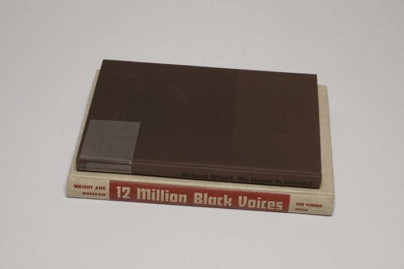
I don’t remember how or where I first came across the book 12 Million Black Voices by Richard Wright and Edwin Rosskam. From the brief description I had read the book sounded not just interesting but also relevant for various aspects of what I do (writing as well as teaching). So I went out to look for a copy of the original 1941 hardcover, which turned out to be relatively straightforward to find (there are more recent reissues). Given the times we live in — the occupant of the White House is a two-bit reality TV star who more or less openly expresses racist sentiments regularly — the book has lost none of its original relevance. It’s a blistering account of the African-American experience in the country.
That there exists a German-language translation I became aware of just recently through one of the contributions in the excellent The Form Of The Book Book (that’s no typo). Jenny Eneqvist, Roland Früh, and Corina Neuenschwander’s essay 1946, 1947, 1948: The Most Beautiful Swiss Books in Retrospect looks at selections made by various experts, among them Wir Neger in Amerika. The book was published in Switzerland in 1948, and it was designed by Richard Lohse. I wouldn’t have paid much attention to the book, had it not been for the fact that here, the design was stressed so much. The same book, translated, but with different design? Obviously, I had to get a copy (found a nice former library one).

As a quick side note, whatever you want to say about the way books were and are made, once you’ve seen the beauty of gravure printing there’s just no way you’ll enjoy the finest printing available today as much. The printing in these books is roughly comparable (see the pictures for slight differences in the tones; note that the original book is placed at the top when both books are shown). But the Swiss book offers a bit more detail in the photographs, making it one of the finest gravure printed books I own.
I never spent time looking at the “same” book in different translations. In fact, I had always assumed they’d translate the text and leave the rest, including the design. Apparently, that’s not always the case. What’s particularly interesting is the fact that the Swiss design is at times vastly different. Lohse re-arranged the photographs completely. It’s still the same book, but the way the two books use their visuals to support the text is quite different (the narration of the book is carried by the text, with the photographs playing a supporting role).


I think a good and simple way to summarize the use of images in 12 Million Black Voices would be to say that it mostly adheres to the picture-magazine model, where a combination of captions and image pairings is designed to drive the various points home. In contrast, in Wir Neger in Amerika this device is used only rarely. Instead, more often than not, images are left to either stand on their own, or they’re juxtaposed without any text. In the two images above you can see the Swiss layout (which does indeed look very Swiss) plus two of the spreads in the US edition from which the bottom pictures were taken.

A spread from the US edition, with its picture-magazine style combination of text plus captions, exemplifies how photographs are employed to visually support the text.

In contrast, (in an unrelated spread) the Swiss edition uses no text and relies on the photographs themselves — in the US edition, this spread exists exactly in this form, but there are captions under both images.

Lohse even went so far as to produce spreads like the one above, which moves way beyond the layout in the US edition.
The role of design in photobook making all too often is either ignored or treated as some minor aspect. But design actually can play a major role in how a story is being told. In this particular case, the same story is being told in two slightly different ways. While the writing carries the bulk of the weight of the narration in both books, the photographs are used in different ways. I personally don’t think that one is better than the other.
In fact, what these two versions of the same book might demonstrate is that in order to make a photobook, the key is not to come up with the best possible realization of all possibilities — how would you even be able to find it? Instead, it comes down to picking a realization and to then producing the best possible outcome. Clearly, the makers of both 12 Million Black Voices and Wir Neger in Amerika had exactly that in mind.
