There are two ways we could look at photobooks. We could either say that they’re these incredibly special, limited-edition objects that we all wish, I’m sure, larger audiences would have a chance to see. Or we could say that our definition of the photobook usually excludes those books that do reach a larger audience, mostly for reasons of, let’s face it, snootiness (“But, my, those are coffee-table books!”). The reality might lie somewhere in between, and it’s actually a bit more complex than I made it sound.
With prints runs usually being very low for most photobooks (around the order of up to 2,000 or 3,000 copies), one way to possibly reach larger audiences is to produce an electronic version in the form of an “app” for a tablet computer (such as an iPad or whatever other devices are available). Compared with physical books, which are very costly to produce and distribute, apps come with relatively low up-front costs. They can thus be sold for much less than a photobook, making them potentially attractive to people who don’t want to spend $60 to see one (or can’t – people in the art world love to ignore the fact that many people have to think carefully about their spending). Plus, it really makes no difference in up-front costs whether you sell ten “copies” of your app or 10,000. Storage also isn’t a problem.
That said, apps aren’t photobooks. They’re apps. Unless you want to be dogmatic about it, one isn’t necessarily better than the other. They’re two different experiences with photography in general. The same is true for pretty much everything else that can be experienced (or consumed) on a tablet computer. You can watch a movie on your iPad, say, and that’s really not the same as watching it on the movie screen. It’s a different experience. Nobody will kick your chair, and you can bring in as much of your own popcorn as you want. But then, it’s a pretty small screen, which comes nowhere close to the one movie theaters use.
I bought an iPad (the “mini” version) last year to have a look at how useful the technology might be. I’m now using it for some things, while it’s no replacement for others. For example, I enjoy looking at magazines on my iPad, and I don’t miss the paper copies (in fact, I like not having to recycle all that paper). I enjoy reading some books on the iPad (the ones that I either use professionally – it’s so easy to mark text and use it later, or books I’m sure to only read once); but most books I still read on paper (and assuming there continue to be paper copies I won’t switch to the iPad for those).
Photography-wise, the iPad with its backlit screen is a very different experience for a lot of images. To give you one very obvious example, I saw some work by Daido Moriyama in the iPad version of the British Journal of Photography, and I was struck by how different I perceived them compared with seeing them in a book. I don’t own that many of Moriyama’s books, but the ones I have are more or less the complete opposite of what I experience on the iPad. Given that most photographers and/or publishers think very carefully about how photographs and/or photobooks are being printed, the fact that iPad apps are all backlit already results in possibly one major change in experience.
Needless to say, this might not matter for a fair amount of photographs, in particular those that are already mostly seen on computer screens, such as photojournalistic work. This brings me to Why Mister, Why? by Geert van Kesteren. With this book and Baghdad Calling (see my review here), van Kesteren single-handedly not only produced the two most relevant photobooks about the United States’ Iraq war, but he also raised the bar of what the medium photobook could do for photojournalistic work.


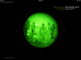
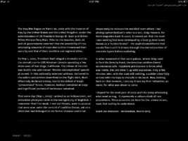
Why Mister, Why? now exists in the form of an app, which adds 166 images to the 237 photographs in the book. The organization of the app follows that of a book, with various details being adapted to the medium tablet computer. Books have pages. An iPad is always just that, a flat shiny thing. The viewer gets from one “page” to the next by swiping to the left or right. Thankfully, whoever developed the app resisted the temptation to add fake pages (Issuu style). An app is not a book, so why pretend there are virtual pages? Swiping left/right from a chapter’s main “page” will bring you to the Arabic/English language introductory essay (the app is fully bilingual), neatly mimicking how Arabic and English are being read from right to left and left to right, respectively (it’s taking care of details like this that seems to set apart Dutch photobook/app designers from the rest).
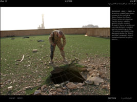
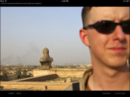
Each page displays a single photograph. For each image, there is a caption that can be accessed by pressing where it says “caption” on the screen. If you look at the gallery of images, you can see the various details I’m referring to – the images are all screenshots from my iPad. In a physical book, you either have a caption, or you don’t. Here, it’s the viewer’s choice to see it or not. In other words, you can decide how you want to engage with the app. The way the app is organized wastes no space for something that people might not want to see right away (you can’t do that with a book). Furthermore, vertical images are displayed just like horizontal ones. To properly see them, you need to turn your iPad. There are relatively few vertical images, so that’s not a big deal at all.
To navigate between chapters, you swipe up or down when you are on the very first page of any chapter. You cannot do that when you’re in the middle of a chapter. Again, this is not only simple and intuitive, it also makes sense: Since each chapter deals with a specific part of the story, you can’t create your own stories. If you’re in the middle of some chapter, and you want to go back to the main index, touch the screen where it says “Index”.
Why Mister, Why? thus is intuitively simple, while at the same time allowing for probably the best experience of the body of work on the iPad. The app brings a second life to the book (which is sold out), while, at the same time, making it available for – hopefully – a much larger audience.
But the app also shows that photojournalism does have a very good electronic future. Photojournalism should not be about reaching audiences first (by trying to be cool or hip) and about possibly having some sort of story second. Instead, it should be about well-produced stories first and then about trying to reach audiences with those stories. In a day and age where some people confuse taking Instagram pictures with photojournalism, Why Mister, Why?, the app, demonstrates what can be done with new media without sacrificing what made the profession in the first place.
Highly recommended.
Ratings explained here.
