The physical form and shape of a photobook matter immensely. Photobooks are objects, designed to be looked at, to be handled, to be stored. This is a fairly obvious statement. But while the production might involve rather elaborate ways to construct the book, often enough the aspect of how it handles appears to have been ignored. I have come across the most amazing photobooks, which, unfortunately, were impossible to properly look at, or which I had trouble placing somewhere in my library.
Just to make this clear, I am not merely talking about convenience here. Whether or not a book can be handled conveniently needs to be thought about by its maker(s) in almost all cases. This does not mean that every book should always be convenient. However, whatever inconvenience is involved has to have a clear purpose for the book in question. That’s the key point.
When confronted with having to make a decision about a photobook in the making, it is important to ask: do the possible options make sense? Do I actually need what I’m working on here?
This boils down to thinking about whether the various aspects of the book fit its overall concept. The concept better be fully resolved, because any uncertainty will almost automatically translate into a problem in the end. Consequently, a series of very clear decisions about every aspect of the book is needed.
But there are other issues as well, those fairly annoying problems: can I afford the production of this book (meaning: do I have the money to pay for it)? Given the production of the book and the resulting price, will a potential buyer be able to afford it? Will s/he be able to handle and look at the book? Will s/he be able to simply put it wherever s/he stores her/his other books? Etc.
These questions open a Pandora’s Box of problems to be thought about and solved. In all likelihood, compromises will have to be made. How does one go about that?
In order to address this question, I want to discuss the relationship between the form and function of a photobook. The idea of “form follows function” is well known, and as far as I am concerned it applies to photobooks. I like stressing the idea of “function,” because I don’t think many people consider it when making or looking at a book. After all, isn’t the function of a photobook to be looked at? Yes, it is. But the function of a photobook is also related to its concept. The concept informs the function. The way a book is constructed is (or at least should be) informed by what the book aims to do.
If this sounds too abstract, just think about gatefolds. A gatefold adds a very specific aspect to a photobook. The viewer is encouraged to unfold and refold a page (it’s good to keep in mind that nobody is forcing them to do that). Clearly, the use of gatefolds should be informed by a book’s concept. What’s the point, after all, to make the viewer go through all the extra work – plus to vastly increase production costs – when there’s no real reason for it?
The question ultimately is: does the concept of this book require the use of gatefolds, which will have the viewer interact with the book in a very specific way, and which will drive up production costs?
It’s simplest to study these kinds of aspects of photobooks making by looking at specific examples. It would seem that there almost is an infinity of problems to be solved. The number is finite, but it still is a daunting challenge to face them. A good way to approach them is to look at existing photobooks in more detail. If you can critically “reverse engineer” photobooks, doing it the other way around – making a book – becomes much easier.
I also want to mention that this short series of articles is intended as an experiment, to, I hope, augment discussions of photobooks online. I feel that all too often, they end up being too short on talking about the form of a photobook. As objects, photobooks have a lot more to offer than merely being collections of pictures. Given electronic media will never be able to replicate most aspects of materiality and given so many designers and other photobook makers put such large efforts into shaping the physical forms, I feel they need to be discussed more.
In the following, I want to look at some books in more detail, focusing on the way they are made. The idea is not to talk about whether they’re good or bad books. Instead, I want to focus on their construction, on their physical shape, to look into different aspects of the actual – physical – making of a book. This is going to be a two-part article. Here, I will pick two somewhat unusual (or uncommon) ways to construct a photobook. Next week, I will talk about aspects of photobooks that are more common (and that are thus easier to overlook).
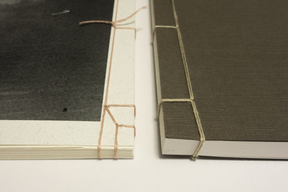
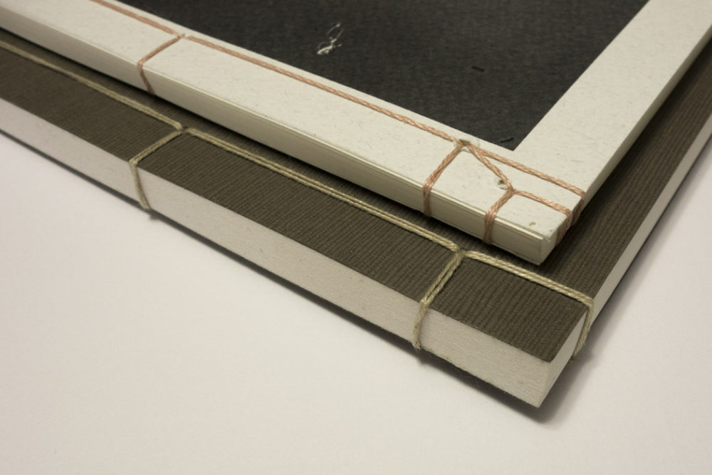
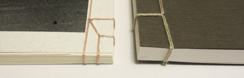
A book is a set of pages that are somehow held together. People don’t think about this much, until they come across a book that is a little different. The regular edition of Daisuke Yokota‘s Linger was made using a Japanese Stab Binding. This type of binding essentially works with a stack of paper (with a slightly thicker/heavier stock for the covers) with fives holes, which is held together by a thread woven through those holes. It’s a rare type of binding for photobooks. Another example is provided by Diana Scherer‘s Nurture Studies (click on any of the pictures to see them larger, with some commentary added).
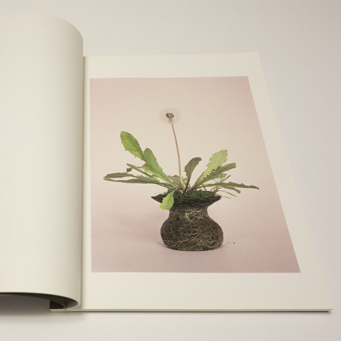
Using a stab binding is a great way to make a book, in particular if you want to incorporate different types of paper. In the case of Nurture Studies, the pages the photographs are printed on alternate with sheets of vellum paper. The result is very elegant, a prime example of the beauty of Japanese Stab Binding.
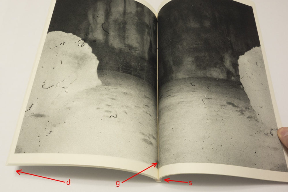
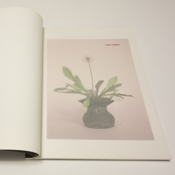
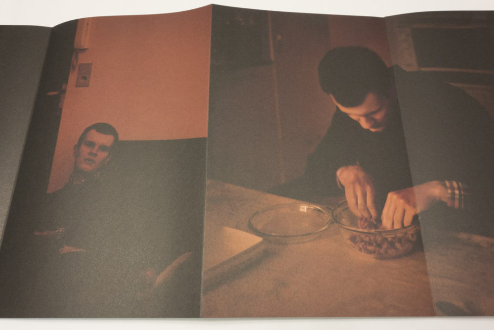
This choice of binding comes at a “price,” though. Any type of binding has its advantages and disadvantages. Japanese Stab Binding creates a block of paper, held together firmly by the thread. If you want to have an image across the gutter, things get a little iffy. You have to line the parts up perfectly, and that’s almost impossible to achieve. In the image above, you can see me holding Linger open with an image across the gutter. The image aligns very well, but there still is a gap formed by the gutter.
Just to make this clear, none of these comments are intended to be a criticism on my part. They are observations. I think Linger is a fantastic book, certainly one of this year’s highlights. I love the way the book uses this particular binding; but just like any binding it has its drawbacks.
In the image, you can also see another effect of the binding, given the choice of paper (which, I think, is utterly marvelous – you’ll have to see a physical copy to experience it). The paper stock is fairly stiff, so the book doesn’t open easily (you’ll get the same problem with perfect bound books). Again, this is not a problem for me – usually I hold the book with two hands (for the picture, I needed to operate the camera). Nurture Studies, btw, behaves the same way.
I quite like both Linger and Nurture Studies, and I think the choice of binding is brilliant in both cases. Conceptually, it makes a lot of sense – in both books, it adds value to the pictures. Yokota’s work is heavily process oriented, even though thankfully that is not all there is to it. Linger (the book) reflects the idea of process beautifully. While most types of binding manage to hide the way the pages are held together, the Japanese Stab Binding puts it center stage. In contrast, Scherer’s work certainly has strong echos of flower arrangements and the way those are usually photographed. Using this type of binding thus is an obvious and very good reference.
Just as an aside, both books have no text on the spine. With this type of binding, getting text on the spine isn’t straightforward (you could conceivably print something onto the spine or glue a label to it). So I store these books in a way that allows me to find them easily. Having no information on the spine is one of those things photographers often forget – how do you find a book on your book shelf, if there’s no information on the spine?
A lot of these aspects come down to a matter of taste as well. I certainly don’t want to pretend that there is a perfect solution for (m)any of these problems. Some people really hate seeing pictures go across the gutter. Other people get very annoyed if the spine has no information. If form follows function, though, you’re on a good path.
There is another way of making a book that I am a huge fan of (provided it’s done well), a type of book that I feel is very much underused in the world of photobooks: the accordion. You could argue that an accordion isn’t even really bound or a book, and sure, over a beer I might be up for that discussion. Without the beer, an accordion simply is a very specific way of making a book.
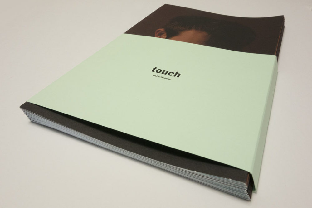
This is Peter Dekens‘ Touch. It’s an accordion book in it simplest form: a single strip of paper, folded up to form the accordion.

In reality, though, it’s not a single strip of paper. Instead, various segments were very carefully attached to each other. When you hold an accordion book, you can look at it just like a regular book, turning pages. Since the pages are held together by themselves (there is no supporting spine), accordion books usually use a strong/think paper stock. That way, the pages don’t tear easily; and when unfolding larger parts of the book, the object itself remains stable.
A notable exception is provided by Anne Carson‘s Nox (which isn’t a photobook). Its rather flimsy pages are housed in a sturdy clamshell style box that opens like a book. So there is support for the object. Especially with accordion books, the question of support becomes crucial.
Touch does not come with a cover. Or rather, the front page serves as the cover. But there is no support for the accordion other than a belly band. The belly band holds the book together, but the overall object is rather flimsy (again, this is an observation, not a criticism).
The advantage of the accordion format is that it’s up to the viewer to decide how s/he wants to look at the book. In addition to treating it like a regular book, there always is the option of unfolding larger sections. This is, I think, what makes this format so interesting for photography: this is the only book format I can think of where the viewer can see more than two pages at the same time (if they want to), while the overall sequence remains fixed.
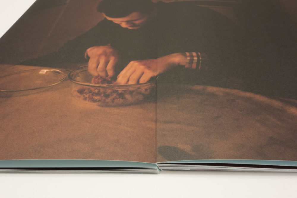
Touch works with this idea by having the images cross the various folds. In other words, if you look at the book like you would look at a regular book, you only get to see parts of some images at any given time. Unfold sections of the book, and you see both parts of an image across a fold – plus more of the neighbouring images.
The photographs in Touch were taken with available light. The blind man depicted of course doesn’t need any lights in his home, whereas for people with sight it’s hard to orient oneself in a dim room. This aspect of disorientation is reflected in the presentation – it’s not always clear where pictures begin or end.
In this simple form, an accordion book doesn’t have a spine. To make a more “book like” version you could attach the accordion to a regular hard cover (which comes with a spine, plus a lot of support). Also, an accordion book has two separate sides – the front and the back. In the case of Touch, the back is blank.
Unlike a book made with Japanese Stab Binding, accordion books by construction open all the way without any problems. Each spread will be fully visible. Nothing gets lost in the gutter.
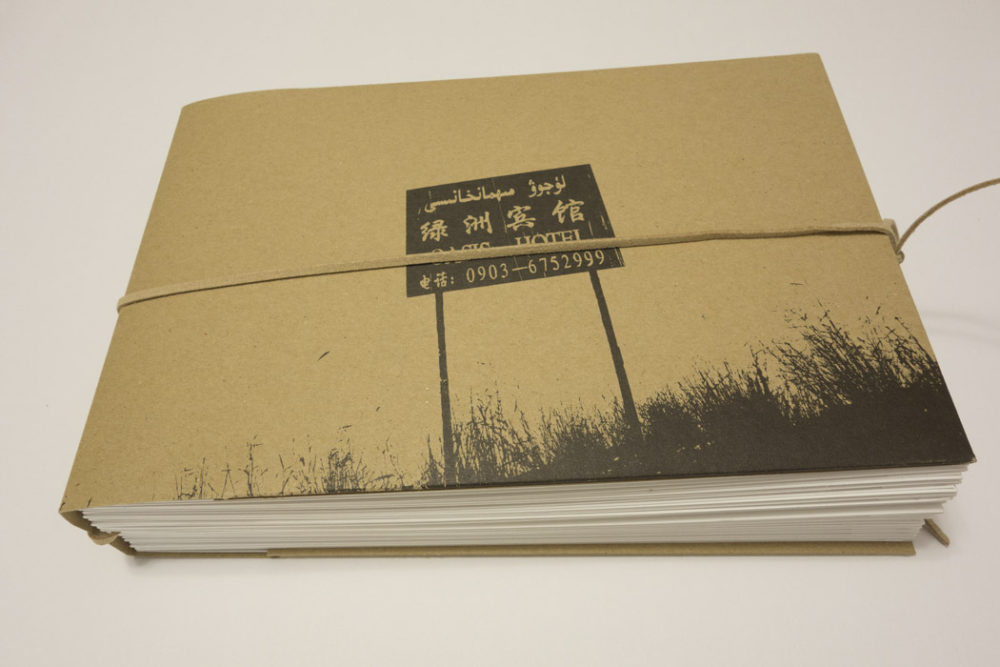
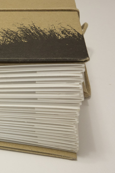
Nicolo Degiorgis‘ Oasis Hotel also is an accordion book, but there’s a little twist. The accordion’s two ends are inserted into pouches provided by the cardboard cover, essentially forcing the accordion into a more regular form. There also is a leather string that holds the whole package together. But of course the viewer can treat the book like a looser accordion book. The cardboard cover adds various ingredients that Touch does without: a spine (with text on it), plus a “proper” front and back.
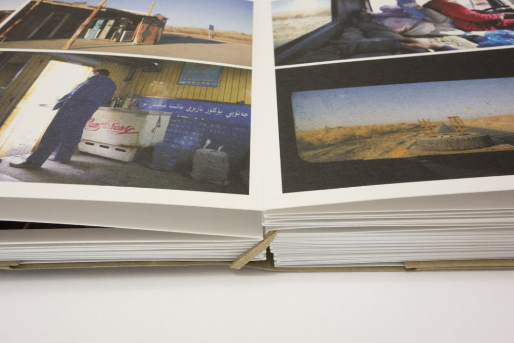
Oasis Hotel uses an even thicker paper stock than Touch, making the book rather bulky, while, at the same time, not adding much support. You certainly don’t want to put it into a stack of book, and if you do, it should probably lie on top. Working with images from a long road trip, the accordion itself makes a lot of sense, but I think the book would have gained from the concept enforced more tightly, meaning avoiding a total of eight images per spread and using the form of the accordion without this type of cover.
So possibly the exception of Oasis Hotel, each of the books mentioned above makes excellent use of its production/form. It would be weird to see Touch using a Japanese Stab Binding, just like Nurture Studies would make a tremendously boring accordion book.
As I mentioned earlier, the format/construction of a photobook usually only attracts notice if it’s unusual. For a variety of reasons, many people shy away from the types of binding I discussed in this article. But conceptually, these bindings are not any more or less crazy than, say, perfect binding or whatever else. It’s just that the unusual format makes us notice advantages and disadvantages more clearly.
In part 2 of this series, I will discuss more standard ways to make photobooks.