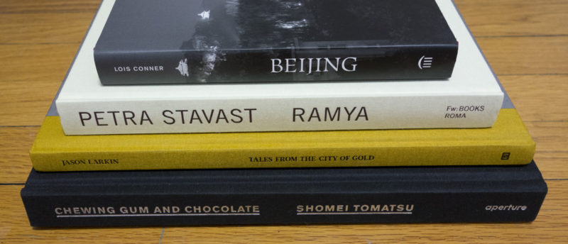
As I noted last week, I’m starting the New Year by shrinking the pile of photobooks waiting for a review. At the same time, I’m currently hoping for some inspiration – even though I publish an article (or review) every week (often two per week), inspiration does not arrive in a similar fashion. Sometimes, it comes pouring in. At other times, it’s more like going to check your (physical) mail: you open the door and check your mailbox, only to realize that, well, there isn’t going to be any mail that day. Regardless…
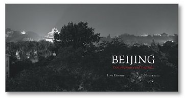
In the world of photography, panoramic photographs are relatively rare. They’re hard to deal with, in all kinds of ways. For a start, the panoramic format is incredibly awkward. There is a lot of horizontal space, with – relatively speaking – very little vertical one. Filling the frame smartly is tough, especially since the wider the panorama gets, the more the viewer will be inclined (or actually forced) to scan the resulting image from left to right, being unable to take everything in at once.
At the same time, making a book with panoramic photographs is straightforward, yet a little awkward. You get a very long book, which, when opened, feels even longer. Lois Conner‘s Beijing could serve as a great example of such a book. At (roughly) 8″ by 15″ (20 cm by 38 cm), it’s about as panoramic as it gets, showcasing work made with a camera that produces negatives sized 7″ by 17″ (the photographs in the book are 5.5″ by 13.5″ [14 cm by 34 cm] – so they’re actually smaller than the negatives). Occasionally, there are images across the gutter, and there are two gatefolds (if I’m counting this properly), showing you images that are 43″ (109 cm) wide.
If the book were an exercise in doing panoramic photography, it wouldn’t be all that interesting, though. Large parts of photoland are obsessed with process, often valuing process over content. But process alone is usually no guarantee for a successful body of work. Beijing easily makes this concern disappear. You have to be an expert craftsperson to successfully make photographs with a wooden box that contains 7″ by 17″ film. But you have to be an artist to make, well, art. And Conner is an artist.
Conner photographed in China over the course of almost thirty years, an impressive amount of time, with more than enough work to choose from. China has recently seen its fair share of being depicted, once contemporary photographers descended upon it to – however briefly – document its recent economic boom. The good news is that while there are traces of those kinds of pictures in Beijing, there is a lot more.
The book casts a wide net, maybe at times too wide a net. Where it is strongest is where it allows for the scene to impress itself upon its viewers, instead of relying on scenes that are easily impressive but that then fail to offer much else. I suppose with a subject matter like this, making decisions about what to include and what to exclude it a tough job.
And we all might want different things from photobooks anyway. That said, the book clearly demonstrates the power of panoramic photography, and it shows what is to be gained from an engagement with a subject matter that is counted in decades, not days.
Beijing; photographs by Lois Conner; essay by Geremie R. Barme; 144 pages; Princeton Architectural Press; 2014
Rating: Photography 3.5, Book Concept 3, Edit 2, Production 4 – Overall 3.3
It is one of those coincidences that has me review Shomei Tomatsu’s Chewing Gum and Chocolate, having just finished reading Shigeru Mizuki’s Showa 1944-1953
. Manga – in fact comics in general – aren’t necessarily my cup of tea, but I thought I might as well start a new year by challenging myself with something outside of my comfort zone. It’s unlikely I would have bought just any manga (or comic) book, because honestly, I’m really not all that interested in the medium. I picked up the copy of Showa simply because I found it at a local book shop browsing for a new calendar, and it was my interest in the history of Japan that got me hooked.
Showa, subtitled A History of Japan, is a series of books, and the one I bought isn’t the very first. It is, instead, the one that covers the period of time in Japanese history that provided the basis for the photography in Tomatsu’s book. Using that term, Tomatsu’s book, might be somewhat inaccurate, though, depending on where you’re coming from, depending on your ideas of authorship and editing (note to self: there’s an idea for an article right there). The photographs are Tomatsu’s, but the cover notes it was edited by Leo Rubenfien and John Junkerman.
However, according to Lesley Martin (Aperture), “Tomatsu was involved in the edit and selection of the images up until the time of his death; it’s not entirely the same as having seen it all the way through, but all the ideas, including these of his original texts and the general edit were discussed with him. In fact, there are some images we would have really loved to have used and tried hard to get him to agree, but that he felt definitively did not fit into the concept, etc. None of the images included were any he did not want to include.” (from an email, quoted with kind permission)
The question of editing and intention matters in the case of a book like Chewing Gum and Chocolate, given that large parts of the photography work against the background of the photographer’s trying to come to terms with the outcome and consequences of World War 2 in Japan, specifically the occupation and presence of US soldiers and civilians on its soil, the import of Western values and products, and those same foreign soldiers using parts of Japan as staging grounds for new wars, in particular the one in Vietnam.
There are various essays by Tomatsu included, which alone make Chewing Gum and Chocolate a must-buy for anyone interested in photography. These essays put the work itself into context, and they provide yet another example of a Japanese photographer writing about his work in ways that have much to teach. In addition to all of this, some of Tomatsu’s most well known photographs mingle with less well known ones.
In terms of the production, the book stays close to what a book made in the 1960s or 1970s would have looked like. Given neither negatives nor prints of various of the photographs were available, spreads or pages from earlier books were used instead. This makes for an inventive presentation, which doesn’t take away from the power of the images in question at all (it only made this reviewer put the photographer’s earlier books higher on his wish list).
So here then is a partial re-release of Tomatsu’s work, with a lot of material added, which, it is to be hoped, brings this particular photographer’s achievements and struggles, as an artist as well as a person, closer to where it belongs in the world of photography: center stage.
Chewing Gum and Chocolate; photographs by Shomei Tomatsu; essays by Shomei Tomatsu, Leo Rubenfien, John Junkerman; 216 pages; Aperture; 2014
Rating: Photography 4, Book Concept 4, Edit 2.5, Production 4 – Overall 3.8
If a photograph of a person, a portrait, tells us something about that person, as we all appear to believe, then a large collection of such pictures must tell us a lot. It must certainly give us insight into the portrayed, into her or his character, her or his idiosyncrasies, her or his moods. If this is true – I don’t think it is at all, but regardless: if this is true, when we ought to learn a lot about a woman named Anneke van Assendelft, who also went by the first name of Ramya, from Petra Stavast‘s book Ramya.
To admit that we don’t in fact learn much from the book would miss the point entirely. After all, much like how Thomas Ruff’s famous large-scale portraits are centered on the conflict between our beliefs what portraits do and what they really can do (very little actually), Ramya ultimately is a book centered more on everything that we tie to pictures, in this case portraits, instead of on what the pictures show (a person).
This might sound like an incredibly tedious photobook to look at – it’s anything but. That said, the book has the potential to frustrate those viewers who are looking for easy answers. Photography, the visual depiction of surfaces, does not provide easy answers. It only provides answers that are too easy.
Ramya combines photographs taken by Stavast over the course of many years with pictures made by others, Ramya included. There is text, too, in the form of conversations about Ramya. There also are reproductions of documents. I suspect that initially, the book’s edit might make some people feel there is an unwillingness or maybe an inability to edit. But there isn’t. If portraiture often comes down to picking that one photograph that expresses… well, what? But anyway, if that’s what portraiture supposedly is, then doing the opposite certainly throws down a gauntlet: Here, you think you know so well what these portraits do, so what do you get when I show you all that stuff?
All of this might come down to us humans essentially being unknowable – to ourselves certainly (how else would there so many therapists, psychologists, and psychiatrists be around?), and to others. We can hope to come closer to someone through an extended personal engagement. But we can’t hope to achieve any of that through pictures, through the accumulation of materials.
Photography ultimately merely is the projection of rays of light onto a light-sensitive surface. What we make of those pictures is little more than a projection as well, our naive beliefs concerning its truthfulness notwithstanding.
Ramya; photographs by Petra Stavast and others; 224 pages; Fw:/ROMA; 2014
Rating: Photography 3, Book Concept 4.5, Edit 3, Production 3.5 – Overall 3.5
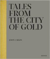
There are subject matters that are so loaded that it’s hard, if not impossible, to do them justice in a way that will make everybody happy. If you’re an artist, there is no such obligation. What is this telling me? Instead of: Does this tell me what I want to see? This, I believe, is especially important with loaded subject matters, because those tend to come with conventions along which a possible discourse is encouraged to proceed.
Post-Apartheid South Africa is such a loaded subject matter, given its larger history and the various factors that make it a somewhat unique African country. To cover South Africa photographically means to wade into tricky territory. This is what Jason Larkin did with Tales from the City of Gold, a book about the larger Johannesburg area and its connection to mining.
What we get, in the form of photographs sandwiched between two essays, is what I see as a somewhat hesitant portrait of a harshly beautiful place that seems to offer little, if any hope for those living there. Whatever salvation is there to be had, it is brought by religion; and the only people not weighed down by the existence they find themselves in are the children depicted playing their games, enjoying their lives.
The photographs employ some of the strategies well-known from contemporary photography: Sweeping, distant vistas interact with portraits taken at mid-distance, keeping a careful balance between visual beauty and direct engagement.
I’m tempted to think that right now, in these early days of 2015, we’re just beyond the point where we’ve realized how far such a strategy will take us and where we’re craving for a little more.
I would have indeed craved for a little more here – it’s almost as if whenever the book starts to focus in on what all of this might mean, what implications there might be (however true or false those implications might be – remember, it’s art), there’s a step back. That hesitation runs like a huge red thread through large parts of contemporary photography. I wish Larkin had pushed beyond it.
That said, Tales from the City of Gold is a book that offers much to those who are willing to look, a book that has made me come back to it a lot while it was sitting somewhere in that pile of books waiting to be reviewed.
Tales from the City of Gold; photographs by Jason Larkin; essays by Mara Kardas-Nelson, Julian Rodriguez; 96 pages; Kehrer; 2013
Rating: Photography 3.5, Book Concept 3.5, Edit 3, Production 3 – Overall 3.3
Ratings explained here.
