It’s summer, and what better way to kick back than to sit on a porch or beach or in a cafe somewhere with a good book. Or photobook. After all, who says your reading material has to be literature? And maybe looking at a photobook in a public place might result in someone else having a peek? Isn’t it about time photoland emerged from its, let’s face it, largely self-imposed ghetto?
This week’s selection of photobooks covers a wide variety of work and publishing options. It’s also an attempt to reduce the height of the stack of to-be-reviewed books right in front of me.

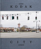
Catherine Leutenegger – Kodak City
To produce a photobook about a particular place that will make the local residents happy is a thankless task. You might as well work for the tourist information office. As much as I understand the frequent complaints about photographers supposedly misrepresenting some place, whether it’s Appalachia, Detroit, or somewhere else, ultimately these complaints are based on misguided expectations, and on the idea that photography somehow – quite magically – accurately represents the world. It does not. By now – this is 2014 – we should have learned this. Even what the tourist information office produces is inaccurate in that it is little else than propaganda glossing over the not-so-wonderful bits.
At the end of the day, a photobook about any place tells us a lot about its maker and, possibly, something about the location. Approached this way, photobooks have something to offer that tourist brochures lack: they’re an invitation to get challenged, instead of having one’s expectations confirmed. This then makes the creation of a photobook about a place a lot harder than it would seem, in particular if the place in question comes with a large number of preconceptions on the audience’s part.
Rochester is home to Kodak, a company that doesn’t need an introduction. Without Kodak, the history of photography would have been very different, regardless of whether one thinks about the quintessentially American idea of “you press the button, we do the rest” or of films like Tri-X that shaped what pictures would look like (as a photographer, I still rely exclusively on Kodak film in the form of the Portra colour films. It’s possible and quite likely that in my life time, it will disappear).
Catherine Leutenegger‘s Kodak City portrays both the company’s grounds and factories (or rather what’s left of them) and the city itself (ditto). The result is a little bit more complex than it would appear, in particular since the red thread running through the book is not unique to the combination of Kodak plus Rochester. There is a lot of mostly anonymous corporate architecture on display in the form of both buildings themselves and the way they are adorned inside and outside. Kodak City is made to stand for any city that relied on a large corporation to get wealthy, to later enter a slow and steady period of decline as the company’s fortunes started waning.
Seen that way, whether the book accurately or properly portrays Rochester (whatever that might mean) is quite irrelevant. It might, or it might not. What it speaks of very, very clearly, however, is the fate of large cities in an economical system that values “creative destruction.” Swap out film for cars, say, steel, or paper, and the book speaks of Detroit, Pittsburgh, or Holyoke (think of typewriters, and you get the German town of Wilhelmshaven, where I was born).
Using the specific to speak about the universal – that’s one way for photography to succeed.
Kodak City; photographs by Catherine Leutenegger; essays by A.D. Coleman, Joerg Bader, Urs Stahel, Catherine Leutenegger; 160 pages; Kehrer; 2014
Rating: Photography 3.5, Book Concept 3, Edit 2, Production 3.5 – Overall 3.2

Philipp Ebeling – Land Without Past
I’d like to think that I understand the impetus behind Philipp Ebeling‘s Land Without Past very well, maybe too well to be able to write a review. But then, much like art itself all reviewing is grounded in being subjective, with the idea being that out of it will come the universal, or at least something that allows others to make a connection.
Here then is the essential challenge Ebeling has been facing: how do you connect with your home country if it is Germany – given its past, and especially given how people have so far been dealing with it?
I’ve written extensively about German photography and its strange way of dealing with the past – there is a rich history of German (non-photo) artists creating work around the Nazi era and the Holocaust. But until very recently, or more accurately until approximately the fall of the Berlin Wall and the country’s subsequent reunification, German photographers were mostly silent about it (see my earlier pieces from 2010: part 1 and part 2).
Photographers of my generation dealing with the past appears to tap into the larger topic of the group of people known in Germany as Kriegsenkel – the children of the generation that at the end of World War 2 grew up in the rubble, a generation that would rather rebuild a prosperous country than deal with its own hurt, let alone deal with what their parents did.
So it seems appropriate that the dust jacket of Land Without Past has photo corners attached to it, most of which are empty. This mirrors what could be found in German photo albums – you get rid of the past in part by censoring your memories, and photographs serve as such. But the past won’t just disappear this way, in particular since on a societal level, Germans have been dealing with their collective past ever since. The book is an attempt by the photographer to come to terms with his own past.
Combining archival pictures with his own photographs, Ebeling lays out what, frankly, makes me uncomfortable as well. There is no easy resolution to the discomfort – this might be the ultimate lesson. The discomfort must be experienced, and it will never fully go away. The flag waving of German soccer fans at the World Cup still gives me the chills, as much as I realize that some mild form of nationalism might in fact simply be necessary. But still…
Ebeling stays close to his family, and he throws in all the right symbols for good measure, regardless of how much or how little they still mean: the German flag, carefree German youth, sausages in a soup… There is no resolving what cannot be resolved, and it is this realization that makes the book succeed for me. The land with its well-known public past whose citizens individually attempted not to have a private past is finally becoming a normal country, with all the successes and flaws such countries come with.
Land Without Past; photographs by Philipp Ebeling; 80 pages; Fishbar; 2014
Rating: Photography 3.5, Book Concept 4, Edit 3, Production 3.5 – Overall 3.6

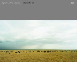
Sze Tsung Leong – Horizons
Occam’s Razor essentially states that the simplest solution to any given problem is the preferred one. There should be a photography equivalent. In the case of photography, the simplest ideas for a body of work are often the most successful ones. Mind you, a simple idea does not necessarily translate into a simple execution. Often, the opposite is the case. But usually, the best approach to any given photography project is to keep it as simple as possible and to make it work.
Sze Tsung Leong‘s Horizons provides a great point in case: landscape photographs done in such a way that the horizon line is always in exactly the same spot. For his series, the photographer traveled all over the globe, to assemble a massive and impressive body of work. Horizons could (maybe should) serve as an example for photography students how, given the work’s level of consistency and quality – both photographic and artistic (no, those are not the same).
It’s tempting to think that with such a body of work a photobook almost makes itself. But the books that seemingly are the easiest to make require a lot of very careful work. You probably don’t want to just sequence the photographs willy-nilly. You also need to think about whether or how to use gatefolds – use too many, and the book becomes a hot mess, use too few, and they become almost pointless. All of these aspects were taken care of carefully, resulting in possibly one of the best possible presentations of this body of work in book form (maybe a bit conservative, but there really isn’t anything wrong with that in this case).
A simple idea, executed and presented perfectly – there’s really nothing else one could hope for.
Horizons; photographs by Sze Tsung Leong; essays by Sze Tsung Leong, Charlotte Cotton, Pico Iyer, Duncan Forbes, interview by Joshua Chuang; 176 pages; Hatje Cantz; 2014
Rating: Photography 4.5, Book Concept 3, Edit 4, Production 4 – Overall 3.9

Anaïs López – In The Beginning No Birds Sang
Most people will pay attention to something if they have to, meaning they will inevitably ignore quite a bit. Per se, there isn’t anything wrong with this, given that sensory overload cannot be the ultimate goal in life. But how do we decide what to pay attention to and what to ignore? Our decisions are often thrown into sharp relief when we encounter people who differ quite a bit from us, regardless of whether it’s by choice or necessity. A blind person, for example, will inevitably be much more susceptible to sound (unless they are deaf). We are, after all, surrounded by sound just as much as by visuals.
Sound, of course, almost never plays any kind of role in photography, because you cannot take a picture of it. Compared with what sound can do, photography is a fairly anemic medium. Seeing a picture of a crying baby will hardly cause the same reaction as hearing a baby cry (even if it’s not yours – if you don’t believe me, just get trapped on a long flight with a fussy baby on board). All you can hope for as a photographer is to allude to the effects of whatever sound you’re interested in, a task made even harder if you’re not photographing crying babies but instead something whose sounds people mostly pay no attention to.
Anaïs López‘s In the Beginning No Bird Sang does just that. The photographer had a blind man named Jean Poppers show her IJburg, a neighbourhood under construction in Amsterdam. Regardless of whether you find yourself in some new suburb in the US or in any one of those recently built neighbourhoods in Europe, initially there is very little to experience. Unless you have a guide like Poppers who will teach you to pay attention to the sounds. There are birds, for example, and they all sound very different. They even produce different sounds depending on the occasion (check out, to use an example I particularly enjoy, the Northern Cardinal). And pretty much everything else will also have a sound, whether it’s cars driving by, the branches of trees rustling in the wind, or whatever else.
Thus the book “talks” about IJburg, and its birds, using Jean as a guide – small photographs of him cupping his ears are reproduced several times. In addition to landscapes and images of birds, there also are reproductions of wave forms for the various birds living there. Of course, the book does not achieve the unachievable. Even if you go to the artist’s website and listen to the audio files of the birds, you’re not going to get much closer to the auditory experience of IJburg. But I don’t see that as the book’s real goal. Instead, the book tells us something about a world that offers us much more than we often want to think. Hearing the different sounds can reveal aspects we previously were unaware of.
As a book, In the Beginning No Bird Sang is a somewhat ambitious object, but I feel some of its aspects have maybe gone a bit too far. There are six dust jackets, each of which giving additional information. There are two gatefold pages that don’t add much to the book. Occasionally, I feel Dutch photobook making goes a bit overboard. But for this particular book, these are mostly minor quibbles.
In the Beginning No Bird Sang; photographs by Anaïs López; 112 pages; self-published; 2013
Rating: Photography 3, Book Concept 3.5, Edit 3, Production 3 – Overall 3.1
Ratings explained here.
