
In part 1 of this series, I discussed two fairly uncommonly used ways to construct a photobook, the Japanese Stab Binding and the accordion. In the following, I want to focus on two more conventional methods.
You’ll remember from the discussion of the stab binding that a book can be made by stacking a set of paper and by then fixing everything with a thread that is woven through holes (perfect binding replaces the holes and thread with a slab of glue). Another, very simple way to make a book also uses a stack of paper. Instead of fixing everything at one end, the stack is folded down the middle, and the book is created by running either a thread or staples through the gutter (in reality, you don’t have to fix anything – think of newspapers): Saddle Stitching.
The binding aside, there’s a difference between Japanese Stab Binding and Saddle Stitching: if you add another piece of paper to a stack of paper, you get two and four additional pages, respectively. In the case of the Saddle Stitch, you get four pages because you fold the piece of paper in half (“folio”). This might not sound like a big deal. But when you make a book that is saddle-stitched, your total page number will be a multiple of four. There are other types of bindings that place similar limits on the available number of pages.
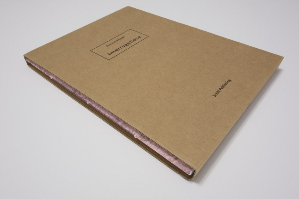
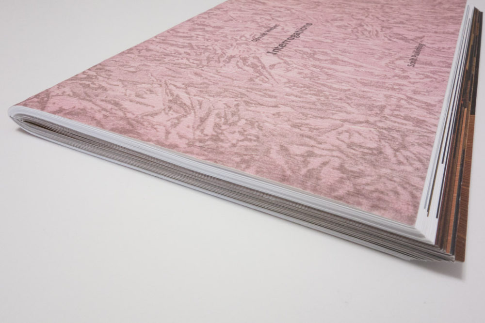
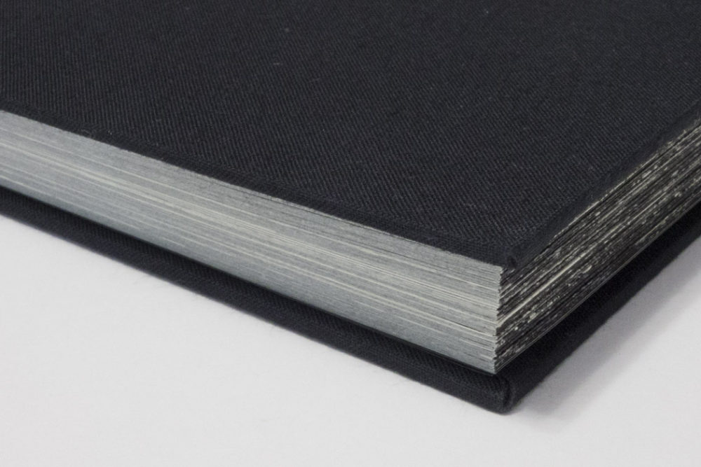
A great example of a saddle-stitched book is provided by Donald Weber‘s Interrogations. The book very clearly is the result of stacking a lot of folios on top of each other – at one end of the book, you see them bulging out. You don’t get to see this effect often, simply because most saddle-stitched books don’t quite use this many folios, and books are trimmed after the binding (you simply guillotine the edges to get everything straight).
Another thing to note about a saddle-stitched book is that it doesn’t have a spine. There simply is a thin line running across, which will either show you the staples or, in this case, the thread used to bind the book. Interrogations solves this problem by housing the book in a cardboard sleeve. One of the edges of the sleeve serves as the spine. What is more, the sleeve also protects the edges of the book, at least to some extent.
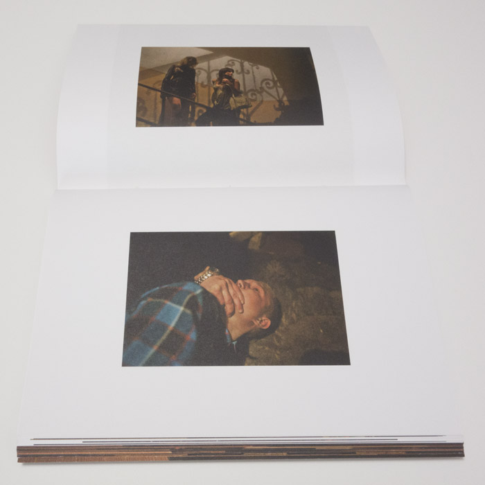
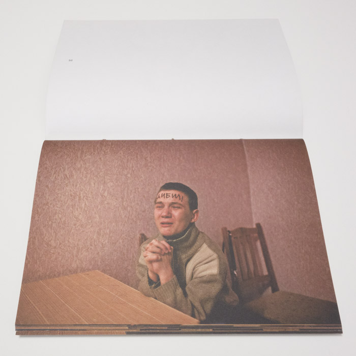
Overall, Interrogations comes across as a pretty rough book (please remember from part 1 that in this series, I’m mostly interested in making observations without value judgments being implied). The cardboard used for the sleeve is most basic and not overly sturdy. The book’s cover paper stock is textured and has a rough feel to the touch. The cover’s pattern mirrors some of the backgrounds in the actual interrogation photographs inside, photographs many of which portray a fair amount of psychological violence. You probably wouldn’t want to make an overly precious book out of a subject matter that itself is rough. So the book’s form takes the material it is presenting into account. At the same time, given it’s somewhat unusual, the form also makes the book stand out from the crowd.

The second example concerns the use of gatefolds (which I already mentioned in part 1). What better way to talk about gatefolds than by picking a book that uses them as much as possible, and by “as much as possible” I literally mean just that. This is Kikuji Kawada‘s The Map (rather the 2005 Nazraeli Press reprint, which, alas, is sold out).
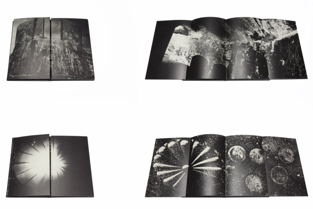
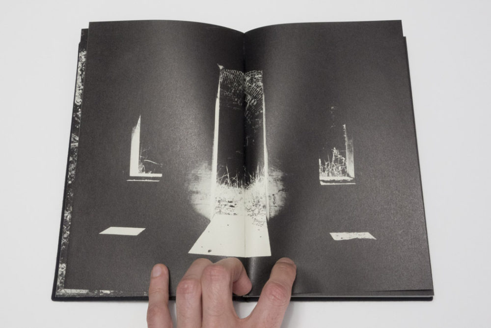
Almost every other spread in The Map uses gatefolds (I suppose one could construct a book where every spread had a gatefold – I’ve never seen such a book). You open such a spread, and you see a photograph that is cut in half, showing the two closed wings of the gatefold (see images). Open the wings, and there is another, much wider image (which occasionally consists of more than one part). There are 23 gatefolds.
One would imagine that having to open and close 23 gatefolds would be an incredible chore. It is not. Instead, looking at the whole book becomes an almost meditative experience, as new images are revealed and then hidden again. In other words, the viewer’s engagement is part of the overall experience of the book. This is a very bold way to make a photobook. If you lose your viewers somewhere, if the viewers feel the physical aspect of looking at the book becomes too much of a chore, the book essentially fails.
But The Map never fails. Every year, I present my copy of the book to MFA students as part of a photobook-history class; every year, the room goes incredibly silent as the students are being drawn in. It’s quite amazing actually. I don’t think any other book I’ve shown over the years has ever even come close to getting the same reception as The Map (another student favourite: Weegee’s Naked City).
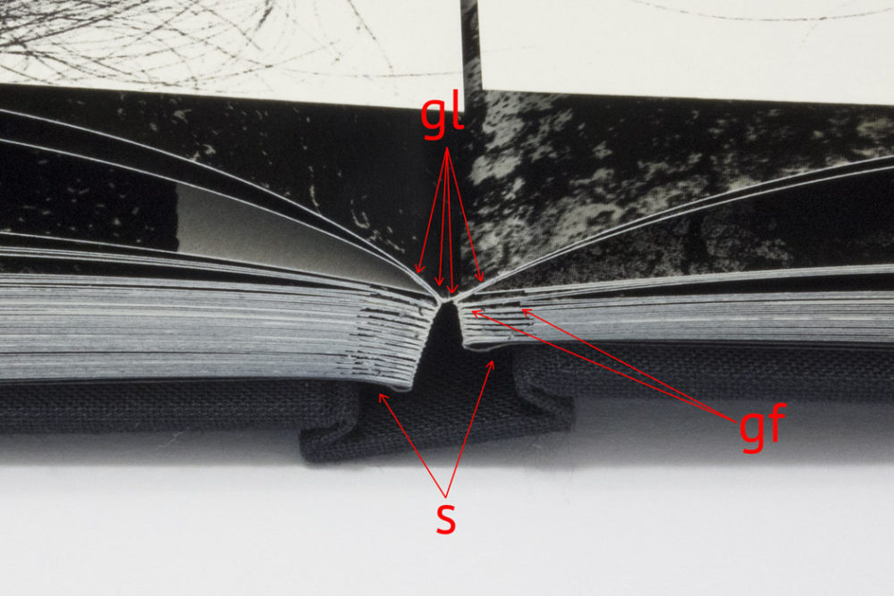
In terms of the construction, there are a few interesting details to note (see the image above for an illustration). For a start, the book is constructed in such a way that the gatefolds open easily, and the book lies flat. You wouldn’t want the book to bulge up when the gatefolds are open, in particular since the best way to look at the book is to place it on a table. The wings are slightly shorter than the main pages, preventing problems when refolding them. This is an important detail as well – if you’ve ever had a book where a gatefold’s wing was too long, you know what I’m talking about.
So the object is made in such a way that none of the possible problems that could arise from the format interfere with the process of looking at the book. Opening 23 gatefolds never becomes difficult or tedious; instead, the object allows its content to (in part literally) unfold itself in front of the viewer, drawing her/him in.
It’s unlikely you will want to make a book that uses as many gatefolds as The Map. Each photobook requires its own solutions for what it intends to do. But then, maybe you do need a book with a lot of gatefolds. Or you need an accordion book, or a book that is printed on newsprint, without any binding (like a newspaper). As I noted in part 1, the key to making a photobook always is to find the right form, a form that derives from the book’s function, which, in turn, is very closely related to the experience you want the viewer to have.
I want to say this, though, and this is extremely important: Never, ever add something to a photobook simply because you think it’s “cool”. I see this all the time. If any of the elements your book’s form requires happens to be “cool” – good for you. If not, resist the temptation to add stuff the book doesn’t need.
When making a photobook, it helps looking at other photobooks to see what might work. Books can serve as templates for other books. At the same time, given that photobooks (ideally) aren’t just templates, but fully realized books, it’s important to try to understand the possible decisions that went into their making carefully. Reverse-engineering photobooks is a great way to understand them: What does this do? How does this work? How is this constructed? How does the form support the function? And what went wrong here (if there’s something that went wrong)?
While each photobook requires its own unique solution, there also are a lot of things that boil down to personal preferences. It’s impossible to make the book that will make everybody happy. Compromises will have to be made, and you might have to give up on a few things you really thought you wanted or needed (for whatever reason). But photobook making, just like photography itself, starts with looking, in this case looking at other people’s books.
Oh, and do yourself a favour and never, ever try making your photobook on a computer, using InDesign or whatever other tool you might love. Work with physical dummies. It doesn’t matter whether they’re constructed perfectly or not. But you will see whether a gatefold works easily when you have a shoddily constructed dummy – try that on the computer, and you’ll probably fail. It’s fine to figure everything out on paper and then go back to the computer – doing it the other way around is almost certainly a guarantee for failure.