
Ever since seeing Pontiac, I started collecting Gerry Johansson‘s photobooks. They’re unique experiences, quite unlike most of what is going on in the world of contemporary photography. Everything about them feels extremely carefully considered, yet there is a lightness to them that is quite rare. Earlier this year, I met the photographer in person, to hear him talk about his work. This then had me ask him whether he’d be available for a conversation about his work.
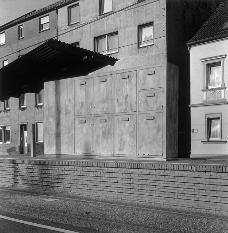
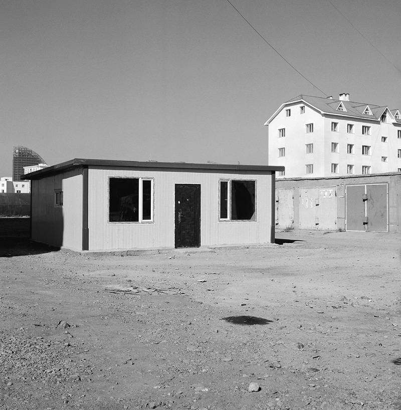
Jörg Colberg: To start off, I found a quote by you that intrigues me: “I photograph what I find beautiful. That can include both a run-down 1970s urban scene and a romantic rural landscape. My pictures can be seen as a counterweight to the dystopic portrayal of our world in mass media.” (source) Many artists these days shy away from beauty for reasons that I have never fully understood. What is more, many of your photographs (which I think are very beautiful) show places that I have a feeling wouldn’t look as beautiful if one were there. I grew up in Germany, and I was quite surprised to see your Germany, especially how you found beauty in places that I would have never expected to have any. Can you talk about your approach to a place and to looking for beauty a little bit?
Gerry Johansson: The question What is beauty? is one that I think has an infinite number of answers. I read Robert Adams’ Beauty in photography. An essay in defense of traditional values when it was published in the early eighties. (Who can resist a title like that?) That changed my mind from being a nihilist critic to optimistic recorder of life.
We all find beauty in different things. And most of us try to find beauty in our lives. It might not alway be to your or mine liking, but people try to express themselves through beauty. You seldom hear anybody saying ” I tried to make my garden as horrible as possible” or “this is the ugliest tattoo I cold come up with.” (perhaps not a perfect example)
I think my definition of beauty would be “something I like and can look at for a long time.”
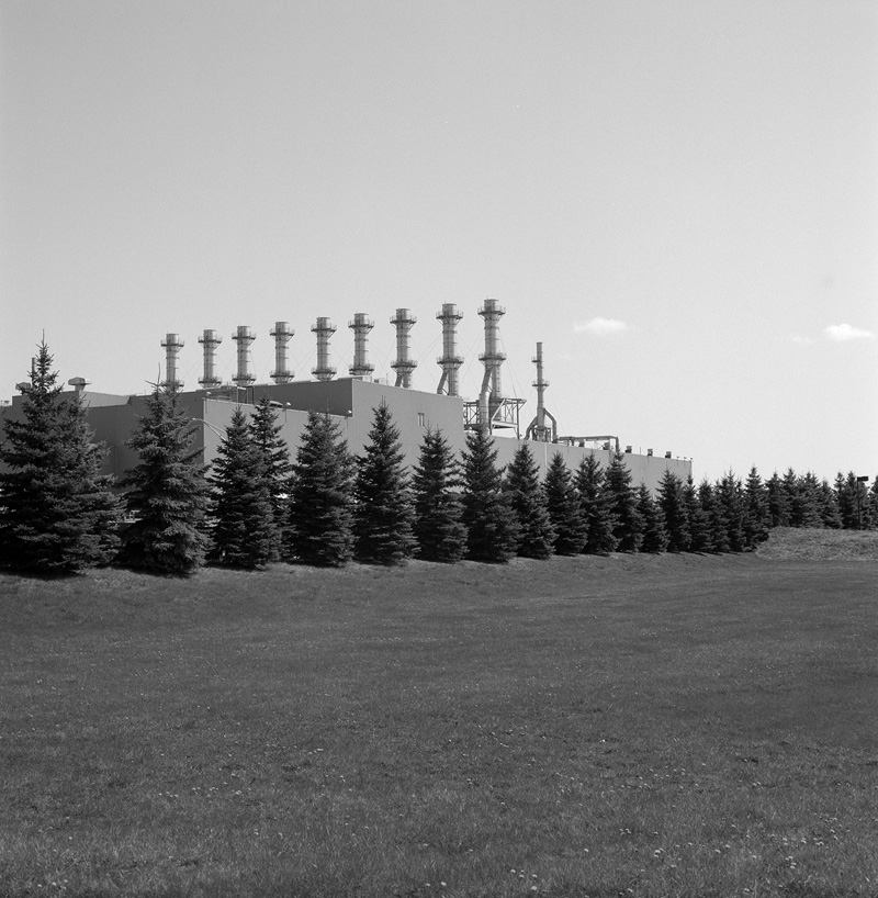
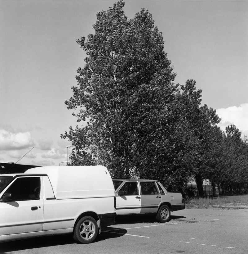
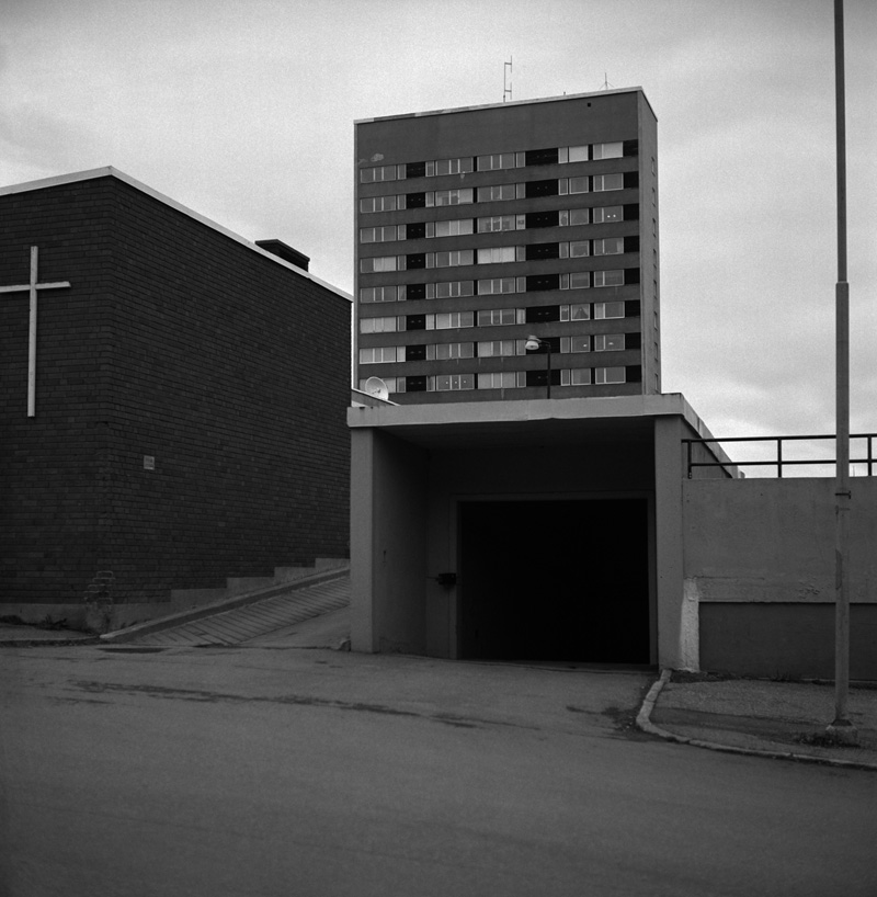
Generally I would say that I only photograph things and places I like for various reasons, history, design, memory, cultural comment… Things I recognize myself in. When I work I just park my car and start walking in the direction that seems most promising and then my curiosity leads me through the day. Photography I think is very much the art of the subconscious. You have the possibility to react to your feelings instantly and it is very difficult to pinpoint what draws you to certain objects or places.
What I try do when I photograph is to present things and places as clearly as possible by means of framing, composition, light and so on. I work with very simple equipment. A Rolleiflex or Hasselblad with an 80 millimeter lens. This simpleness makes it easy to the viewer to orientate themselves in the image. It gives you an impression that you are a part of the picture you self. Well, that’s at least what I hope. Most things are interesting when you are able to see them clearly. I also think that most things are made with the best intentions, even though it doesn’t always work out the way we had hoped.
JC: I like that you talk about “things I recognize myself in” when talking about a place. Isn’t that really the fallacy of so much photography – to think you’re pointing the camera at the world, without realizing this so very technical form of art still speaks mostly about the person operating the camera?
GJ: That photography is a technical art form has long been seen as a disadvantage when it is rather the great basic idea with photography. The camera is a wonderful machine to preserve feelings, memories and discoveries, and to communicate those to others sometimes.
I think most photographers start out “with things they recognize themselves in”. That’s what you do when you start making pictures for your own pleasure. Unfortunately, a lot of those personal or private expressions get sorted out because of the rules and conventions of what a photograph shall look like. It’s not by any means easy for a photographer to persist in his ideas of a private, straightforward and communicative imagery. The world is full of editors, art directors, or, in worst case, curators that know best.
You often see amateur photographs made from personal experiences that doesn’t communicate to us very well, because they do not follow the formal rules of what a photograph should look like. But I can feel a lot sympathy for those pictures and I enjoy them.
Sometimes when I look through old prints or negatives I think “why on earth did I make that picture? Shouldn’t I have known better. What did I think of?” Probably I didn’t think at all, I just made it. You should allow yourself to do that. That’s part of the richness of photography.
JC: The work in some of your books was photographed over a fairly long period of time. Deutschland, for example, contains photographs from 1993 and 2005-2012 (which I don’t think is visible in the photographs – I don’t think there is an idea of time in them). How do you go about finishing something like this? How do you know that something is done? And do you have a series of projects that you add to with time?
GJ: From the beginning there was no such thing as a “project”. I simply photographed things I found interesting and collected the pictures in boxes. There were no exhibitions and no books, so there was really no need to end any project. There were “themes” of course but they were kept open, there was no need to finish them. I sometimes miss that feeling. Nowadays I feel a bit forced, mostly by myself, into this project thinking, which is a magazine or art world influence I guess, and I don’t like it. People keep asking “what are you working on now” and “what is your next project”. I hate those questions! Project is dangerously close to assignment.
The first pictures in Amerika (1998) were made in 1993. At that time I had no plans for a book, it just evolved as work went on. After Amerika was published I started on Sverige, which is mostly done 2001-02, but it also contains some pictures from the mid eighties. I tried to find a place to exhibit them, but it wasn’t until 2005 I could show them at Fotografins Hus (House of Photography) in Stockholm. Remember, this is Stömholm/Petersen Country.
The question of time is interesting. I recently had an exhibition at GunGallery in Stockholm with pictures from my six last books. 228 pictures, from 1985 to 2012, in a small gallery, and they all looked as if they were made on the same day.
Even my early, teen age, pictures made in 1962/63 in New York look like they were made in the thirties. I think it has to do with the fact that I avoid having time markers like people and cars in my pictures. I guess it also has to do with my absence of style, that my prints are very neutral, b/w, a bit old-fashioned and small. I rarely photograph new things, they have to gain a bit of patina. Looking at new stuff gives me an uneasy feeling, like having a fresh haircut.
JC: Boxes filled with pictures… I just have to ask: How do you go about editing when you compile a book? You photograph seeing things clearly – what is the next step coming from there when putting a book together?
GJ: I would rather say boxes with small printouts, 9 x 9,2 cm, the same size as in the books. I scan the films and make small printouts on A5 paper of the images I like. I make a generous selection, usually 4 or 5 from each film. I think it is important to see them in the size they will be printed. Pictures can be very different depending on their size and the viewing distance.
Instead of reading a good book when I go to bed, I bring a box of pictures just to familiarize myself with what I have done, to find patterns, surprises or repetitions. This is repeated over a long time, and I have to say, if you excuse me, that I seldom get bored. The final selection is usually quite quick and more based on the concept of the book, alphabetical, geographical or chronological. Sometimes I do it myself and sometimes together with Greger Ulf Nilsson.
JC: Looking at your books, they use a very stark design, with fairly small photographs on the pages. All the books I know (I own four) follow the same layout, and two of them – Amerika and Deutschland – contain photographs simply in the alphabetical order of the location names. How did you arrive at making books like this?
GJ: I have a background in graphic design and publishing. In the seventies, the company I was co-partner of published more than 20 photography books in Sweden. I designed some of them. What always annoyed me was that the photographers wanted to change things. So when Amerika was going to be published (I had left the company by then) I asked my friend Henrik Nygren to design the book. We agreed on the format of the book, mostly based on cost reasons, and it was his idea to have the images so small. My first thought was that they were actually a bit too small and my second thought, thankfully, was that I shouldn’t be like other photographers. My idea with the book was to have a flow of pictures, just one per spread to avoid communication between images. Every picture is a new story, and to emphasize that there was no edited story line they were presented in alphabetical order. The title is also very important to the image. That’s why the type is quite large. Ideally, the book should be read out loud even though it can feel a bit silly. I do this sometimes at exhibitions and it is highly appreciated.
I was really pleased with how Amerika turned out and we have stayed with the concept for Sverige and Deutschland. Kvidinge, Ulan Bator and Pontiac have different editing strategies.
When Sverige was going to be published we changed the binding. Amerika was soft cover and I didn’t like that it didn’t open up properly. Henrik choose the cloth and decided it should have two tipped in images. It was also supposed to have the title and my name on the cover. I decided against that. To me it was enough to have it on the spine and we agreed on that. (after all I’m a photographer). The next decision was taken when Kvidinge was going to be published. At that time Henrik’s friend Greger Ulf Nilsson was added to the “committee”. Should we have a new color of the cloth? We all agreed not to change it. At that point I was quite clear that it would be a series of six books, and we all thought they would look nice together in this wonderful brown cloth.
I’m very happy with the choice of the small images in the books. It has influenced me in a good way. I have been forced to simplify my images and I have no problem with the fact that there sometimes are things you can’t see.

JC: When you look at your photographs on the wall and in the books – which presentation is the one you’d prefer and why? Assuming you prefer one over the other?
A:I can’t really say that I prefer one over the other. I like the flow of pictures in the books and that the amount of images is a bit forgiving. They don’t all have to be masterpieces. The ups and downs are part of the joy of books. I also like the fact that the pictures become available to a lot of people over a long period of time.
My exhibitions are also quite generous with prints. Usually 50 -150 prints in simple frames. I like the exhibitions because I get to show the real image and the craft of photography. Is there anything in the world that is as beautiful as a black and white sliver gelatin print? I like the idea that you work with a material when you work in the darkroom. It sets certain limits to what you can do. Digital today looks fine, but everything is possible and the result usually comes out boring.